

 AdonisJS
Open Site Width
- In the toolbar (the bar across the top of your site once you’re signed in; see The toolbar), choose Site design, then the Site Width tab.
- Or open the command palette (⌘K, or Ctrl+K on Windows), choose Site design, then Site Width.
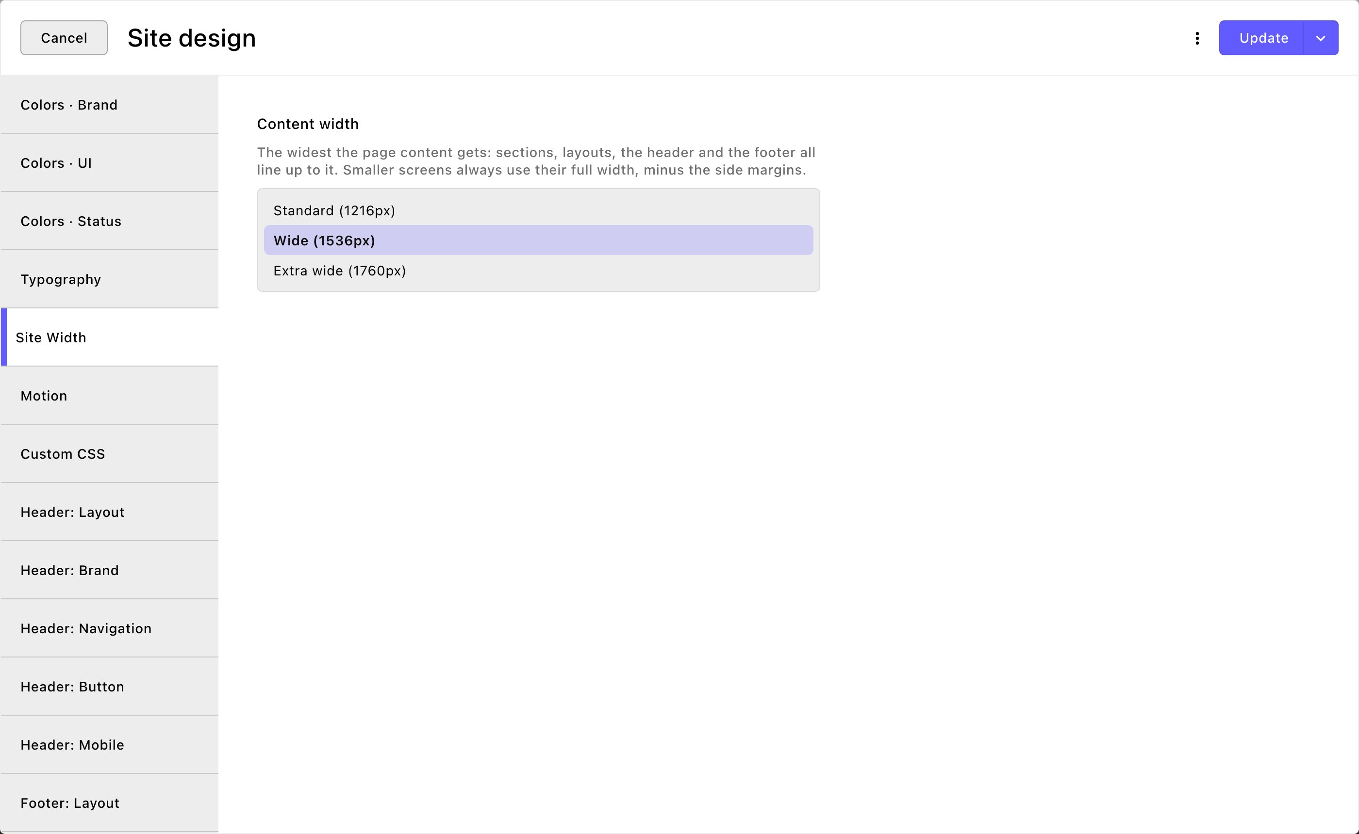
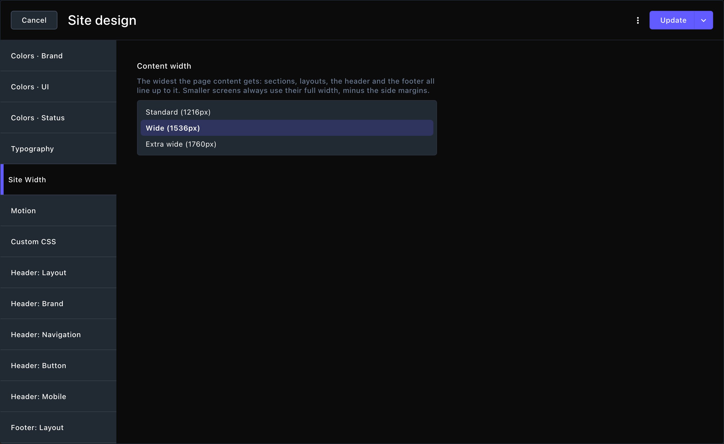
The Site Width tab and its three widths.
Content width
Content width is the widest your content gets. The widths are in pixels (px), the tiny dots a screen is made of. You don’t need to work anything out: a typical laptop screen is about 1440px wide, and a large desktop screen 1920px. Every section, side-by-side layout, the header and the footer line up to it, so their edges always match.- Standard (1216px): a narrower page. Good for sites with lots of text.
- Wide (1536px): the built-in width. A balance of text and room for images.
- Extra wide (1760px): the widest page. Good for big photos and galleries on large screens.
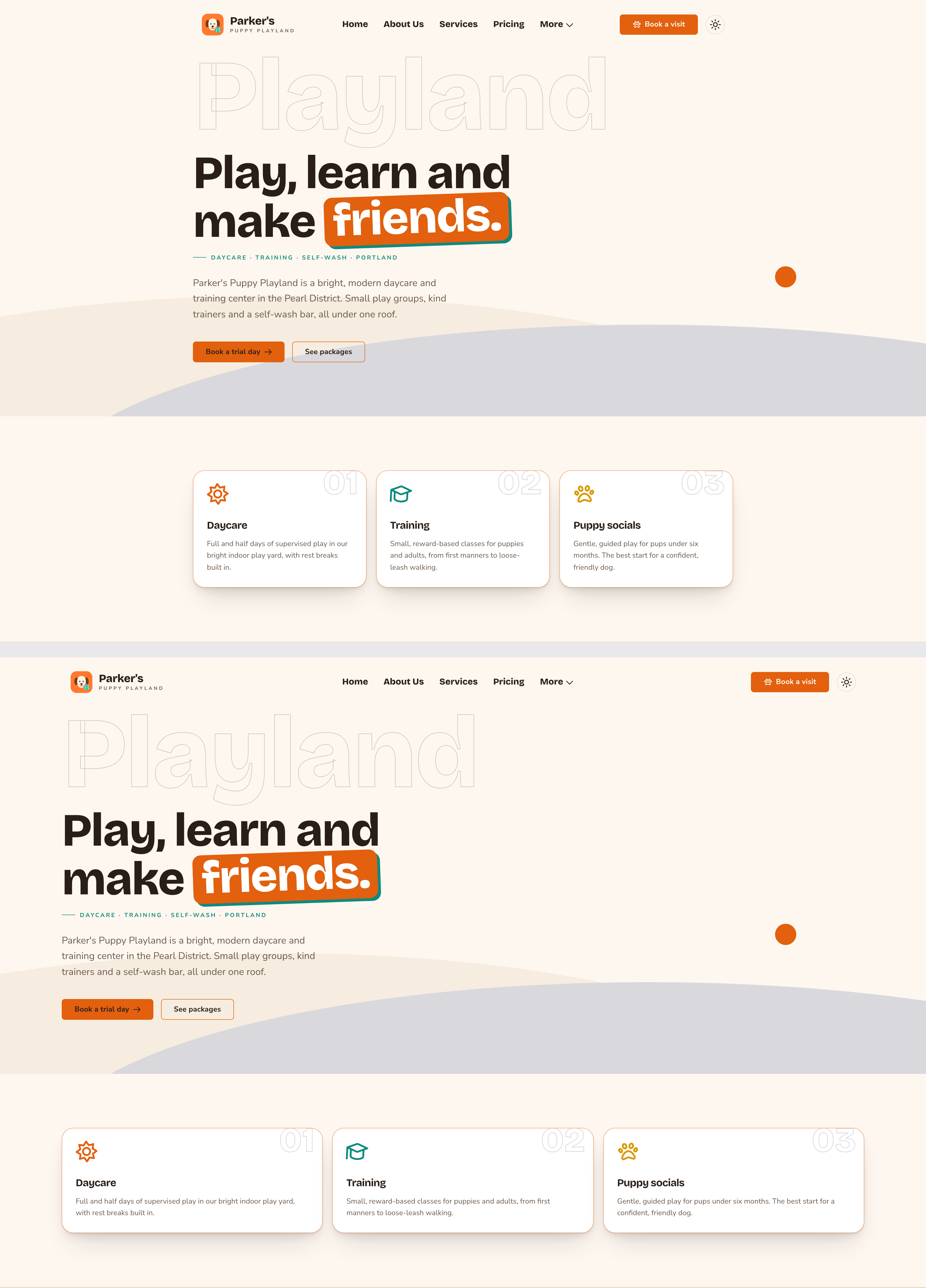
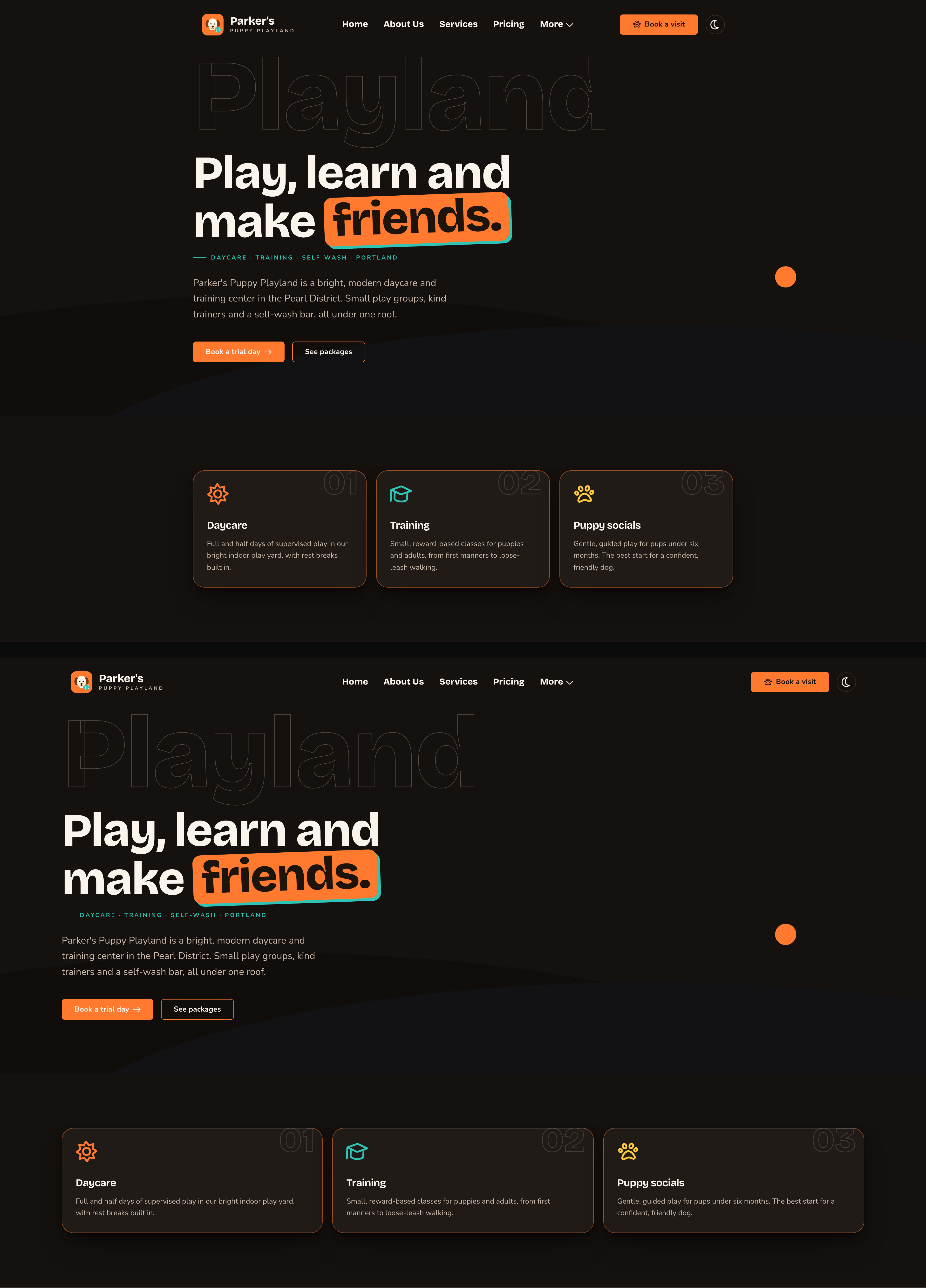
Standard keeps content narrow on a big screen. Extra wide uses more of it.
Put the change live
Choose Update to save the width and put it live on your site. To save it without putting it live yet, open the arrow next to Update (More save options) and choose Save Draft. Your changes wait there; open the window again and choose Update when you’re ready to put them live.Good to know
- Check on a big screen. On a laptop or a phone you may see no change at all, because the screen is narrower than every choice.
- Backgrounds still reach the edges. Content width limits the content, not the section’s background color or photo.
- Preview other screen sizes. Use the device buttons in the edit bar to see your page at phone and tablet sizes. See Preview on phones and tablets.
Related
Side-by-side layouts
columns that line up to the same width.
Header
the header bar, which follows this width.
Site design
every tab on this screen.