

 AdonisJS
Open the colors
- In the toolbar (the bar across the top of your site once you’re signed in; see The toolbar), choose Site design.
- Or open the command palette (⌘K, or Ctrl+K on Windows) and choose Site design.
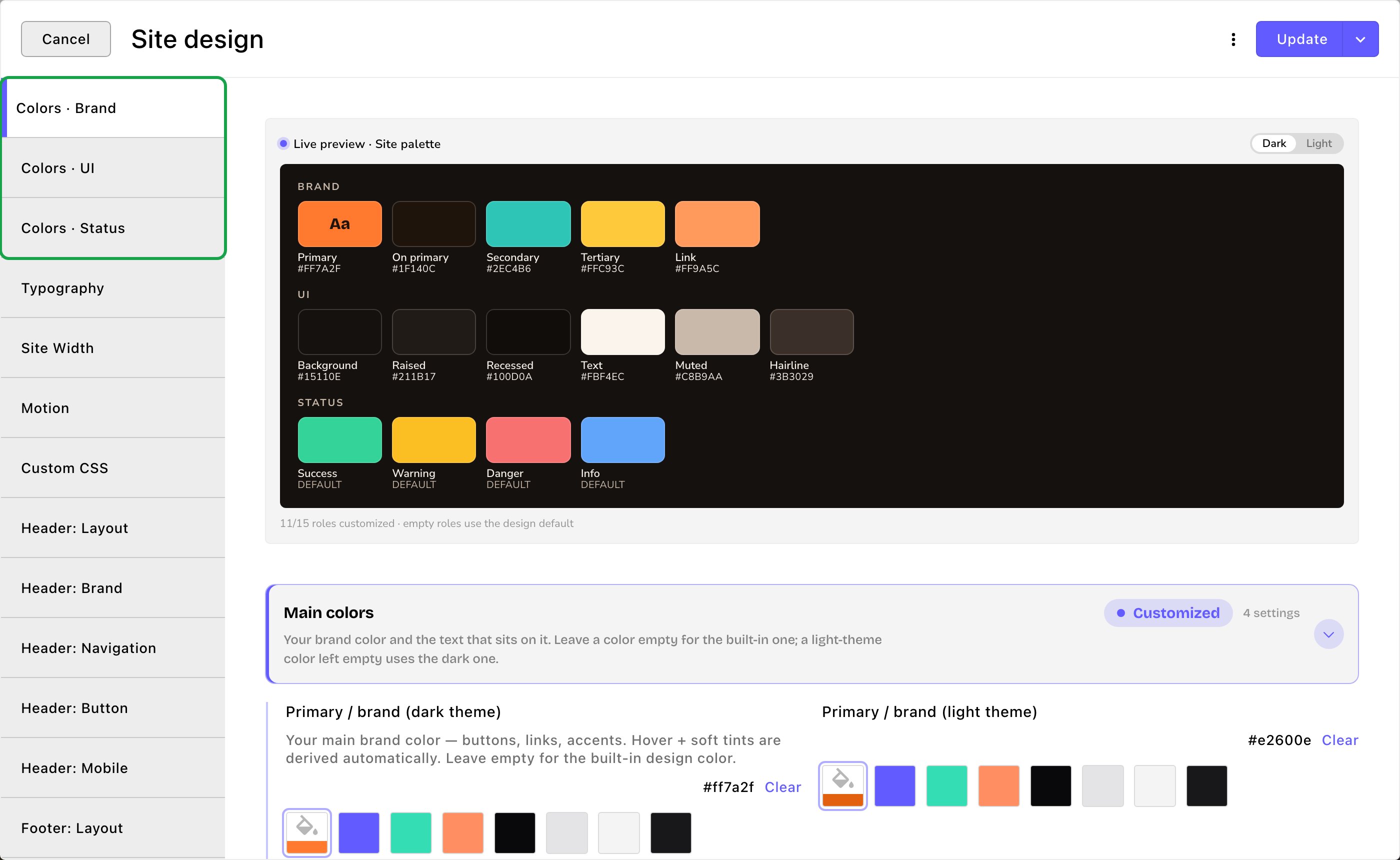
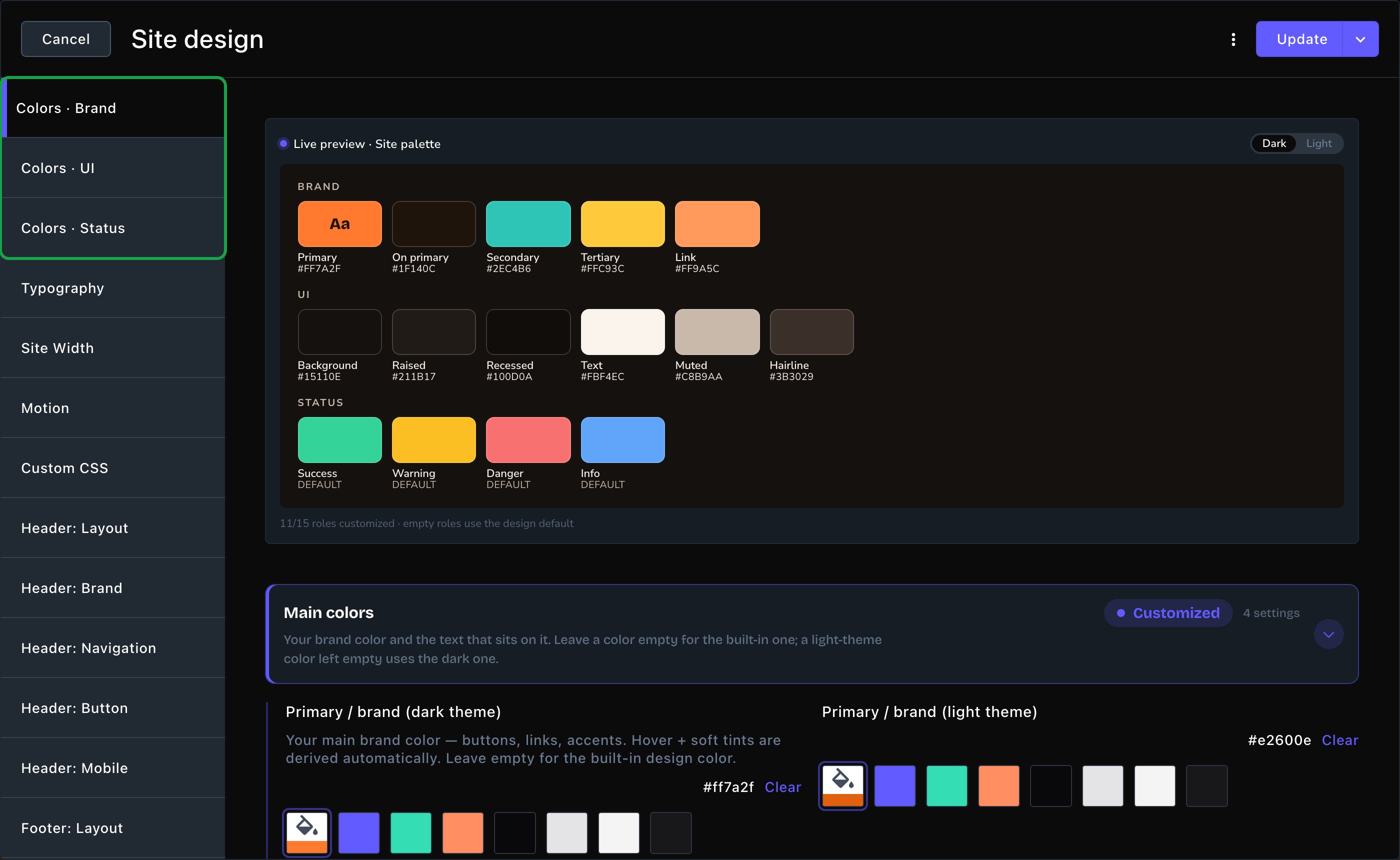
Colors · Brand, with the live preview at the top and Main colors open.
Two boxes for every color
Every color has two boxes: one for the dark theme and one for the light theme. Visitors can switch your site between the two.- On Colors · Brand and Colors · Status, a light-theme box left empty uses the dark-theme color. Set only the dark box when one color works in both themes.
- On Colors · UI, each theme keeps its own built-in color. Backgrounds and text are usually different in light and dark, so set both boxes.
- Leave both boxes empty to keep the built-in color.
- Open the card that holds the color, such as Main colors.
- Choose the color’s box for the theme you want. A color picker opens.
- Pick a color, choose one of the swatches, or type your brand color’s code, such as #E8743B. A designer or brand guide gives you this code; it starts with #.
- Do the same in the other box if that color needs a different shade in the other theme.
Colors · Brand
Main colors- Primary / brand: your main color. Main buttons, highlights and accents use it. The CMS makes a hover shade (the color a button changes to when a visitor points at it) and a soft tint from it for you.
- Text on primary: the color of text that sits on your primary color. An example is the highlighted word in a Hero headline. (A Hero is the big opening section at the top of a page; see Hero.)
- Secondary: a second color for small touches, such as eyebrows (the short labels that sit above some headings).
- Tertiary: a third, warmer color for extra accents.
- Link: the color of links in text. It matches your primary color until you set it.
Colors · UI
UI stands for user interface. These are the quiet colors that make up most of the page: the backgrounds, the text and the lines. Backgrounds- Page background: the color behind everything.
- Cards: the color of cards and raised panels.
- Bands between sections: the slightly darker color some sections use as a band.
- Text: the main text color.
- Muted text: softer text for details and captions.
- Lines and borders: dividers and outlines.
Colors · Status
Status colors appear in forms, alerts and badges.- Success: confirmations, such as “Thanks, we got your message.”
- Warning: gentle alerts.
- Error: problems, such as a missing form field.
- Information: neutral notes.
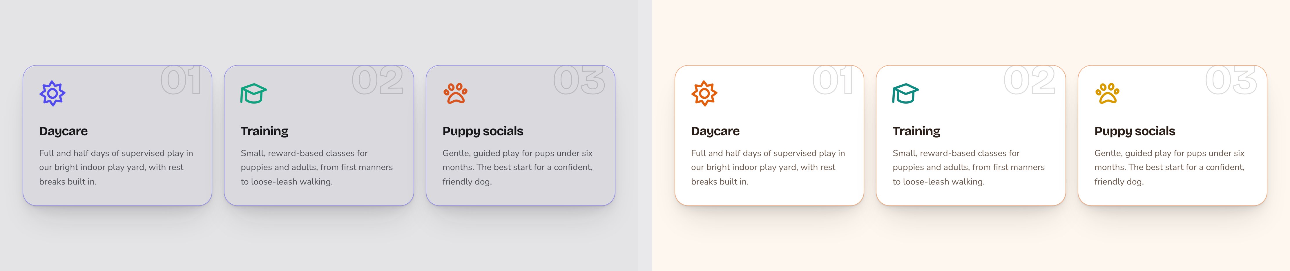
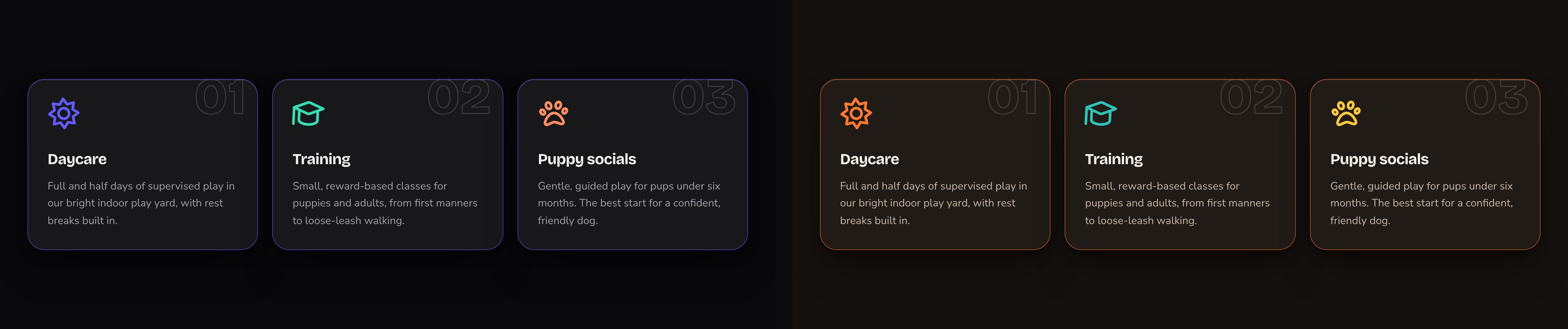
The same section with the built-in colors and with your own.
Put your colors live
Choose Update to save your colors and put them live on your site. To save them without putting them live yet, open the arrow next to Update (More save options) and choose Save Draft. Your changes wait there; open the window again and choose Update when you’re ready to put them live. Then open a page on your site and check it in both themes. Use the light and dark switch in your site’s header. On a phone-sized screen, it’s inside the menu. The moon in the CMS toolbar only changes the CMS, not your site.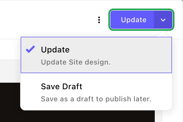
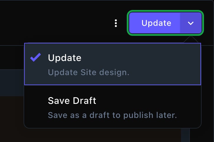
Update puts your colors live. More save options lets you save a draft.
Good to know
- Check text on your primary color. Highlighted words sit on it, so make sure Text on primary stays easy to read against Primary / brand.
- Button labels have their own color. Section buttons use their Label color, which follows your Text color unless you change it. See Buttons and card styles.
- Sections can still have their own colors. Many sections have color options of their own. Leave them empty and they follow your palette.
- Readable text matters. Light text on a pale background, or dark text on a dark one, is hard for many people to read. Keep strong contrast between text and its background.
- FetchskiAI can help. Ask the FetchskiAI Agent to suggest a palette. Admins and Owners can let it change the colors for you.
Related
Typography
choose your site’s fonts.
Buttons and card styles
how buttons and cards use your colors.
What every section shares
section backgrounds and fonts.
Site design
every tab on this screen.