

 AdonisJS
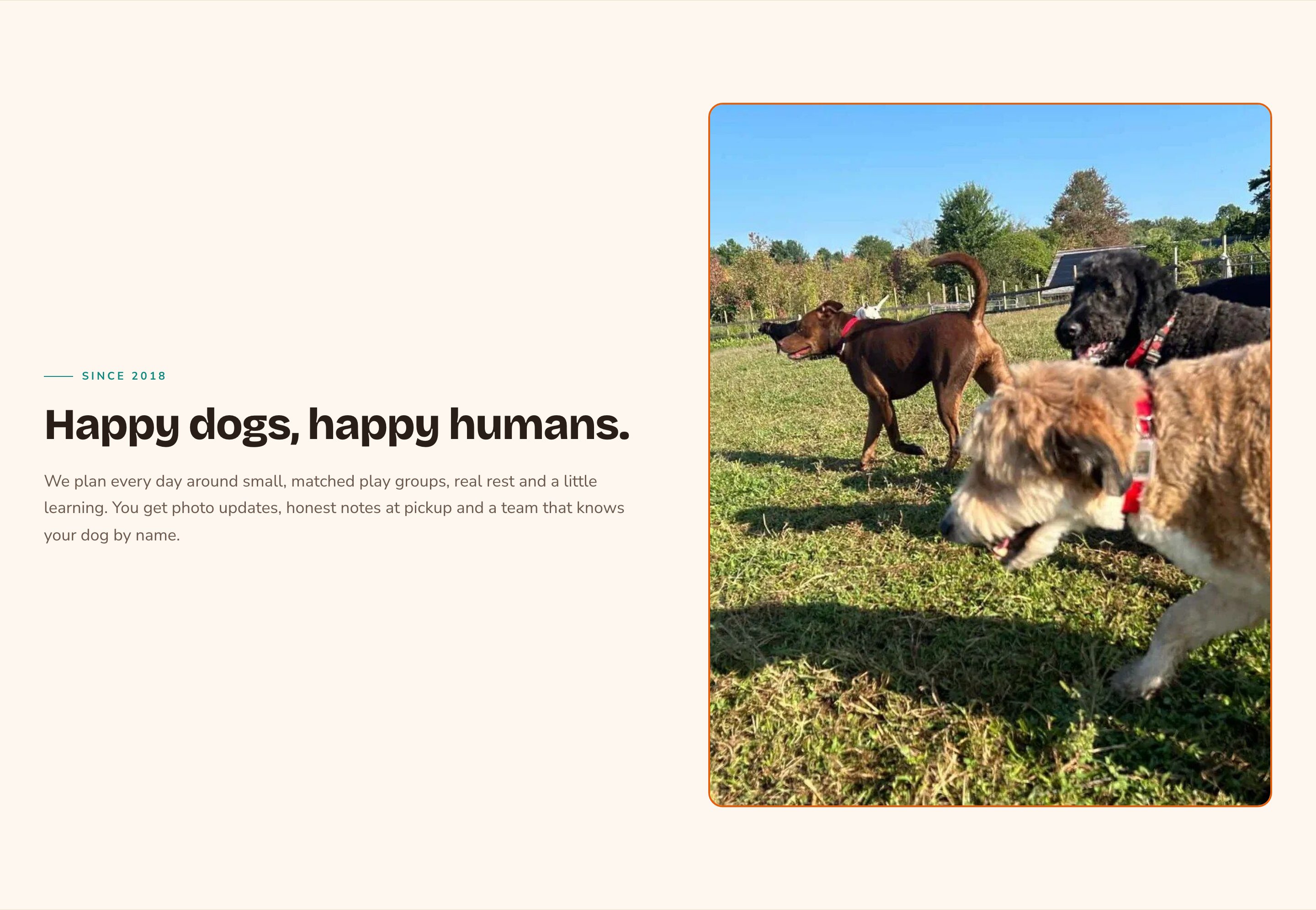
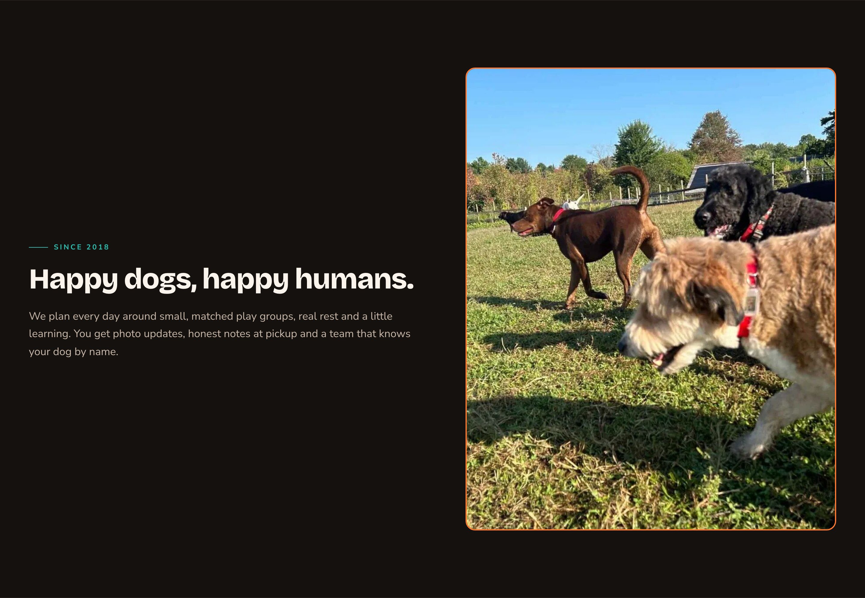
An Intro / Trust section with a photo on the right.
When to use it
- Right after a Hero, to say in a few lines who you are and why people choose you.
- On an About page, to tell your story beside a photo of your team or your place.
- Anywhere you want one clear message over a full-width photo.
- Inside a column or a blog post, as a short highlighted message.
Add it to a page
1
Open the page
Sign in, open the page on your site, and choose Edit in the edit bar at the top.
2
Find the spot
Select the section next to where the new one should go. A round + button appears on its top and bottom edges. On an empty page, choose Add Content in the middle.
3
Choose the section
The Add Content menu opens with its groups. Choose the section, then select it and choose Edit in its side toolbar to make it yours.
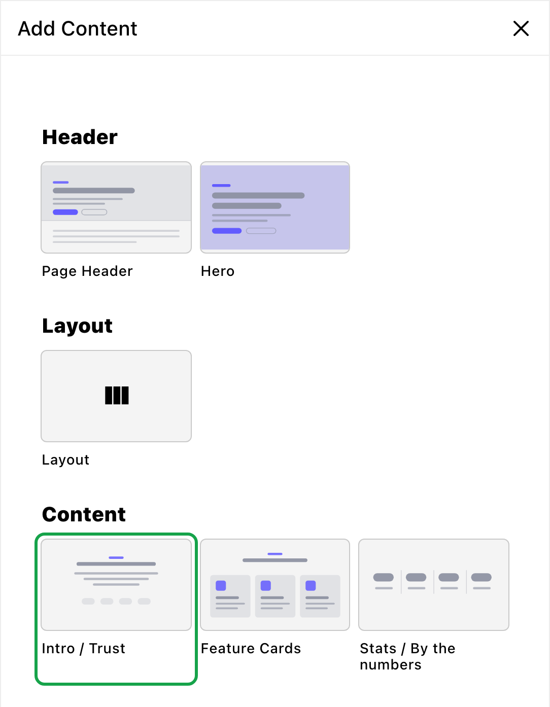
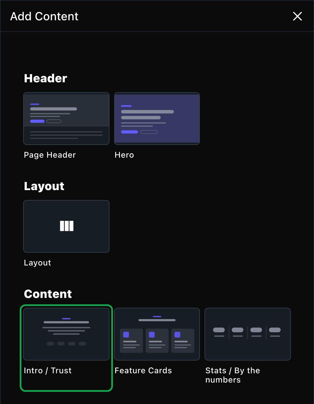
Intro / Trust is in the Content group.
What you can change
Select the section on the page and choose Edit. The editor opens beside the page, so you see each change as you make it. It has four tabs. Your changes go into the page’s draft. Visitors see them once the page is published with Update in the edit bar (Publish on a page never published).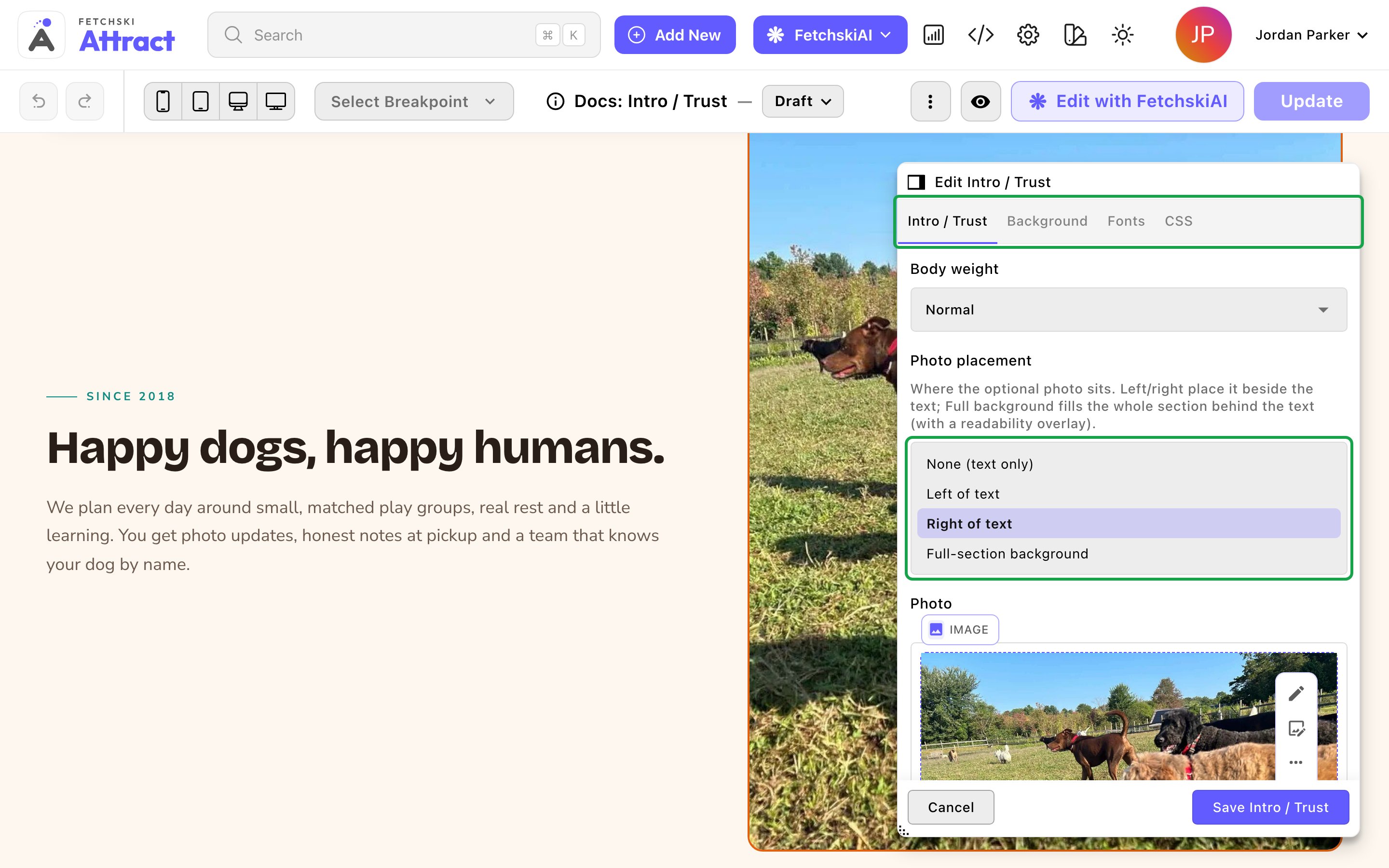
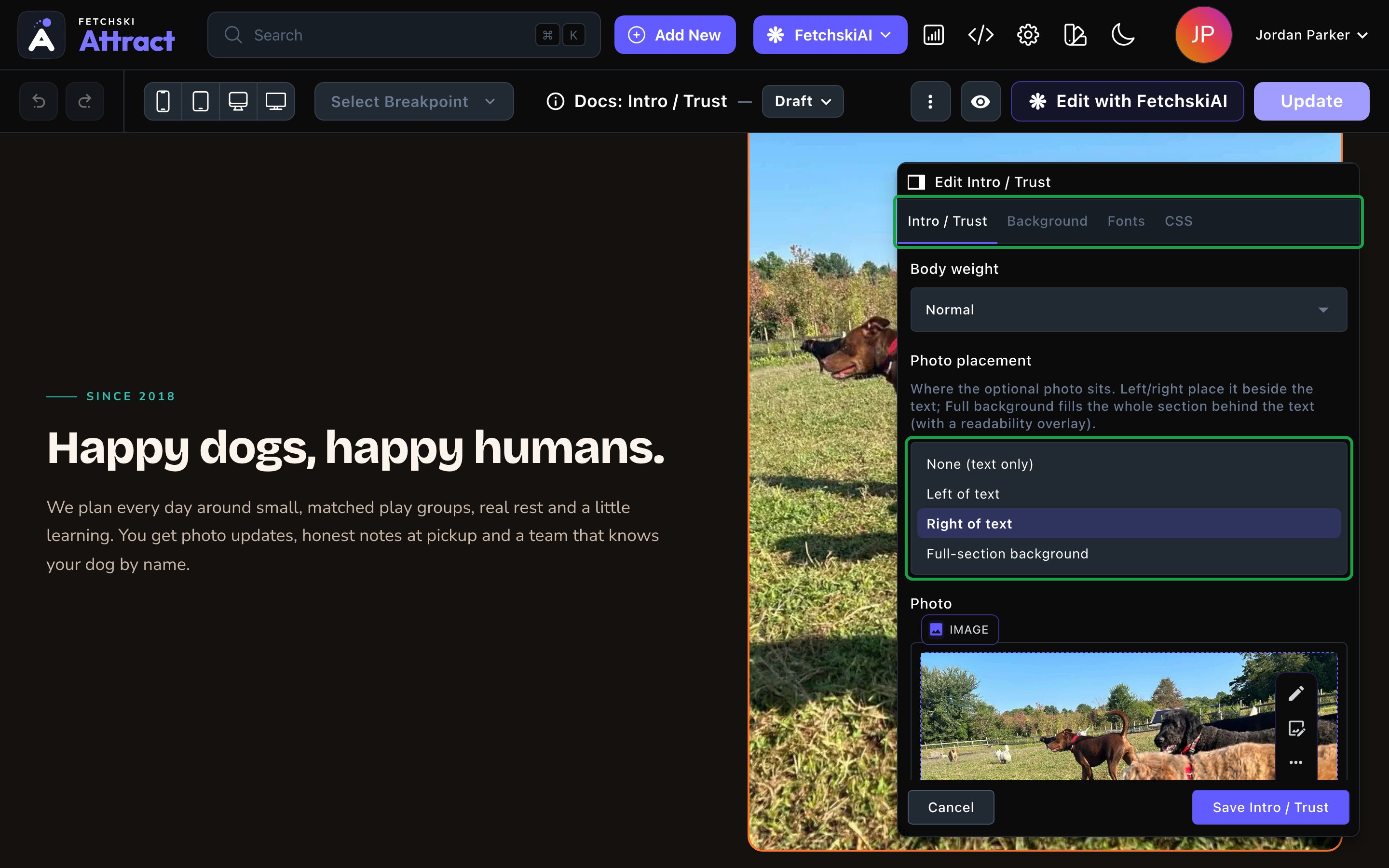
The Intro / Trust editor, with the section updating beside it.
Intro / Trust
Intro / Trust
The words, the photo and how they look. Some photo options appear only for the placement they belong to.Text
- Eyebrow: a short line above the headline, such as “Since 2015”. Clear it to hide the eyebrow.
- Headline: your message in one line, such as “Happy dogs, happy humans.”
- Body copy: the paragraph under the headline (“copy” means text). Two or three sentences that back the headline up work best.
- Each one has its own color and weight. The eyebrow also has Eyebrow size. Colors come in pairs for the dark and light themes, and empty colors use your site’s colors.
- Photo placement: None (text only), Left of text, Right of text or Full-section background. It starts on Right of text.
- Photo: the picture to show. Until you choose one, the section shows text only.
- Photo corners: Rounded or Squared.
- Photo frame: None, Border or Offset frame, an accent-colored frame set just behind the photo. Frame color changes its color.
- Photo tilt: None, Tilt left or Tilt right, for a more playful look.
- Photo hover effect: what the photo does when a visitor points at it: Lift, Zoom, Tilt, Glow, Lift & Glow, Zoom & Glow or None.
- Overlay color (dark theme) and Overlay color (light theme): a tint over the photo that keeps the text readable. Empty uses your page background color.
- Overlay opacity (%): how strong the tint is. It starts at 55%. Raise it if the text is hard to read.
Background
Background
Give the section its own full-width color band, separately for the dark and light themes. It starts on Transparent (page background). See What every section shares.
Fonts
Fonts
Use a different typeface for parts of this section only, such as the headline. Leave it empty to use the page’s fonts, which normally come from Site design → Typography. See What every section shares.
CSS
CSS
Custom styles for this section only, such as its headline, its body text or the photo frame. Admins and Owners can change this tab. See Custom CSS.
Looks you can make
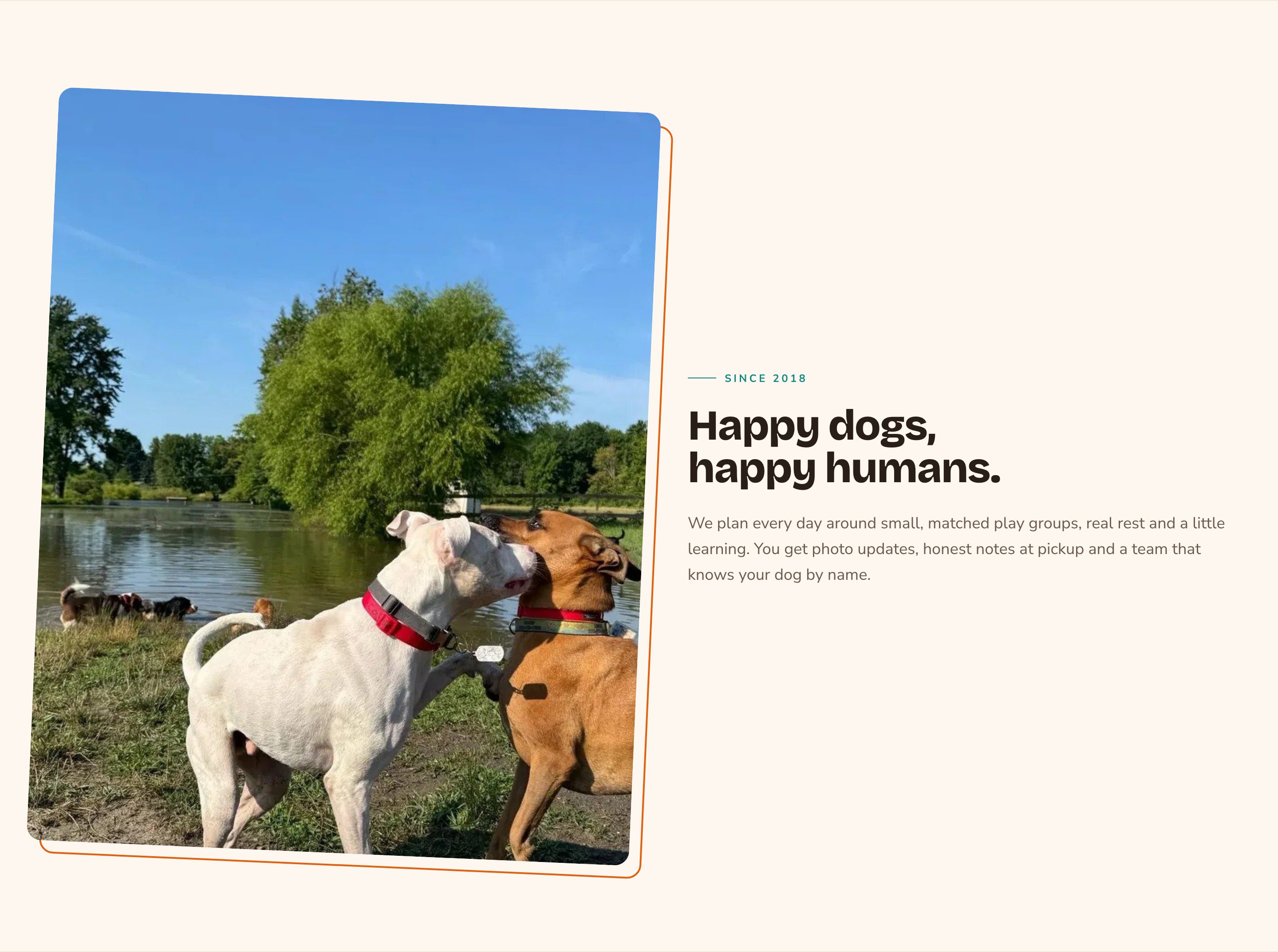
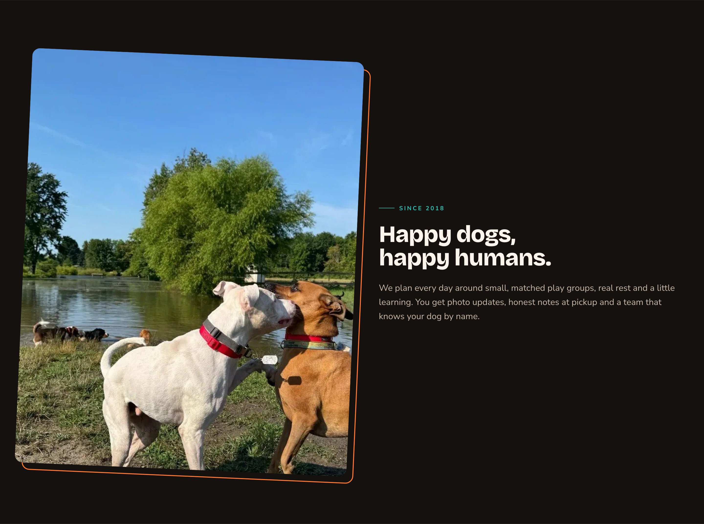
An offset frame and a small tilt add personality.
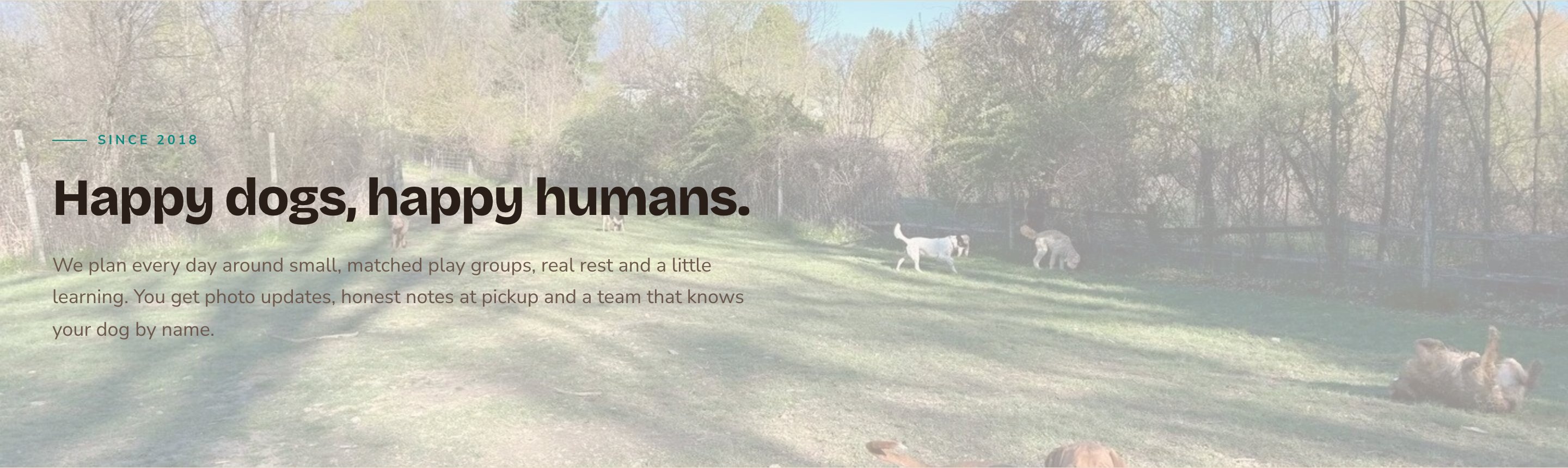

A full-width photo behind the text.
Text only, on its own band.
Good to know
- The headline is a section heading, not the page’s main heading. The page’s main heading comes from the Hero or Page Header at the top.
- Write alt text for your photo. Alt text is a short description that screen readers read aloud, such as “Two puppies playing tug-of-war on the lawn”. To add it, open the command palette (⌘K, or Ctrl+K on Windows), choose Images, choose the photo, and fill in Alt Text. See The media library.
- Over a full-width photo, check both themes. Use the light and dark switch in your site’s header (inside the menu on phones) to make sure the text stays readable. The moon in the CMS toolbar changes only the CMS, not your site.
- Hover effects respect reduced motion. Visitors who prefer less motion see the photo without any hover effect.
- Animations play for visitors only. While you edit, the section shows its finished state.
Appearance options
Most sections also share a few tabs that work the same everywhere:- Background: set the color behind the section, separately for the dark and light themes.
- Fonts: use a different typeface for parts of this section only.
- CSS: add custom styles to this section. Admins and Owners can change it.
Related
Hero
the opening that usually comes first.
Media + Text block
several photo and text blocks in a row.
Side-by-side layouts
put an Intro / Trust in a column.
The media library
upload photos and write alt text.