

 AdonisJS
Before you start
- Sign in and open the page on your site. Device preview works whether you’re editing or not.
- The device buttons sit at the left of the edit bar, beside Select Breakpoint, the menu where you choose a screen size to preview.
- In a narrow browser window the device buttons step aside to make room, and Select Breakpoint shrinks to a laptop-and-phone icon. It opens the same list.
- On a phone the device buttons aren’t in the bar: you’re already looking at the page on a phone.
Preview on a device
1
Choose a device button
There are 4, from left to right:
- a phone (iPhone 17)
- a tablet (iPad Pro 11″)
- a laptop (MacBook Air 13″)
- a desktop screen (Desktop — FHD 1080p)
2
Look through the page
The page shrinks into a frame the size of that screen and rearranges itself the way it does on the real device. Scroll inside the frame to see the whole page.
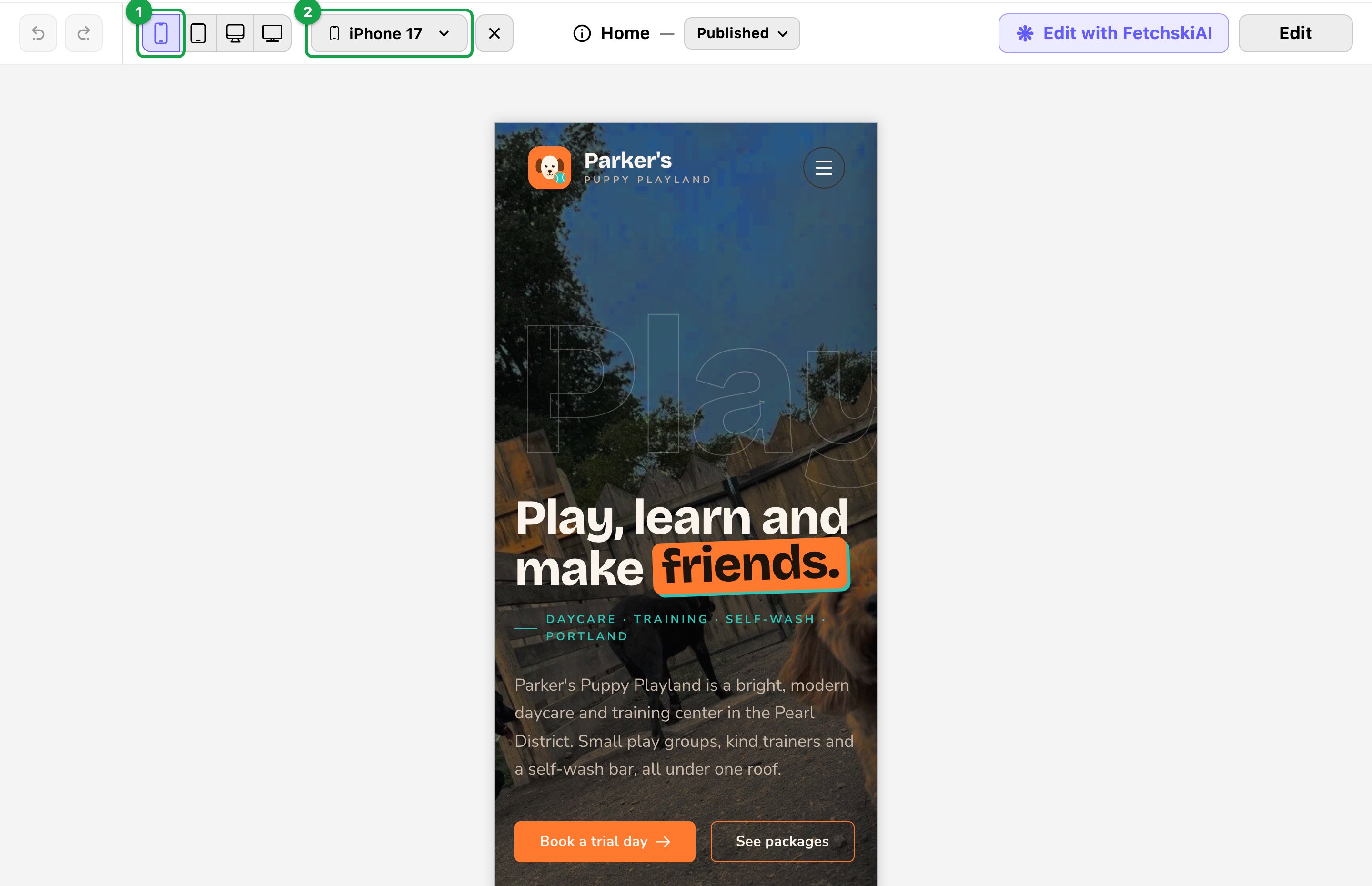
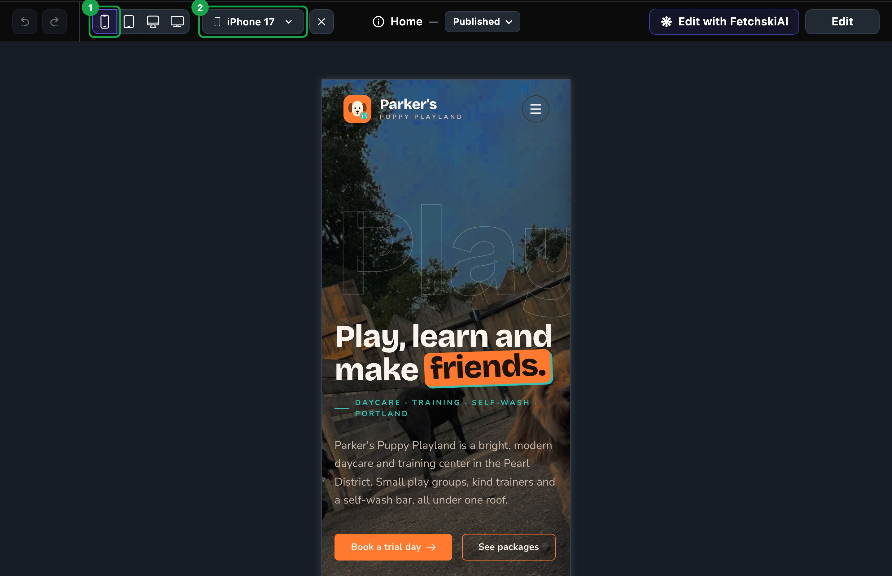
The page at a phone's size, as a visitor on that phone sees it.
Choose another device
1
Choose Select Breakpoint (or the name of the device you're on)
2
Choose a device from the list
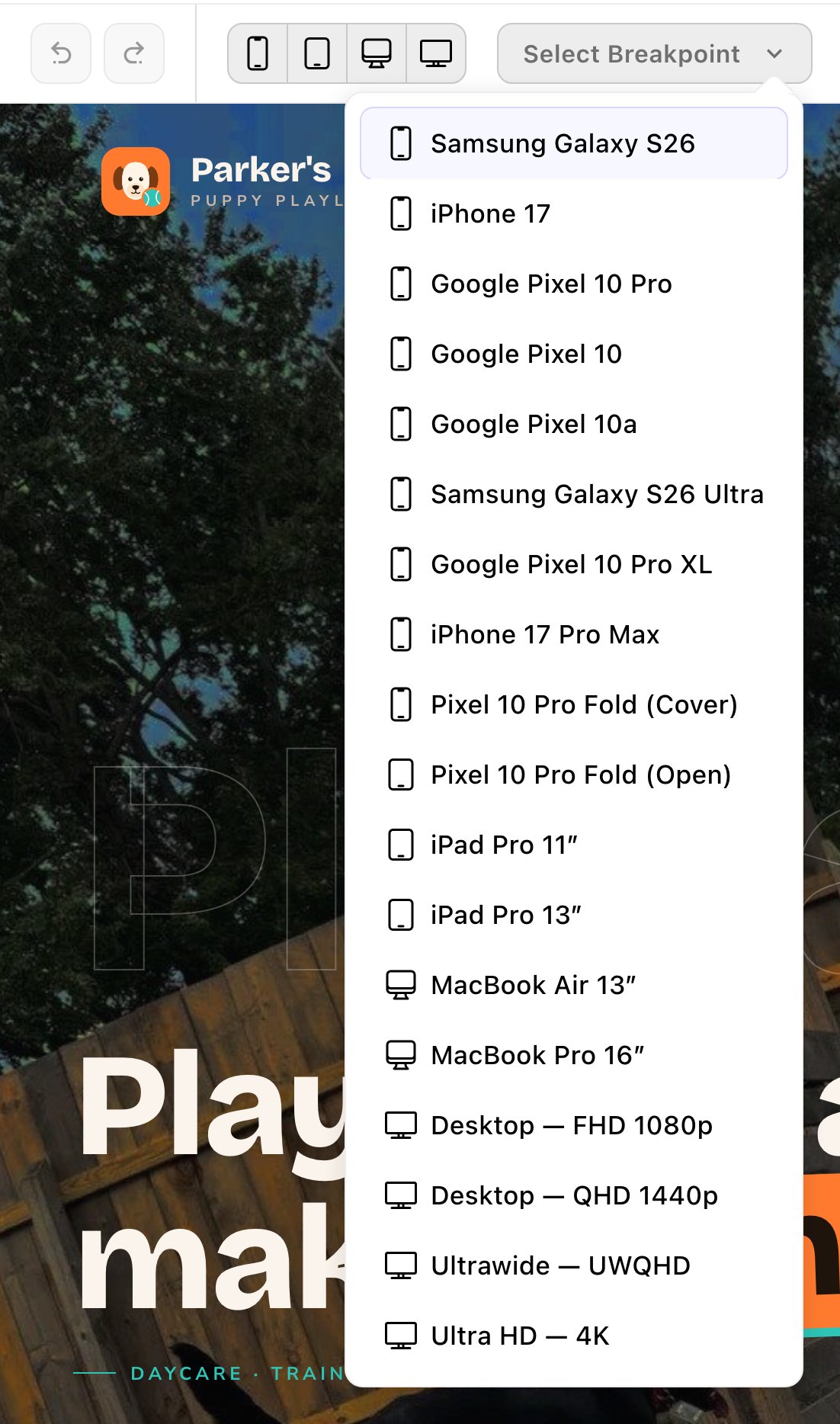
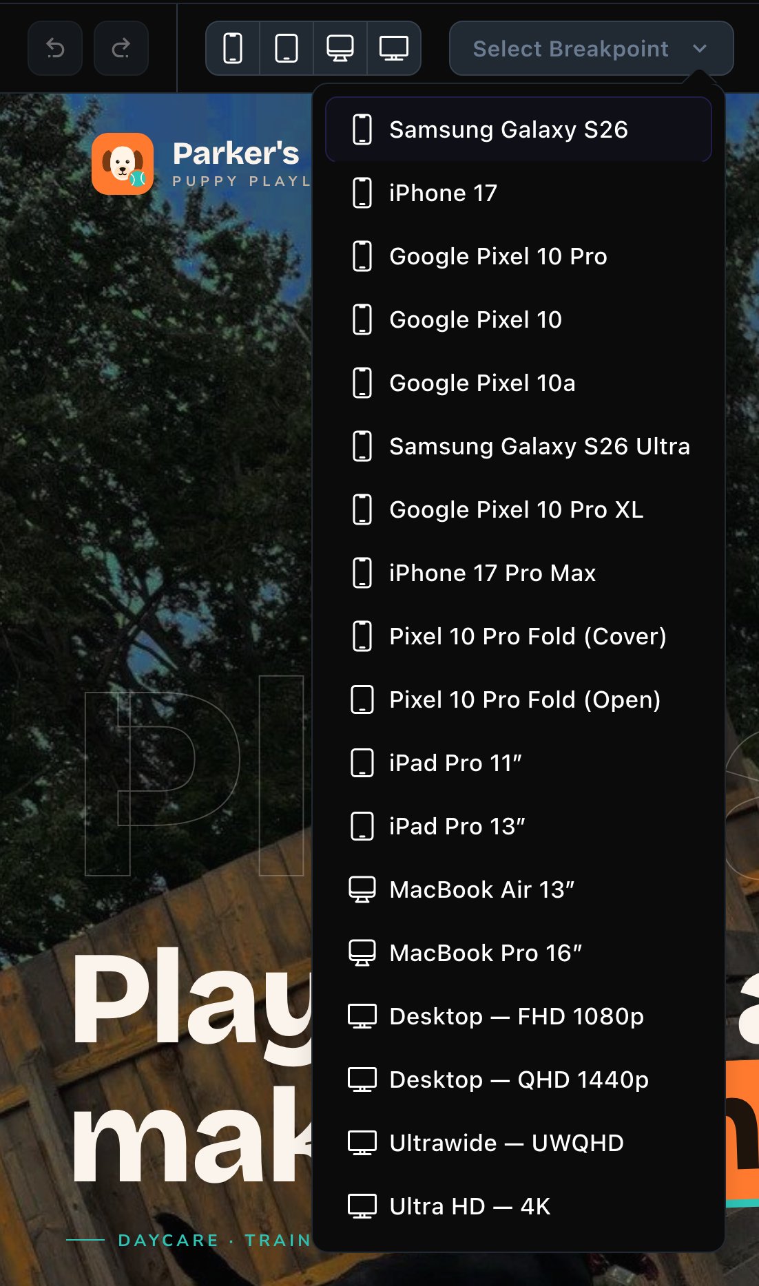
Select Breakpoint lists every screen size you can preview.
- Phones: Samsung Galaxy S26, iPhone 17, Google Pixel 10 Pro, Google Pixel 10, Google Pixel 10a, Samsung Galaxy S26 Ultra, Google Pixel 10 Pro XL and iPhone 17 Pro Max.
- Foldable: Pixel 10 Pro Fold (Cover) and Pixel 10 Pro Fold (Open).
- Tablets: iPad Pro 11″ and iPad Pro 13″.
- Laptops: MacBook Air 13″ and MacBook Pro 16″.
- Desktop screens: Desktop — FHD 1080p is an ordinary computer screen and the one to check first. Desktop — QHD 1440p is a larger monitor, Ultrawide — UWQHD an extra-wide one, and Ultra HD — 4K the biggest. On the wide ones, your content stays centered at your site’s width.
Go back to full size
Choose Clear Breakpoint (the × beside the device name) to stop previewing a screen size. The page fills your window again. The preview stays on while you move between pages in the same browser tab. Clear it when you’re done.Use the keyboard
Press P, then a number:- P, 1 to P, 4: the 4 device buttons, from phone to desktop.
- P, 0: back to full size.
What to check
- The menu. On narrow screens your header menu folds into a menu button. You choose the screen size where this happens in Site design → Header: Layout → Collapse nav to menu at. See Header.
- Columns. On tablets, a Layout’s columns sit 2 per row. On phones they stack. See Side-by-side layouts.
- Long words and headlines. A headline that fits on a computer can wrap onto many lines on a phone. Shorten it if it looks crowded.
- Hidden columns. A column set to hide on tablets or phones disappears in those previews.
Good to know
- Most animations don’t play while you’re signed in. Sections that fade in or count up as you scroll show finished. Visitors see the animations. Scrolling strips and carousels, such as moving logos, still move.
- It’s a close match, not the real device. Touch, the device’s own fonts and its browser’s toolbars aren’t part of it. For a last check, open the published page on your own phone.
- Only the page changes size. The toolbar and edit bar stay full width.
Related
Side-by-side layouts
how columns fit smaller screens.
Header
when the menu folds into a button.
Add, move and remove sections
change what’s on the page.
Drafts, publishing and scheduling
make your changes live.