

 AdonisJS
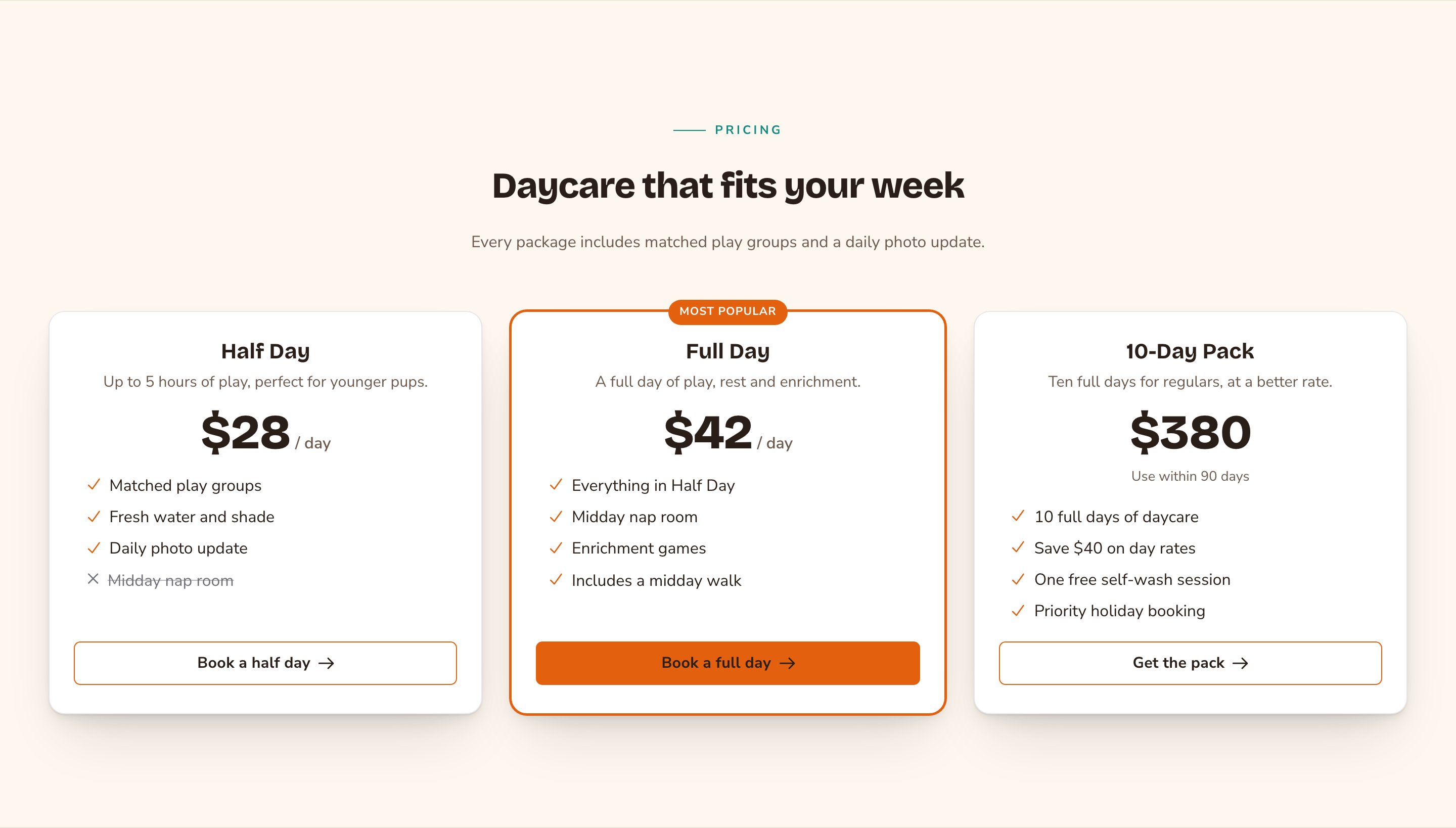
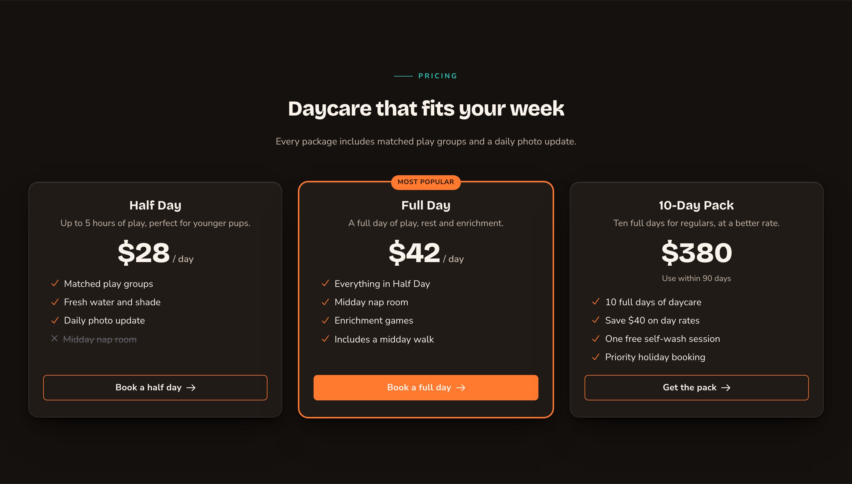
3 packages, with the most popular one highlighted.
When to use it
- To compare plans or packages side by side, such as half-day and full-day daycare.
- To list services with a “starting at” price, such as training classes.
- To steer visitors to the option most people choose.
Add it to a page
1
Open the page
Sign in, open the page on your site, and choose Edit in the edit bar at the top.
2
Find the spot
Select the section next to where the new one should go. A round + button appears on its top and bottom edges. On an empty page, choose Add Content in the middle.
3
Choose the section
The Add Content menu opens with its groups. Choose the section, then select it and choose Edit in its side toolbar to make it yours.
What you can change
Select the section on the page and choose Edit. The editor opens beside the page, so you see each change as you make it. It has 5 tabs. Your changes go into the page’s draft. Visitors see them once the page is published with Update in the edit bar (Publish on a page never published).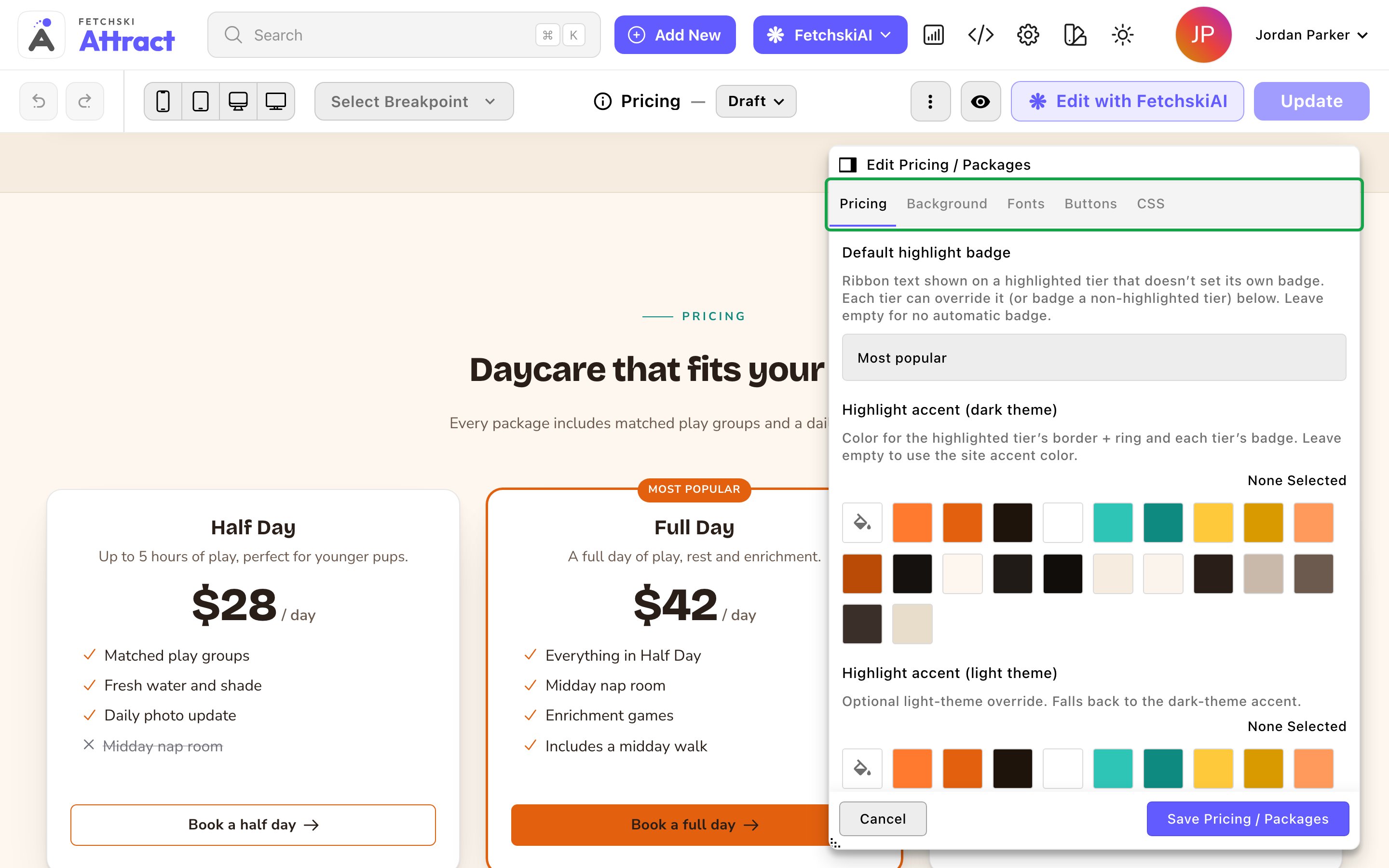
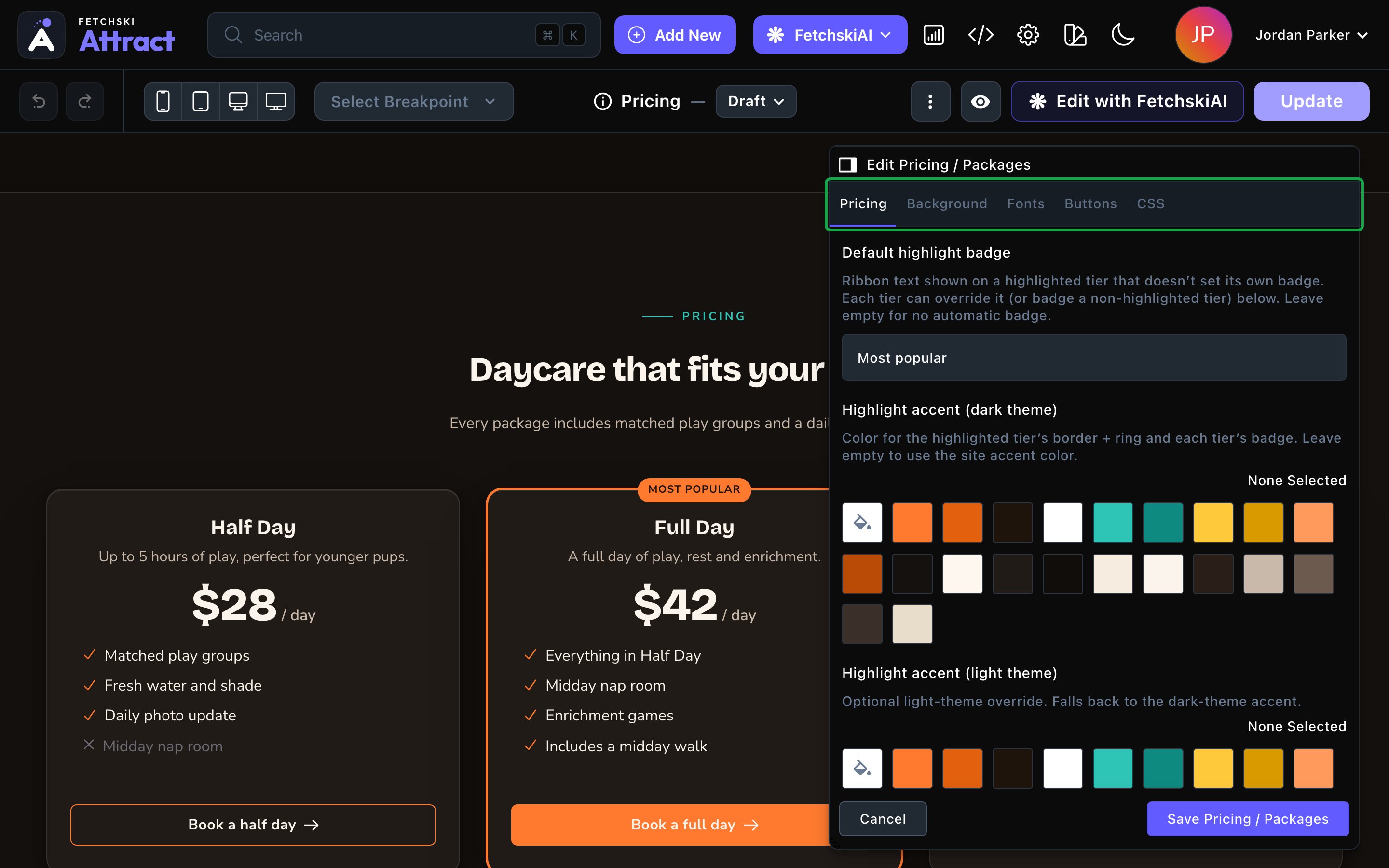
The Pricing editor, with the cards updating beside it.
Pricing
Pricing
Everything about the cards and the words above them.Header
- Show eyebrow and Eyebrow: a short line above the heading. It starts as “Pricing”.
- Heading: the section’s title. Leave it empty to hide the heading. To show just the cards, also turn off Show eyebrow and clear the intro line.
- Intro line: one short sentence under the heading.
- Cards per row: Auto (fit to width) works for any number of cards. Or choose 2 per row, 3 per row or 4 per row. On phones the cards stack.
- Gap between cards: Tight, Normal or Roomy.
- Card style and Card corners: the look of every card. The default is Raised — lit soft card. A highlighted card always gets its own bold frame. See Buttons and card styles.
- Alignment: Center or Left, for the header and the text in each card.
- Equal-height cards: on by default. Every card is as tall as the tallest, with the buttons lined up along the bottom.
- Show feature check marks: on by default. A check mark shows before each included feature and a cross before each one that isn’t. Turn it off for a plain list.
- Card hover effect: what a card does when a visitor points at it. The default is Rise + underglow. You can also choose Selection ring, Spotlight wash, Checklist cascade, Tilt (3-D — needs motion on) or None.
- Hover accent: the color of the hover effect. Leave it empty to use the highlight color.
- Scroll-in animation: how the cards appear as visitors scroll to them. Featured-led rise brings the highlighted card in last, to draw the eye. Simple stagger brings them in evenly, and None shows them still.
- Card name size, Price size, Description size and Feature size: set once here, so every card matches.
- Default highlight badge: the ribbon a highlighted card shows, “Most popular” to start. Leave it empty for no automatic badge.
- Highlight accent: the color of the highlighted card’s frame and of every badge. Leave it empty to use your site’s main color.
- Name: the plan, package or service, such as “Full Day”. It’s required.
- Price, Period (optional) and Price note (optional): for example “$42”, ”/ day” and “Includes a midday walk”.
- Description (optional): a short line under the name.
- Features: the list of what’s included. Each Feature can have a Note (optional), such as “up to 5”. Turn off Included to show something this card doesn’t have, crossed out.
- Highlight this card: makes the card stand out, with a colored frame, a slight lift, the badge and the stronger button.
- Badge (optional): a ribbon such as “Best value”. It works on any card and replaces the default badge.
- Text alignment: Normal follows the section. Left, Center and Right change this card only. Center also centers its feature list.
- Icon name: an optional icon at the top of the card. Type any Font Awesome icon name, such as “paw” or “star”, without “fa-”. Find names at fontawesome.com/icons. Then set its Icon family, Icon color, Icon size and Icon spacing, and animate it if you like with Icon animation, for example Bounce or Spin.
- Button label (optional), Button link (optional) and Open button in new tab: this card’s own button text and link. Each one is separate: leave the label empty to use the shared label, and the link empty to use the shared link. Open button in new tab counts only when the card has its own link.
Background
Background
Give the section its own background color, from your site’s palette or a custom color. See What every section shares.
Fonts
Fonts
Use a different typeface for parts of this section only, such as the prices. Leave it empty to use the page’s fonts, which normally come from Site design → Typography. See What every section shares.
CSS
CSS
Custom styles for this section only. Admins and Owners can change this tab. See Custom CSS.
Looks you can make
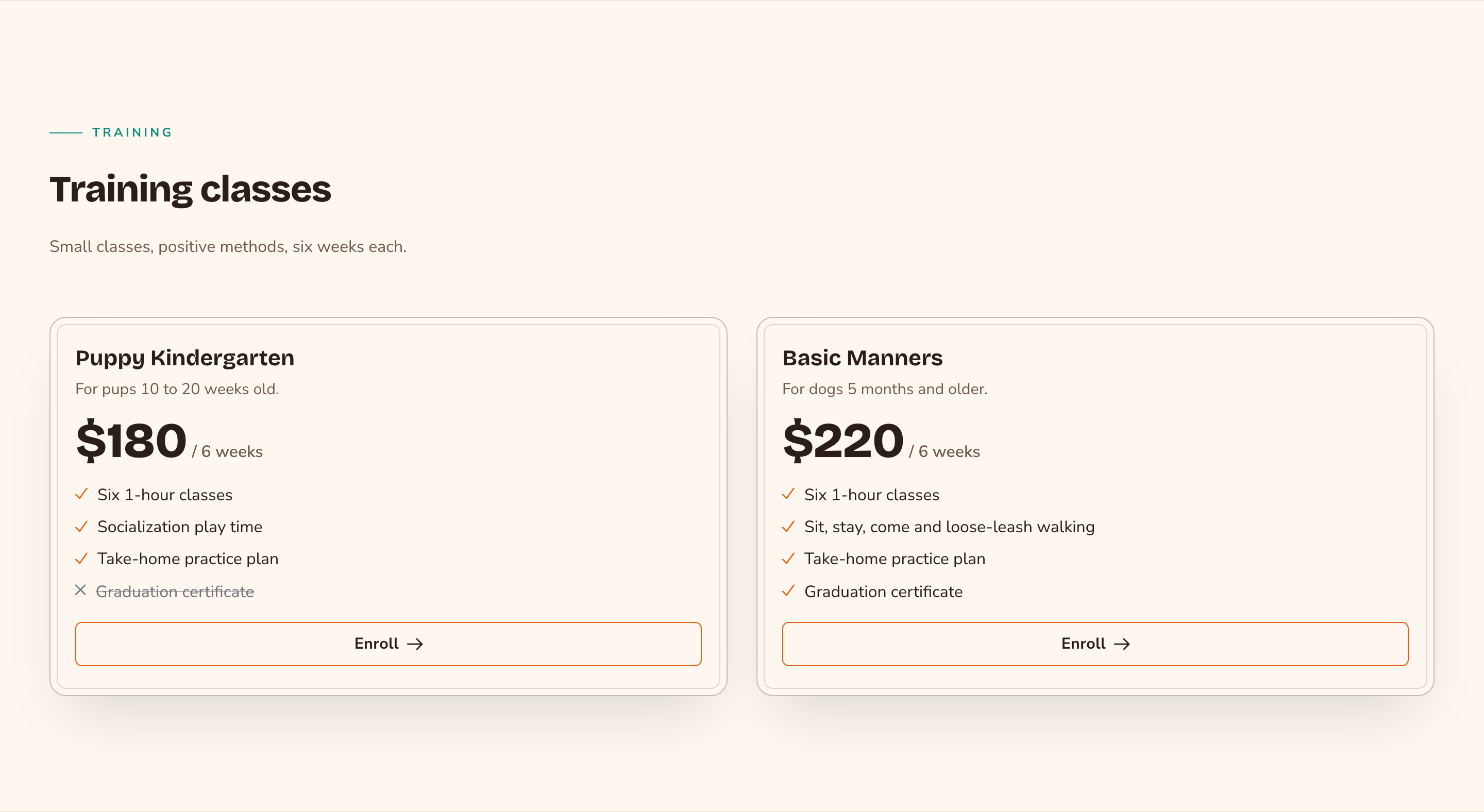
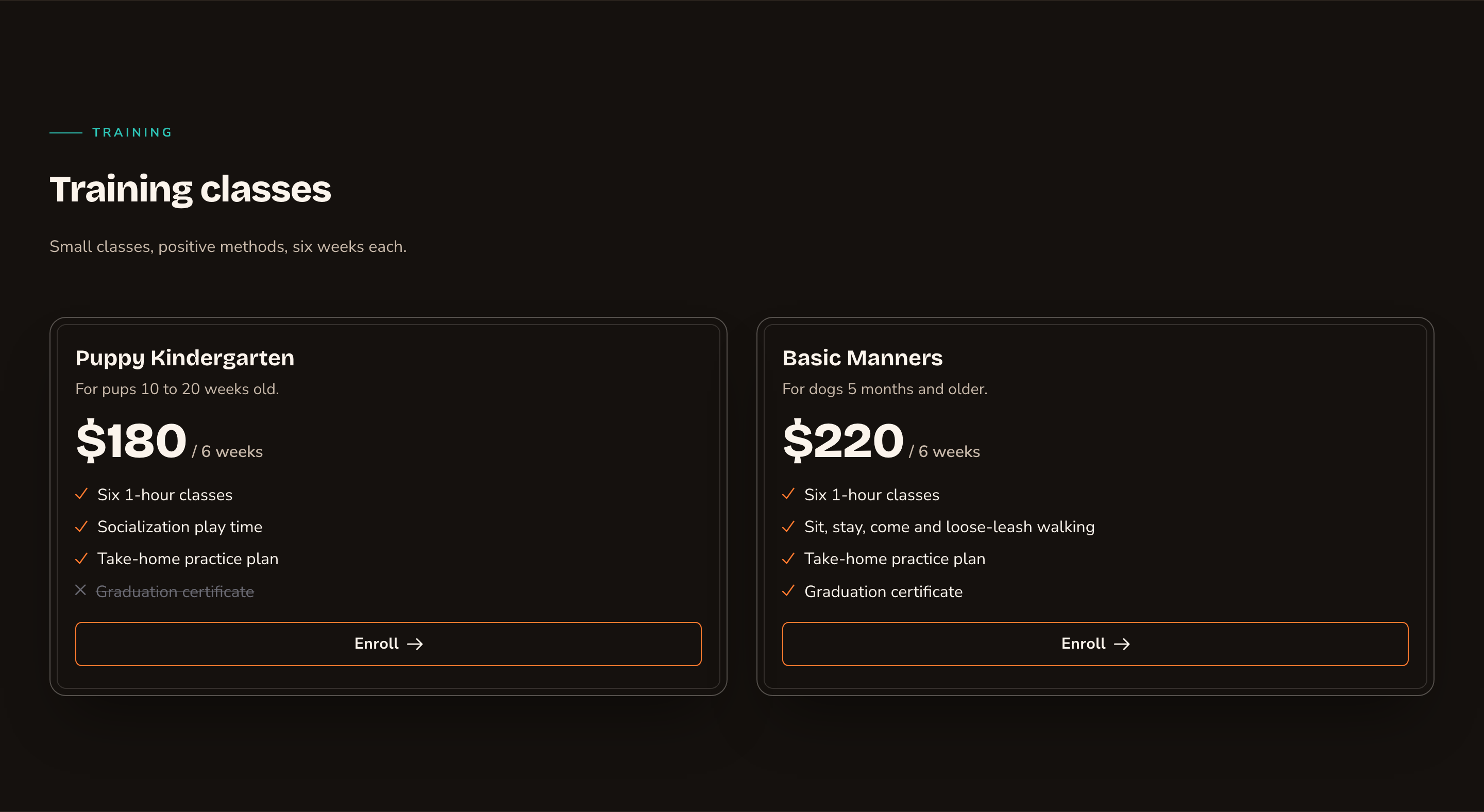
2 classes compared, left-aligned.
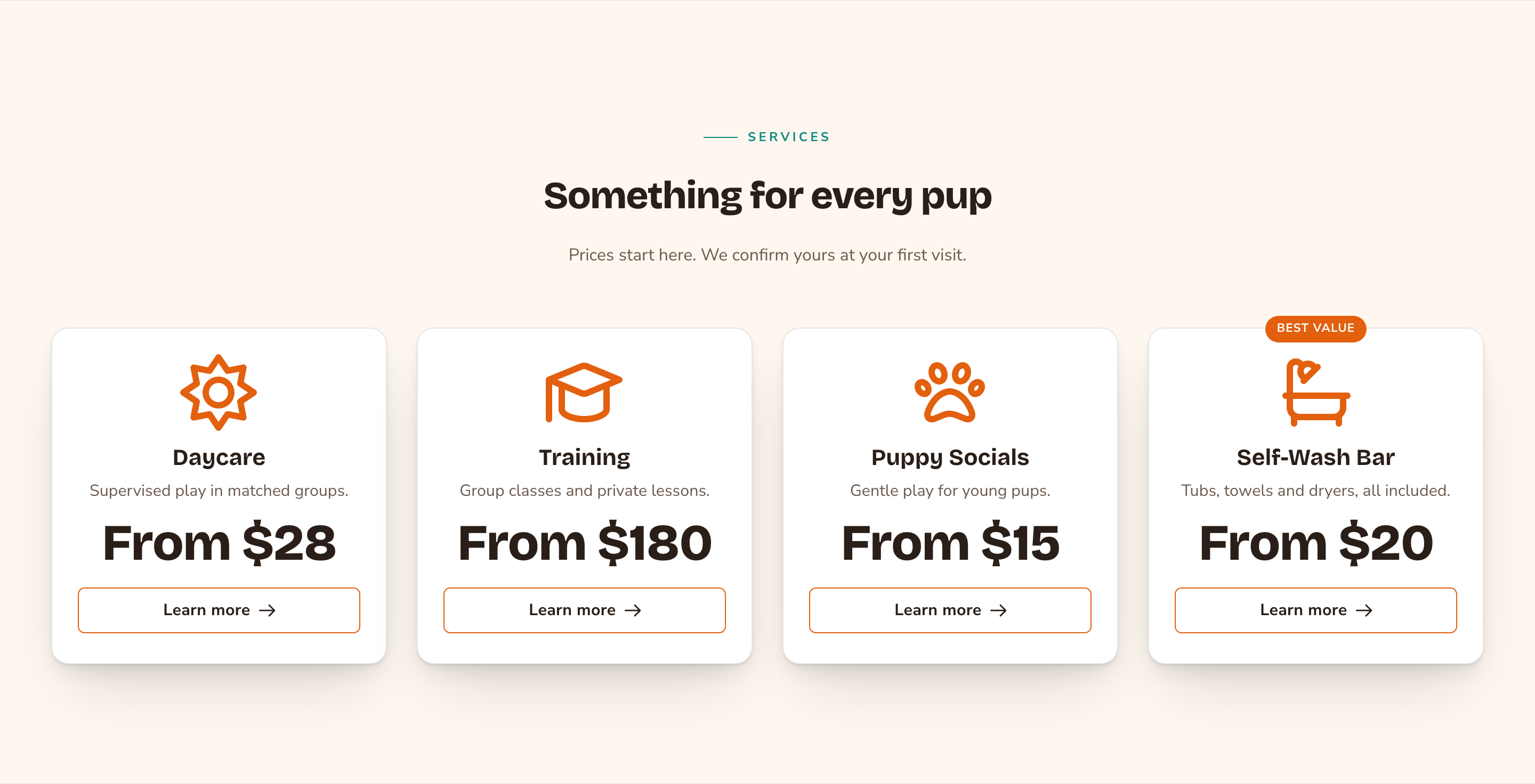
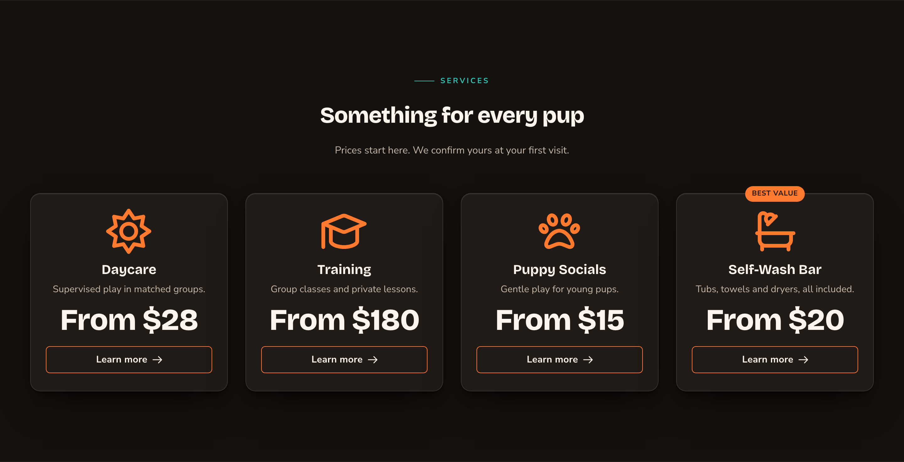
A menu of services, each with its own icon.
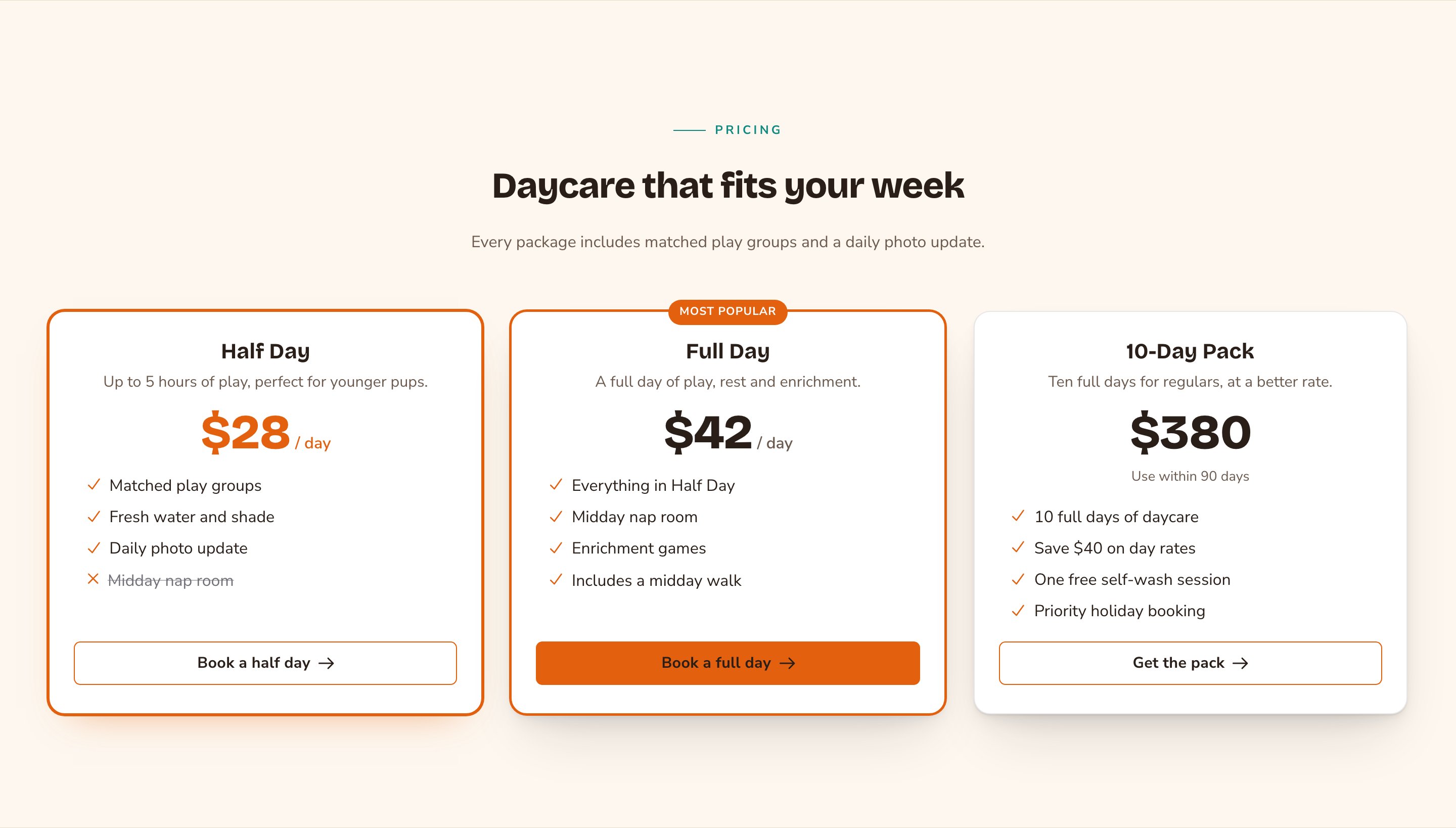
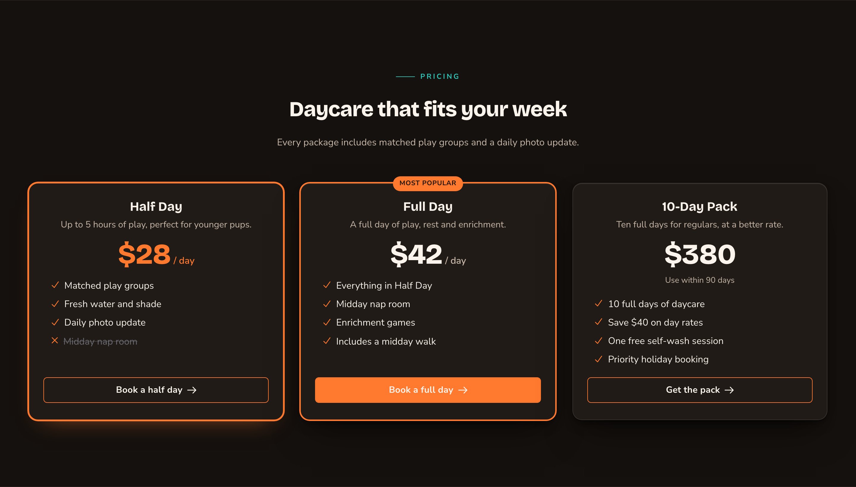
Selection ring previews the highlighted look on hover.
Good to know
- Highlight one card. One highlighted card makes the choice easy. With several, none of them stands out.
- The scroll-in animation plays for visitors only. While you edit, the cards show in their finished state. Visitors who prefer less motion, and sites with animations off in Motion, see the cards without it.
- Tilt needs animations on. Tilt (3-D — needs motion on) follows the pointer only when animations are on for your site.
- Keep feature lists short. Equal-height cards lines the buttons up, but a very long list makes every card tall.
Appearance options
Most sections also share a few tabs that work the same everywhere:- Background: set the color behind the section, separately for the dark and light themes.
- Fonts: use a different typeface for parts of this section only.
- CSS: add custom styles to this section. Admins and Owners can change it.
Related
Feature Cards
cards for benefits or services without prices.
Final CTA
a bold closing band with buttons.
Buttons and card styles
every button and card option.
Side-by-side layouts
put Pricing in a column.