

 AdonisJS
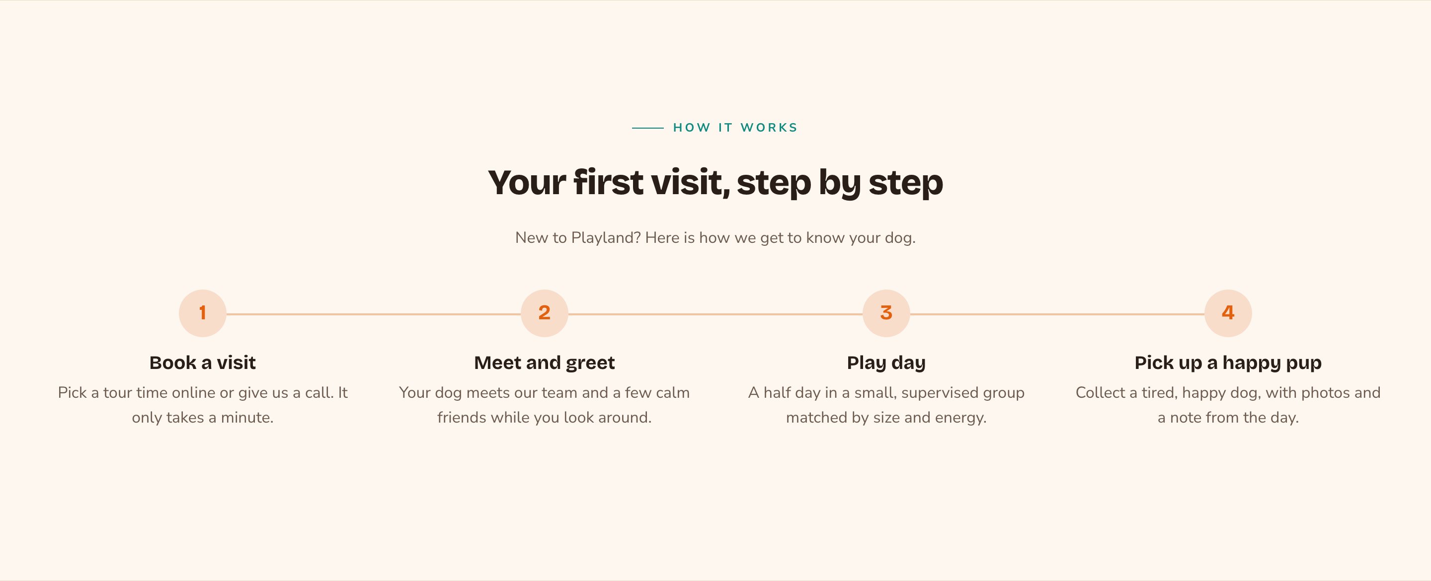
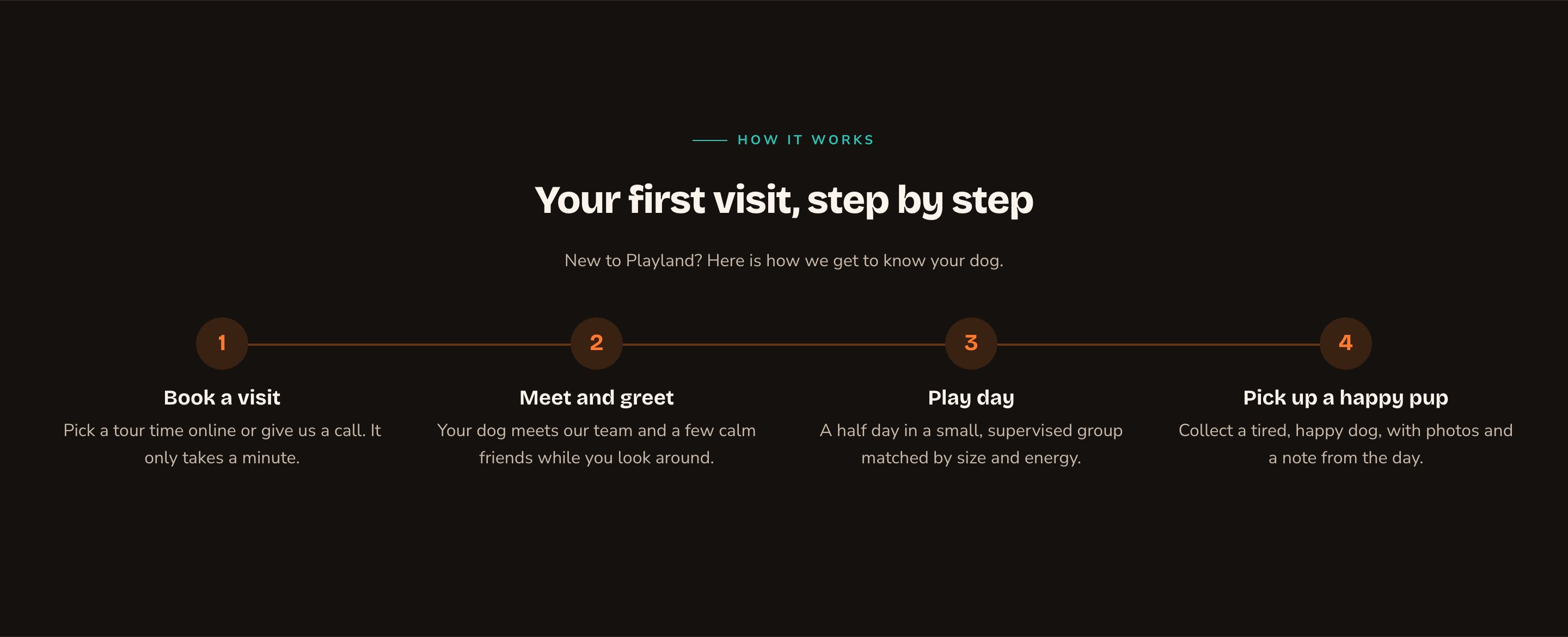
Four numbered steps in a row, linked by a line.
When to use it
- To explain how to get started with you, from first contact to done.
- To set expectations for a first visit, an order or a project.
- To show a timeline, such as your history or a program’s weeks.
Add it to a page
1
Open the page
Sign in, open the page on your site, and choose Edit in the edit bar at the top.
2
Find the spot
Select the section next to where the new one should go. A round + button appears on its top and bottom edges. On an empty page, choose Add Content in the middle.
3
Choose the section
The Add Content menu opens with its groups. Choose the section, then select it and choose Edit in its side toolbar to make it yours.
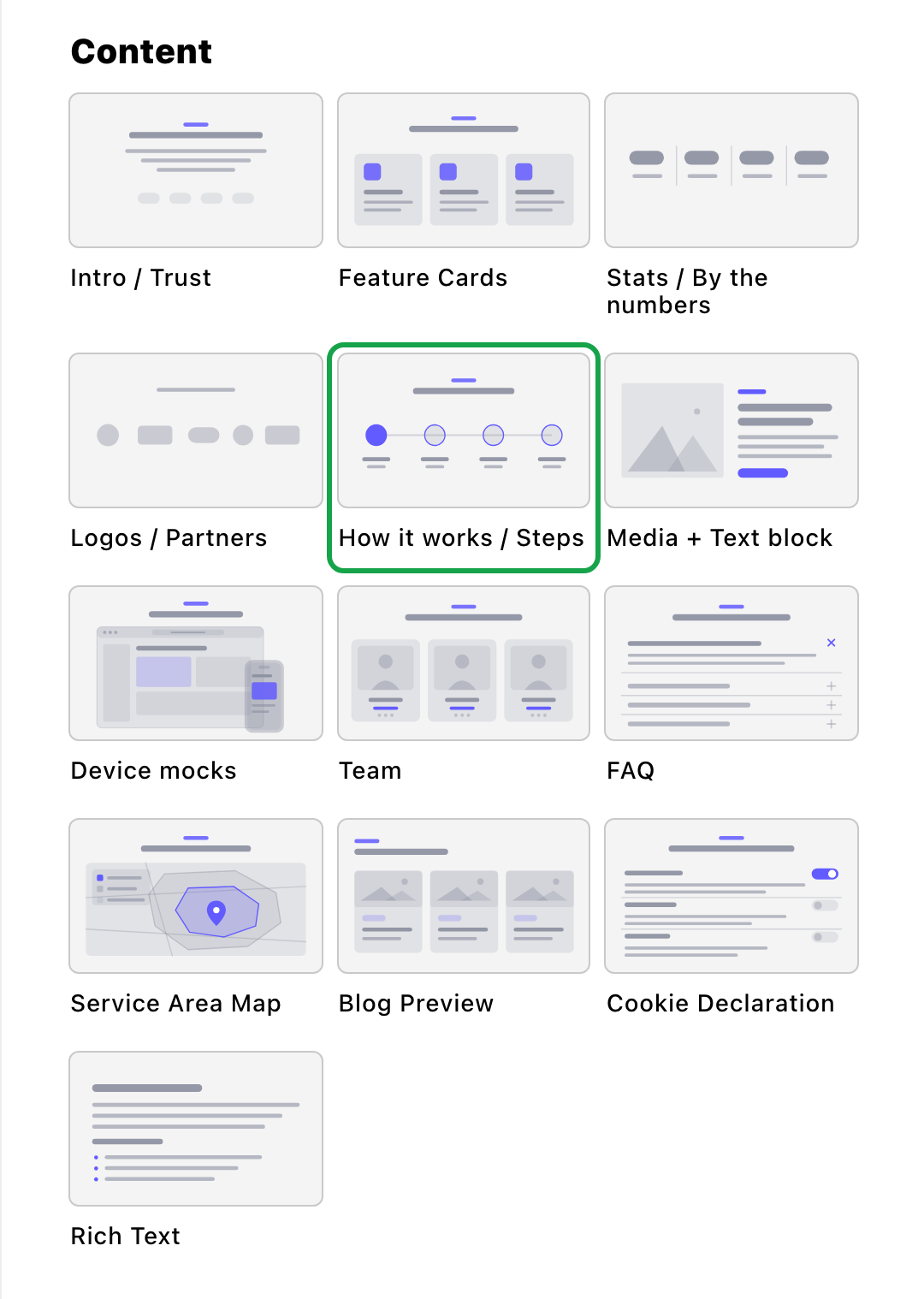
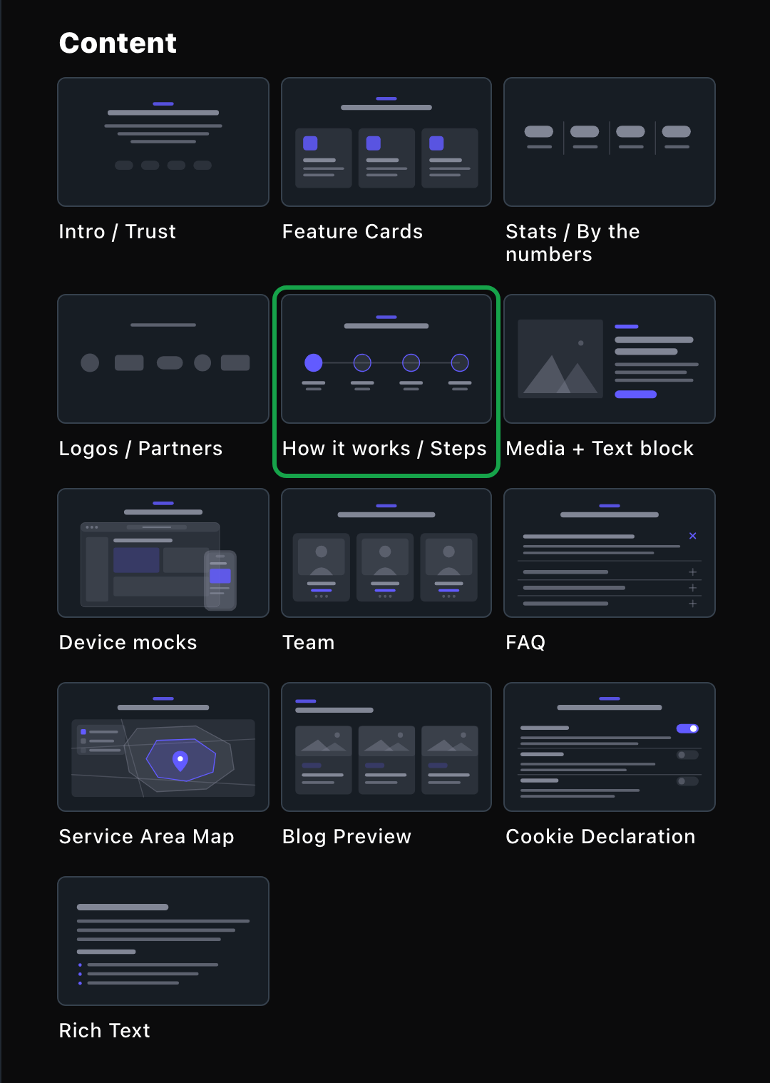
How it works / Steps lives in the Content group.
What you can change
Select the section on the page and choose Edit. The editor opens beside the page, so you see each change as you make it. It has five tabs: Steps, Background, Fonts, Button and CSS. Your changes go into the page’s draft. Visitors see them once the page is published with Update in the edit bar (Publish on a page never published).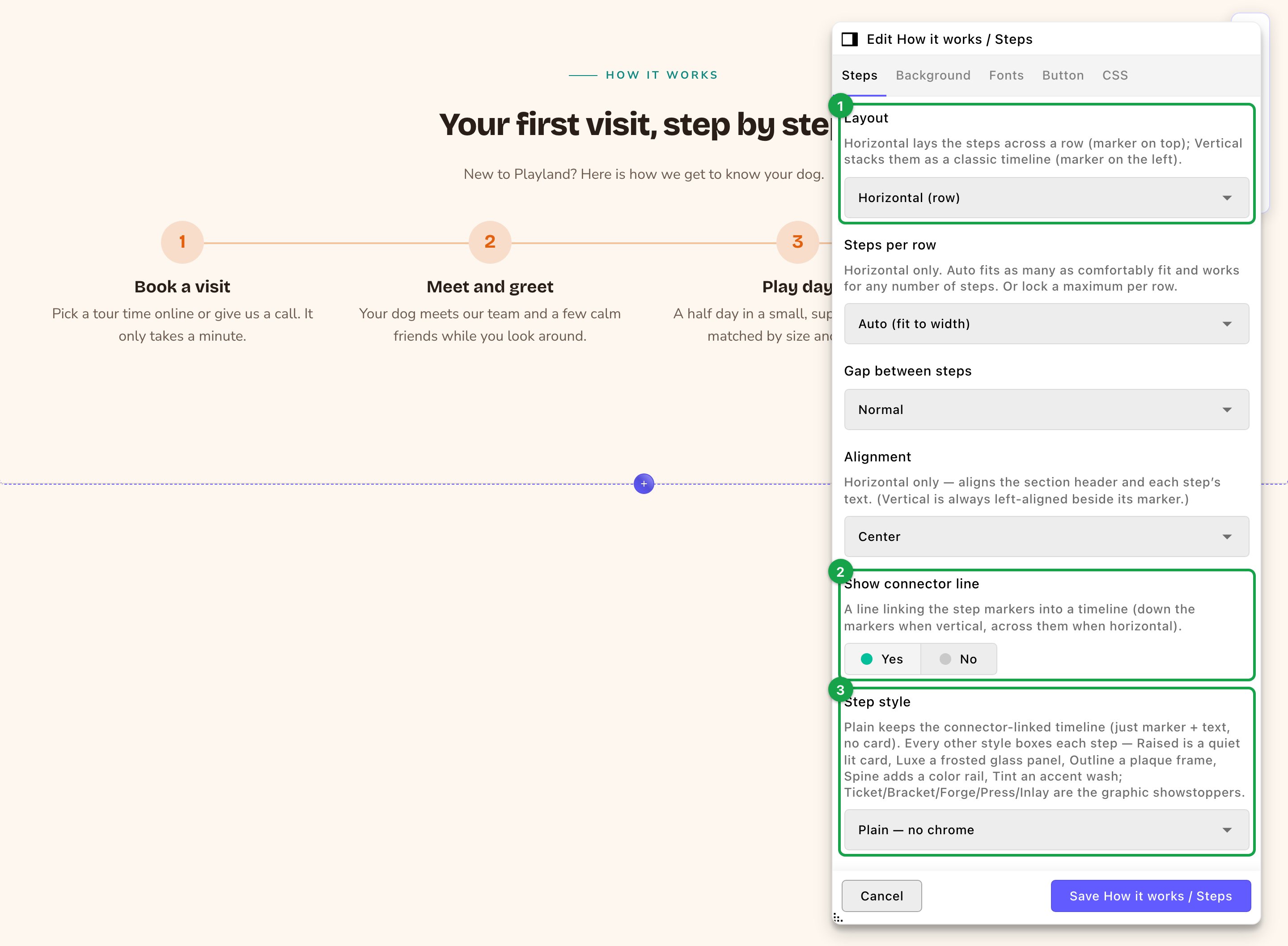
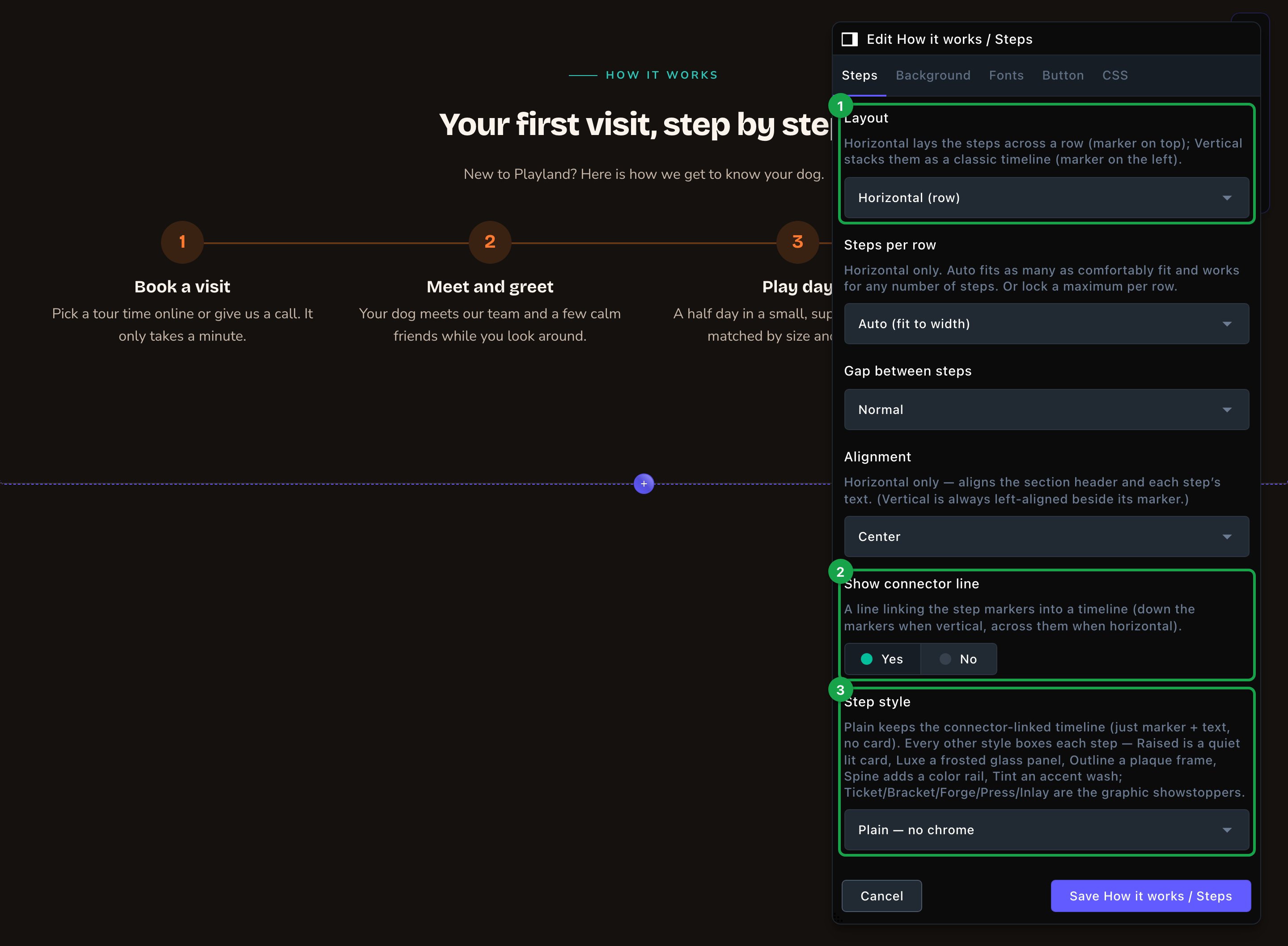
The Steps editor, with the page updating beside it.
Steps
Steps
Everything about the header, the layout, the markers and the steps themselves. Some options appear only for the layout or style they belong to.Header
- Show eyebrow and Eyebrow: a small line above the heading, “How it works” to start.
- Heading and Intro line: an optional heading and a short sentence under it. Clearing the heading hides only the heading. To show just the steps, also turn off Show eyebrow and clear the intro line.
- Heading size and Intro size go from Small up to Huge. Each part also has its own weight.
- Layout: Horizontal (row) lays the steps side by side with the marker on top. Vertical (timeline) stacks them with the marker on the left.
- Steps per row: for a row only. Auto (fit to width) fits as many as look good, or lock 2 per row, 3 per row or 4 per row.
- Gap between steps: Tight, Normal or Roomy.
- Alignment: Center or Left, for a row. A timeline always lines up on the left, beside its markers.
- Show connector line: a line that links the markers, across a row or down a timeline. It shows only with the Plain step style.
- Step style: Plain — no chrome keeps just the marker and text, linked by the connector line. Every other style puts each step in a box, such as Raised — lit soft card or Outline — plaque frame.
- Card corners: how rounded each box is.
- Hover effect: what a boxed step does when a visitor points at it, such as Lift — rises, shadow deepens. It isn’t offered for Plain.
- Step marker: Number counts 1, 2, 3 for you. Icon shows each step’s icon instead, and uses the number for a step with no icon. None hides the badge.
- Marker style: Soft (tinted), Filled or Outline.
- Marker shape and Marker size: Circle, Rounded or Square, at Small, Medium or Large.
- Accent color: colors the markers and the connector line. Leave it empty to use your site’s accent color.
- Title size, Title weight, Body size and Body weight apply to every step, so they stay consistent.
- Title: the step’s name, such as “Book a visit”. It’s required.
- Body: an optional sentence or two under the title.
- Icon name: an optional icon, such as paw or calendar-check, shown in the marker when Step marker is Icon. Find names at fontawesome.com/icons and type them without “fa-”. Pick its look with Icon family.
- Marker label (optional): replaces the automatic number for this step, such as “01” or “A”.
Background
Background
A background color for the whole section, set separately for the dark and light themes. It starts as Transparent (page background). See What every section shares.
Fonts
Fonts
Use a different typeface for parts of this section only, such as the step titles. Leave it empty to use the page’s fonts, which normally come from Site design → Typography. See What every section shares.
CSS
CSS
Custom styles for this section only. Admins and Owners can change this tab. See Custom CSS.
Looks you can make
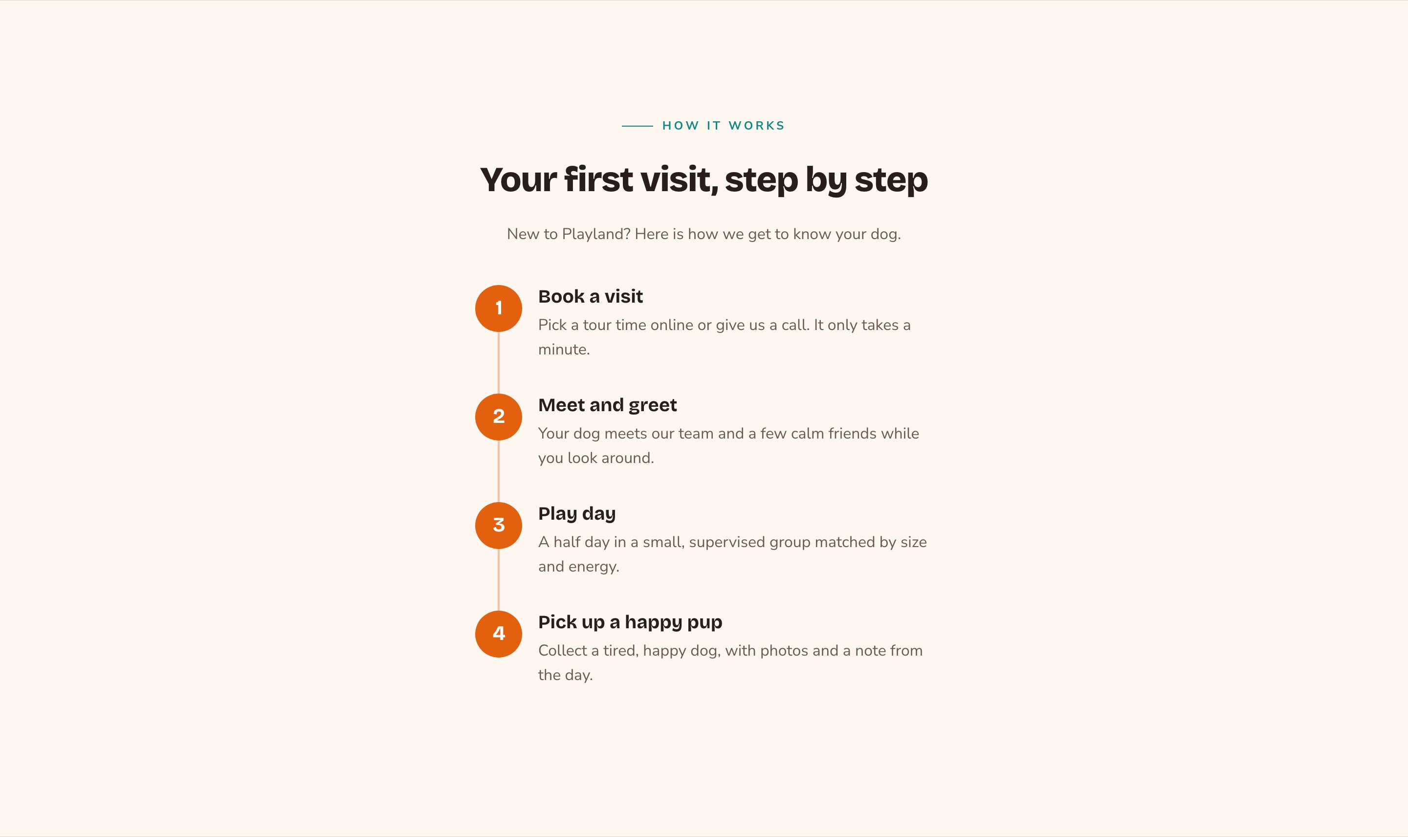
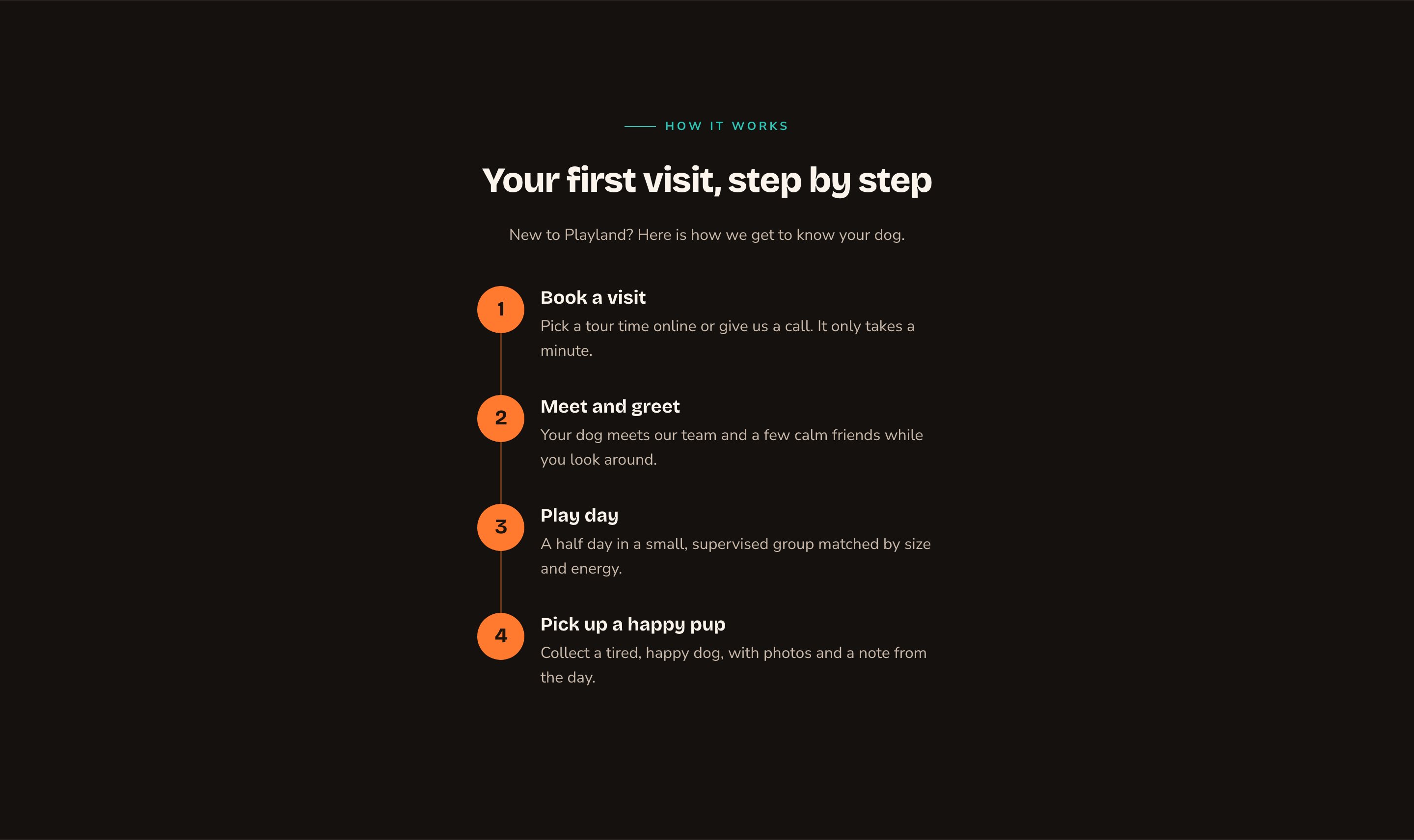
A vertical timeline with filled markers.
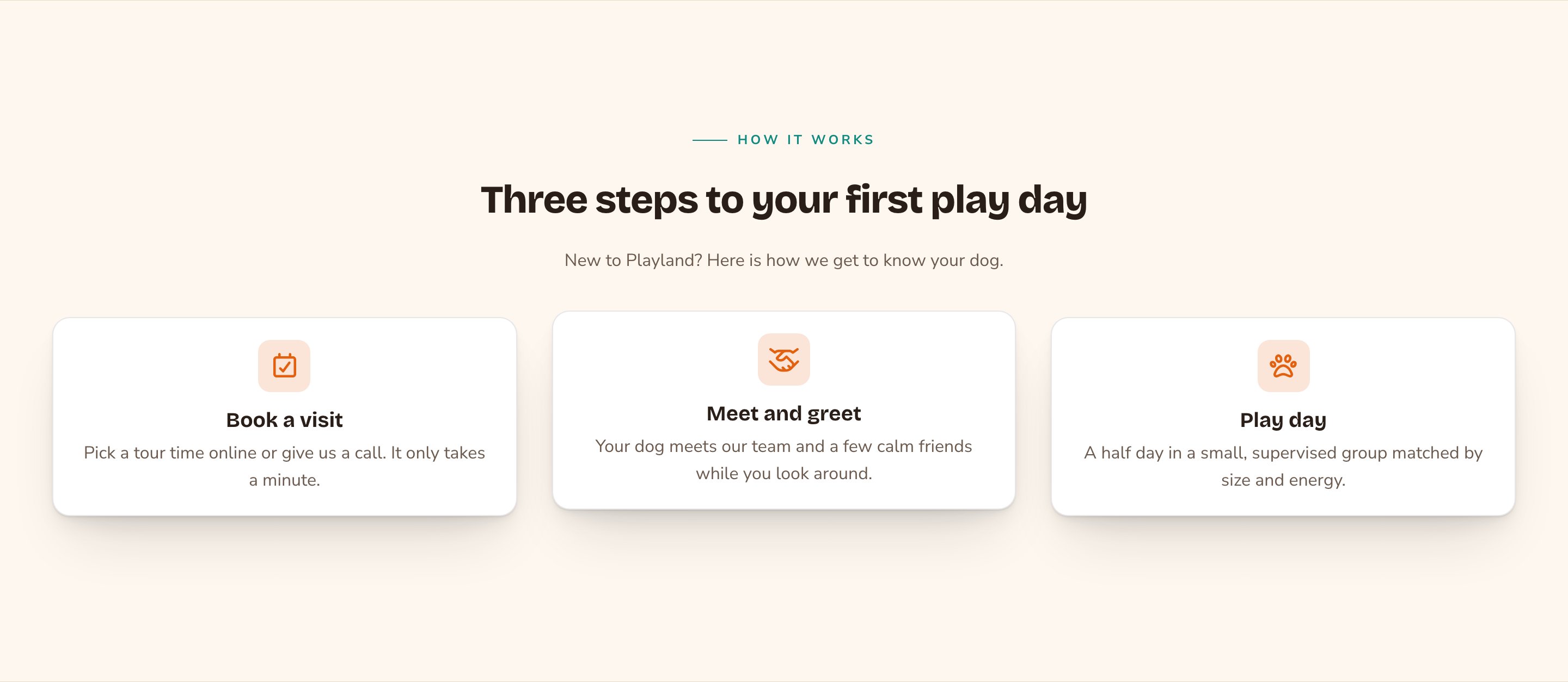
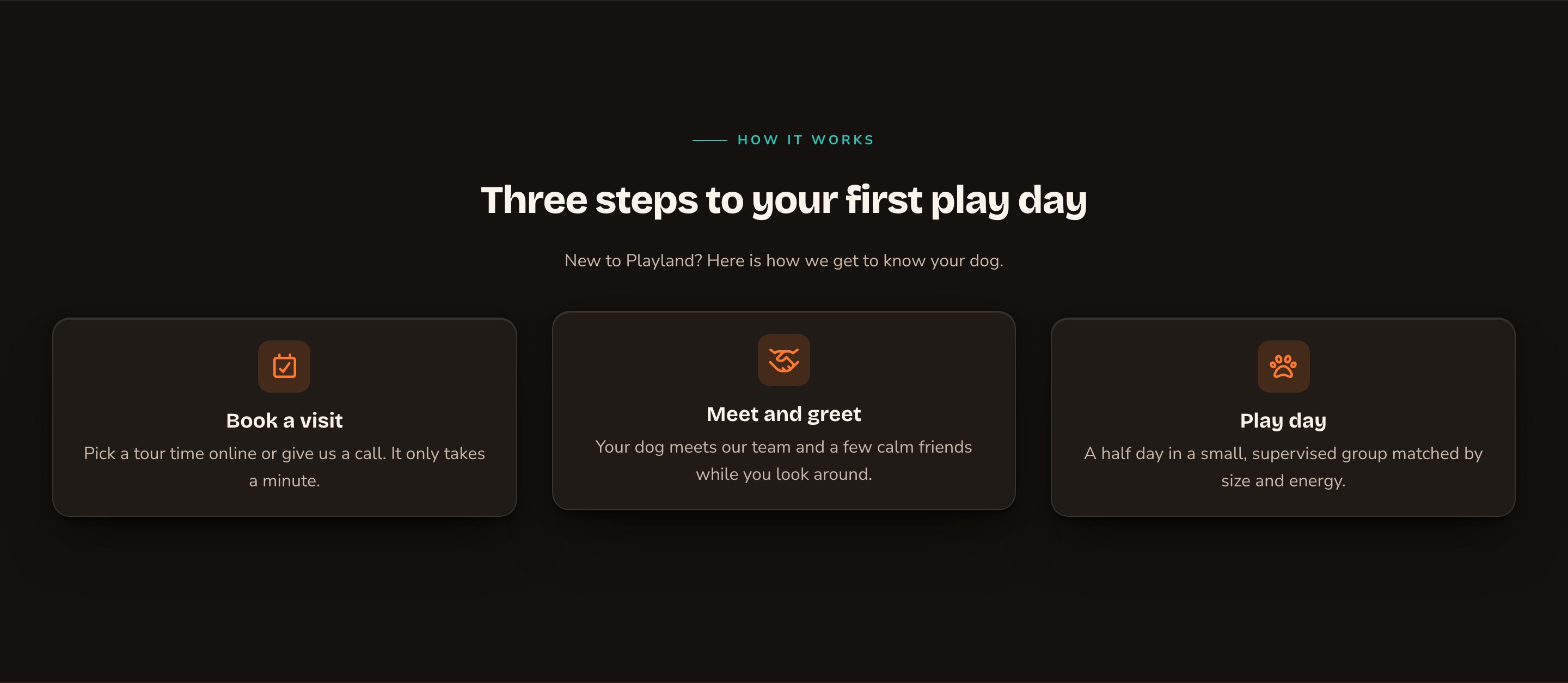
Boxed steps with icons that lift on hover.
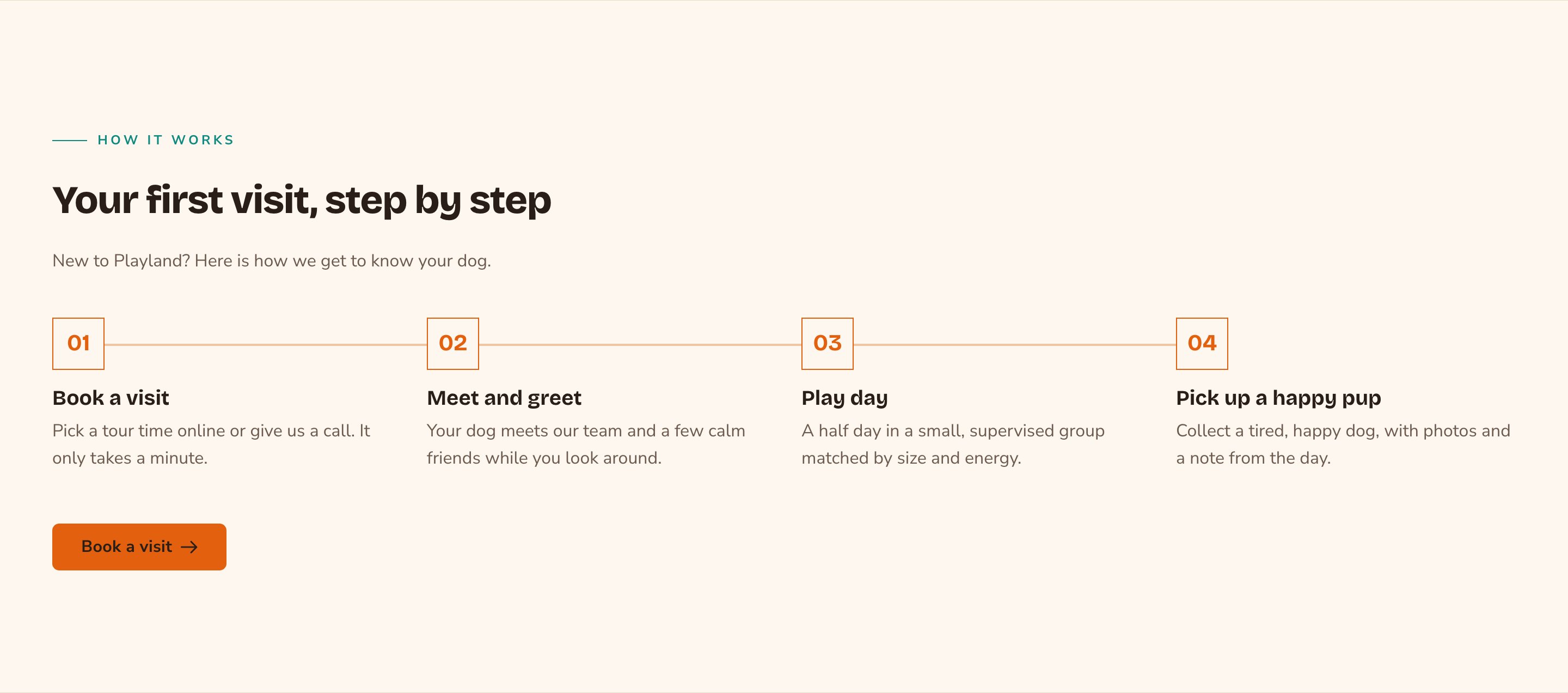
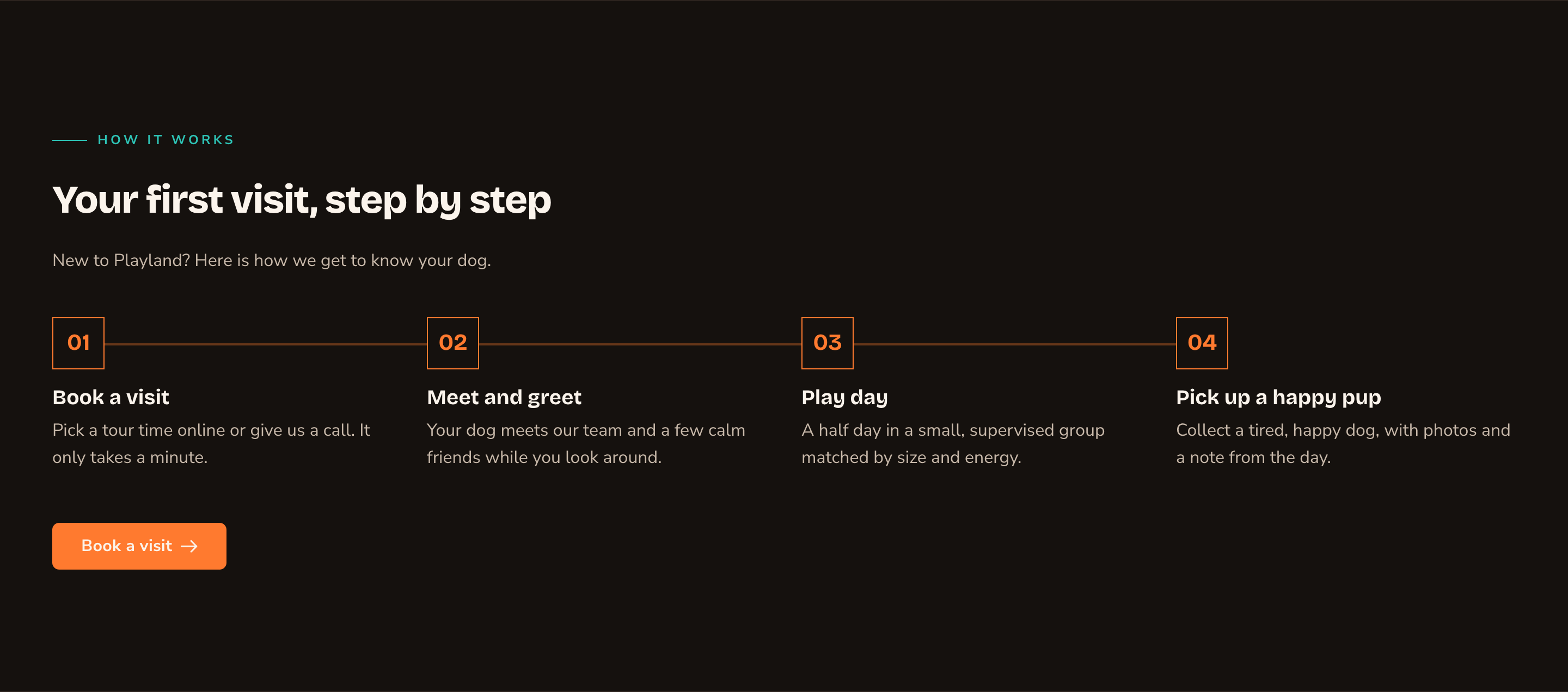
Your own marker labels and a button to finish.
Good to know
- Headings stay in order. The section heading is a subheading on the page, and each step title sits one level below it.
- Hover effects that follow the pointer need site animations on. See Motion.
- Animations play for visitors only. While you edit, the steps show their finished state. Visitors who prefer less motion also see them without animation.
Appearance options
Most sections also share a few tabs that work the same everywhere:- Background: set the color behind the section, separately for the dark and light themes.
- Fonts: use a different typeface for parts of this section only.
- CSS: add custom styles to this section. Admins and Owners can change it.
Related
Feature Cards
cards for features or services.
Buttons and card styles
every card style and hover effect.
Side-by-side layouts
put steps beside other content.
Final CTA
end the page with a clear next step.