

 AdonisJS
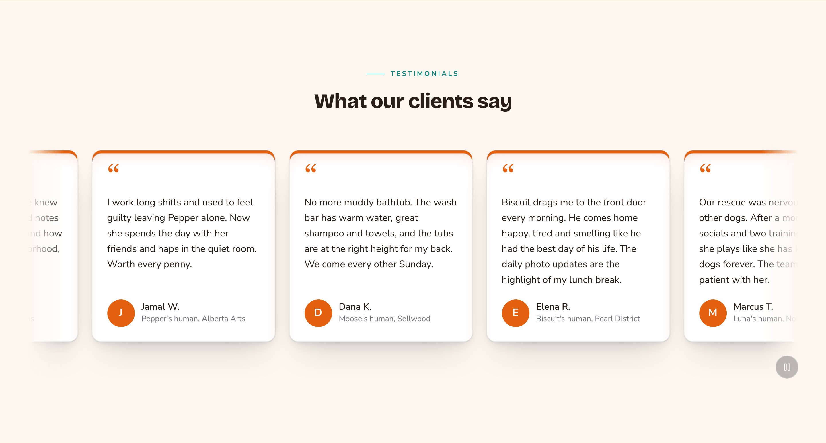
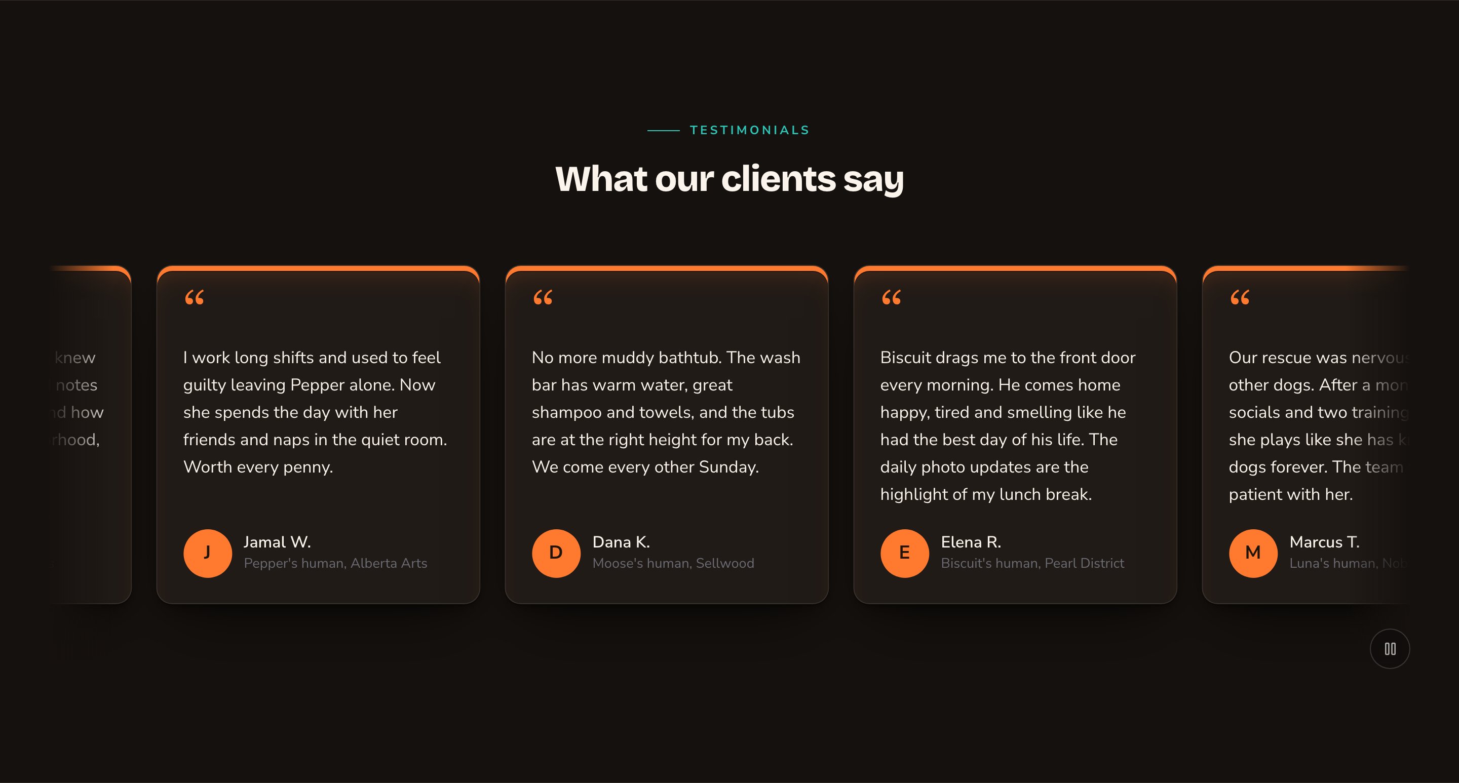
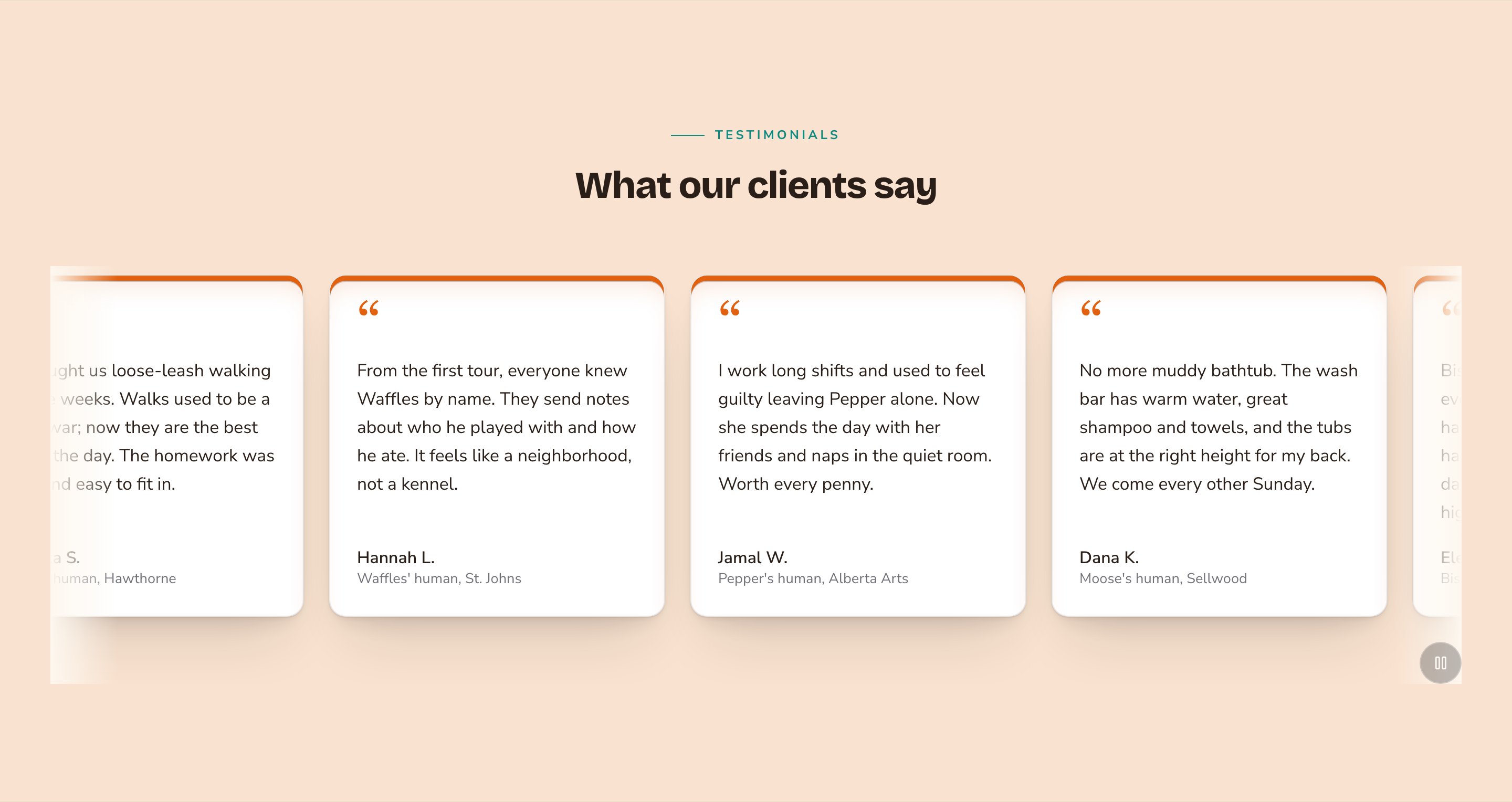
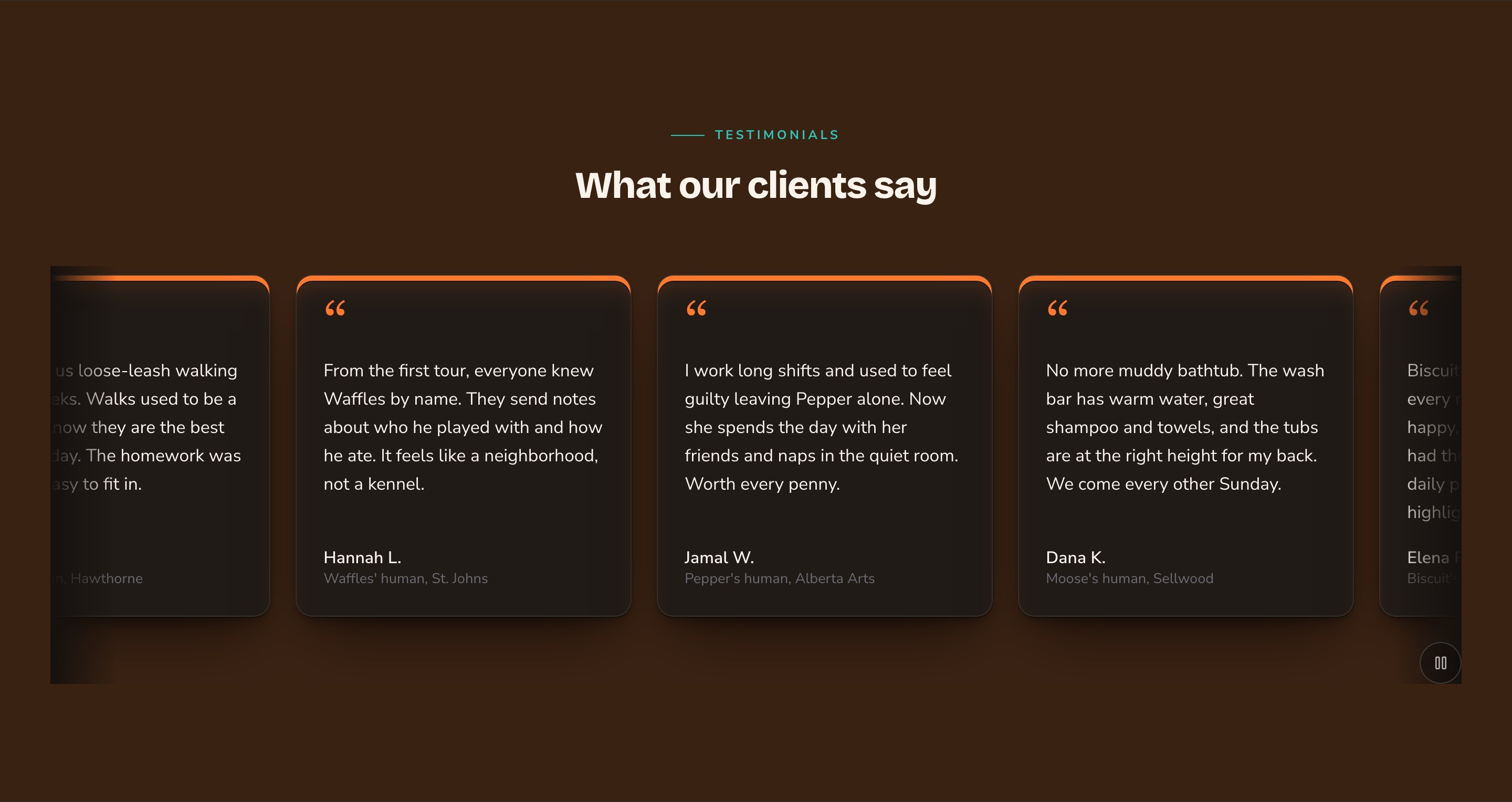
A scrolling row of Quote-led testimonial cards.
When to use it
- To show visitors that real customers love your business.
- To answer doubts next to your prices or a sign-up form.
- To build a full page of customer stories.
Where the testimonials come from
You don’t type quotes into the section. You add each testimonial once in the Testimonials manager, with the quote, the author’s name and role, and an optional photo, star rating and link. Every Testimonials section then shows them, featured ones first. To open the manager, press ⌘K (Ctrl+K on Windows) and choose Testimonials under Manage. See Testimonials for every option.Add it to a page
1
Open the page
Sign in, open the page on your site, and choose Edit in the edit bar at the top.
2
Find the spot
Select the section next to where the new one should go. A round + button appears on its top and bottom edges. On an empty page, choose Add Content in the middle.
3
Choose the section
The Add Content menu opens with its groups. Choose the section, then select it and choose Edit in its side toolbar to make it yours.
What you can change
Select the Testimonials section on the page and choose Edit. The editor opens beside the page, so you see each change as you make it. It has 7 tabs. Your changes go into the page’s draft. Visitors see them once the page is published with Update in the edit bar (Publish on a page never published).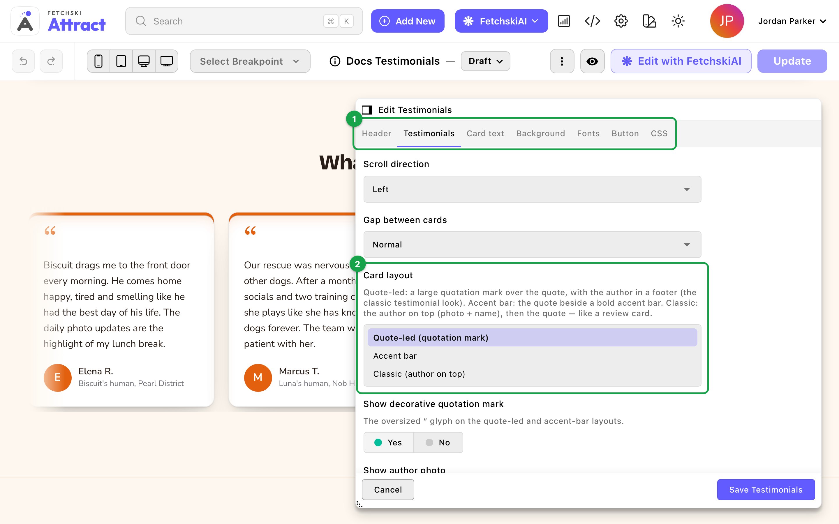
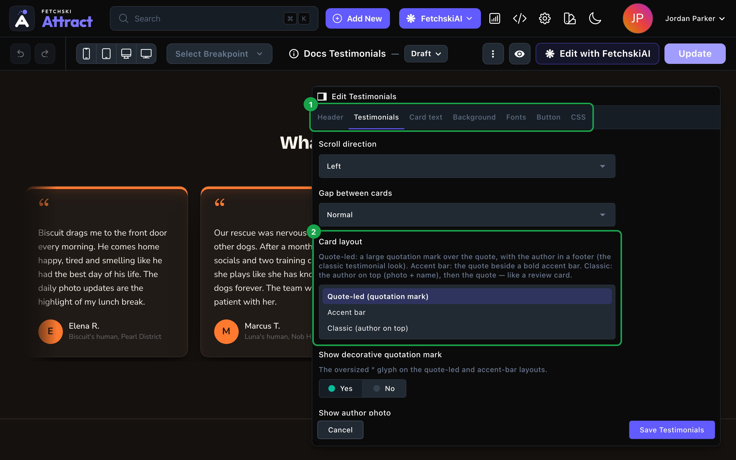
The Testimonials editor, with the section updating beside it.
Header
Header
The words above the cards. Each part is optional.
- Eyebrow: a short line above the heading, such as “Testimonials”.
- Heading: the section’s title, such as “What our clients say”. Leave it empty to hide the heading. To show just the cards, clear the eyebrow and intro line too.
- Intro line: one short sentence under the heading.
- Header alignment: Center or Left.
Testimonials
Testimonials
Which testimonials show, how they’re arranged, and how each card looks.Which testimonials show
- Featured testimonials only: show only the testimonials marked Featured in the Testimonials manager.
- Maximum testimonials: the most to show, from 1 to 30. The default is 6.
- Carousel (animated marquee): a row of cards that scrolls on its own. Choose its Scroll speed and Scroll direction.
- Grid (multi-row): a tidy grid.
- Masonry: a staggered wall where each card fits its quote’s length.
- Quote-led (quotation mark): a large quotation mark over the quote, with the author below.
- Accent bar: the quote beside a bold bar of color.
- Classic (author on top): the author’s photo and name first, then the quote.
- Show author photo: the author’s photo, or their initial when they have none. Turn it off to hide the photo spot entirely.
- Show author role / context: the line under the author’s name, such as “Puppy parent since 2023”.
- Show star rating: each testimonial’s stars. It’s off by default.
- Link label: the text for a testimonial’s link, such as “Read the full story”. It shows only on testimonials that have a Source link.
- Card style and Hover effect: the card’s frame and what it does on hover. The default is Spine — accent rail with Sheen — a light sweeps across. See Buttons and card styles.
- Card width: Narrow, Normal or Wide.
- Card height: Auto (fit content), Comfortable or Tall. Taller cards give a carousel or grid an even look. Masonry ignores this.
- Card content alignment: Left, Center or Right.
- Star color and Accent: the stars, and the color of the quotation mark, the accent bar and the initials. Leave Star color empty for warm amber stars, and Accent empty to use your site’s accent color.
Card text
Card text
The size, weight and color of the author’s Name, their Role and the Quote.Quote length caps each quote at 4, 6, 8 or 12 lines, so one long quote doesn’t stretch its card. Visitors can’t open a cut-off quote to read the rest. The default is 8 lines. Choose Full text (no limit) to show every word.
Background
Background
Give the section its own background color, from your site’s palette or a custom color. See What every section shares.
Fonts
Fonts
Use a different typeface for parts of this section only, such as the quotes. Leave it empty to use the page’s fonts, which normally come from Site design → Typography. See What every section shares.
CSS
CSS
Custom styles for this section only. Admins and Owners can change this tab. See Custom CSS.
Looks you can make
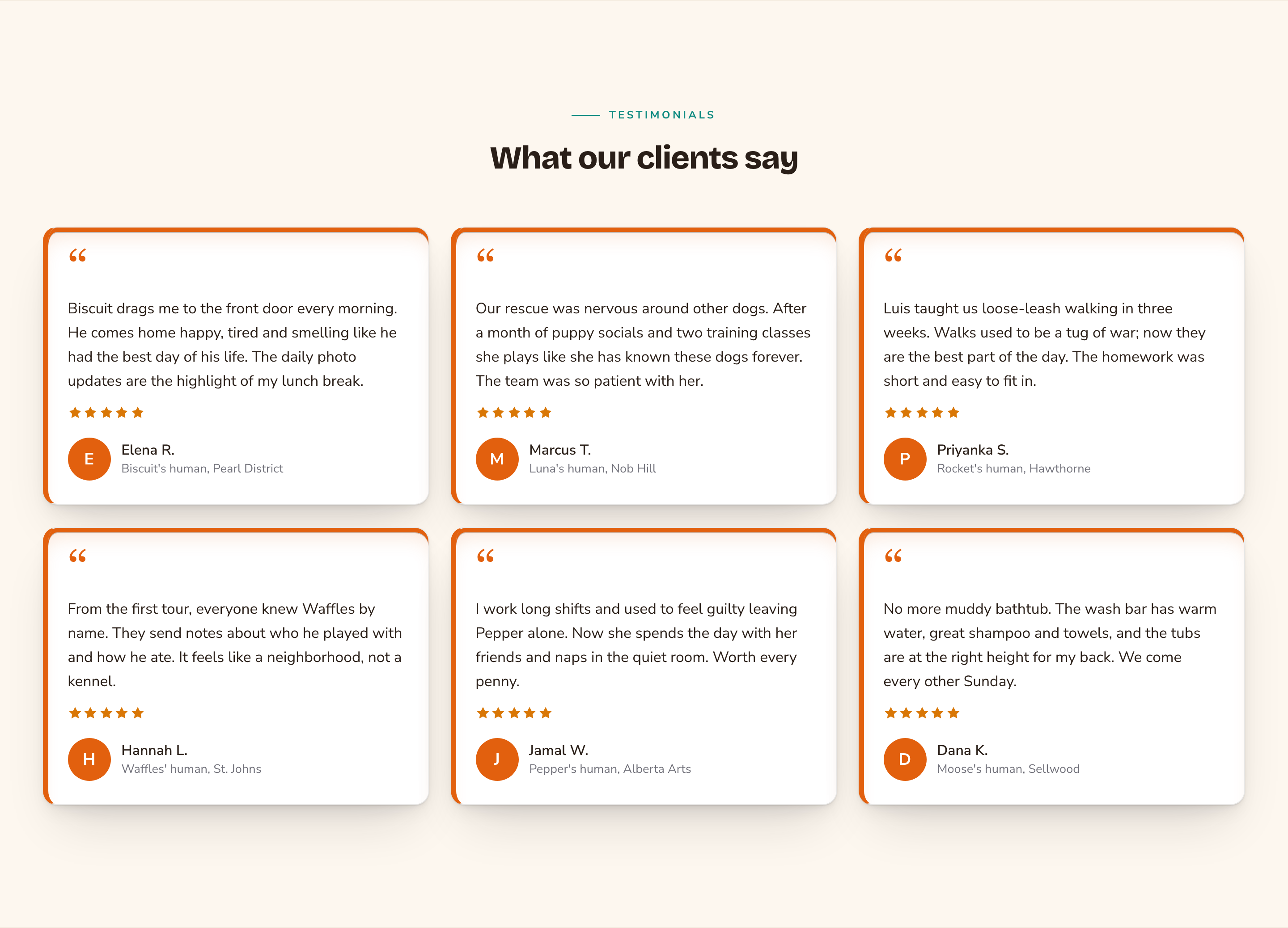
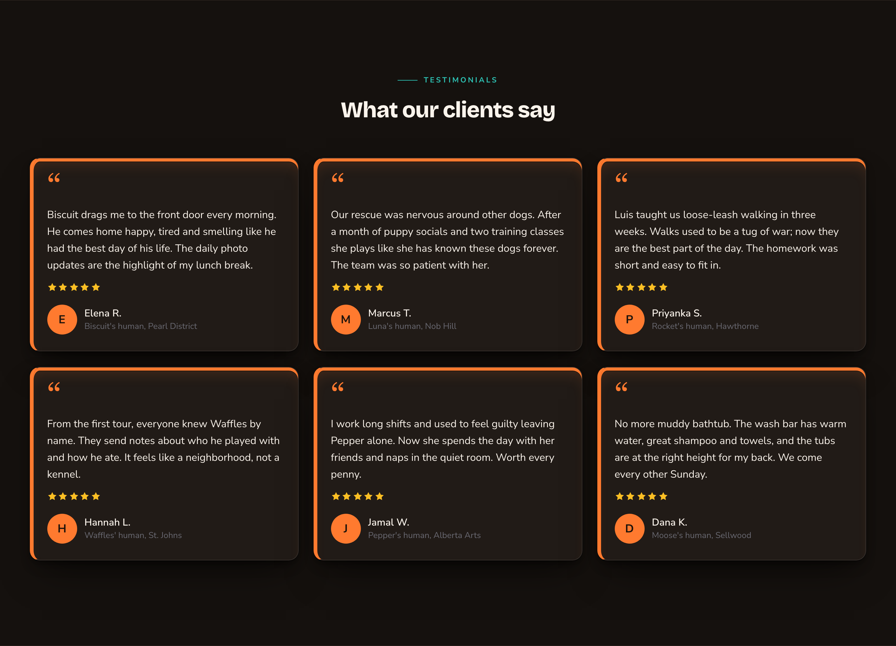
A Masonry wall fits quotes of every length.
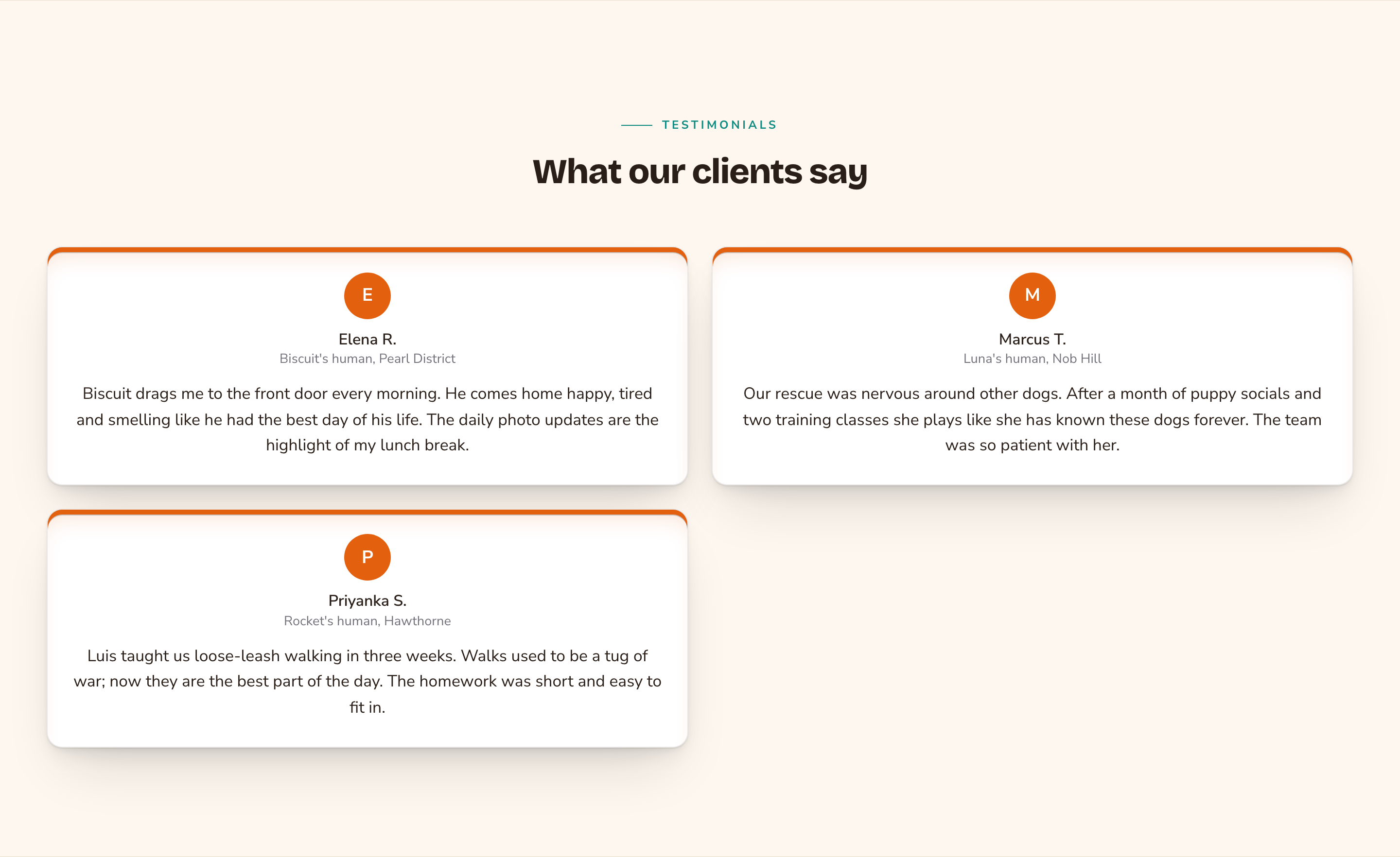
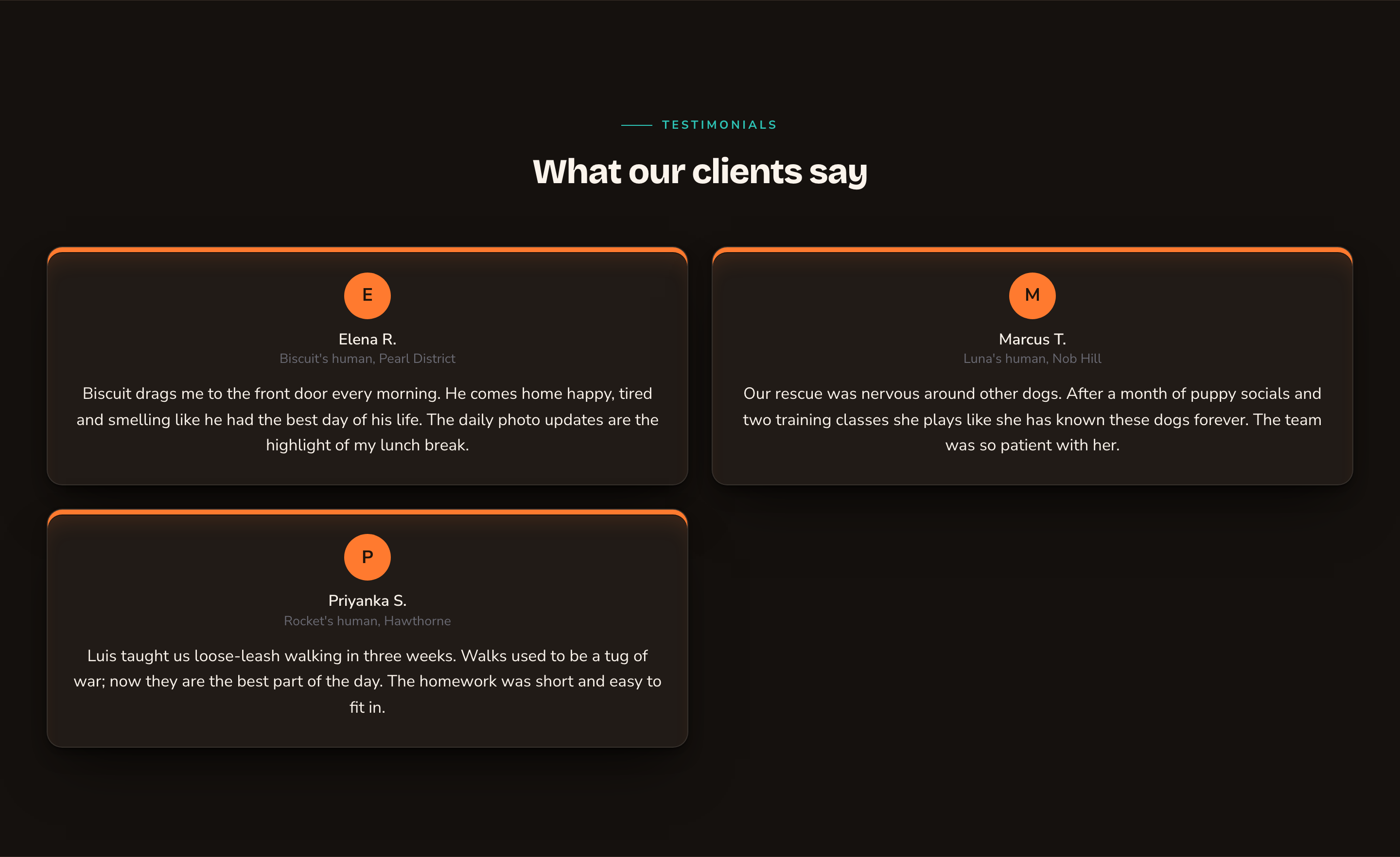
Classic cards lead with the person.
Without photos, the words take center stage.
Good to know
- The carousel needs animations on. If animations are turned off for the whole site in Motion, the carousel shows as a grid instead.
- Moving rows can be paused. The carousel always gets a pause button. Visitors who prefer less motion see a still row they can scroll by hand.
- No testimonials, no section. With no testimonials to show, the section stays hidden, even while you edit. If a setting you just changed makes it vanish, use the undo arrow at the left of the edit bar, or publish a testimonial that matches.
- Drafts show while you edit. You see testimonials you haven’t published yet. Visitors see only published ones.
- Where it fits. Testimonials is a full-width section. It isn’t offered inside columns or on blog posts.
- Use real words from real customers, with their permission.
Appearance options
Most sections also share a few tabs that work the same everywhere:- Background: set the color behind the section, separately for the dark and light themes.
- Fonts: use a different typeface for parts of this section only.
- CSS: add custom styles to this section. Admins and Owners can change it.
Related
Manage testimonials
add quotes, photos and ratings.
Display Google reviews on a page
show your Google reviews instead.
Buttons and card styles
every card style and hover effect.
Motion
turn site animations on or off.