

 AdonisJS
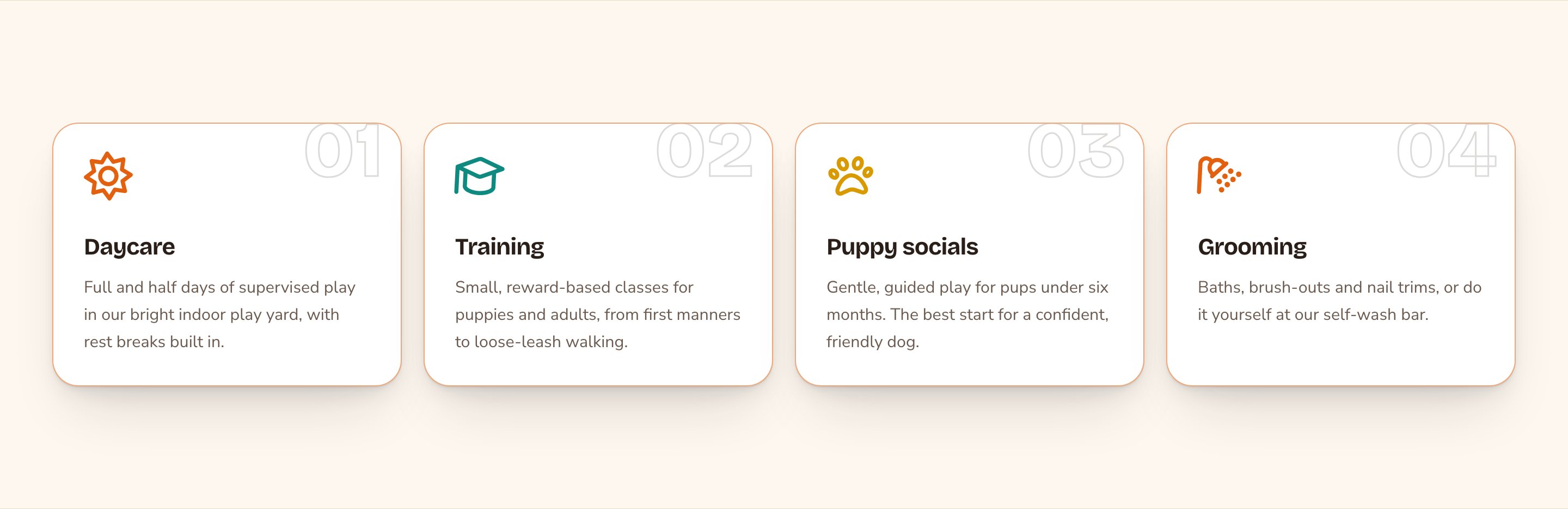
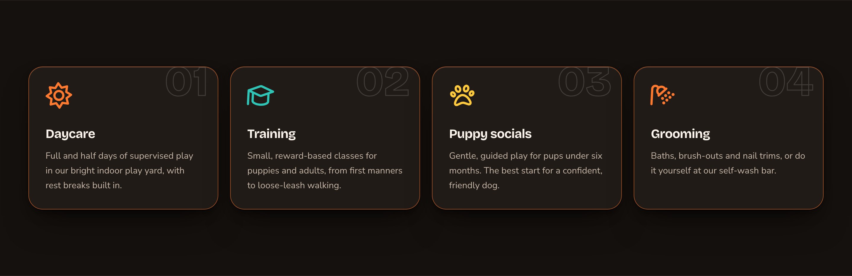
Four feature cards with icons and index numbers.
When to use it
- To list your main services or offers, one card each.
- To show what makes you different in 3 or 4 short points.
- To walk visitors through a short sequence, with the cards numbered 01, 02, 03.
- Inside a blog post, to sum up key points.
Add it to a page
1
Open the page
Sign in, open the page on your site, and choose Edit in the edit bar at the top.
2
Find the spot
Select the section next to where the new one should go. A round + button appears on its top and bottom edges. On an empty page, choose Add Content in the middle.
3
Choose the section
The Add Content menu opens with its groups. Choose the section, then select it and choose Edit in its side toolbar to make it yours.
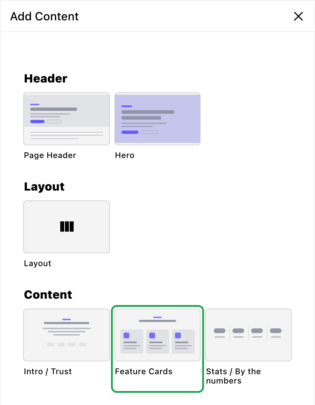
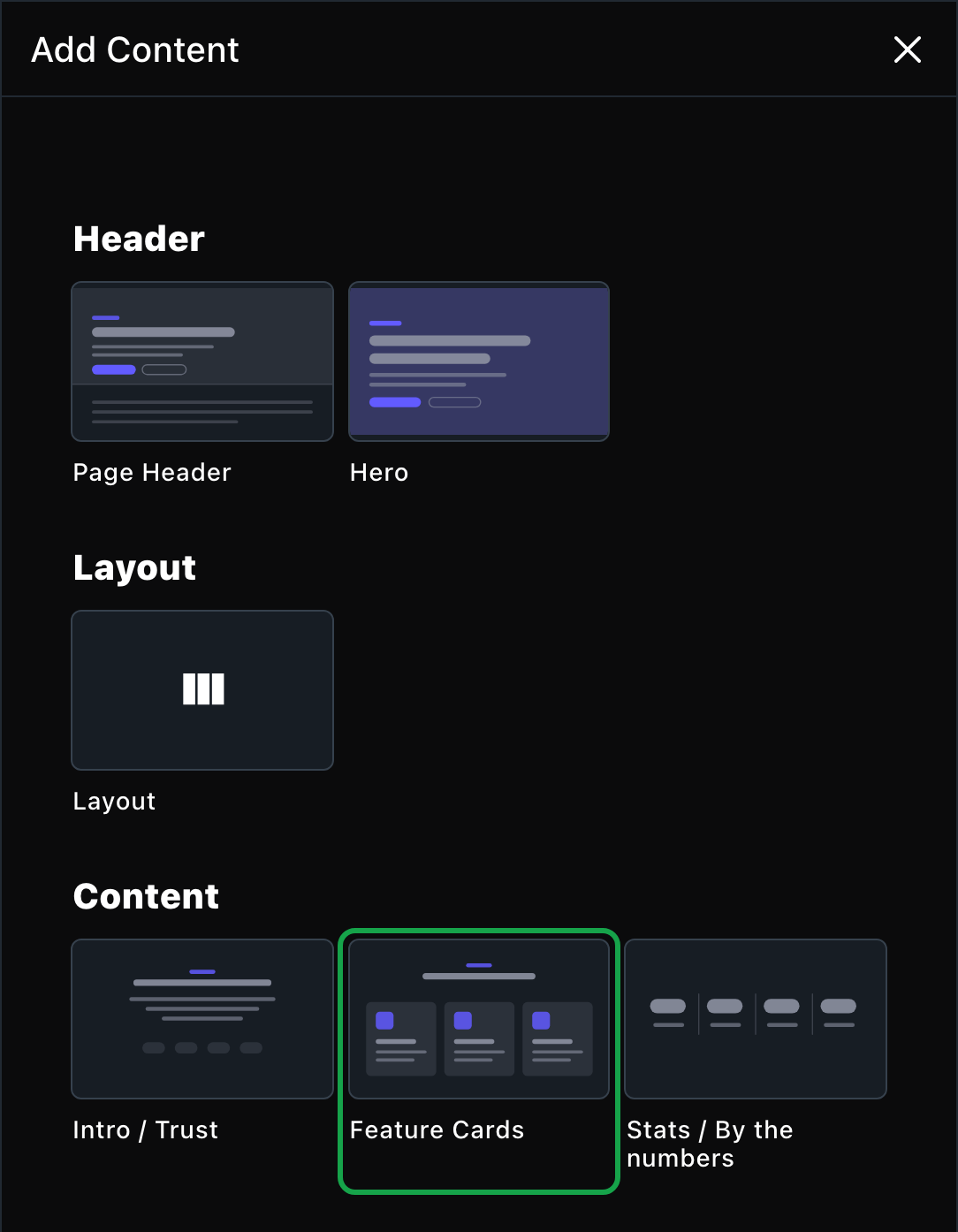
Feature Cards is in the Content group.
What you can change
Select the section on the page and choose Edit. The editor opens beside the page, so you see each change as you make it. It has four tabs. Your changes go into the page’s draft. Visitors see them once the page is published with Update in the edit bar (Publish on a page never published).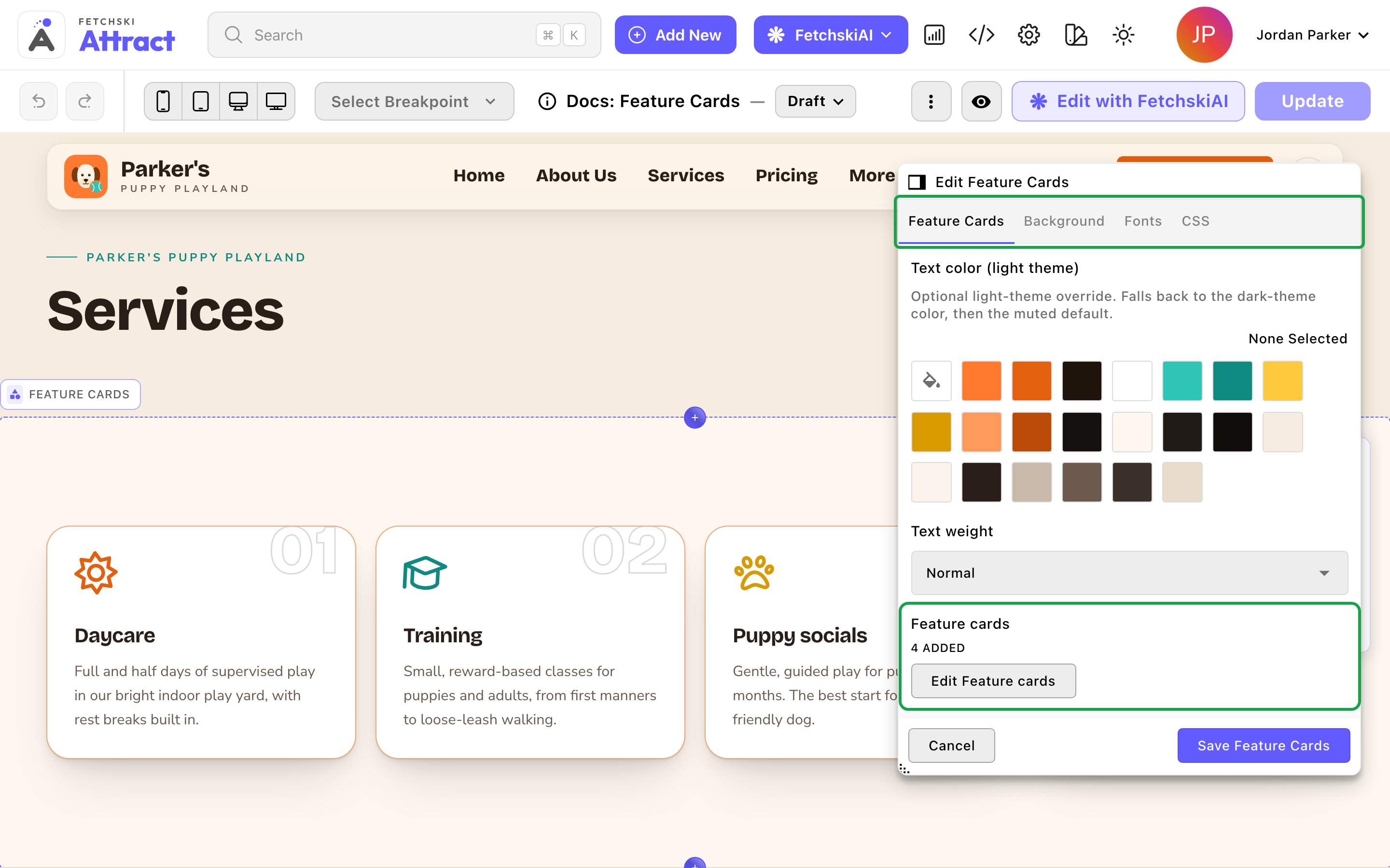
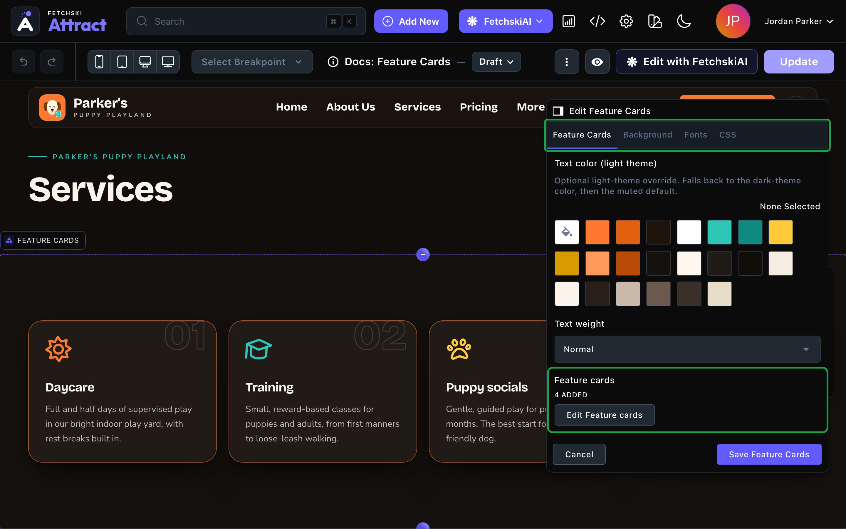
The card list, with the page updating beside it.
Feature Cards
Feature Cards
The cards themselves, and how the grid and the cards look. Some options appear only once you turn on the one they belong to.The cards (in the Feature cards list)
- Title: the card’s heading. It’s required.
- Text: one or two sentences.
- Icon name: any Font Awesome icon name, such as “dog”, “graduation-cap” or “scissors”. Find names at fontawesome.com/icons and type them without “fa-”. Pick its look with Icon family, such as Classic Regular.
- Icon color: leave it empty, and the cards take turns using your site’s accent, secondary and tertiary colors.
- Icon size and Icon animation: make the icon bigger or smaller than the card’s usual size, or animate it, for example with Bounce or Spin.
- Cards per row: Auto (fit to width) fits as many as look good, for any number of cards. Or choose 2 per row, 3 per row or 4 per row.
- Gap between cards: Tight, Normal or Roomy.
- Card size: Small, Medium or Large. It scales the space inside each card, the icon, the title and the number together.
- Card style: how each card looks at rest. It starts on Poster — accent keyline, a card framed by a thin line in your accent color. There are 12 styles to choose from.
- Card corners: from Square to Large. Default keeps the cards’ own corners.
- Some styles also offer a Card style color and, for Forge, Forge color placement and Forge line weight.
- Card hover effect: what a card does when a visitor points at it: Lift, Pop (accent frame + lift), Glow, Border only or None. It starts on Pop (accent frame + lift).
- Hover accent color (dark theme) and Hover accent color (light theme): the color of the hover border or glow. Empty uses your accent color.
- Show index numbers: a big outlined number on each card (01, 02, 03). Turn it off when the cards are separate services or points, not steps in a sequence.
- Number fill: All numbers solid, Fill on hover or Always outlined. It starts on Fill on hover.
- Number color (dark theme) and Number color (light theme): the number’s color. Empty uses your site’s text color.
- Title color (dark theme), Title weight, Text color (dark theme) and Text weight: one setting for all the cards at once. Titles start Bold and text starts Normal.
Background
Background
Give the section its own full-width color band, separately for the dark and light themes. It starts on Transparent (page background). See What every section shares.
Fonts
Fonts
Use a different typeface for parts of this section only, such as the card titles. Leave it empty to use the page’s fonts, which normally come from Site design → Typography. See What every section shares.
CSS
CSS
Custom styles for this section only, such as one card, the index numbers or the icons. Admins and Owners can change this tab. See Custom CSS.
Looks you can make
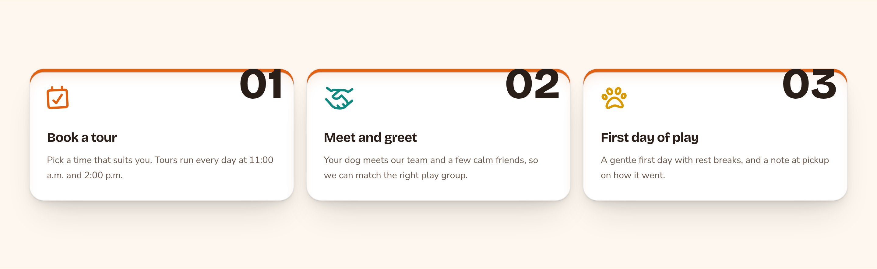
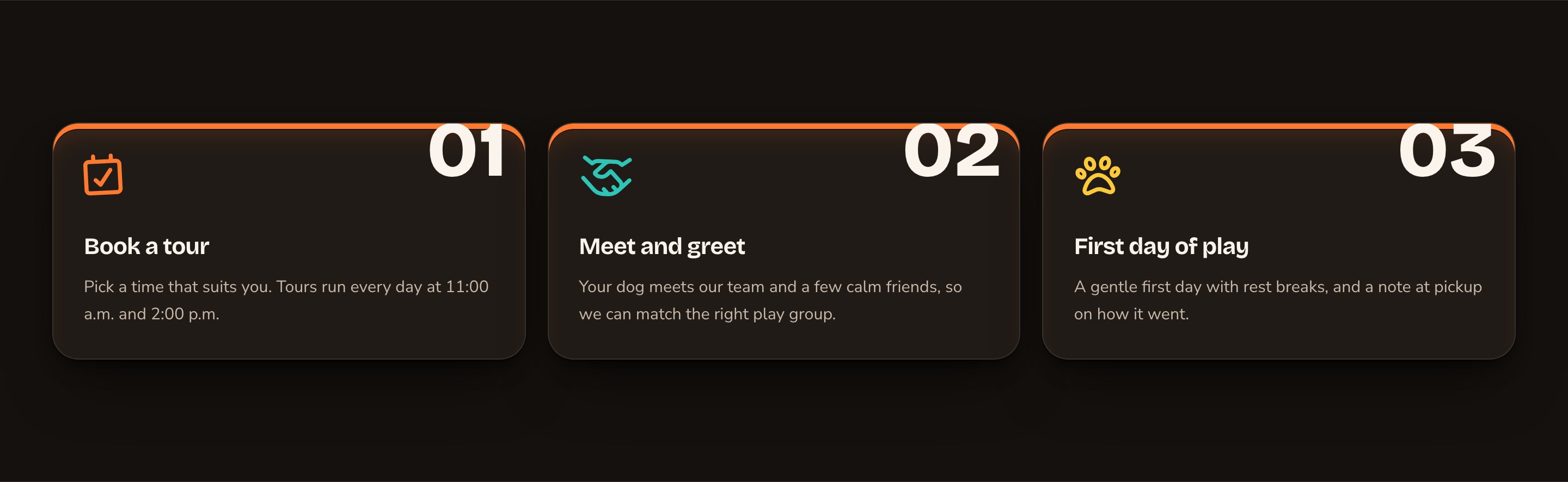
Numbered cards for a three-step sequence.
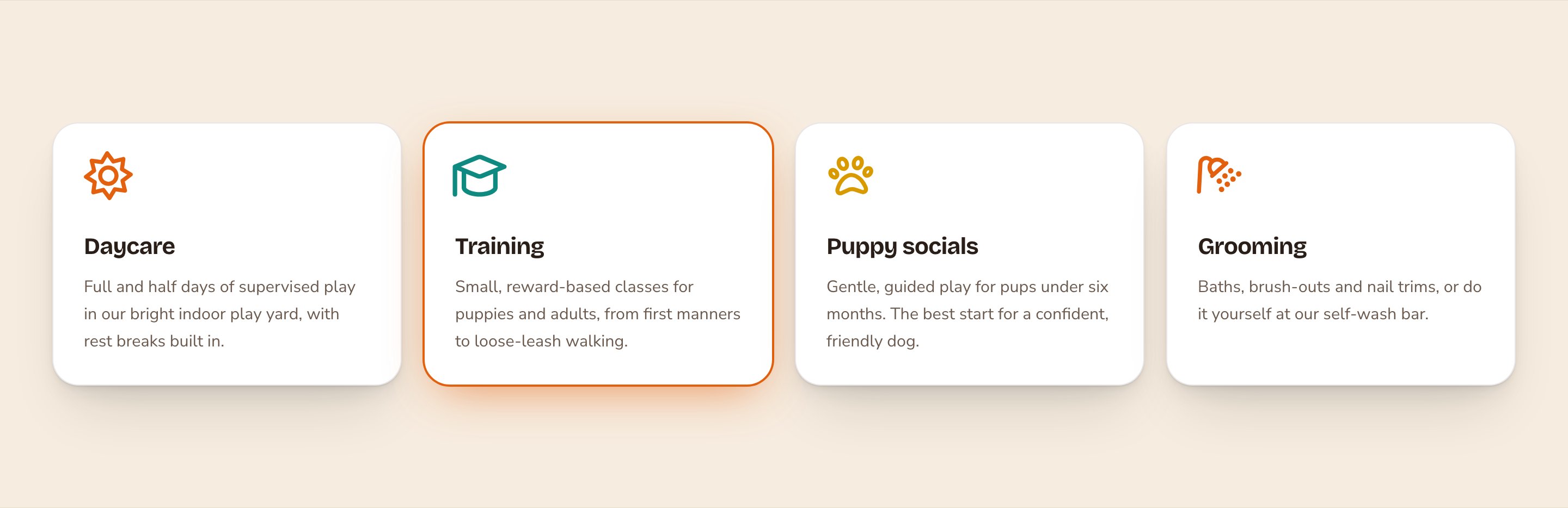
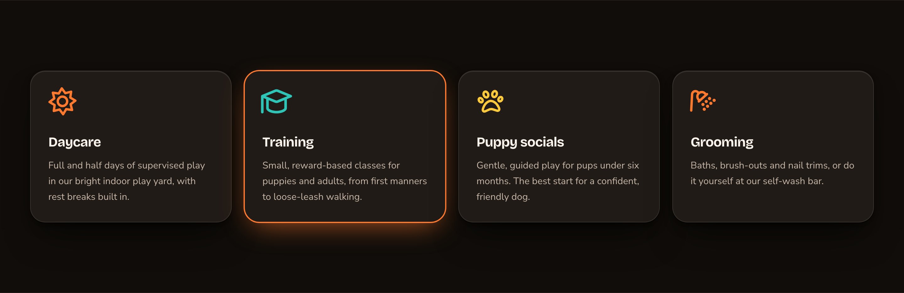
Quiet raised cards with a soft glow on hover.
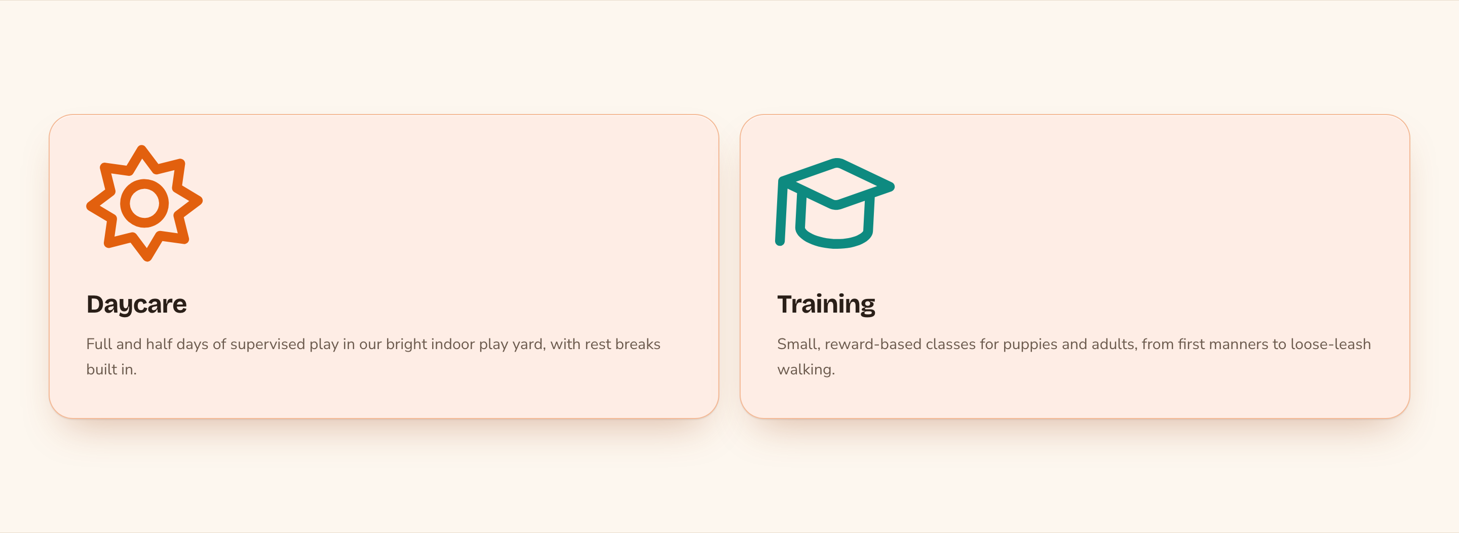
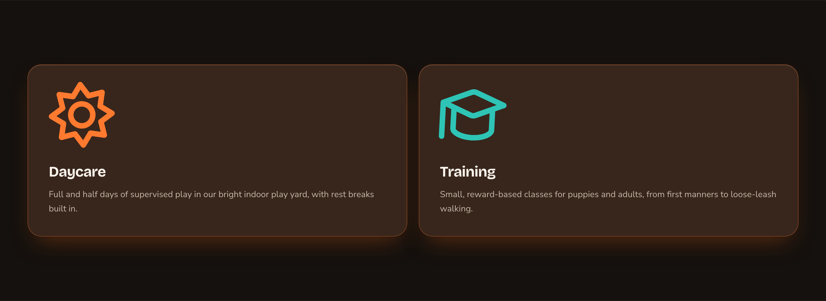
Two big cards for your two main offers.
Good to know
- The card titles are headings. Feature Cards has no heading of its own, so each card title is a main section heading, in order for screen readers and search engines wherever the section sits. To introduce the cards, put an Intro / Trust section or a Rich Text heading just above them.
- Keep the cards about the same length. Cards in a row line up best when their texts are close in length.
- Decorative icons stay silent. Screen readers skip the icons and read the titles and text.
- Hover effects respect reduced motion. Visitors who prefer less motion see the cards without the lift.
- Animations play for visitors only. While you edit, the cards show their finished state.
Appearance options
Most sections also share a few tabs that work the same everywhere:- Background: set the color behind the section, separately for the dark and light themes.
- Fonts: use a different typeface for parts of this section only.
- CSS: add custom styles to this section. Admins and Owners can change it.
Related
How it works / Steps
a numbered process with a connector line.
Pricing / Packages
cards with prices and buttons.
Intro / Trust
a headline to put above your cards.
Buttons and card styles
every card style in depth.