

 AdonisJS
Where custom CSS goes
Open the Design layer
- In the toolbar (the bar across the top of your site once you’re signed in; see The toolbar), choose Site design. Or open the command palette (⌘K, or Ctrl+K on Windows) and choose Site design.
- Choose the Custom CSS tab.
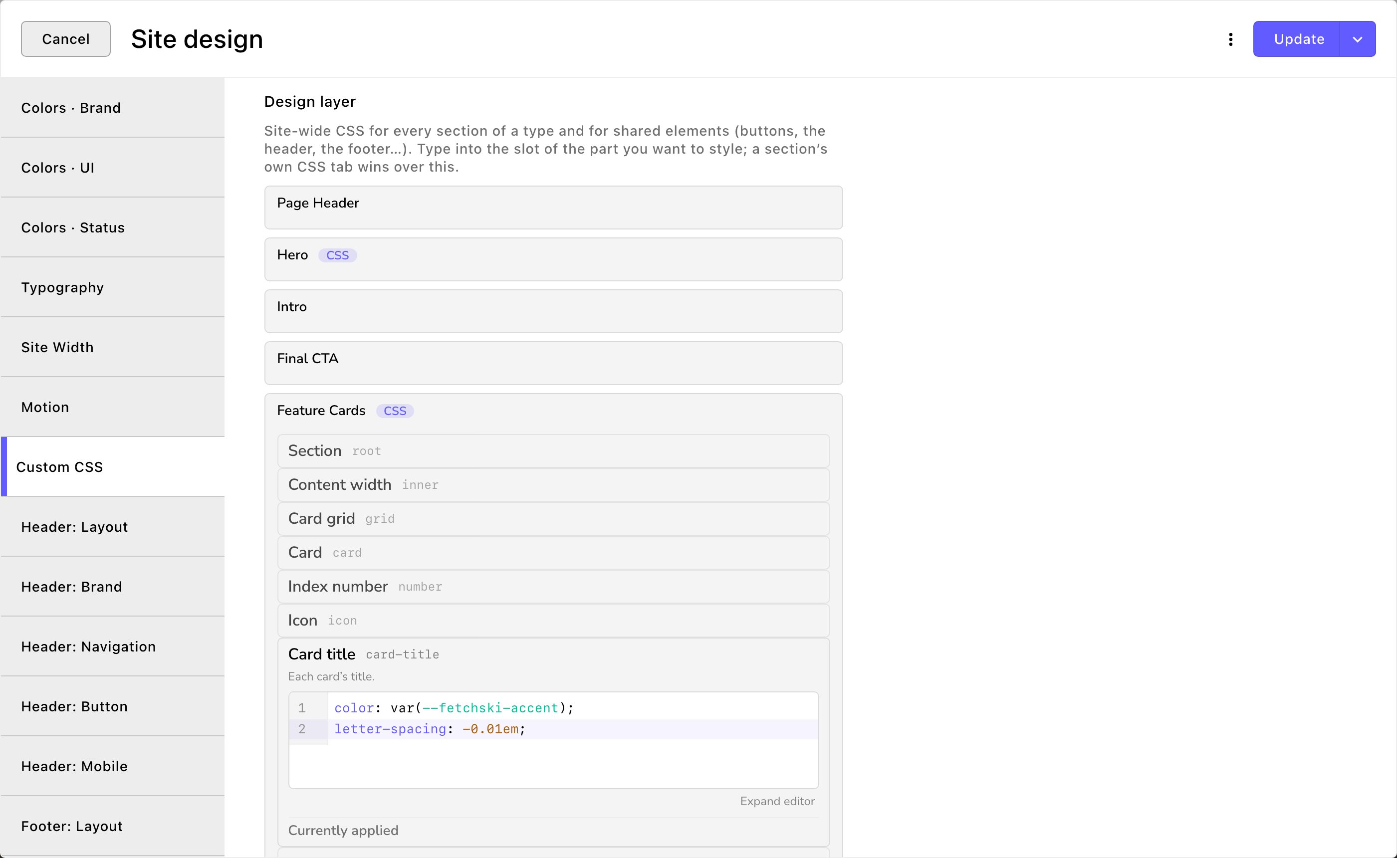
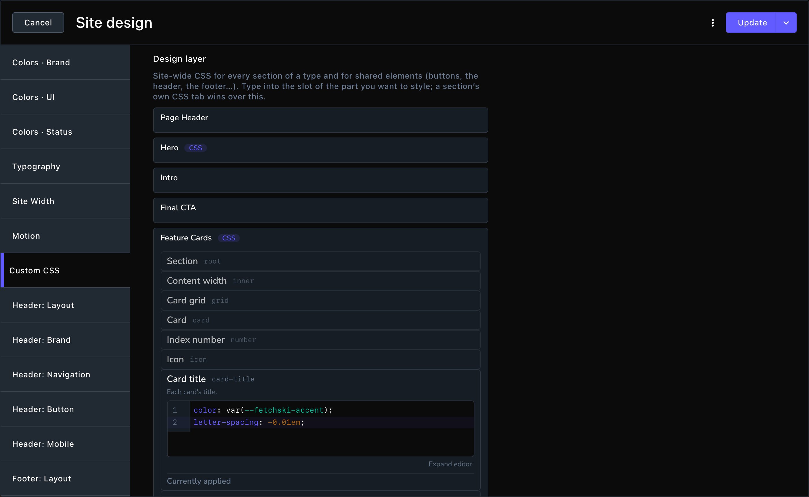
The Design layer: one group per kind of section, one slot per part.
The shared parts
These groups sit below the sections in the Design layer, and only there:- Buttons, Eyebrows and Rich text: every button, every small label above a heading, and all text written in the rich text editor.
- Form controls, Blog cards and Social icons: every form field, blog card and set of social icons.
- Site header, Mobile menu and Site footer: the bars at the top and bottom of every page, and the menu on phones.
- Cookie banner, Blog post and Coming soon: the cookie notice, the blog post page and the “coming soon” note. A page shows that note while it has no content yet (set on its Coming Soon tab). Coming soon isn’t the maintenance page that covers your whole site.
Style one section
- Open the page and choose Edit in the edit bar.
- Select the section, then choose Edit (pencil) in its side toolbar.
- Choose the CSS tab. It holds one Custom CSS field, with one slot per part.
- Open a slot and type your CSS. The section updates on the page as you type.
- Close the editor when you’re done, then choose Update to put the page live.
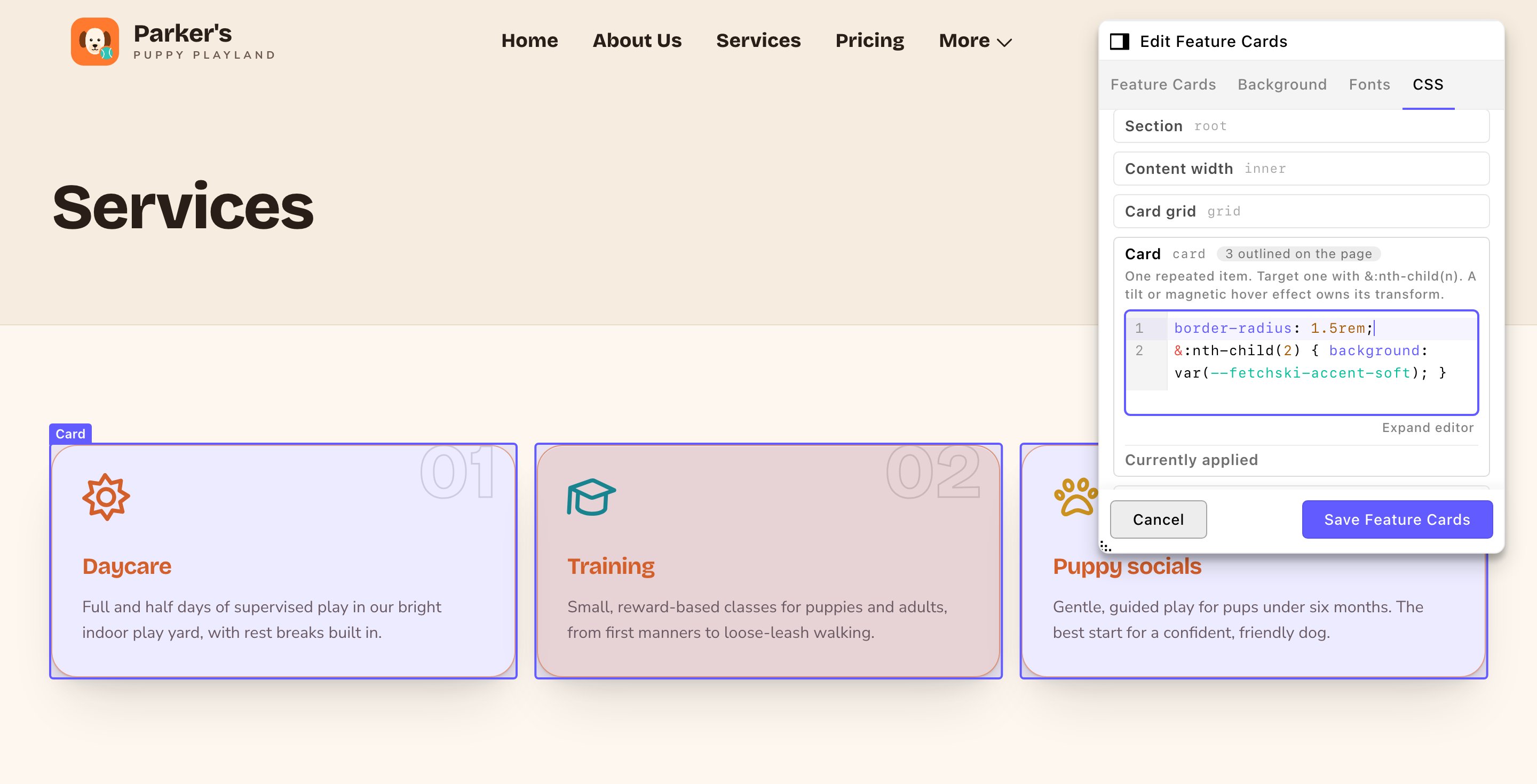
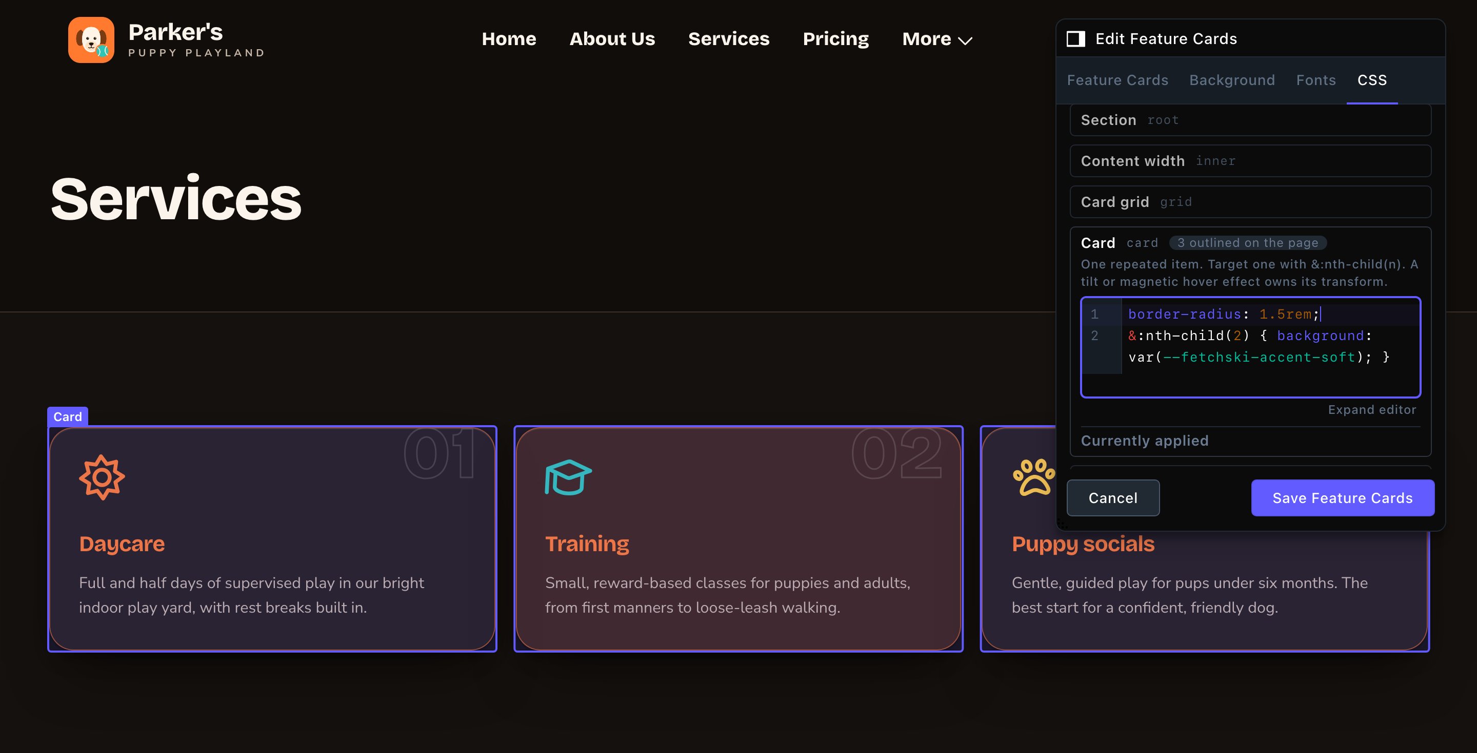
Point at a slot and its part is outlined on the page.
How a slot works
Each slot has the part’s name, a short note on what it styles and a code box.- Point at a slot and its part is outlined on the page. The slot’s title says “Outlined on the page”, or “Not on this page” when the part isn’t there.
- Expand editor gives you a taller code box. Shrink editor puts it back.
- Problems show as you type. Each one is listed under the slot as Error or Warning, with its line number.
- An empty slot changes nothing. The part keeps its built-in look and your site’s settings.
Your first CSS
A slot holds styles for its part, one per line. Each line names what to change, a colon, the new value and a semicolon. For example, to make every Feature Cards card title your Primary / brand color and a little larger:- In Site design → Custom CSS, open Feature Cards, then the Card title slot.
- Type these 2 lines:
- Choose Update, then open a page with a Feature Cards section to check it.
var(--fetchski-accent) means “my Primary / brand color”. rem is a size unit: 1rem is your site’s normal text size, so 1.5rem is one and a half times that. To undo it, empty the slot and choose Update.
Advanced: CSS reference
This section is for people who already write CSS. You don’t write a selector (the part of a CSS rule that says which element it styles): the slot already points at its part. Use& for the part itself in nested rules (a rule inside the slot that styles a state of the part, or something inside it).
- Use your palette colors. These names follow Site design → Colors and switch with light and dark. A plain color like
#625bffstays the same in both themes.
- Write for phones first. Write the phone look first, then larger screens with a media query (a rule that applies only from a screen width up),
@media (width >= …). Media queries that end at a width aren’t allowed, because they break the editor’s device preview. - Target the other theme with
[data-theme='light'] &or[data-theme='dark'] &. - Reach inside the part with
& aor& h2. Every nested rule starts with&, except a theme rule, which starts with[data-theme='light'] &or[data-theme='dark'] &. - Target states with
&:hover,&:focus-visible, or the part’s own states, such as&[aria-expanded='true']on an open question or&[aria-current='page']on the current page’s link. - Pick one card with
&:nth-child(2). A featured card also carries&[data-featured].
See what already styles a part
Every slot has a Currently applied list. It shows what styles the part today, before your CSS.- As it looks now: every rule that styles the part at this screen width and theme, strongest first. A rule that another one beats is struck through. “Overridden by this slot” means your CSS beats it.
- States: hover, focus, active…: the rules for hover, focus and other states.
- Settings these rules read: the settings behind the rules, such as a section’s background or a button’s colors, with their values.
- Copy rule: copies a rule into your slot, ready to change. A rule copied this way no longer follows the setting it came from, so copy only what you mean to change.
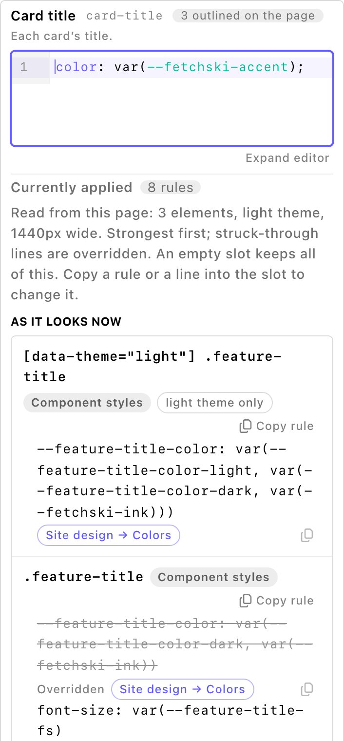
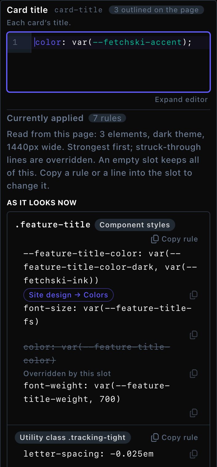
Currently applied shows what styles the part, strongest first.
Which CSS wins
- A section’s own CSS tab wins over the Design layer.
- The Design layer wins over the part’s built-in look and your settings.
A short example
Parker’s Puppy Playland wants every card title in its accent color, and one standout card on the home page.- Jordan opens Site design → Custom CSS, opens Feature Cards, then the Card title slot, and types
color: var(--fetchski-accent);. - Jordan chooses Update. Every Feature Cards section on the site now has accent titles.
- On the home page, Jordan opens the Feature Cards section’s CSS tab, opens the Card slot, and types
&:nth-child(2) { background: var(--fetchski-accent-soft); }. - Jordan closes the editor and publishes the page. Only the second card on the home page gets the soft accent background.
What CSS can’t change
- Movement that runs on its own. Scroll effects, the scrolling ribbons, card tilt and similar motion control their own position and fading. Style the part around them instead.
- Sizes worked out for the layout. Gallery tile placement, column widths in a Layout section, device frames and maps size themselves. Only the parts around them can be styled.
- Clipped edges. Some cards and ribbons hide anything that spills over their edge, so a large shadow can be cut off.
Troubleshooting
CSS with an Error is never saved. The CMS lists every problem, with what to write instead. These are the ones you’re most likely to see.colr isn’t a CSS property. Did you mean color?
colr isn’t a CSS property. Did you mean color?
x needs a ; at the end: every property: value ends with ;.
x needs a ; at the end: every property: value ends with ;.
color: var(--fetchski-accent);.max-width media queries aren’t allowed
max-width media queries aren’t allowed
@media (width >= 48rem). The < character isn’t allowed either, so width < 48rem is refused too.ids (#x) aren’t allowed in custom CSS selectors.
ids (#x) aren’t allowed in custom CSS selectors.
&. To pick one item, use &:nth-child(2).nested selectors must start with &, the part itself
nested selectors must start with &, the part itself
& a to reach links inside the part. To style the part itself, put the styles straight in the slot, and use &:hover for its states.url isn’t allowed: custom CSS can only use images from this site’s uploads
url isn’t allowed: custom CSS can only use images from this site’s uploads
url(), such as background-image: url('/uploads/attachments/parkers-paws.webp');. Fonts can come from fonts.bunny.net or fontshare.@font-face isn’t allowed in custom CSS: add fonts in Site design → Typography.
@font-face isn’t allowed in custom CSS: add fonts in Site design → Typography.
@import and @container aren’t allowed either.#zz isn’t a valid hex color
#zz isn’t a valid hex color
#625bff. Or use a palette color, such as var(--fetchski-accent).this slot is N kB; the limit is 8 kB per slot.
this slot is N kB; the limit is 8 kB per slot.
This section's CSS has errors and isn't applied.
This section's CSS has errors and isn't applied.
Custom CSS needs the “Write custom CSS” permission. Saving keeps the CSS as it is.
Custom CSS needs the “Write custom CSS” permission. Saving keeps the CSS as it is.
Good to know
- Try the built-in options first. Background, Fonts, button and card options follow your palette and both themes for you. Custom CSS is for the touches they don’t cover.
- The Design layer has no preview. Choose Update, then check a page that uses the part. A section’s CSS tab updates the page as you type.
- CSS travels with its section. Copy a section, or save it in a page template, and its CSS comes along.
- Cards from shared lists have no CSS of their own. A testimonial or team member shows in every section that lists it. Style it in that section’s Card slot. Use
&[data-featured]for the ones with Featured turned on in their own settings, or&:nth-child(2)for the second card. - Check both themes. Switch your site between light and dark to see your CSS in each.
- FetchskiAI can help. Admins and Owners can ask the FetchskiAI Agent to write custom CSS. It writes into the same slots.