

 AdonisJS
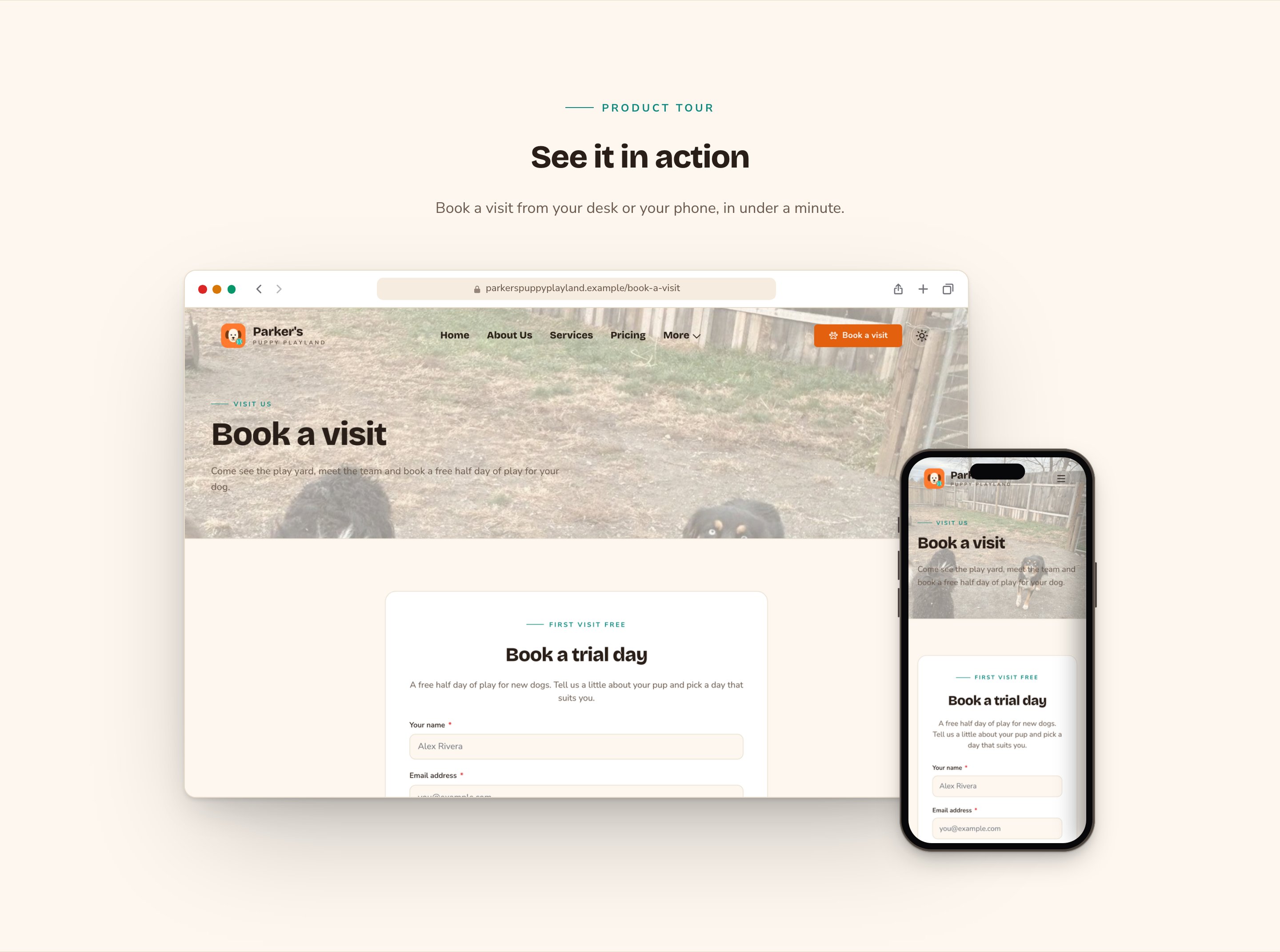
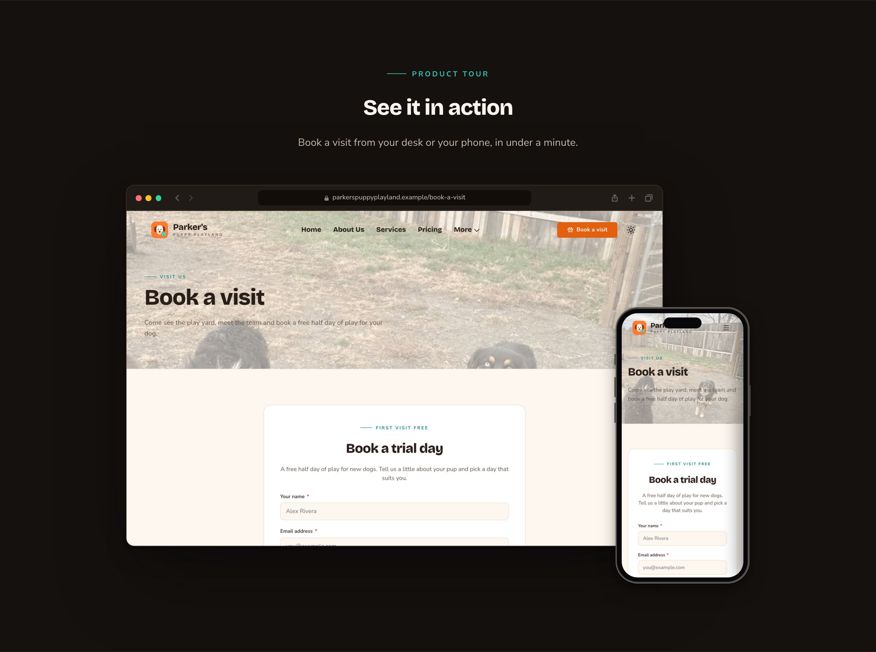
A desktop and a phone, side by side, showing your screens.
When to use it
- To show your online booking, app or customer portal without a long explanation.
- To show how your website looks on a phone and on a computer.
- To play a short screen recording of a task, such as booking a visit.
Add it to a page
1
Open the page
Sign in, open the page on your site, and choose Edit in the edit bar at the top.
2
Find the spot
Select the section next to where the new one should go. A round + button appears on its top and bottom edges. On an empty page, choose Add Content in the middle.
3
Choose the section
The Add Content menu opens with its groups. Choose the section, then select it and choose Edit in its side toolbar to make it yours.
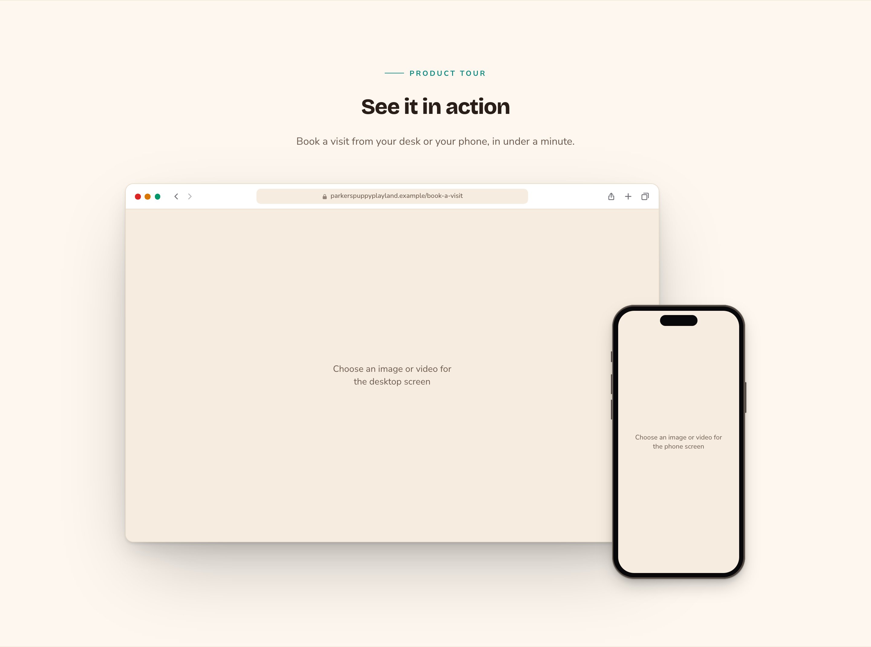
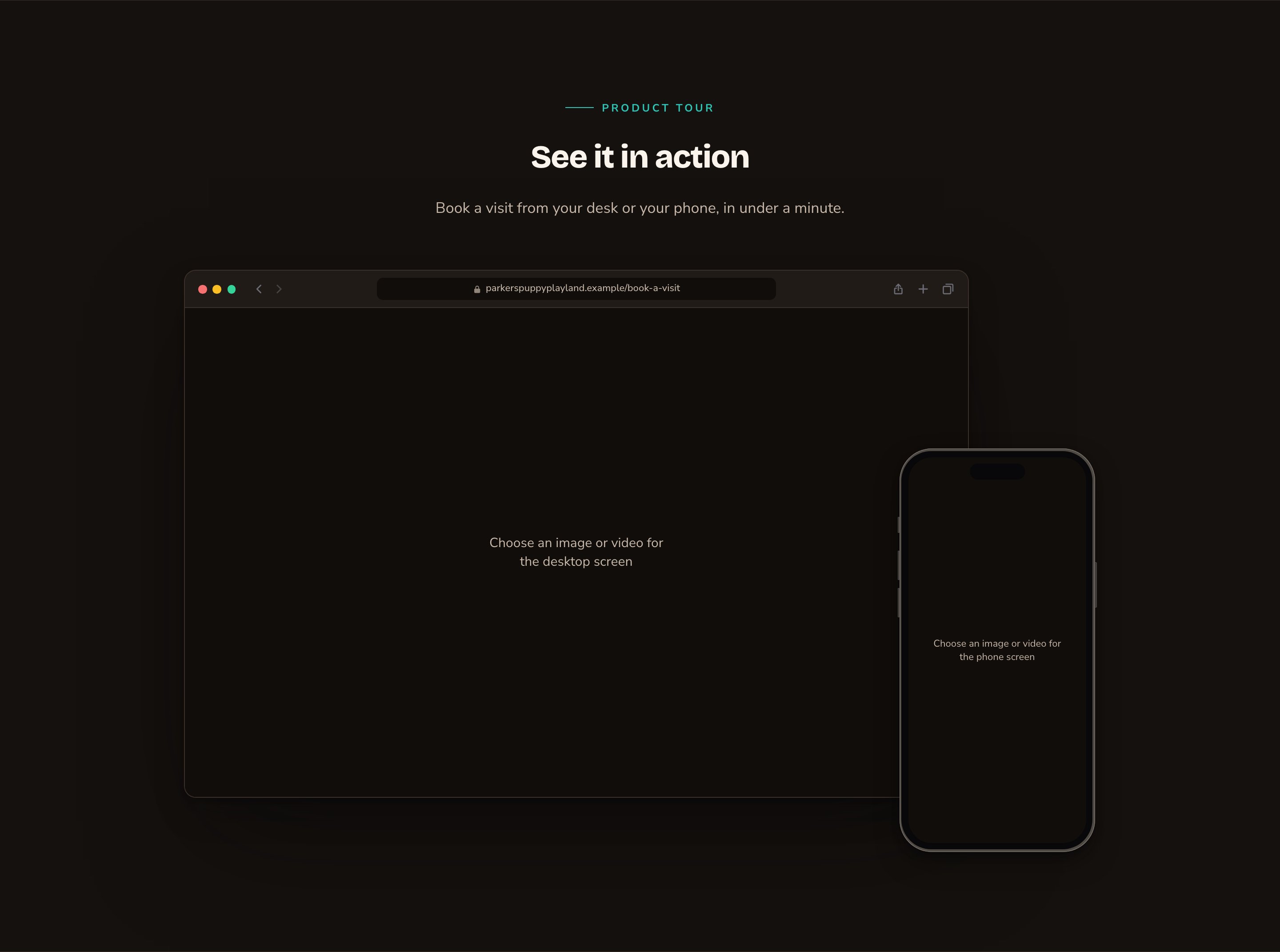
Empty screens tell you what to add.
What you can change
Select the section on the page and choose Edit. The editor opens beside the page, so you see each change as you make it. Its tabs are Device mocks, one tab per screen (TV screen, Desktop screen, Phone screen), then Background, Fonts, Button and CSS. Only the screen tabs for your arrangement appear: a Duo shows Desktop screen and Phone screen. Your changes go into the page’s draft. Visitors see them once the page is published with Update in the edit bar (Publish on a page never published).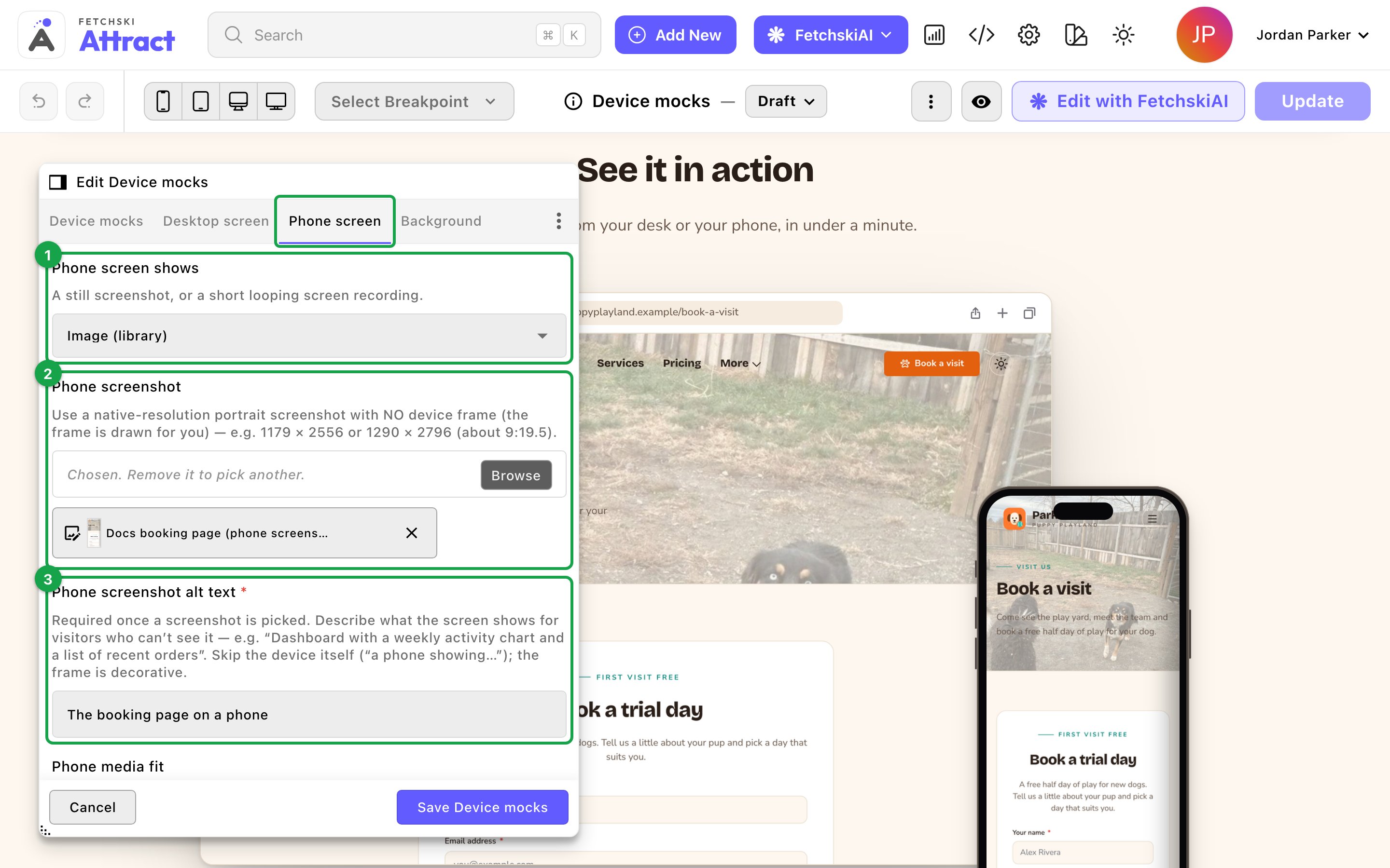
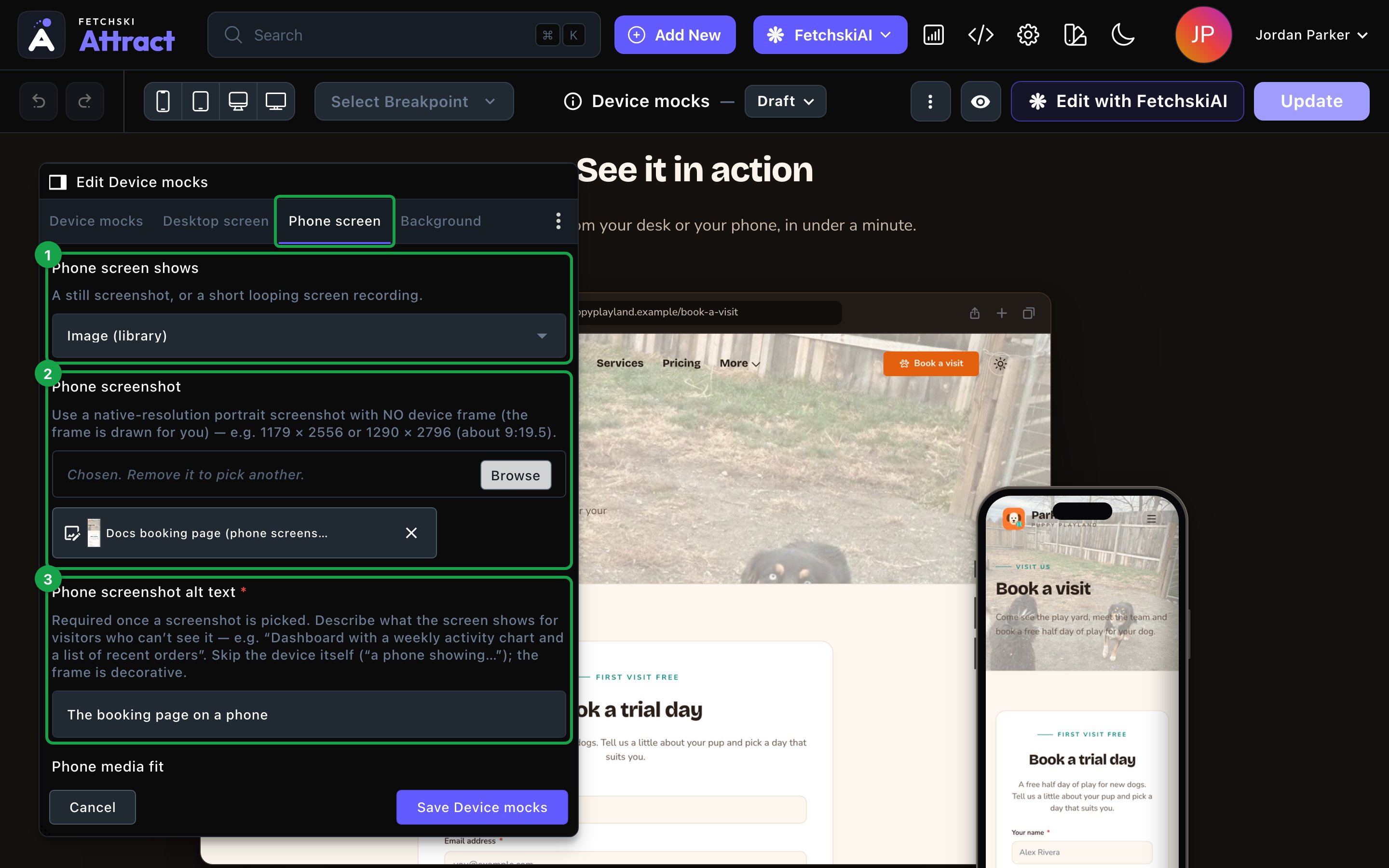
Each device has its own screen tab.
Device mocks
Device mocks
Which devices to show, where the text goes, and the text itself.Devices
- Arrangement: which devices to show.
- Duo — desktop + phone: a phone overlaps the corner of a desktop browser. It suits most apps and websites.
- Trio — TV + desktop + phone: adds a TV behind them. On narrow screens it shows as a Duo, so the devices stay readable.
- Desktop browser only, Phone only or TV only: one device on its own.
- Text placement: Above (centered) puts the text over the devices. Left of the devices or Right of the devices puts it in a column beside them, and on narrow screens above them. None (devices only) hides the eyebrow, heading and intro. A caption still shows under the devices.
- Device size: Compact, Normal or Large.
- Desktop screen shape: 16:10 (laptop) or 16:9 (widescreen). Match the shape of your desktop screenshots.
- Browser address bar text: the web address shown at the top of the browser, “app.example.com” to start. It’s for show and isn’t a link.
- Draw a phone status bar: draws a time, signal and battery bar across the top of the phone screen. Leave it off for phone screenshots, which already include one. Status bar time sets its clock, “9:41” to start.
- Show pause button on background motion: a pause button under the devices that stops their videos. It appears once a screen uses a video, and it’s on to start.
- Show eyebrow and Eyebrow: a small line above the heading, “Product tour” to start.
- Heading and Intro: “See it in action” and a short sentence to start. Clearing the heading hides only the heading. To show just the devices, set Text placement to None (devices only) and clear the caption.
- Caption (optional): a short line under the devices.
TV screen, Desktop screen and Phone screen
TV screen, Desktop screen and Phone screen
Each screen tab has the same options, named for its device. Below are the Phone screen tab’s labels. On the TV screen and Desktop screen tabs, the same options start with “TV” or “Desktop” instead, such as Desktop screen shows.
- Phone screen shows: Image (library) for a still screenshot, or Video loop (library) for a short screen recording.
- Phone screenshot: choose the screenshot from your Images library. The help under it gives the best size for that device.
- Phone screenshot alt text: describe what the screen shows, such as “Booking calendar with three open play times”. It’s required once you choose a screenshot. Skip the device itself, since the frame is just decoration.
- Phone video: choose the recording from your Videos library.
- Phone video description: a short description of what the recording shows, read to screen reader users. It’s recommended.
- Phone media fit: Fill the screen (crop) fills the whole screen. Fit inside the screen shows all of it, with bars if the shapes differ.
- Phone media anchor: Top, Center or Bottom, the part that stays in view when the media is cropped. Top keeps an app’s header in view.
Background
Background
A background color for the whole section, set separately for the dark and light themes. It starts as Transparent (page background). See What every section shares.
Fonts
Fonts
Use a different typeface for parts of this section only, such as the heading. Leave it empty to use the page’s fonts, which normally come from Site design → Typography. See What every section shares.
CSS
CSS
Custom styles for this section only. Admins and Owners can change this tab. See Custom CSS.
Looks you can make
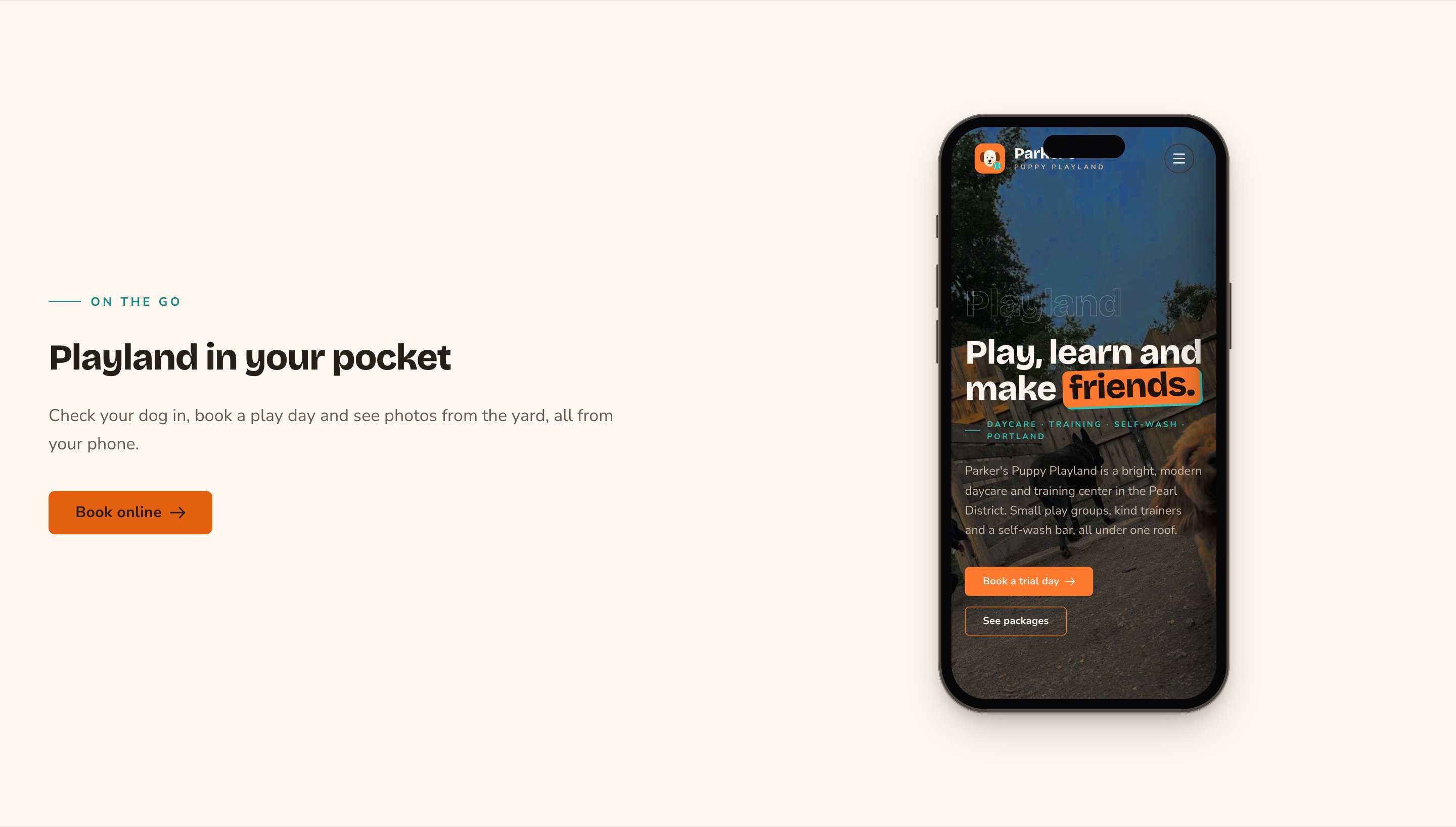
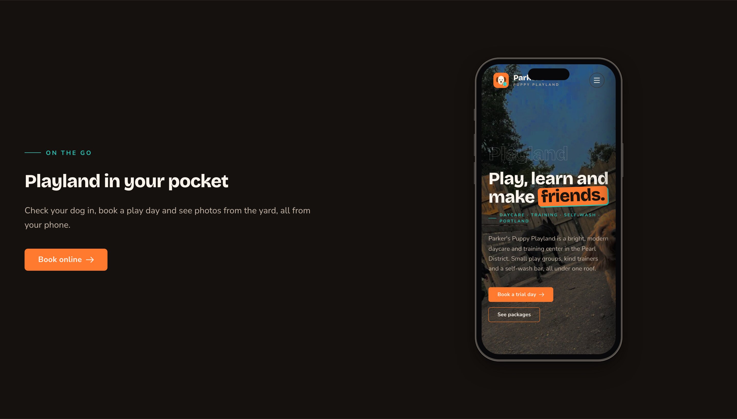
One phone beside your text and a button.
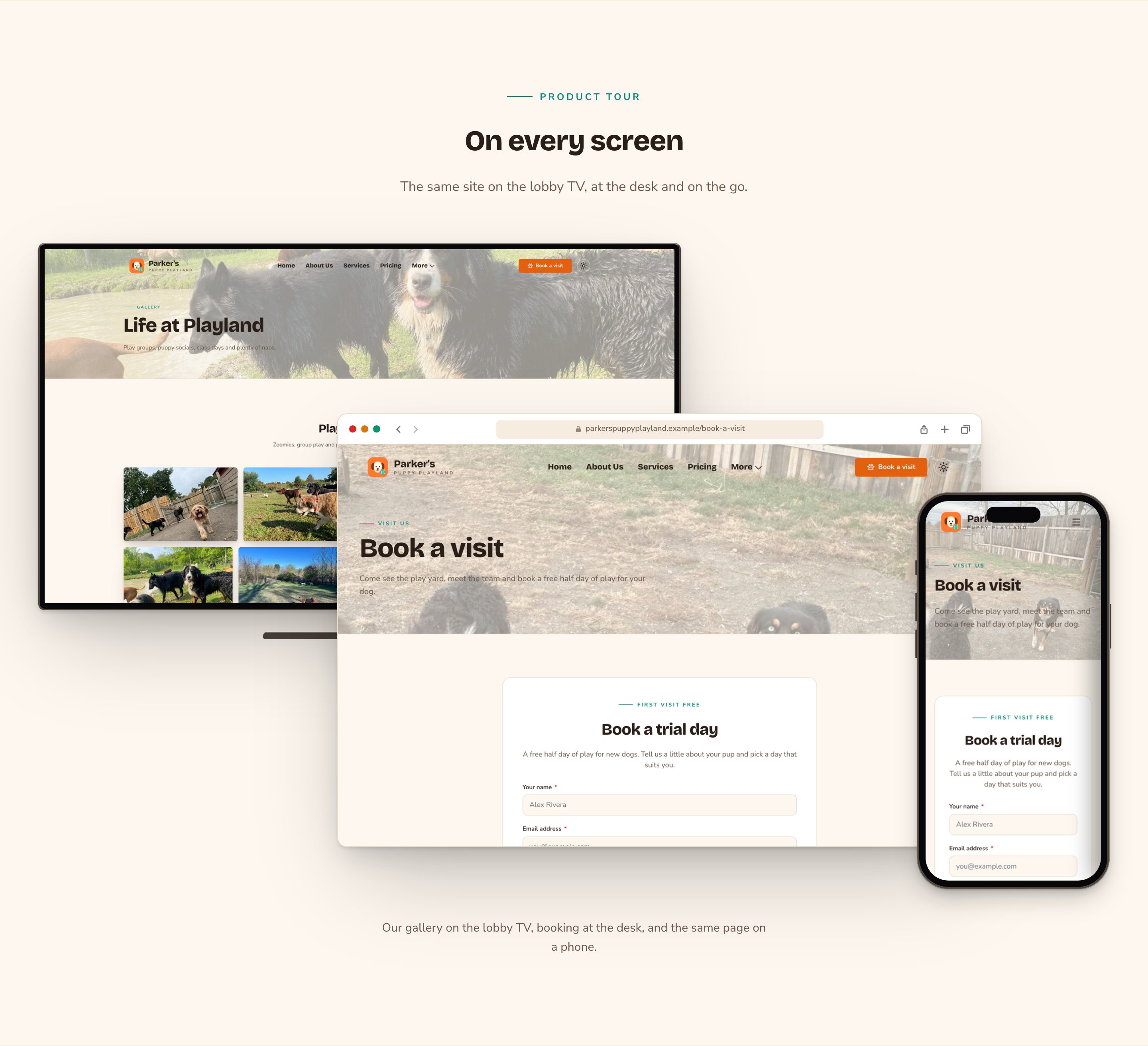
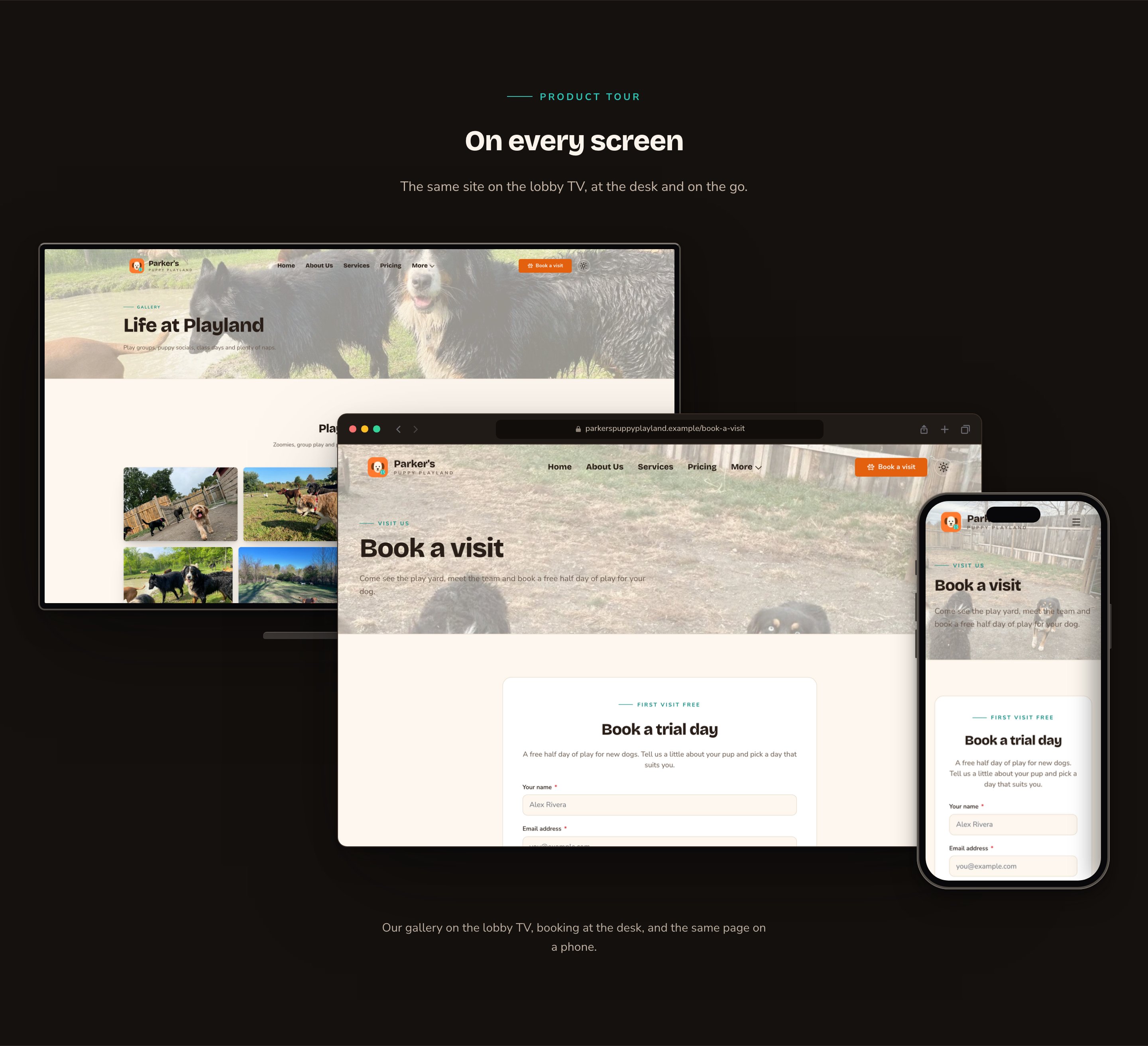
A Trio shows every screen at once.
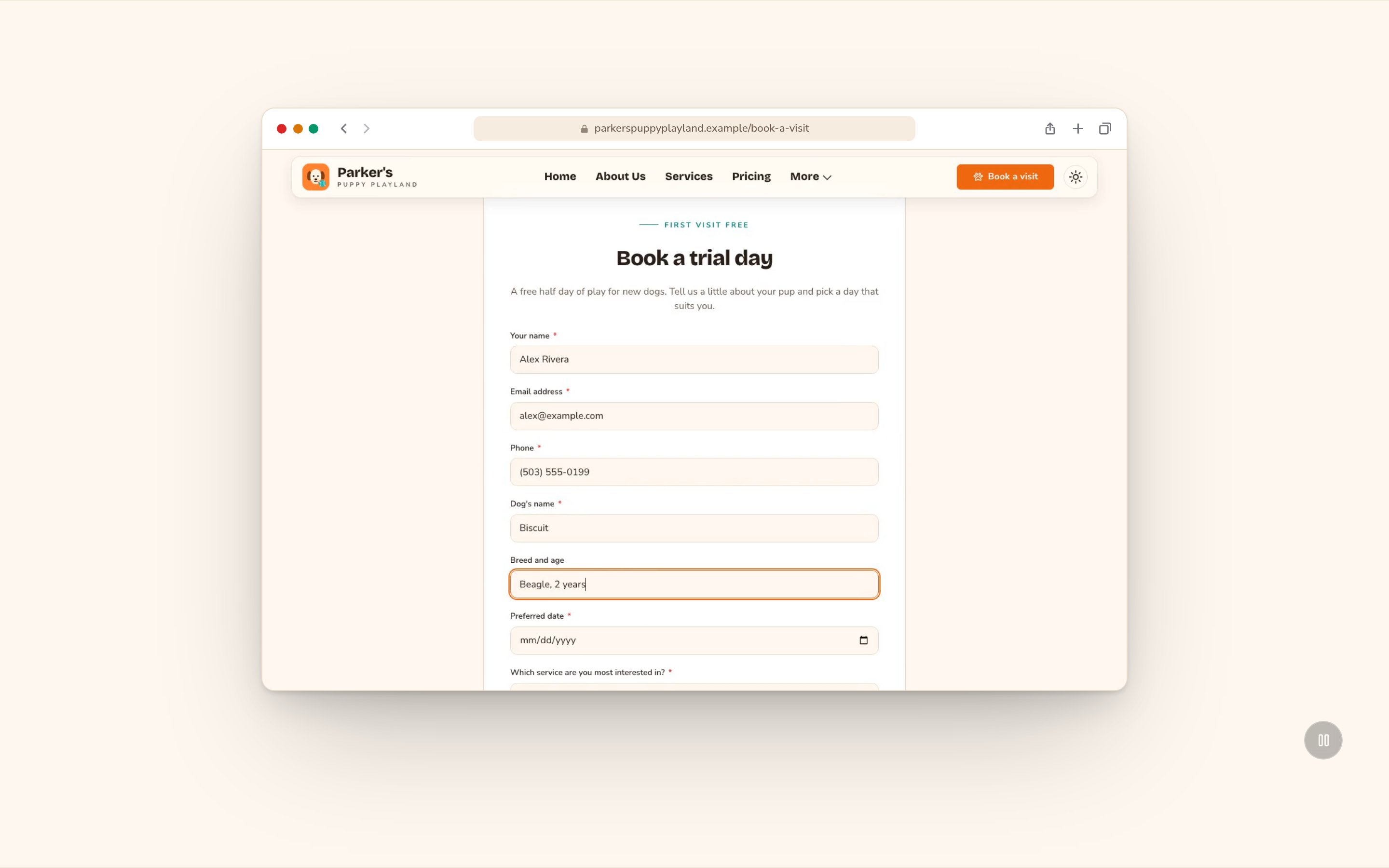
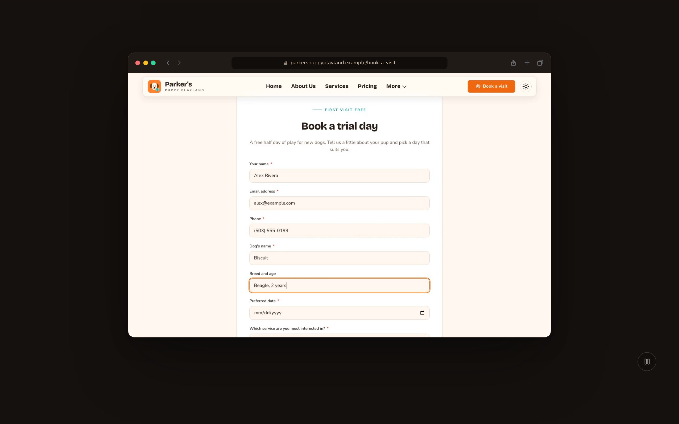
A short screen recording, with a pause button under it.
Good to know
- Use plain screenshots. Capture just the screen, with no device frame or browser toolbar, since the section draws those for you. Phone screenshots should be portrait.
- Finding your Videos library. Open the command palette (press ⌘K, or Ctrl+K on Windows) and choose Videos under Manage.
- Keep recordings short and light: about 5 to 15 seconds, under about 10 MB, with no sound. Give each one a Poster / fallback image in the Videos library: visitors see it first, and visitors who prefer less motion only ever see it.
- Videos play only when they’re on screen, and pause when visitors scroll away, so they don’t slow the page down.
- Keep the pause button on whenever a screen plays a video, so visitors can stop the motion.
- Animations play for visitors only. While you edit, the devices show in place. Visitors who prefer less motion also see them without animation.
Appearance options
Most sections also share a few tabs that work the same everywhere:- Background: set the color behind the section, separately for the dark and light themes.
- Fonts: use a different typeface for parts of this section only.
- CSS: add custom styles to this section. Admins and Owners can change it.
Related
Media + Text block
a photo or video beside text, row by row.
Side-by-side layouts
put a device beside other content.
The media library
upload screenshots and recordings.
Motion
turn site animations on or off.