

 AdonisJS
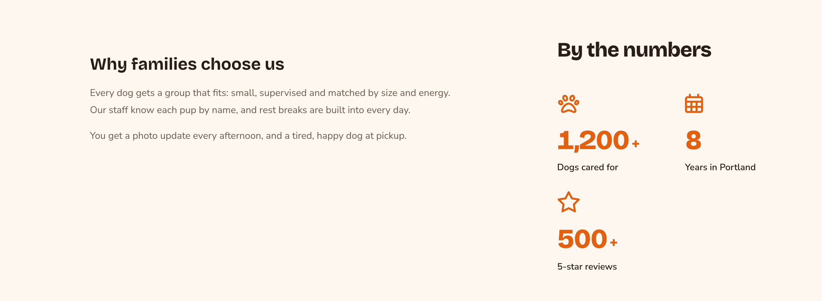

A Layout puts text and numbers side by side.
Before you start
- Open the page on your site and choose Edit in the edit bar.
- A Layout has 2 modes, switched at the top of the Layout when you select it. Edit Columns changes the columns. Edit Content changes what’s in them.
Add a Layout
1
Select a section next to where the columns should go, and choose the round + button above or below it
2
In the Add Content menu, open the Layout group and choose Layout
Arrange the columns
1
Switch to columns
Select the Layout and choose Edit Columns. The grid behind the columns shows.
2
Add a column
Choose an empty spot in the grid to add a column there. In a Layout with no columns yet, choose Add Column.
3
Resize a column
Drag its left or right edge. Columns snap to the grid as you drag.
4
Move a column
Drag it by its move handle (Move Column) to a new place in the row.
5
Remove a column
Choose Delete Column (the trash can) on the column. Everything inside the column goes with it. Removed one by mistake? Choose undo (the curved arrow at the top left of the edit bar).
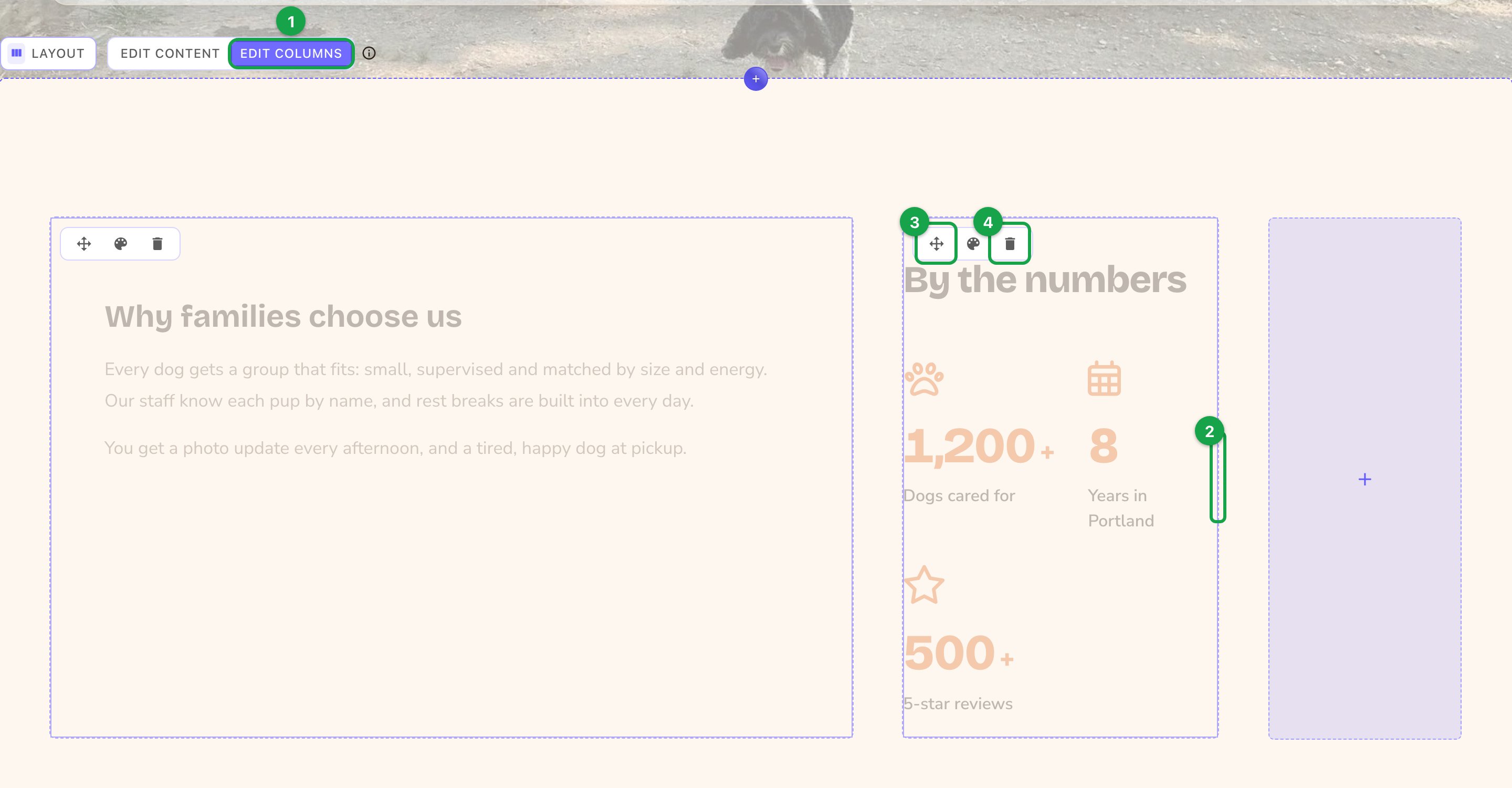
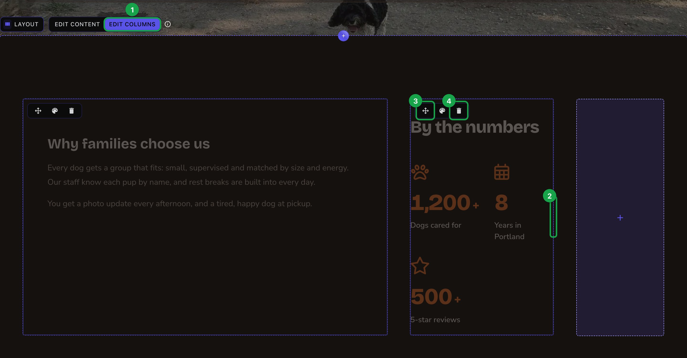
Edit Columns: add, resize, move and remove columns.
Fill the columns
1
Switch to content
Select the Layout and choose Edit Content.
2
Add something to a column
Choose Add Content in the column and pick from its menu.
3
Edit it
Select it and edit it like any section. A column can hold more than one thing, stacked one under another.
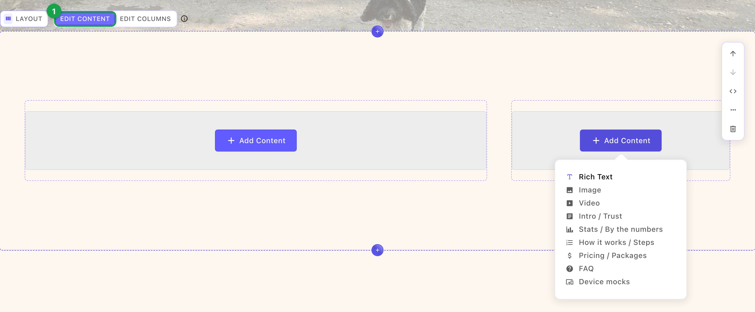
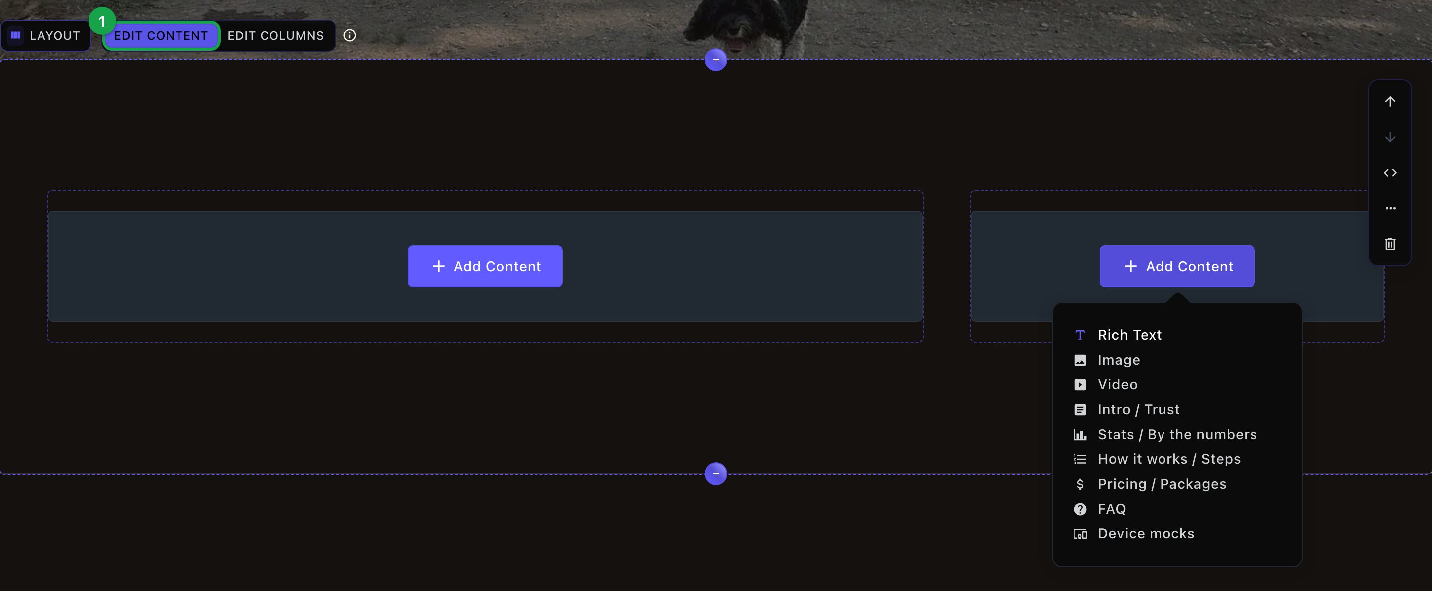
Edit Content: each column has its own, shorter Add Content menu.
What fits in a column
A column takes things that still read well at half or a third of the page:- Rich Text, Image and Video
- Intro / Trust, Stats / By the numbers and How it works / Steps
- Pricing / Packages, FAQ and Device mocks
Column options
Each column has its own options. Select the column and choose its style button (the palette icon).- Visible on tablet and Visible on mobile: turn one off to hide the column on that screen size. Visitors on a computer still see it.
- Horizontal alignment and Vertical alignment: where the column’s content sits inside the column. The choices include Left, Center, Right, Top, Middle and Bottom, or stretch to fill.
How columns fit smaller screens
You set the columns for computers. Smaller screens rearrange them for you:- Tablets show 2 columns per row. If a row has an odd number, the last one goes full width.
- Phones show 1 column per row, in the order they sit on the page.
What happens next
Your changes stay in the page’s draft until someone publishes it with Update. Editors, Admins and Owners can publish. Contributors submit their changes for review. See Drafts, publishing and scheduling.Good to know
- A Layout has no section editor. You change it right on the page. Move or remove the whole Layout from its side toolbar, like any section.
- Spacing is automatic. The gap between columns matches the gap between things stacked in one column.
- You can use a Layout in blog posts too: in a post’s Body and in its After content, the space below the post’s text. Press ⌘K (Ctrl+K on Windows), choose Blog Posts under Manage, open the post, and use its Content or After Content tab.
- Custom CSS: Admins and Owners can style a Layout with the Custom CSS button on its toolbar.
Troubleshooting
Edit Columns" is grayed out ("Disabled on small screens")
Edit Columns" is grayed out ("Disabled on small screens")
Changing columns needs a wider window. Make your browser window wider, or use a computer.
A column is missing on my phone
A column is missing on my phone
Its Visible on mobile option is off, so you can’t select the column in the phone view. Go back to full size first: choose Clear Breakpoint (the × beside the device name in the edit bar). Then select the column, open its options and turn Visible on mobile back on. Choose the phone device button again to check it.
Related
Add, move and remove sections
the Add Content menu and the side toolbar.
Preview on phones and tablets
check how columns stack.
Rich Text
write text in a column.
Media + Text block
a picture beside text, without columns.