

 AdonisJS
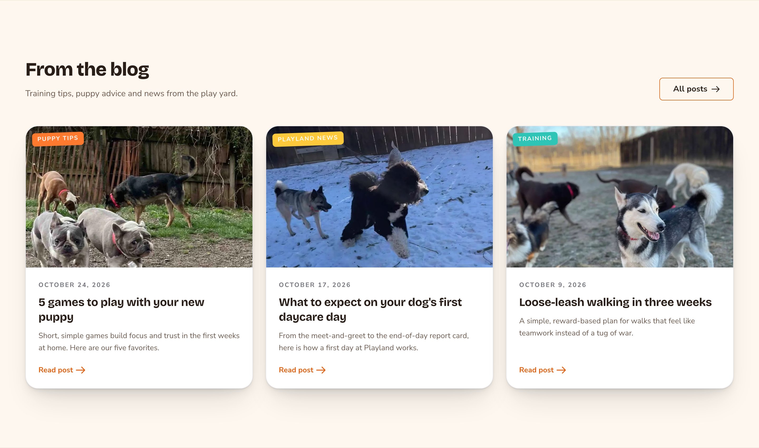
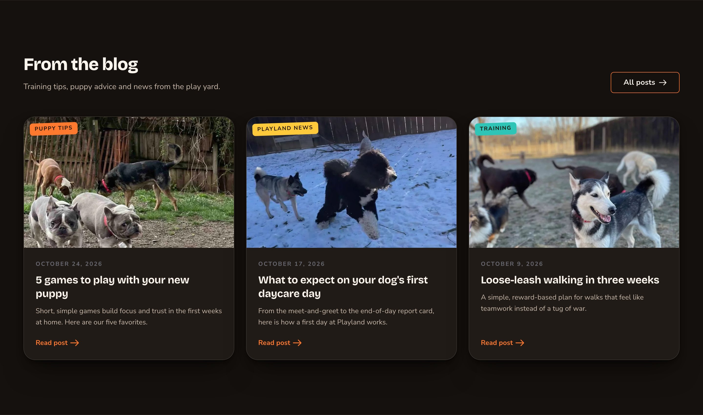
Your newest posts, with a button to the full blog.
When to use it
- To show visitors your business is active, right on your home page.
- To point readers to more posts at the bottom of a blog post.
- To pair news or tips with a related page, such as a training page.
Where the posts come from
You don’t pick posts in the section. It shows up to 3 of your newest posts, newest first, by each post’s Publication Date. To change a post’s place, change its Publication Date on the post’s Basics tab. You write posts in the Blog Posts manager: press ⌘K (Ctrl+K on Windows) and choose Blog Posts under Manage. Each card uses the post’s main picture (its featured image), title, short summary (its excerpt), category, date and author. See Blog for how to write posts and set up categories.Add it to a page
1
Open the page
Sign in, open the page on your site, and choose Edit in the edit bar at the top.
2
Find the spot
Select the section next to where the new one should go. A round + button appears on its top and bottom edges. On an empty page, choose Add Content in the middle.
3
Choose the section
The Add Content menu opens with its groups. Choose the section, then select it and choose Edit in its side toolbar to make it yours.
What you can change
Select the Blog Preview on the page and choose Edit. The editor opens beside the page, so you see each change as you make it. It has five tabs. Your changes go into the page’s draft. Visitors see them once the page is published with Update in the edit bar (Publish on a page never published).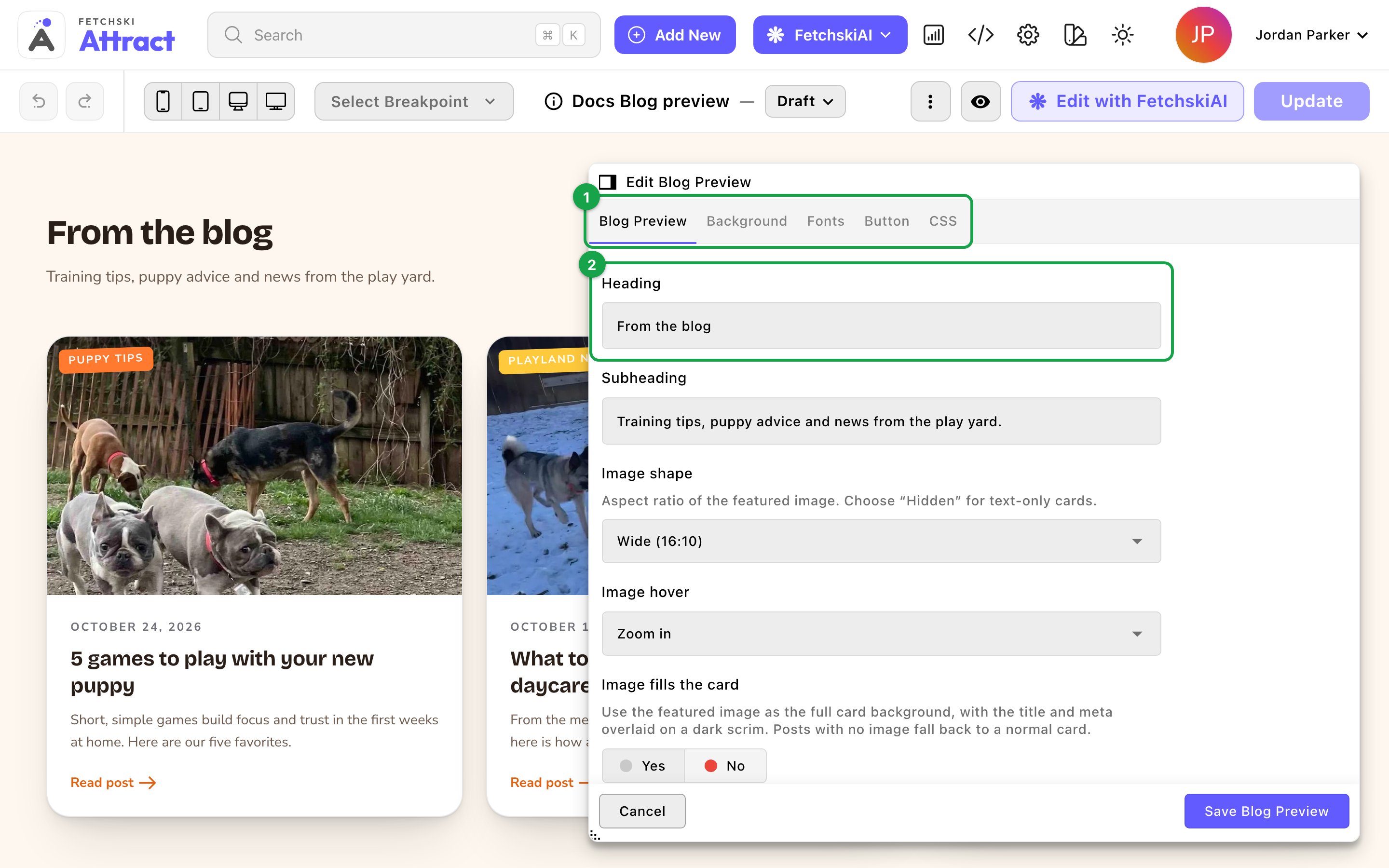
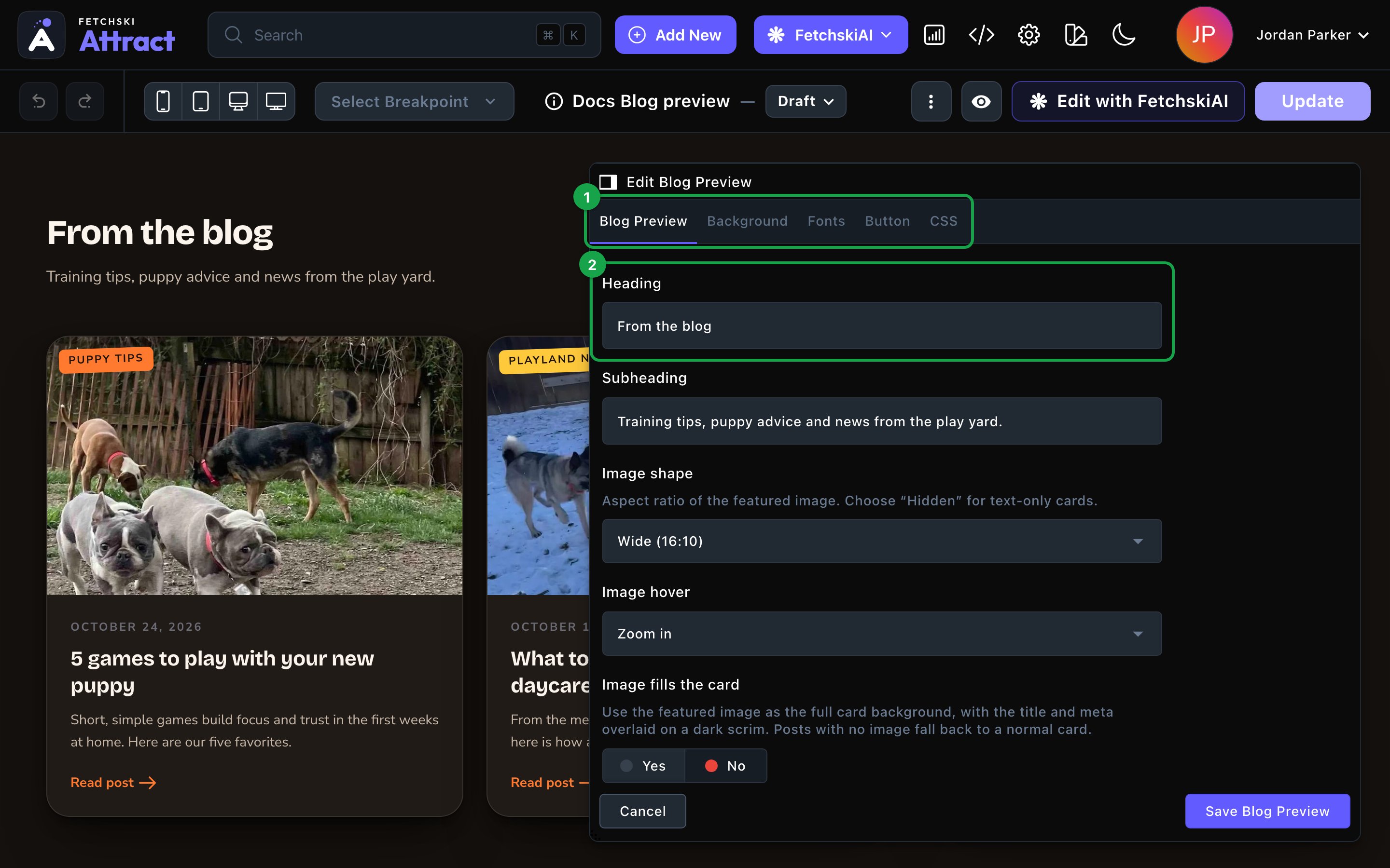
The Blog Preview editor, with the section updating beside it.
Blog Preview
Blog Preview
The heading and how each post card looks.Heading
- Heading: the section’s title. The default is “From the blog”.
- Subheading: one short line under the heading. Clear it to hide it.
- Image shape: Wide (16:10), Photo (4:3), Classic (3:2) or Square (1:1). Choose Hidden (no image) for text-only cards.
- Image hover: Zoom in or None.
- Image fills the card: the photo becomes the whole card, with the title over a dark band. Posts without a photo keep a normal card.
- Card style, Card corners and Card hover effect: the card’s frame, its corners and what it does on hover. See Buttons and card styles.
- Hover accent color: the color of the hover effect. Leave it empty to use your site’s accent color.
- Show category: the post’s category badge, a small label with the category’s name. Category badge style can be Filled, Outline or Minimal. Each category’s color is set in the Blog Categories manager: press ⌘K (Ctrl+K on Windows) and choose Blog Categories under Manage. See Blog.
- Show date, Show excerpt and Show author: turn each one on or off. Excerpt lines sets how many lines of the excerpt show.
- Show “Read post” link: the link at the foot of each card. “Read post” placement can be Auto (per layout), Below the text or Right side. This section always shows its cards in a grid, so Auto (per layout) puts the link below the text.
Background
Background
Give the section its own background color, from your site’s palette or a custom color. See What every section shares.
Fonts
Fonts
Use a different typeface for parts of this section only, such as the heading. Leave it empty to use the page’s fonts, which normally come from Site design → Typography. See What every section shares.
CSS
CSS
Custom styles for this section only. Admins and Owners can change this tab. See Custom CSS.
Looks you can make
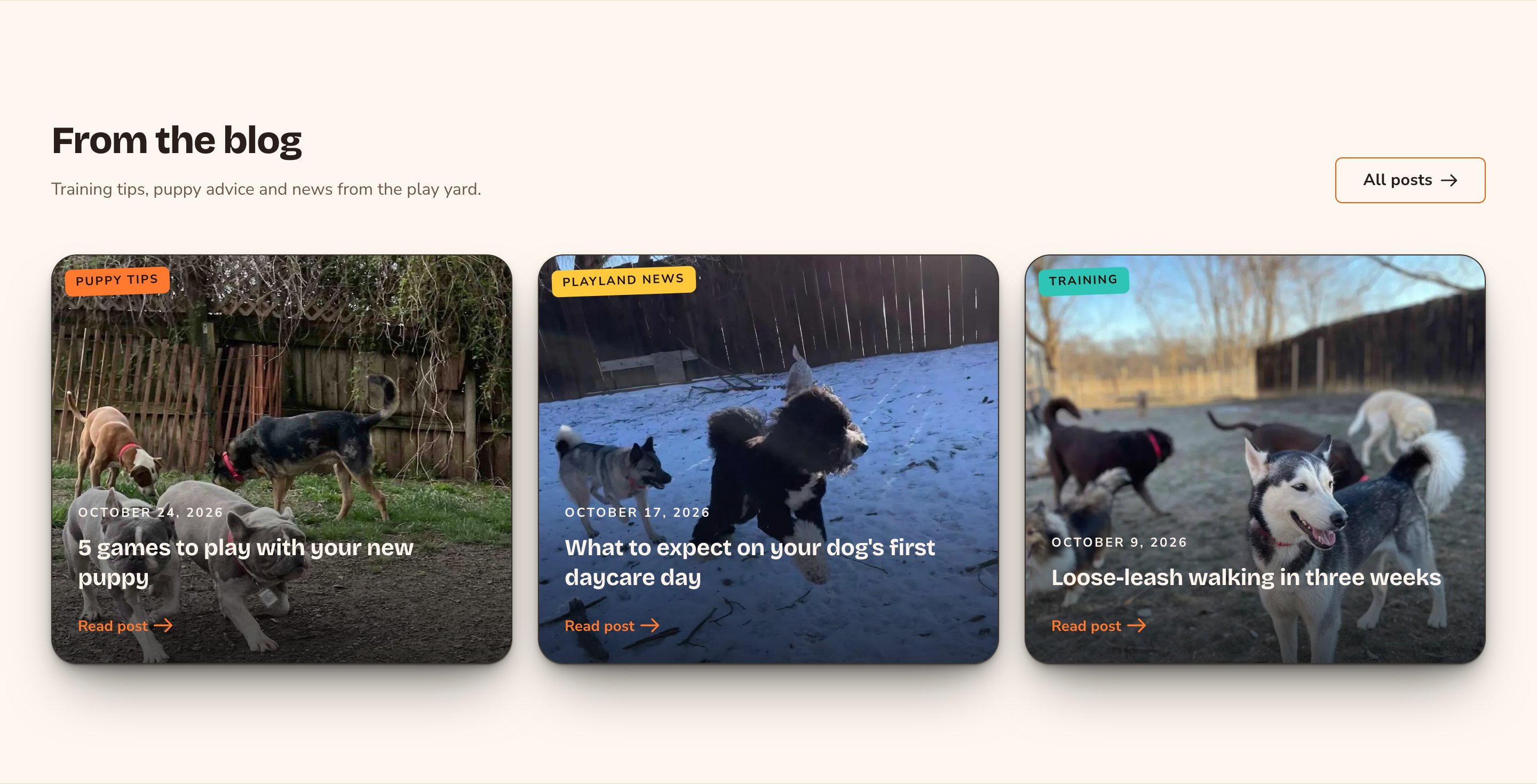
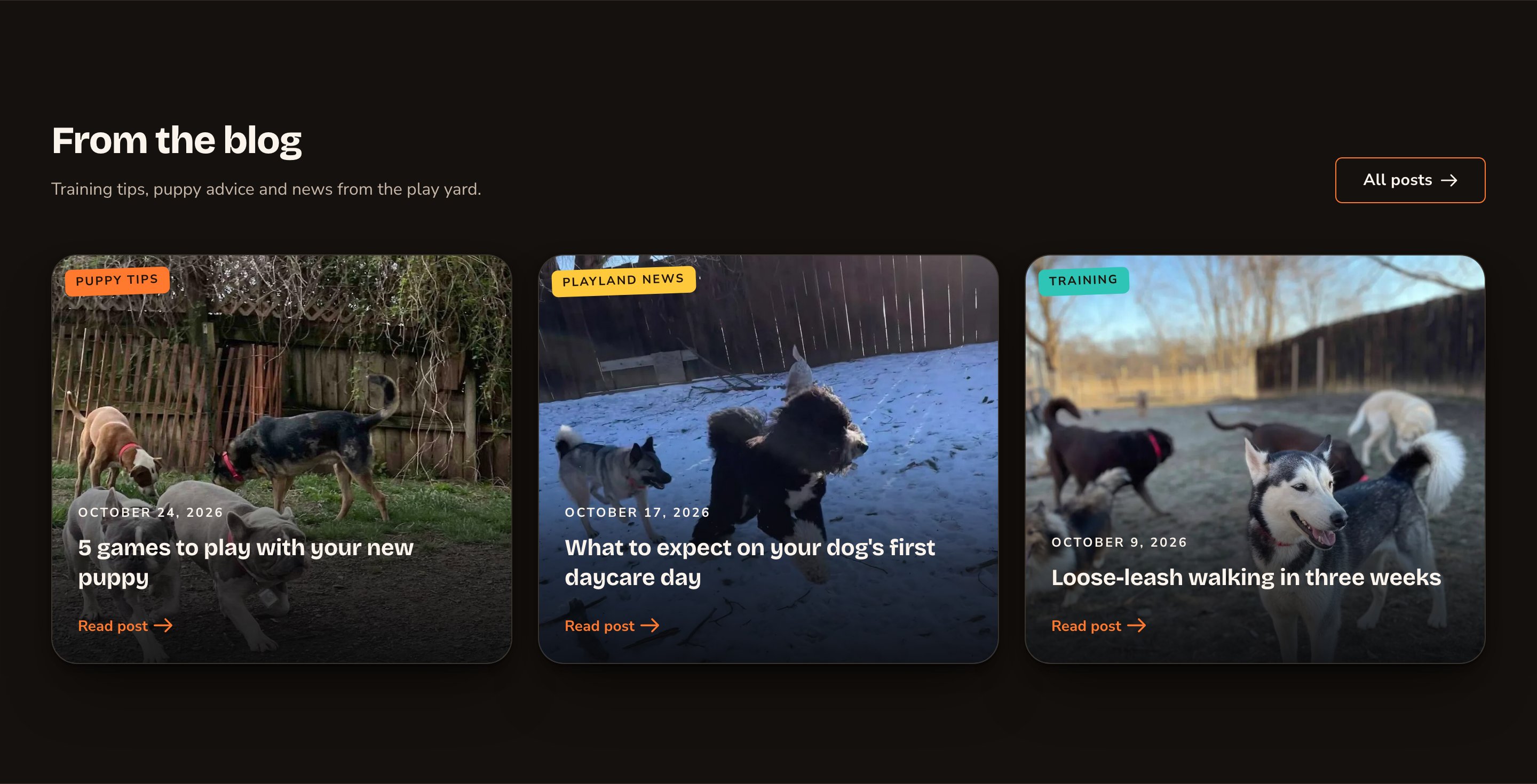
Image-filled cards put your photos first.
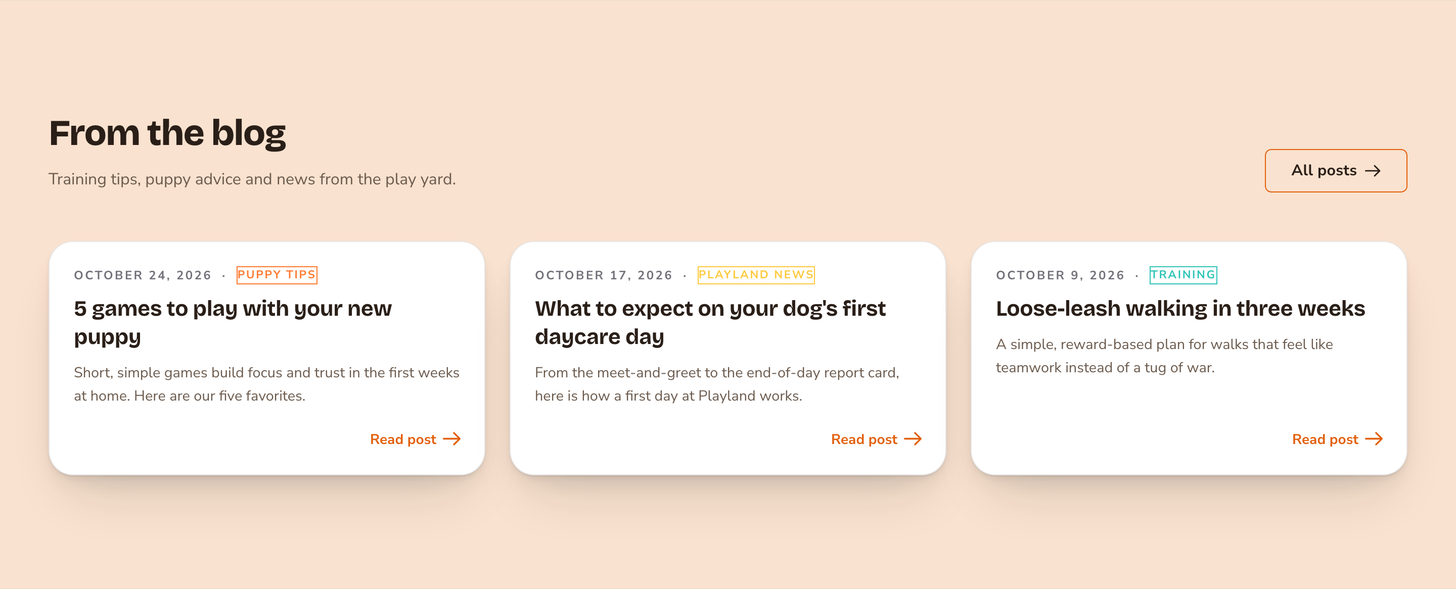
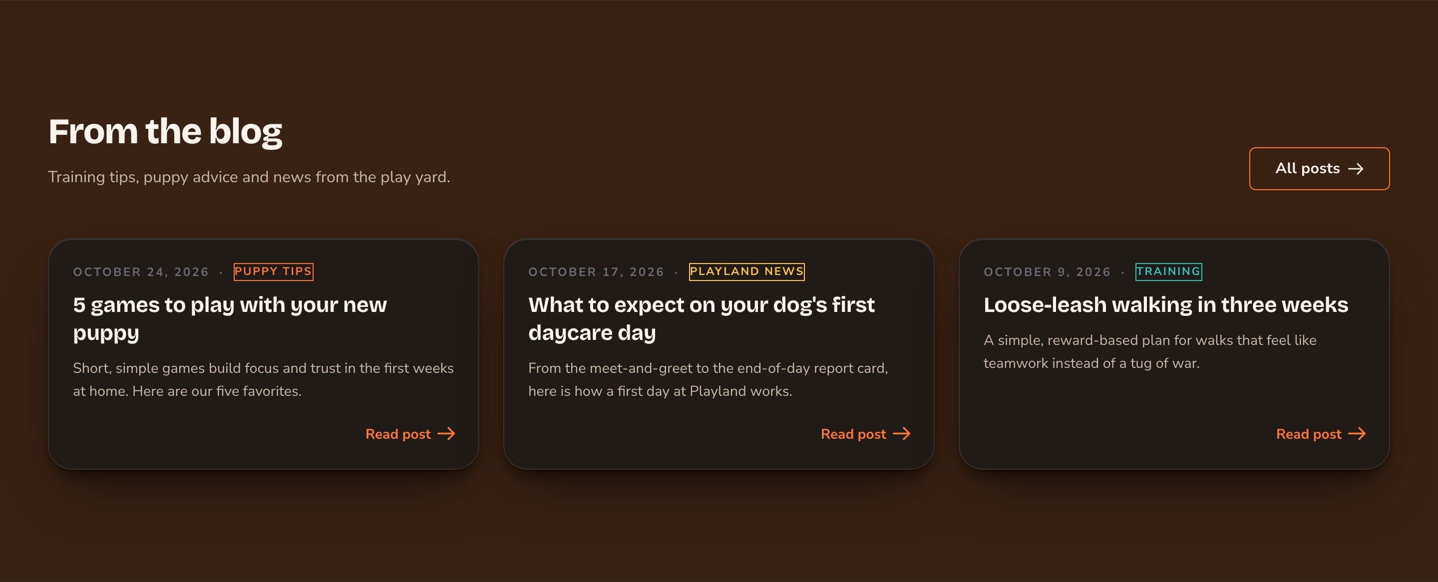
Text-only cards suit news and quick tips.
Good to know
- No posts, no section. With no posts to show, the section stays hidden, even while you edit. It appears once your blog has a post.
- Up to 3 posts. With 3 posts, the cards sit side by side on wide screens, 2 per row on tablets, and stacked on phones. With 1 or 2 posts, the cards keep the same width and the rest of the row stays empty.
- Drafts show while you edit. You see posts you haven’t published yet. Visitors see only your newest published posts.
- Where it fits. Blog Preview is a full-width section. It isn’t offered inside columns or in a post’s Body.
- Write alt text for your post photos, so every card makes sense to screen reader users. Alt text is a short description that screen readers read aloud, such as “Two puppies playing tug-of-war on the lawn”. To add it, open the command palette (⌘K, or Ctrl+K on Windows), choose Images, choose the photo, and fill in Alt Text. See The media library.
Appearance options
Most sections also share a few tabs that work the same everywhere:- Background: set the color behind the section, separately for the dark and light themes.
- Fonts: use a different typeface for parts of this section only.
- CSS: add custom styles to this section. Admins and Owners can change it.
Related
Blog
write posts, add categories and authors, and set up your blog page.
Buttons and card styles
every card style and hover effect.
What every section shares
background, fonts and custom styles.