

 AdonisJS
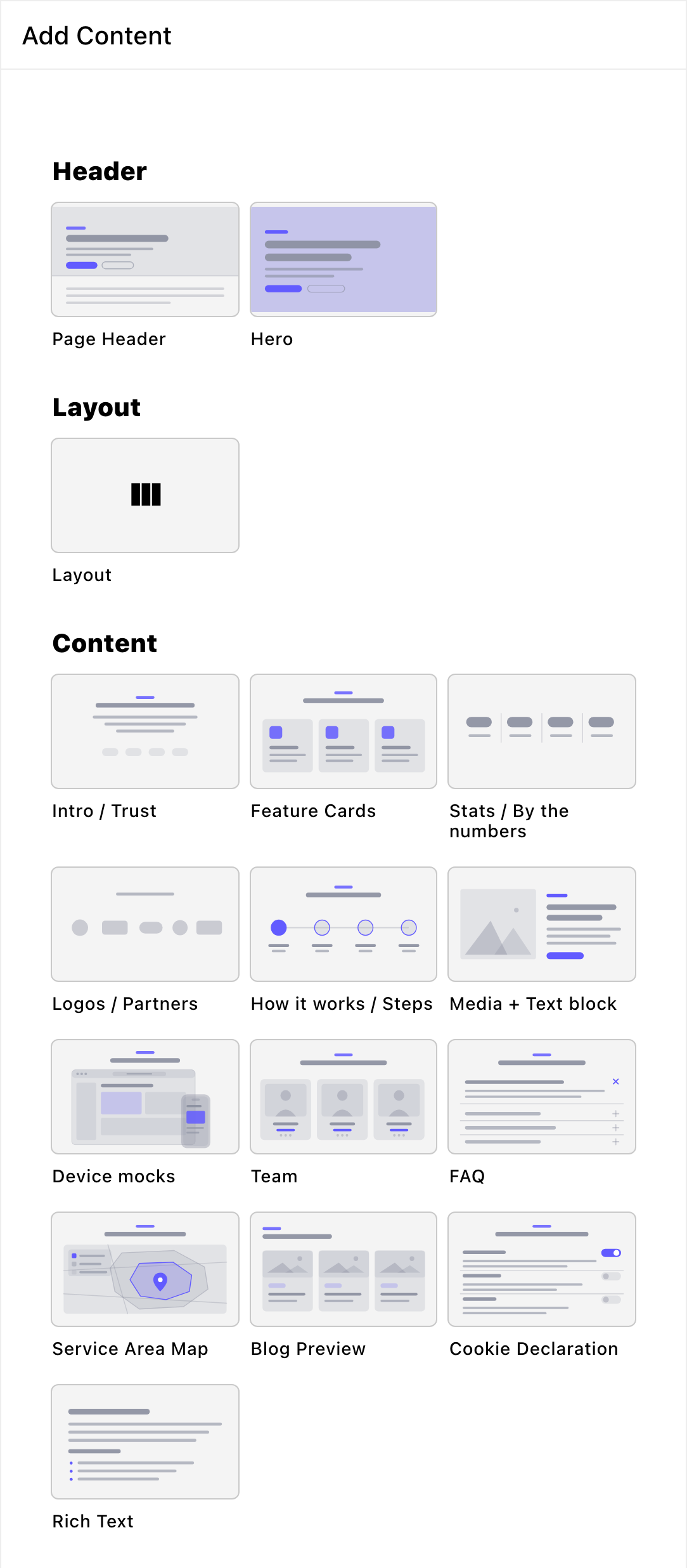
Every section, grouped by what it's for.
Header
The Header group in the Add Content menu holds the sections that open a page. (It isn’t your site’s header, the menu bar at the top of every page.) Every page opens with one of these, and it holds the page’s main heading.Page Header
a title band for pages other than your home page, with a small label above the title (the eyebrow), an introductory paragraph and up to two buttons.
Hero
a big, bold opening with a headline, buttons and an illustration, photo or video behind it.
Layout
Layout
split a row into columns, so sections and text sit side by side.
Content
Intro / Trust
a headline and a paragraph about who you are, with an optional photo beside or behind them.
Feature Cards
a grid of cards, each with an icon, a title and a short text.
Stats / By the numbers
big numbers that count up, such as years in business or happy customers.
Logos / Partners
a row of partner or press logos, scrolling or in a grid.
How it works / Steps
a numbered process, in a row or as a timeline.
Media + Text block
photos or videos paired with text, block by block.
Device mocks
your screenshots or screen recordings inside TV, desktop and phone frames.
Team
your team members as cards, a carousel, a spotlight or a list.
FAQ
questions and answers that open and close.
Service Area Map
a map of the areas you serve, with a search for visitors’ addresses.
Blog Preview
your latest blog posts, with a link to the blog.
Cookie Declaration
the list of cookies your site uses, for your cookie policy.
Rich Text
free text with headings, lists and links, plus FetchskiAI writing help.
Social proof
These sections build trust by showing what other people say about you.Google Reviews
your Google reviews, in a carousel or a grid.
Testimonials
quotes from happy customers that you choose.
Instagram Feed
your latest Instagram posts.
Gallery
Gallery Preview and Gallery (Full)
a photo album as a photo wall, with a full-screen viewer. Preview is a short teaser and Full is the whole album.
Conversion
These sections ask visitors to act, such as signing up, getting in touch or booking.Pricing / Packages
your plans or packages side by side, with one you can highlight.
Newsletter Subscription
an email sign-up band.
SMS Subscription
a text-message sign-up band, with the consent visitors must give.
Form
place a form you’ve built, such as a contact or booking form.
Final CTA
a bold closing band with a call to action (CTA): it asks visitors to take the next step, such as “Book a visit”.
Inside columns and blog posts
Images and videos
a single image or video, inside a column or a blog post.
Where to start
- Open with a Header section. Add a Page Header to an inner page, or a Hero to your home page or a landing page. A page has exactly one of them.
- Say who you are. Follow it with an Intro / Trust section.
- Show what you offer. Add Feature Cards, Pricing / Packages or a Media + Text block.
- Close with a next step. End the page with a Final CTA or a Form.
Good to know
- Sections share their looks. Most sections have the same Background, Fonts and CSS tabs, and many share button and card styles. Learn them once in What every section shares.
- New sections start with sample text. Replace it with your own before you publish.
Related
What every section shares
the tabs most sections have in common.
Add, move and remove sections
build a page from sections.
Side-by-side layouts
put sections in columns.