

 AdonisJS
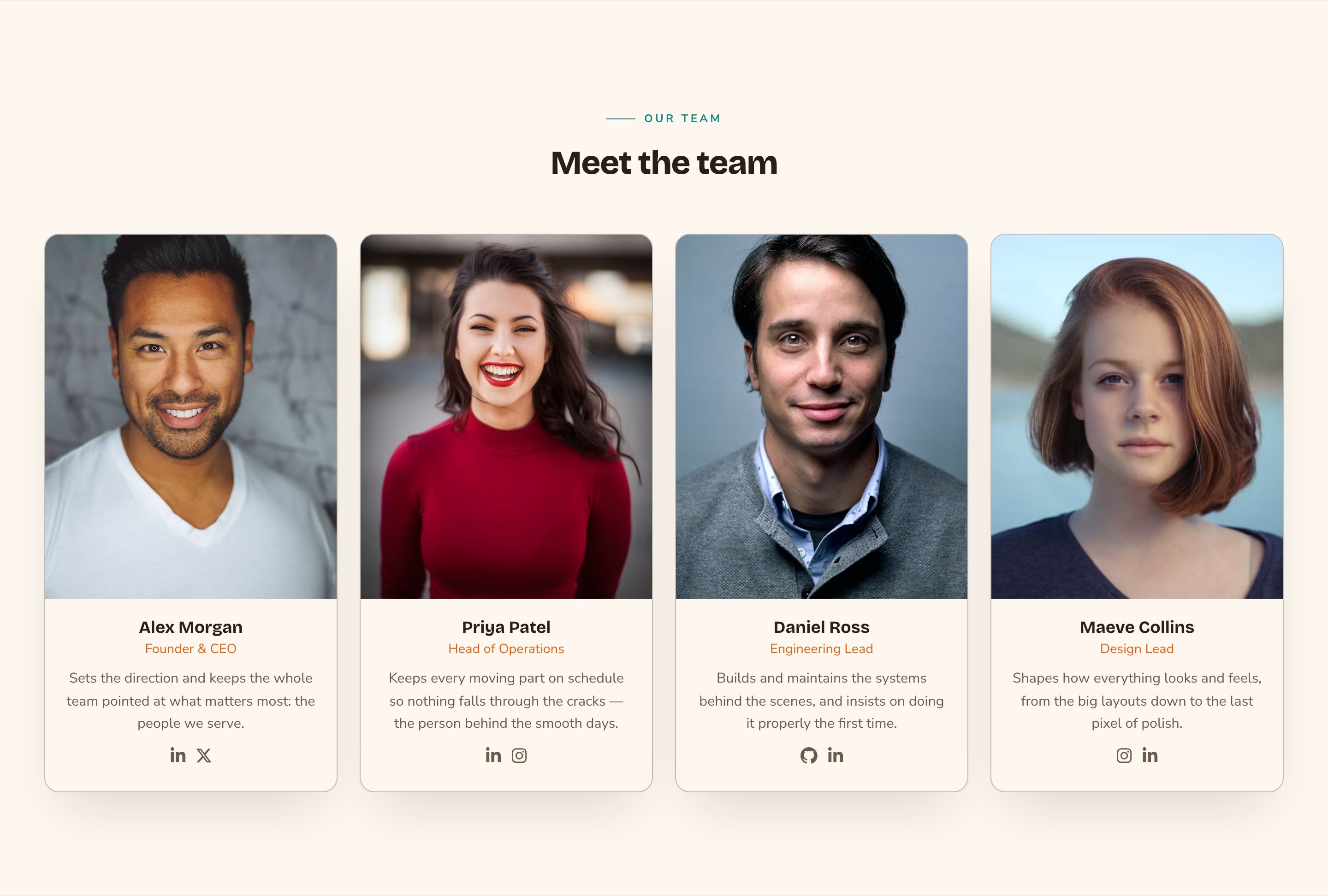
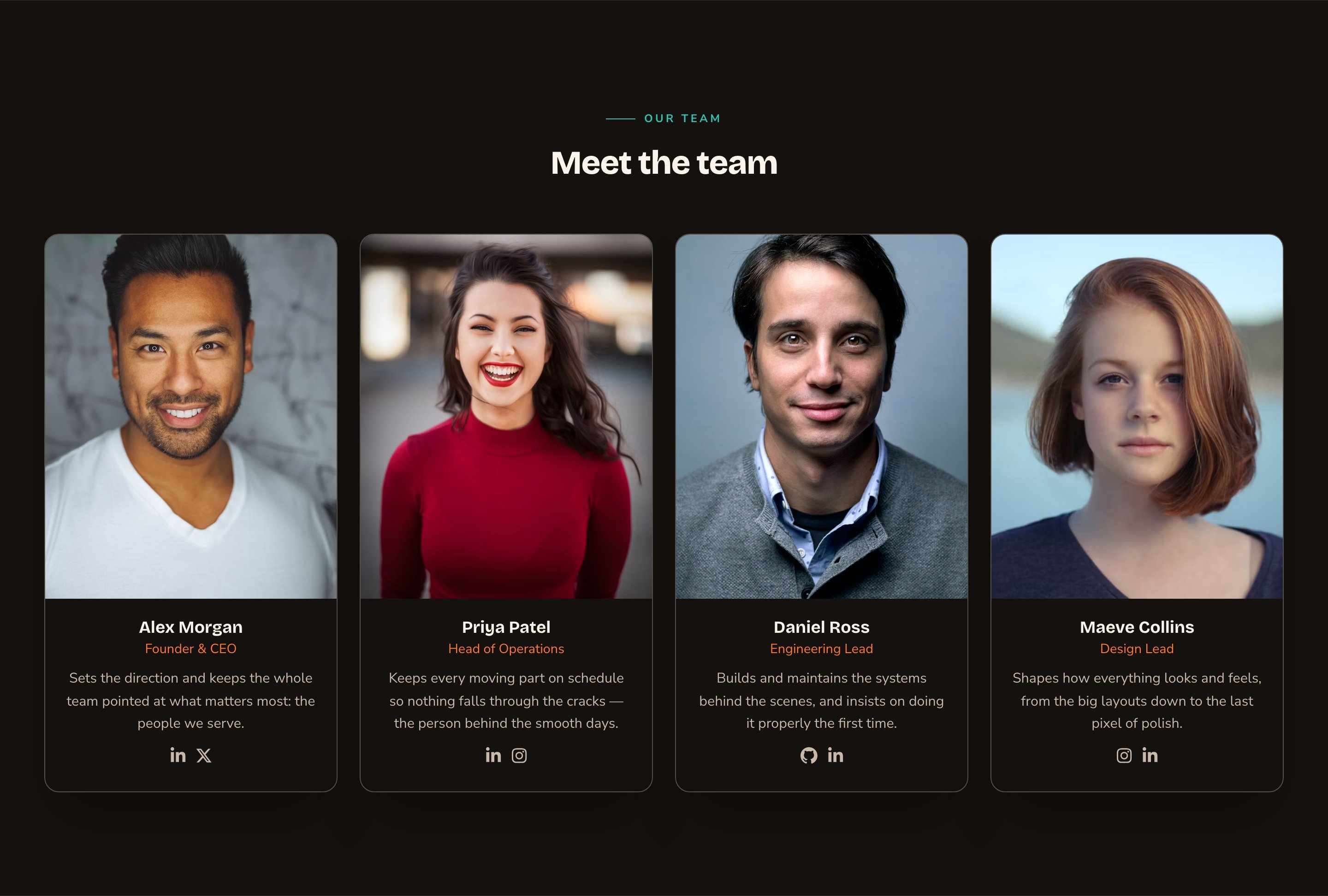
A Team section in the Grid layout with Portrait cards.
When to use it
- To put faces to your business on an About page.
- To show 2 or 3 key people on your home page, with a link to the full team.
- To introduce your trainers, staff or leadership before a visitor books.
Where the people come from
You don’t type people into the section. You add each person once in the Team Members manager, with their photo, job title, bio and social links. Every Team section on your site then shows them, lowest Sort order first. These are public staff profiles for your website. Here, “role” means a person’s job title, such as “Head trainer”. Adding a team member doesn’t give them a sign-in or any access to the CMS. To let someone edit your site, see People & Roles. To open the manager, press ⌘K (Ctrl+K on Windows) and choose Team Members under Manage. See Team members for every option.Add it to a page
1
Open the page
Sign in, open the page on your site, and choose Edit in the edit bar at the top.
2
Find the spot
Select the section next to where the new one should go. A round + button appears on its top and bottom edges. On an empty page, choose Add Content in the middle.
3
Choose the section
The Add Content menu opens with its groups. Choose the section, then select it and choose Edit in its side toolbar to make it yours.
What you can change
Select the Team section on the page and choose Edit. The editor opens beside the page, so you see each change as you make it. It has nine tabs. Your changes go into the page’s draft. Visitors see them once the page is published with Update in the edit bar (Publish on a page never published).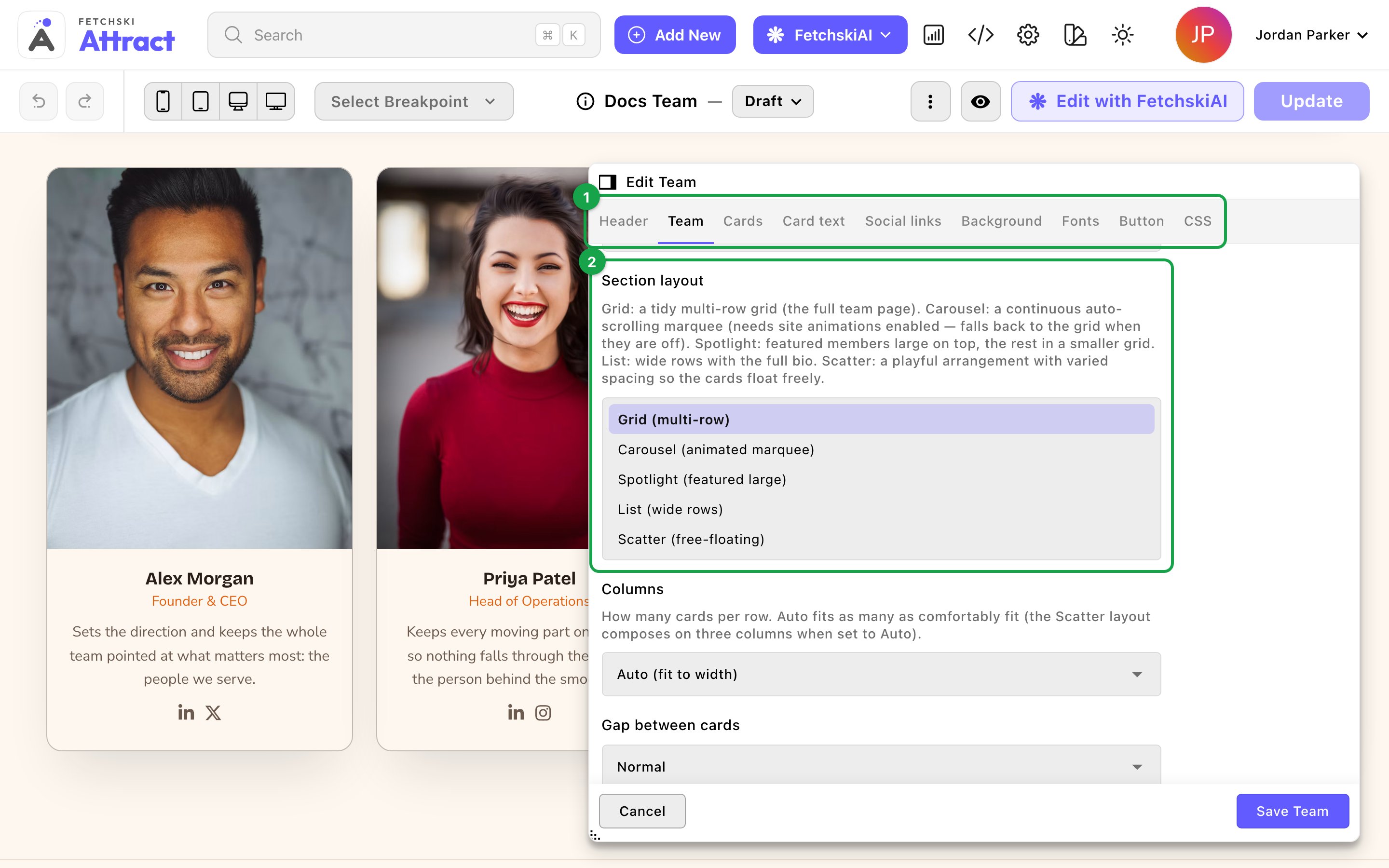
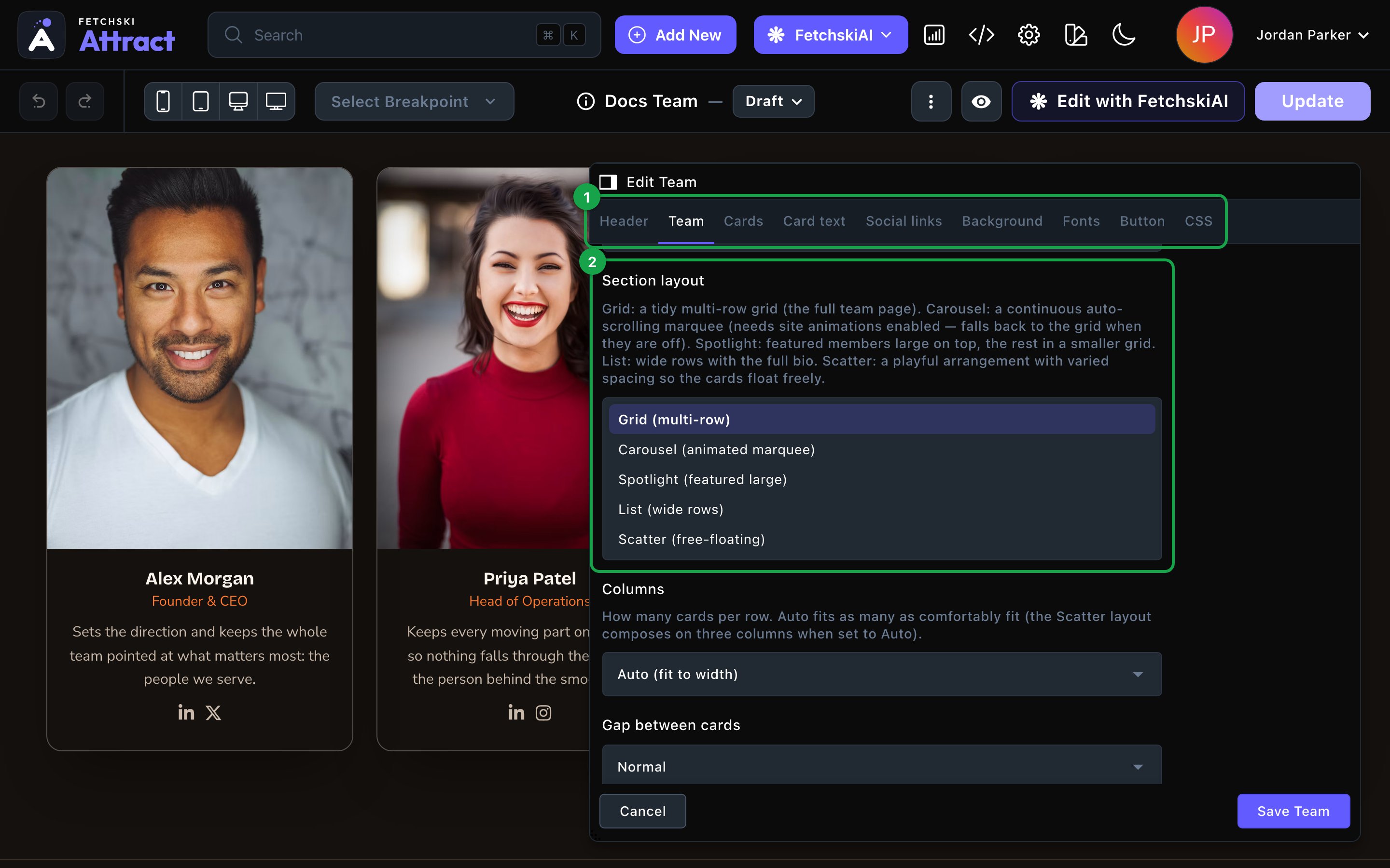
The Team editor, with the section updating beside it.
Header
Header
The words above the people. Each part is optional.
- Eyebrow: a short line above the heading, such as “Our team”.
- Heading: the section’s title, such as “Meet the team”. Leave it empty to hide the heading. To show just the people, clear the eyebrow and intro line too.
- Intro line: one short sentence under the heading.
- Header alignment: Center or Left.
Team
Team
Which people show, and how the section arranges them.Who shows
- Featured members only: show only the people marked Featured in the Team Members manager. This is handy for a short row on your home page.
- Maximum members: the most people to show, from 1 to 50. The default is 12.
- Grid (multi-row): a tidy grid. Set Columns to Auto (fit to width), or to 2, 3 or 4 cards per row.
- Carousel (animated marquee): a row of cards that scrolls on its own. Choose its Scroll speed and Scroll direction.
- Spotlight (featured large): 1 or 2 people lead at full size, with everyone else in a smaller grid below. Set Featured spots (top row) and Cards per row (below). The people who lead are the ones marked Featured in the Team Members manager, taken in Sort order up to the number of spots. Featured people beyond that join the smaller grid. If nobody is marked Featured, the first people in Sort order lead. To put someone in the large spot, open them in Team Members, turn on Featured, give them the lowest Sort order, and publish them.
- List (wide rows): one wide row per person, with their full bio.
- Scatter (free-floating): cards drift and tilt slightly, like photos pinned to a board. Scatter amount goes from Subtle to Wild.
Cards
Cards
How each person’s card looks.
- Card layout: pick 1 of 4 card designs. The List layout always uses its own wide row, so this option is hidden there.
- Portrait (photo on top): the classic card.
- Overlay (photo + panel): the name sits on a solid panel over the photo.
- Profile (horizontal bar): a small photo beside the name.
- Roster (minimal): just the photo, name and role, which suits a large team.
- Photo shape: Square (1:1), Portrait (4:5) or Tall (3:4), for the Portrait and Overlay cards.
- Avatar shape, Avatar size, Avatar border and Avatar backdrop: style the small profile photo (the avatar) on the Profile and Roster cards and the List rows. Avatar backdrop adds a decoration behind it.
- Show role / title, Show bio and Show tagline / fun fact: turn each line on or off. The Overlay and Roster cards never show a bio.
- Swap to the alternate photo on hover: fades to a person’s second photo when a visitor points at the card. It only affects people with an alternate photo.
- Card style and Hover effect: the card’s frame and what it does on hover. The default is Outline — plaque frame with Glow — accent halo blooms. See Buttons and card styles.
- Card content alignment: Center or Left.
- Accent: the color behind a person’s initial when they have no photo, and the color of their role.
Card text
Card text
The size, weight and color of each person’s Name, Role and Bio, plus a color for the tagline.Bio length caps each bio at 2, 3, 4 or 6 lines, so one long bio doesn’t stretch its card. The default is 4 lines. Choose Full text (no limit) to show every word. The List layout always shows the full bio.
Background
Background
Give the section its own background color, from your site’s palette or a custom color. See What every section shares.
Fonts
Fonts
Use a different typeface for parts of this section only, such as the names. Leave it empty to use the page’s fonts, which normally come from Site design → Typography. See What every section shares.
CSS
CSS
Custom styles for this section only. Admins and Owners can change this tab. See Custom CSS.
Looks you can make
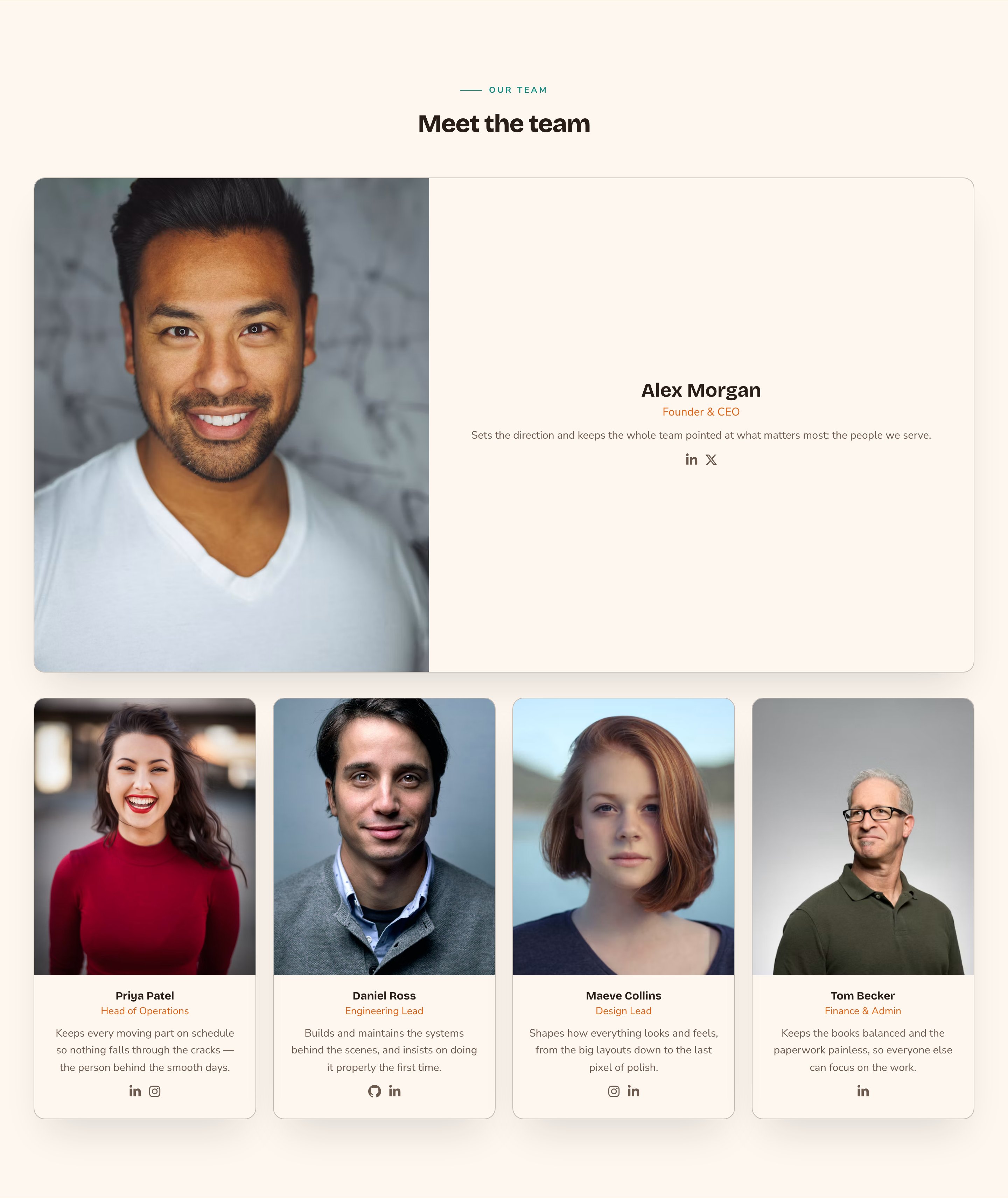
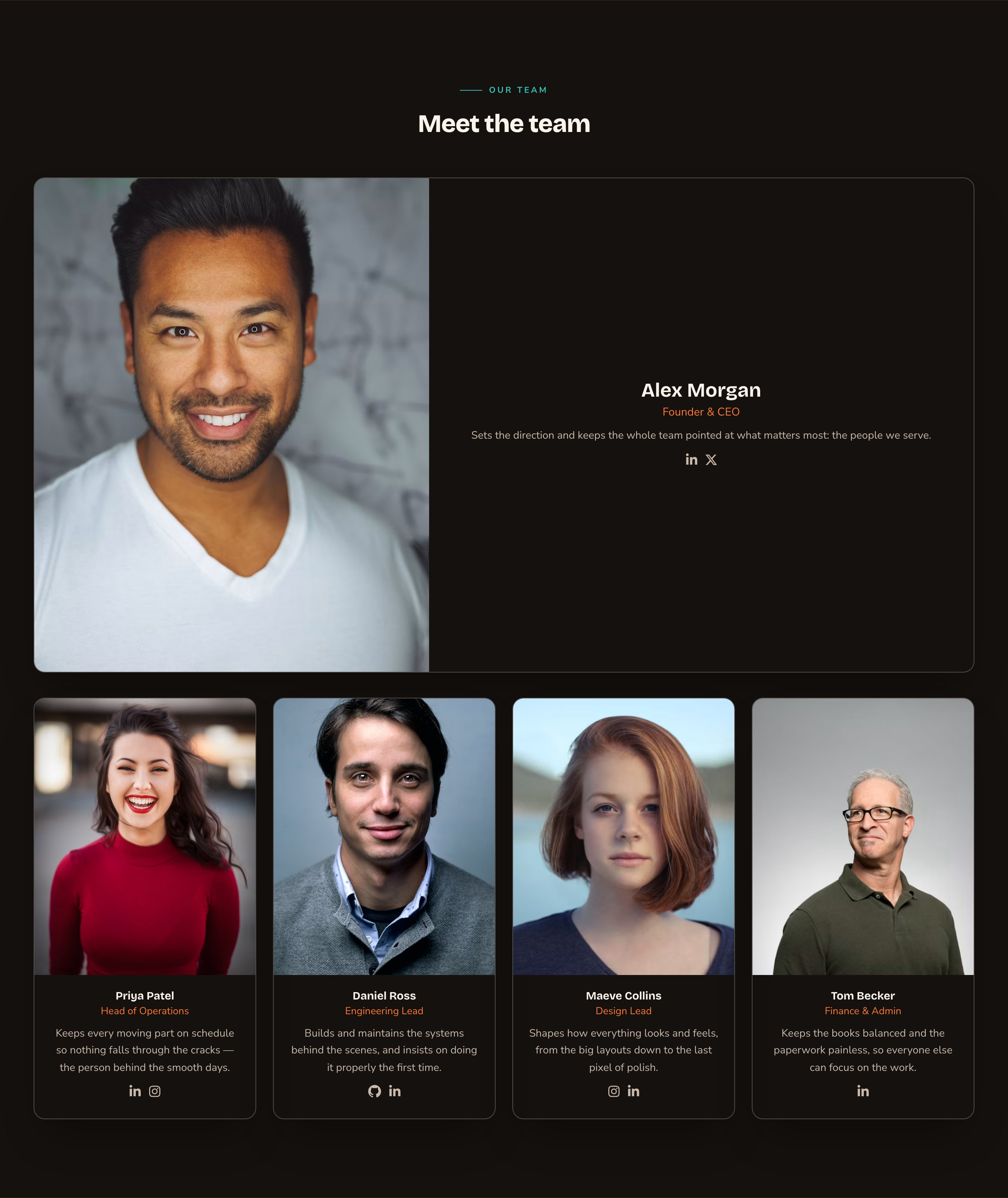
Spotlight puts your key people first.
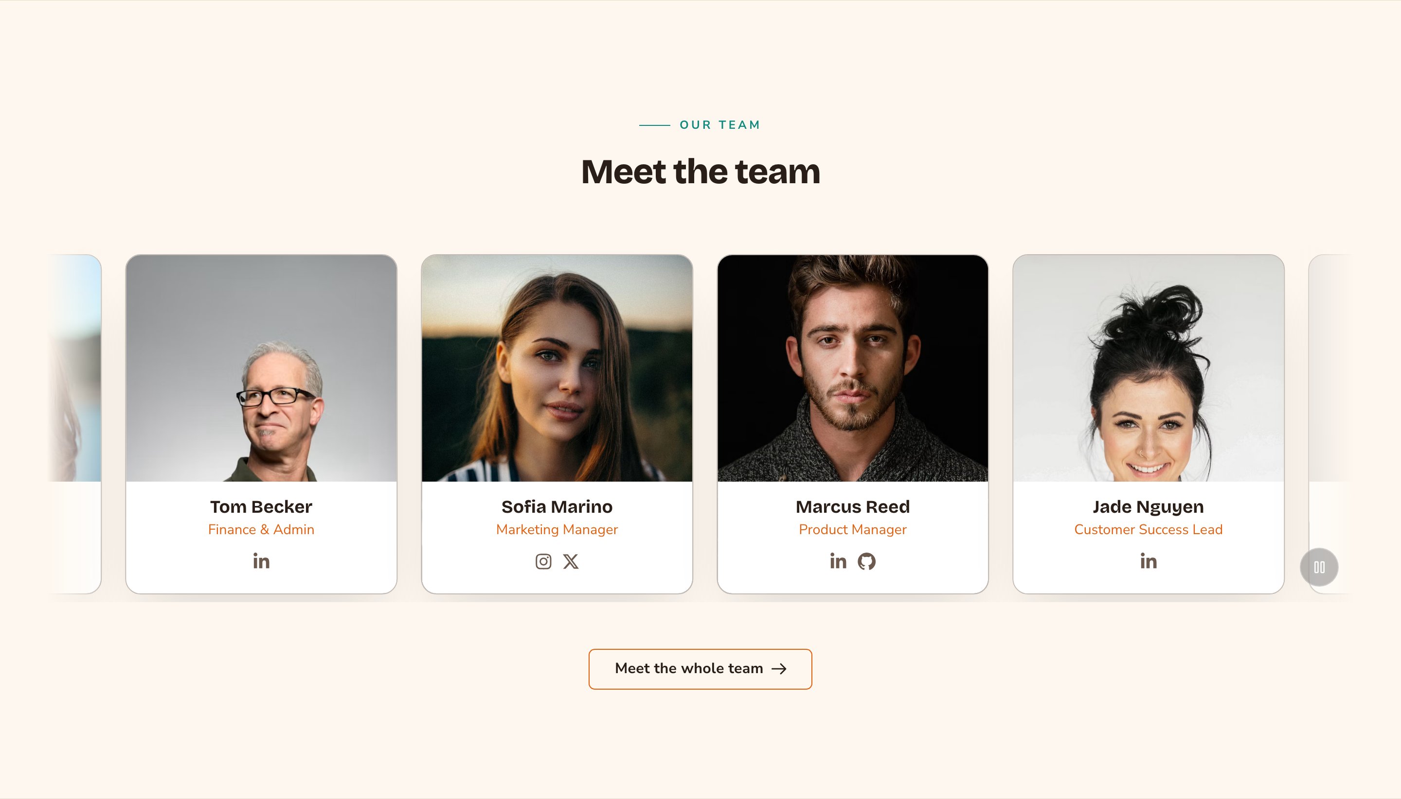
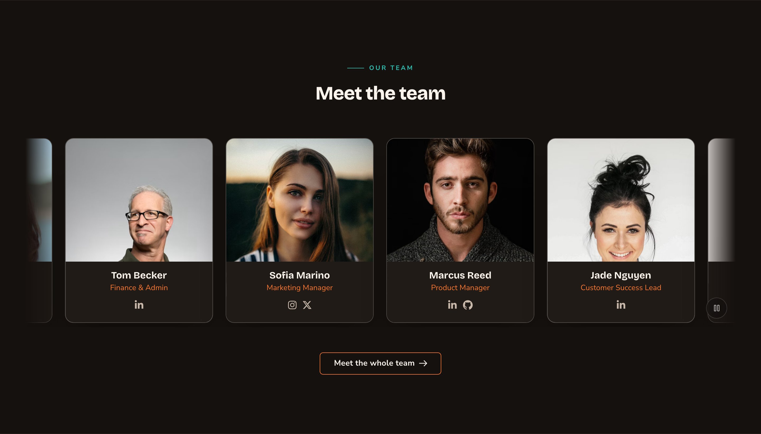
A featured carousel makes a lively home-page row.
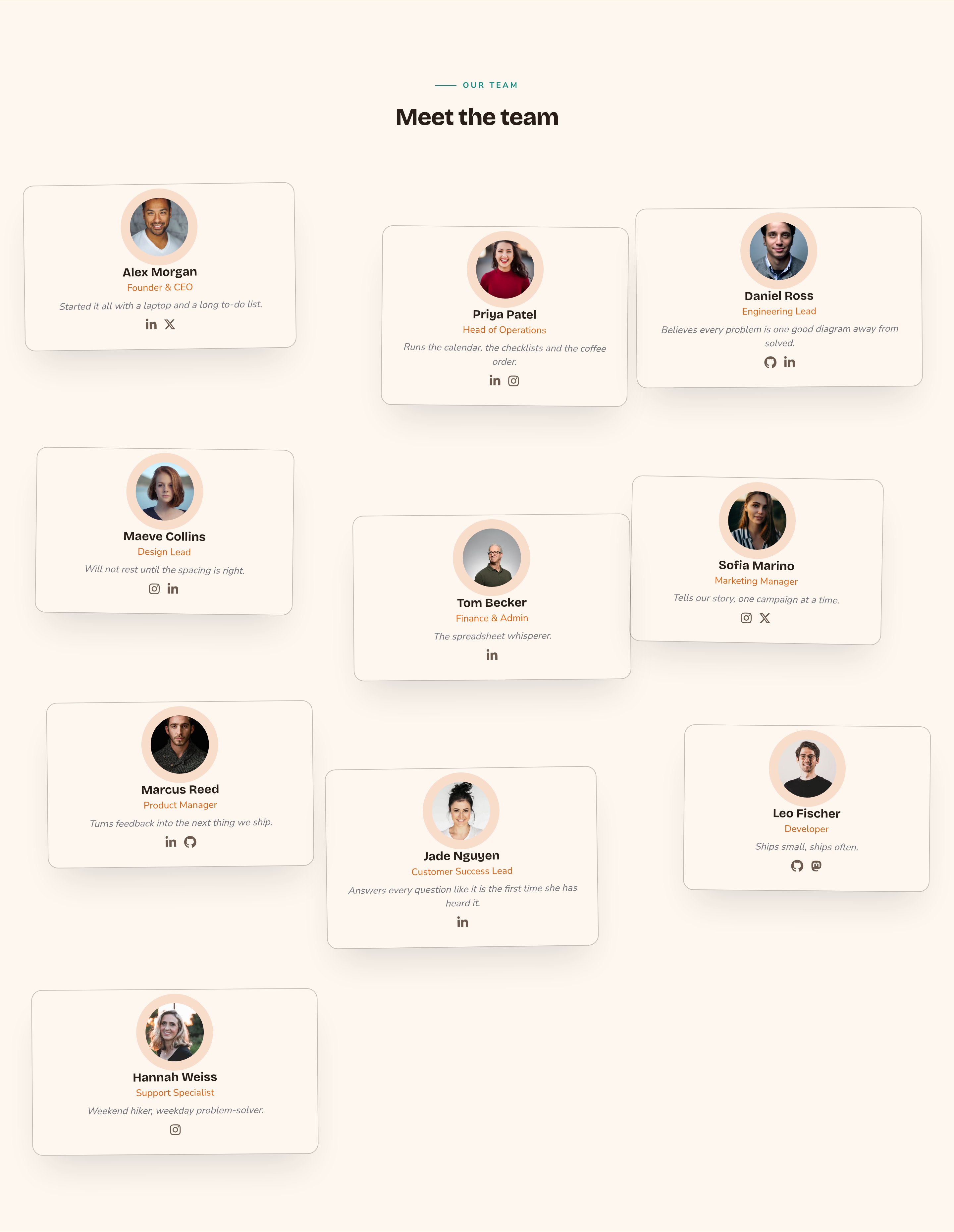
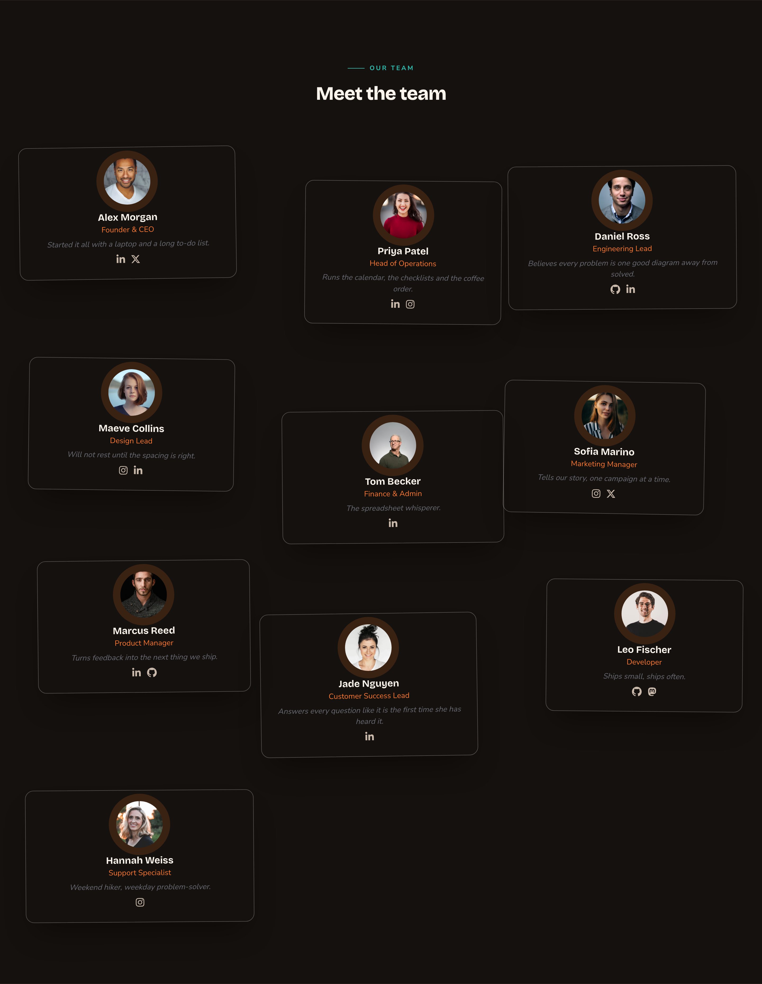
Scatter with Roster cards feels relaxed and friendly.
Good to know
- The carousel needs animations on. If animations are turned off for the whole site in Motion, the carousel shows as a grid instead.
- Moving rows can be paused. The carousel always gets a pause button. Visitors who prefer less motion see a still row they can scroll by hand.
- No people yet? Visitors see nothing. Signed-in editors see a note pointing to the Team Members manager.
- Demo people. A new site comes with demo team members. While the section shows them, editors see a “Demo content only” notice. Visitors see the demo people too if you publish the page, so add your real team first. The demo people are removed as soon as you publish your first real team member.
- Drafts show while you edit. You see team members you haven’t published yet. Visitors see only published ones.
- Where it fits. Team is a full-width section. It isn’t offered inside columns or in a blog post’s text, but you can add it to a post’s After content, the space below the post’s text. Press ⌘K (Ctrl+K on Windows), choose Blog Posts under Manage, open the post, and use its After Content tab.
Appearance options
Most sections also share a few tabs that work the same everywhere:- Background: set the color behind the section, separately for the dark and light themes.
- Fonts: use a different typeface for parts of this section only.
- CSS: add custom styles to this section. Admins and Owners can change it.
Related
Manage team members
add people, photos and the order they show in.
Testimonials
show what your customers say.
Buttons and card styles
every card style and hover effect.
Motion
turn site animations on or off.
- Show social profiles: show each person’s social icons, as set in the Team Members manager. It’s on by default.
- Show email / phone: turn each person’s email and phone into icon links. It’s off by default, so turn it on only if you want those details public.
The rest of the tab styles the icon row: Icon style, Icon size, Icon spacing, Hover color and the icon colors.