

 AdonisJS
Find a section’s button and card options
- Open the page and choose Edit in the edit bar.
- Select the section, then choose Edit (pencil) in its side toolbar. The section editor opens.
- For buttons, open the Button or Buttons tab.
- For cards, look for Card style and Hover effect. They sit on a different tab in each section.
The idea: buttons
One set of options. Every button has the same options, whether it’s in a Hero, a Pricing / Packages card or a form. A Hero is the big opening section at the top of a page; see Hero. A section with one button has a Button tab, and a section with two has a Buttons tab. The header’s button lives in Site design → Header: Button. Two standard looks. Your site has 2 ready-made button looks, Primary Default and Secondary Default:- Primary Default: a solid button in your Primary / brand color, with your Text color for the label.
- Secondary Default: the same button as an outline.
- Button color: no color at all. A solid button gets no fill, so it shows as an outline. The thin border always stays, so a button never disappears.
- Label color: a solid button uses your Text color. The other styles use the Button color.
- Hover color: uses the button’s own color.


Your site's Primary and Secondary buttons, and the Primary on hover.
The options
What it says and where it goes- Button label: the text on the button. Leave it empty to hide the button.
- Button link: where the button goes. For a page on your site, type its address without the domain, starting with /, such as /contact-us. To find it, open the page on your site and copy the part of the address after your domain. For another website, paste its full web address, starting with https://.
- Open in new tab: opens the link in a new browser tab.
- Button style: Solid (filled), Outline, Soft (tinted fill) or Text link. Solid fills the button with its color. The others use the color for the border and text.
- Button size: Small, Normal or Large.
- Corner radius: Pill, Rounded, Slight or Square.
- Button color: the fill of a solid button, or the border and text of the other styles.
- Label color: the color of the text and icon.
- Hover color: the color the hover effect uses, such as the color that sweeps in or the glow. Empty uses the button’s own color.
- Hover surface: what appears on the button when a visitor points at it:
- None: no change.
- Soft shadow: a soft shadow appears under the button.
- Offset shadow: a colored shadow appears, set off to one side of the button.
- Soft glow: a colored glow appears around the button.
- Fill sweep: color sweeps across the button and fills it.
- Border thicken: the button’s outline gets thicker.
- Offset / glow color: the color of the Offset shadow or Soft glow. Empty uses your Secondary color.
- Hover motion: Lift (small slide up), Scale (grow), Lift + scale or None.
- Icon name and Icon family: add an icon to the button. Find an icon at fontawesome.com/icons and type its name without “fa-”, such as arrow-right. Then pick its look in Icon family, such as Classic Regular.
- Icon position: Before label or After label.
- Nudge icon on hover: the icon slides a little toward its side, so an arrow edges outward.
The live preview
In a section editor you see each change on the page beside it. A few places edit a button away from the page, so they show a Live preview · Buttons panel instead:- Site design → Header: Button
- the Page Header section’s Buttons tab
- the blog page’s Post · Back button tab
- the Service Area Map section’s Search button tab
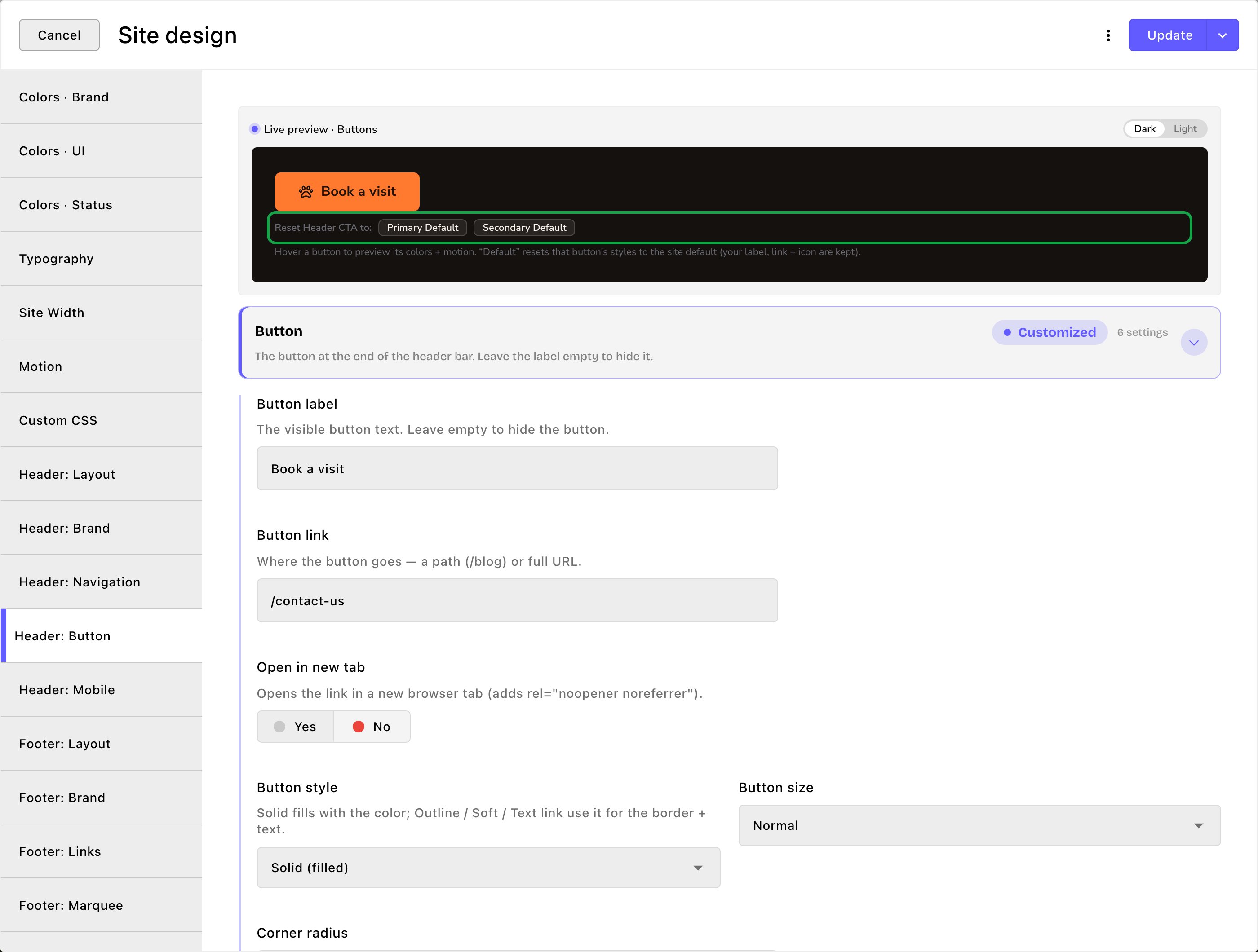
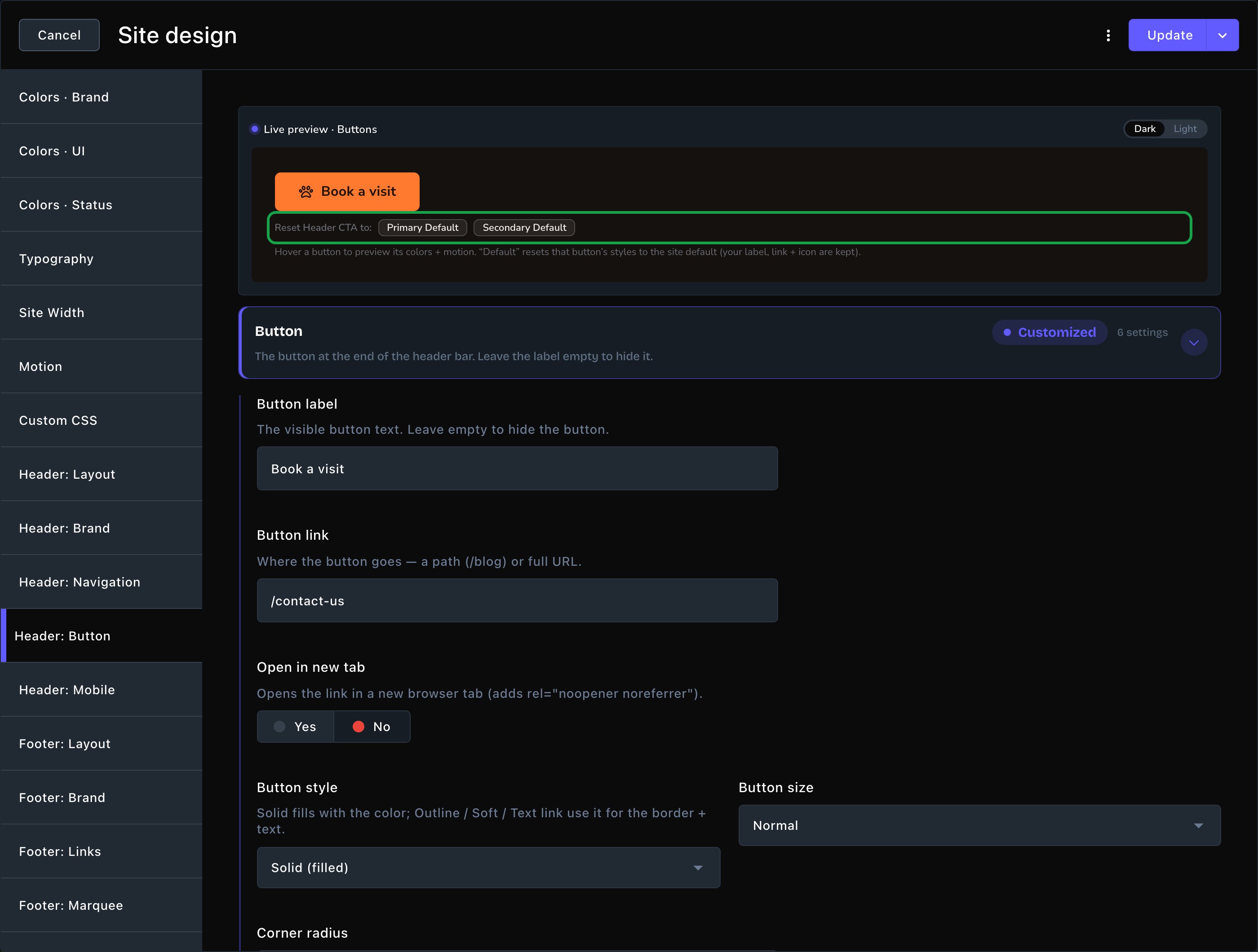
The live preview, with one-click resets to your standard looks.
The idea: card styles
Sections that show cards share 2 options for them. Together they decide how a card looks at rest and what it does when a visitor points at it. Card style is the card’s resting look. There are up to 12. A few sections leave some out, such as Team and Service Area Map (see Good to know), and Instagram Feed has no Card style at all. In How it works / Steps the option is called Step style.
Some styles bring extra options. Card corners sets the rounding: Default, Square, Slight, Rounded or Large. Card style color colors the Spine rail, the Bracket marks, the Forge frame and the Press margin line; empty uses your Primary / brand color. Forge color placement and Forge line weight are for Forge only.
Hover effect is what the card does when a visitor points at it. Feature Cards, Pricing / Packages and the blog sections call it Card hover effect. The shared choices are:
- Lift, Pop, Press, Glow and Outline: quick reactions, such as rising or glowing.
- Sheen: a soft light sweeps across the card once.
- Tilt, Magnetic and Spotlight: the card follows the visitor’s pointer. These need animations turned on in Site design → Motion.
- Tilt tips the card toward the pointer.
- Magnetic leans the card toward it.
- Spotlight moves a soft light in your Primary / brand color across the card with it.
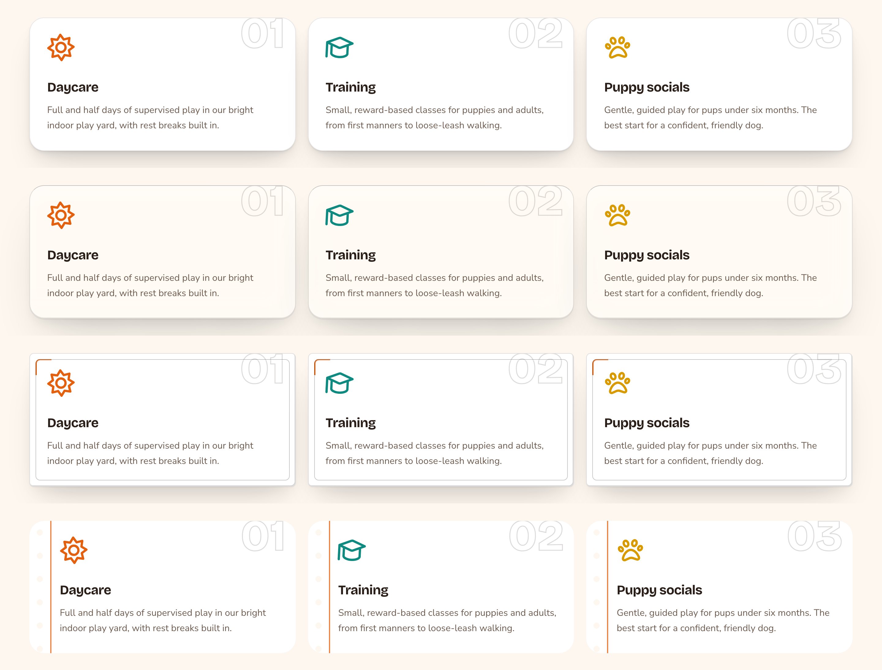
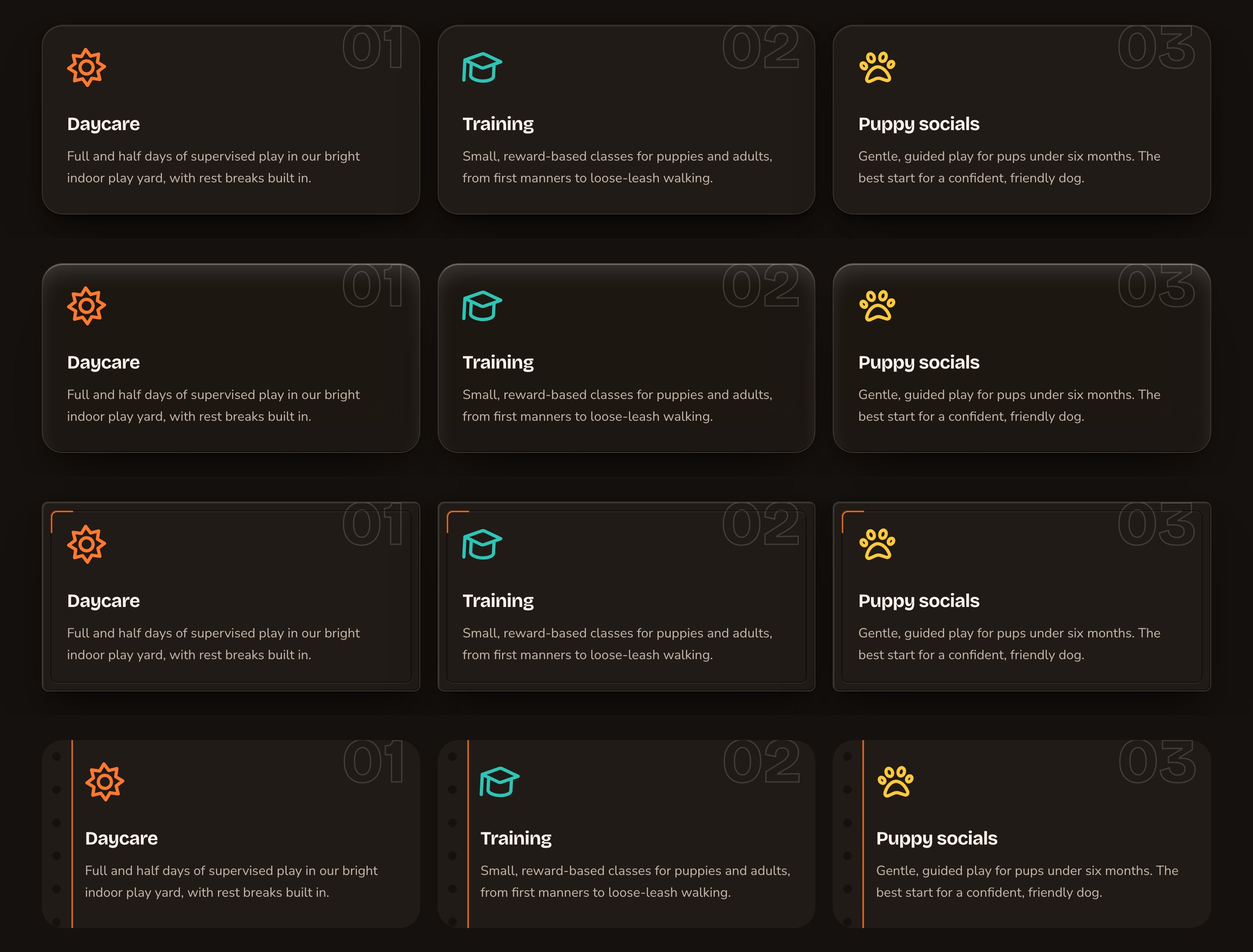
One set of cards in four card styles.
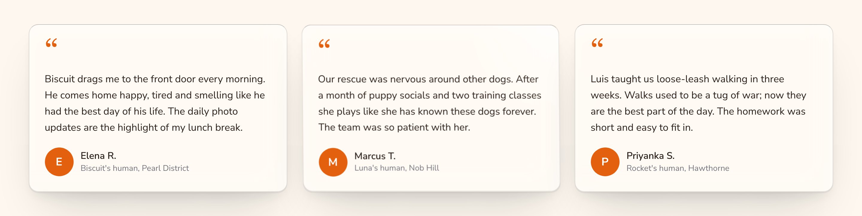
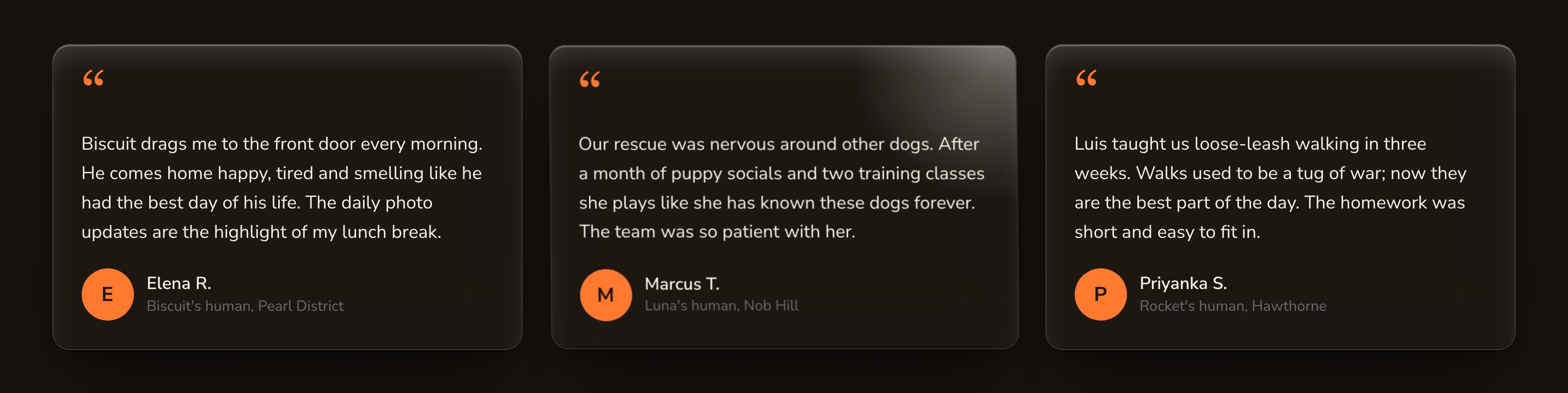
Tilt: the card follows the visitor's pointer.
Every section starts different
Each card section starts on its own look, so a new page with several card sections doesn’t repeat itself:
Instagram Feed has a Hover effect only. It starts on Lift.
When to choose which
A short example
Parker’s Puppy Playland wants its pricing page to feel special, and its home page to stay calm.- On the pricing page, Jordan sets the Pricing / Packages section’s Card style to Luxe — frosted glass panel. Jordan sets its Card hover effect to Tilt (3-D — needs motion on).
- On the home page, Jordan sets the Testimonials section’s Card style to Plain — no chrome and Hover effect to None.
- Jordan opens the Final CTA, the call-to-action band that closes a page (see Final CTA). Jordan changes its second button’s Button style to Text link, so “Book a tour” is the clear main action.
- In Site design → Header: Button, Jordan sets the label to “Book a tour” and chooses Primary Default in the live preview.
Good to know
- Some styles and hovers don’t mix. Bracket, Forge and Press don’t combine with Sheen, Spotlight or Tilt: the hover’s light replaces the style’s marks. Pick another hover for those styles.
- Ticket and Press hide shadows. Their cut-out edges also cut off shadow-based hovers such as Lift’s deeper shadow and Glow’s halo. Pair them with Magnetic, or with Tilt on Ticket.
- A few sections leave out styles. Team has no Forge or Press, because they would draw over people’s photos. Service Area Map has no Ticket, Bracket, Forge or Press.
- Label colors don’t adjust themselves. A cleared Label color on a solid button uses your Text color, whatever the fill. Check that the label stays easy to read on its button, in both themes.
- Hover motion respects visitors. Visitors who ask their device for less motion see buttons and cards hold still, with no sliding, growing or tilting.
- The reset copies, it doesn’t link. Primary Default copies the standard look onto that button once. Change the button afterward, and it keeps your change.
- Final CTA starts in reverse colors. Its buttons start in reverse colors, so they stand out on its colored band. They’re ordinary button colors, so you can change or clear them.
Related
What every section shares
buttons, cards, backgrounds and fonts in every section.
Header
the header button and the rest of the header.
Colors
the palette your buttons and cards start from.
Motion
turn on the animations Tilt, Magnetic and Spotlight need.