

 AdonisJS
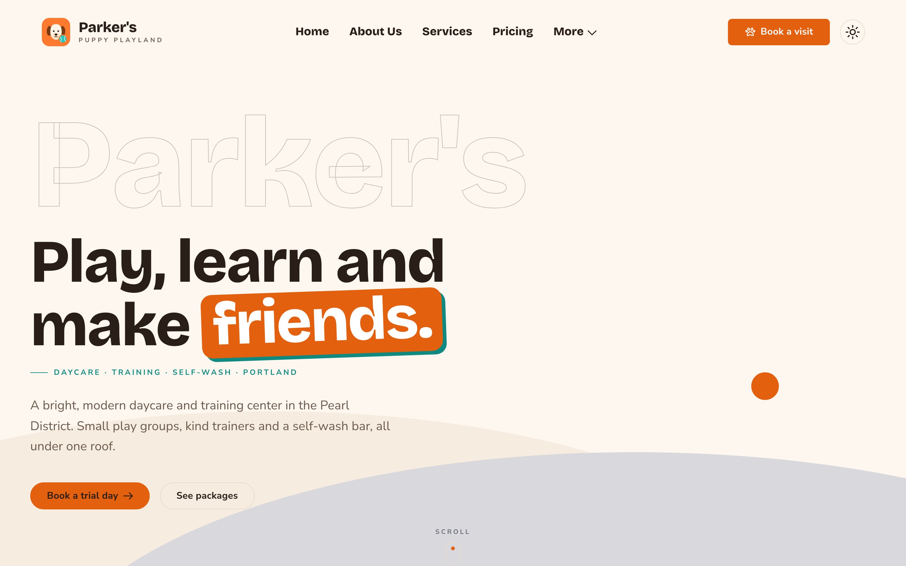
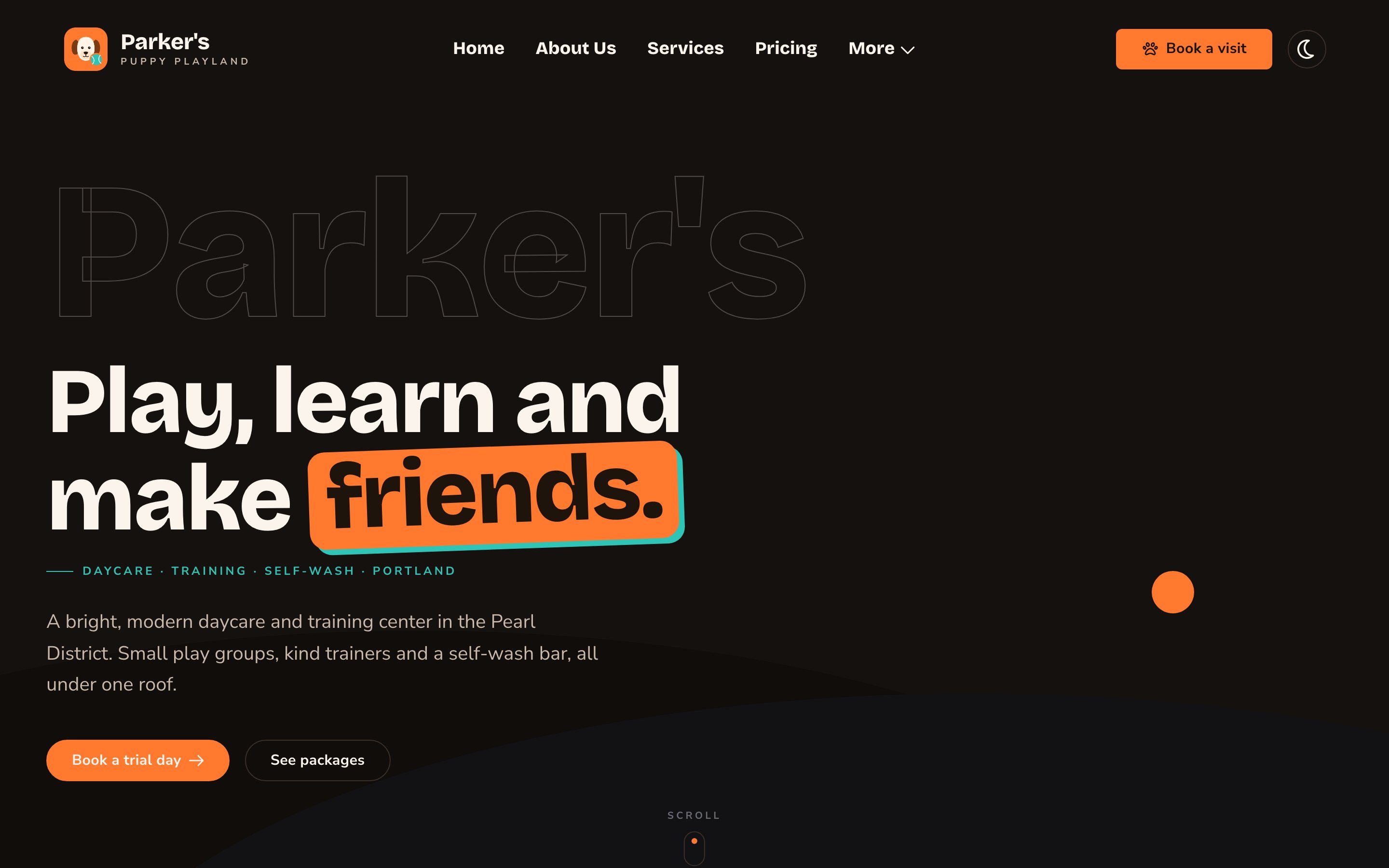
A Hero with the ghost wordmark, a highlighted headline and two buttons.
When to use it
- To open your home page with one clear message and a next step.
- To open a landing page for a campaign, an offer or an event.
- To show a photo or a short video that sets the mood before anything else.
Add it to a page
1
Open the page
Sign in, open the page on your site, and choose Edit in the edit bar at the top.
2
Find the spot
Select the section next to where the new one should go. A round + button appears on its top and bottom edges. On an empty page, choose Add Content in the middle.
3
Choose the section
The Add Content menu opens with its groups. Choose the section, then select it and choose Edit in its side toolbar to make it yours.
- Select the Page Header, and choose the round + button on its top edge.
- Choose Header → Hero. The Hero appears above the Page Header.
- Select the Page Header again, and choose Remove (the trash can) in its side toolbar.
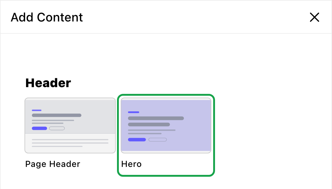
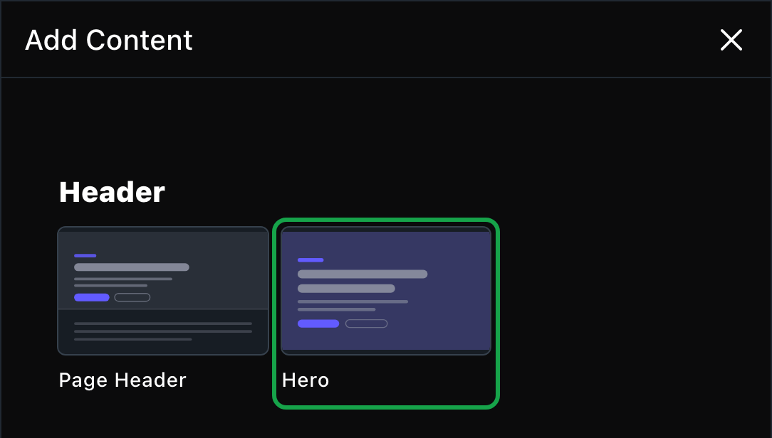
The Hero lives in the Header group.
What you can change
Select the Hero on the page and choose Edit. The editor opens beside the page, so you see each change as you make it. It has four tabs. Your changes go into the page’s draft. Visitors see them once the page is published with Update in the edit bar (Publish on a page never published).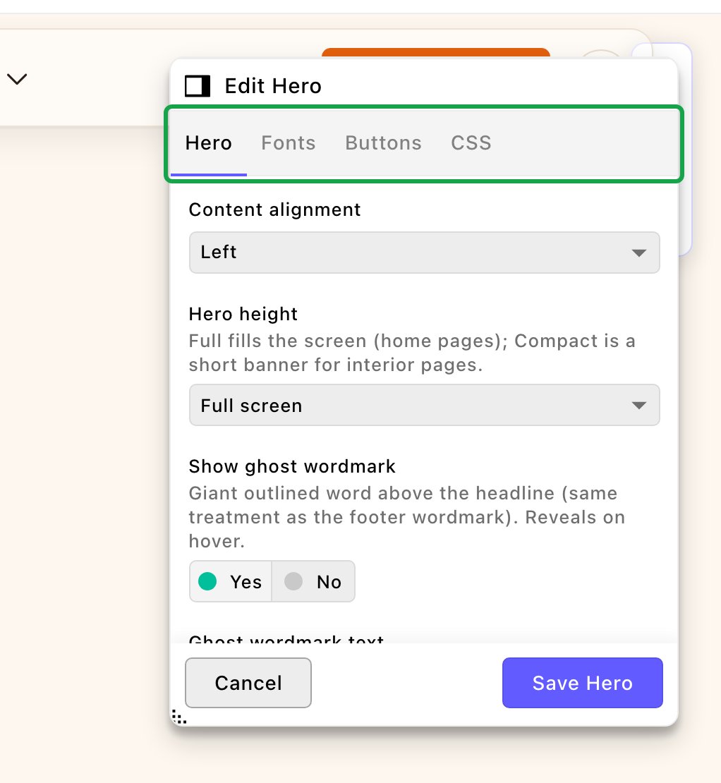
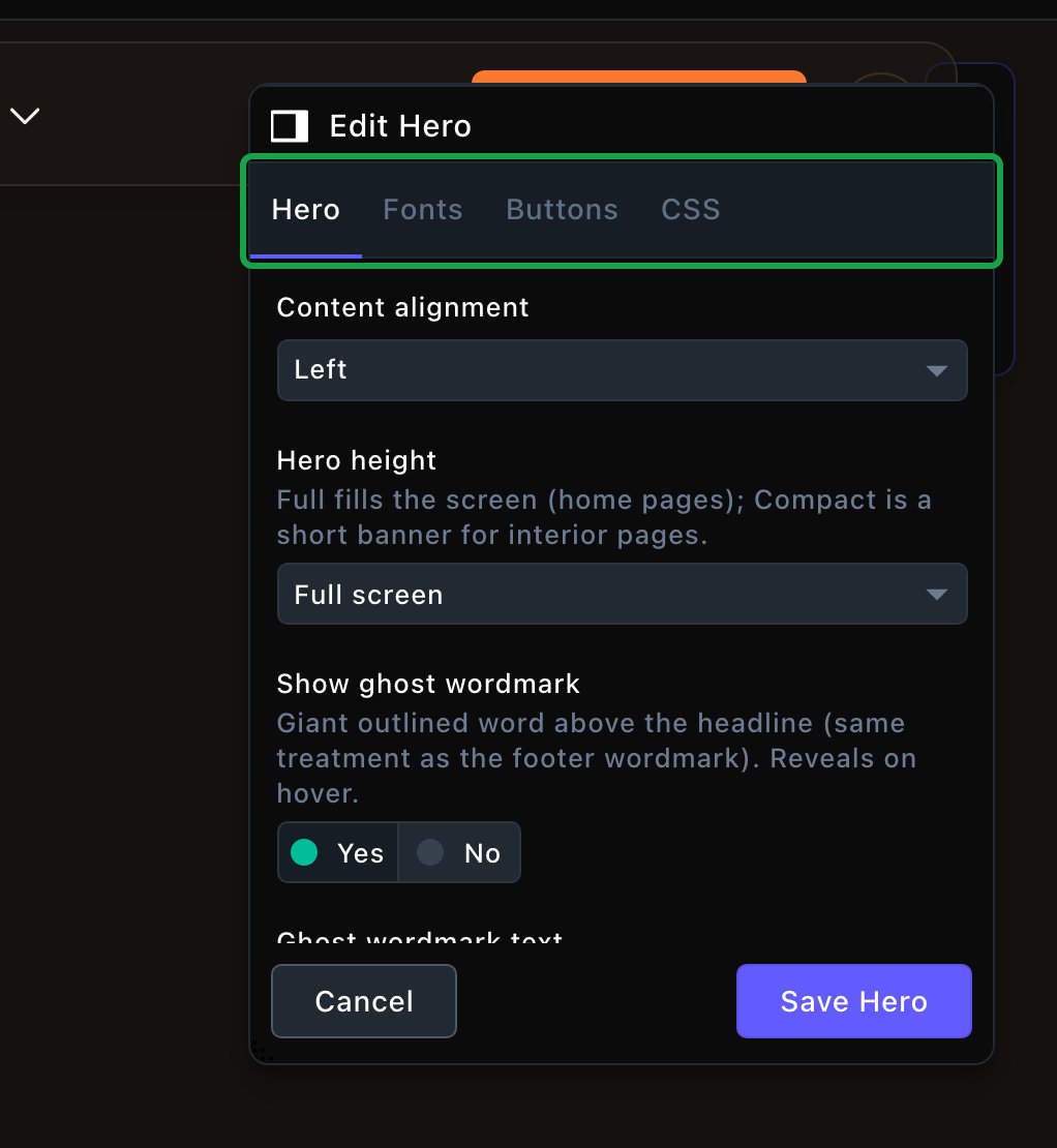
The Hero editor, with the page updating beside it.
Hero
Hero
Everything about the Hero’s own look. Some options appear only once you turn on the one they belong to.Layout
- Content alignment: Left or Centered.
- Hero height: Full screen fills the window, Tall fills most of it, and Compact is a shorter banner for inner pages.
- Show ghost wordmark: turn the giant word on or off.
- Ghost wordmark text: the word to show. Leave it empty to use your business name from Site settings. Short words look best.
- Ghost wordmark size: Display (largest), Large or Medium.
- Ghost wordmark fill: Fill letters individually (hover) fills each letter as a visitor points at it. Fill the whole word (hover) fills it all at once. Always solid keeps it filled.
- Show small name lockup: a small line with your business name above the headline. It shows only when your business name is set.
- Show eyebrow / kicker and Eyebrow: turn it on and write the text, for example “Daycare · Training · Puppy socials”.
- Eyebrow placement: above the headline, below it, or just above the buttons.
- Eyebrow weight and Eyebrow size: make it bolder or bigger.
- Headline: your main message. It’s required, and it becomes the page’s main heading.
- Highlight last word (sticker): puts the last word on a solid color patch. Choose Dual layer (offset shadow) or Single color.
- Headline fill: keep it solid, or fill it on hover like the wordmark.
- Show hashtag and Hashtag: add a hashtag such as “#parkerspups”. Include the #.
- Choose its placement, size, background patch and tilt.
- Intro copy: the introductory text under the headline, one or two sentences.
- Intro weight: make the intro bolder.
- Decorative icon: add a small icon In the name lockup, Above the headline, or Above the ghost wordmark. Then pick the icon and its color. For In the name lockup, also turn on Show small name lockup.
- Background type: Illustrated landscape (no media) shows flat hills and a bouncing ball. You can also choose Image or Video (with image fallback).
- Background image: the photo for an Image background.
- Background video: choose a video from your Videos library. While it loads, and for visitors who prefer less motion, the Hero shows the video’s Poster / fallback image. If the video has none, it shows the Background image. To set the poster, open the command palette (⌘K, or Ctrl+K on Windows), choose Videos, open the video, and choose its Poster / fallback image.
- Show pause button on background motion: adds a pause button over the video.
Fonts
Fonts
Use a different typeface for parts of this Hero only, such as the headline. Leave it empty to use the page’s fonts, which normally come from Site design → Typography. See What every section shares.
CSS
CSS
Custom styles for this Hero only. Admins and Owners can change this tab. See Custom CSS.
Looks you can make
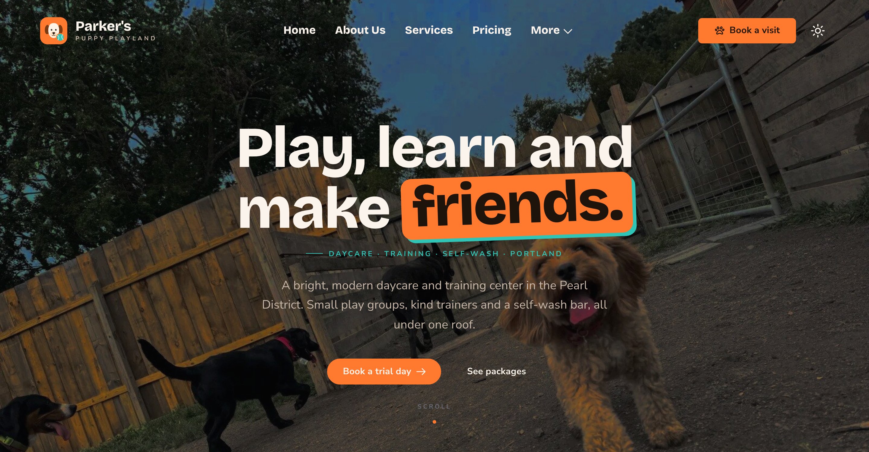
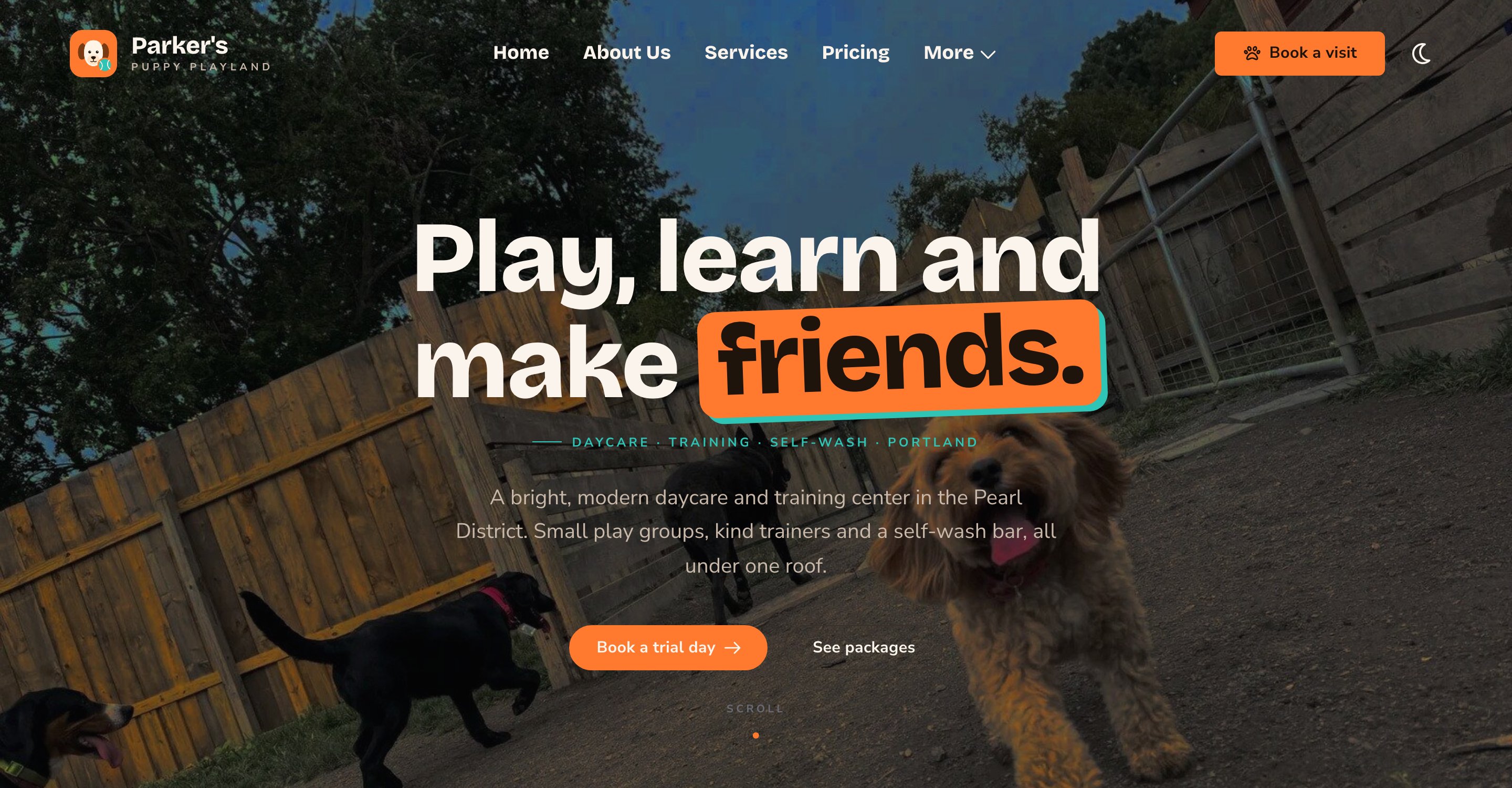
Centered and Tall, over a photo.
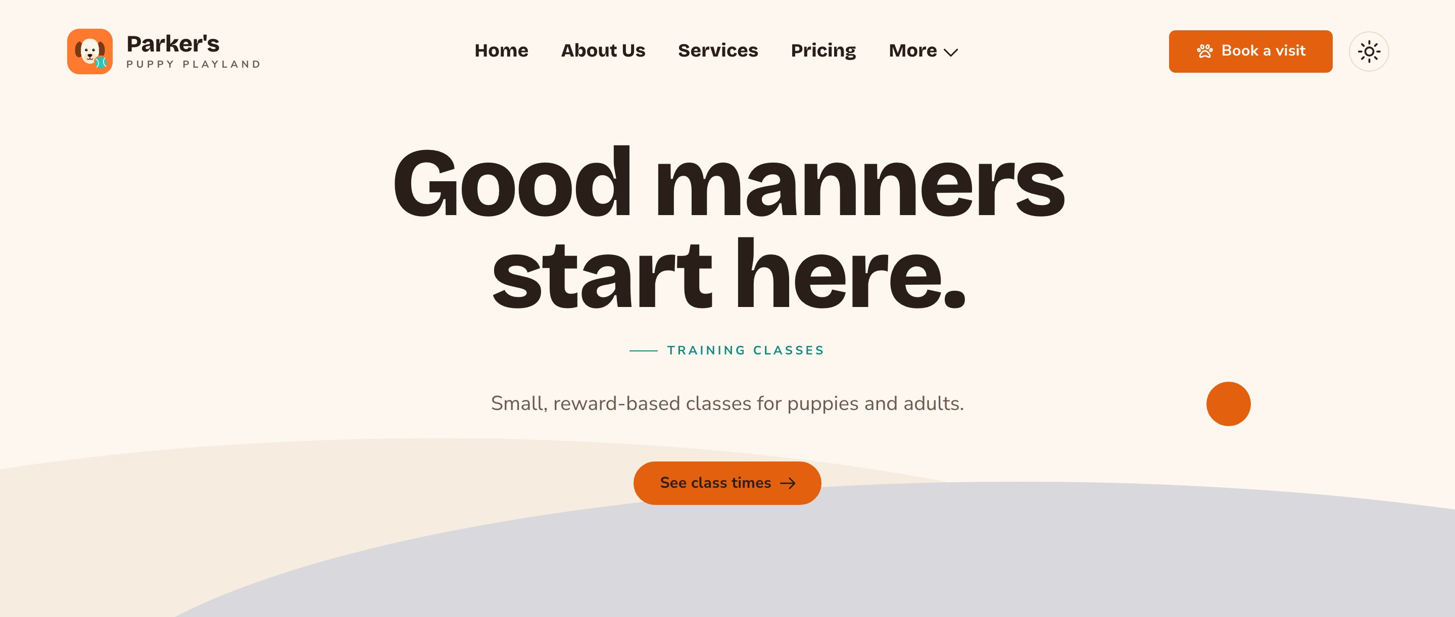
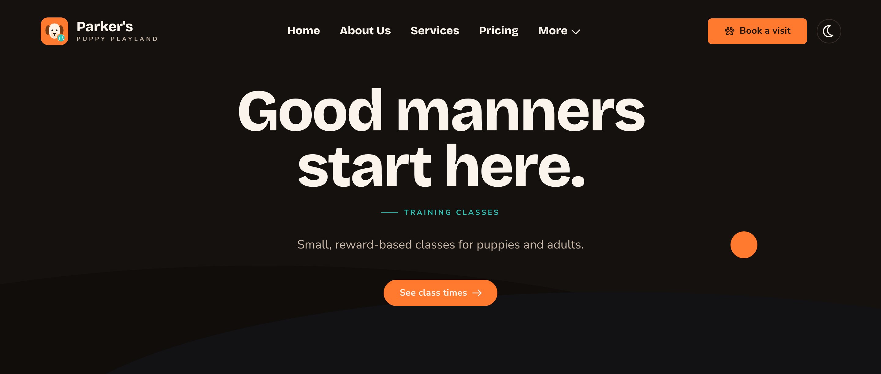
A Compact Hero makes a bold banner for an inner page.
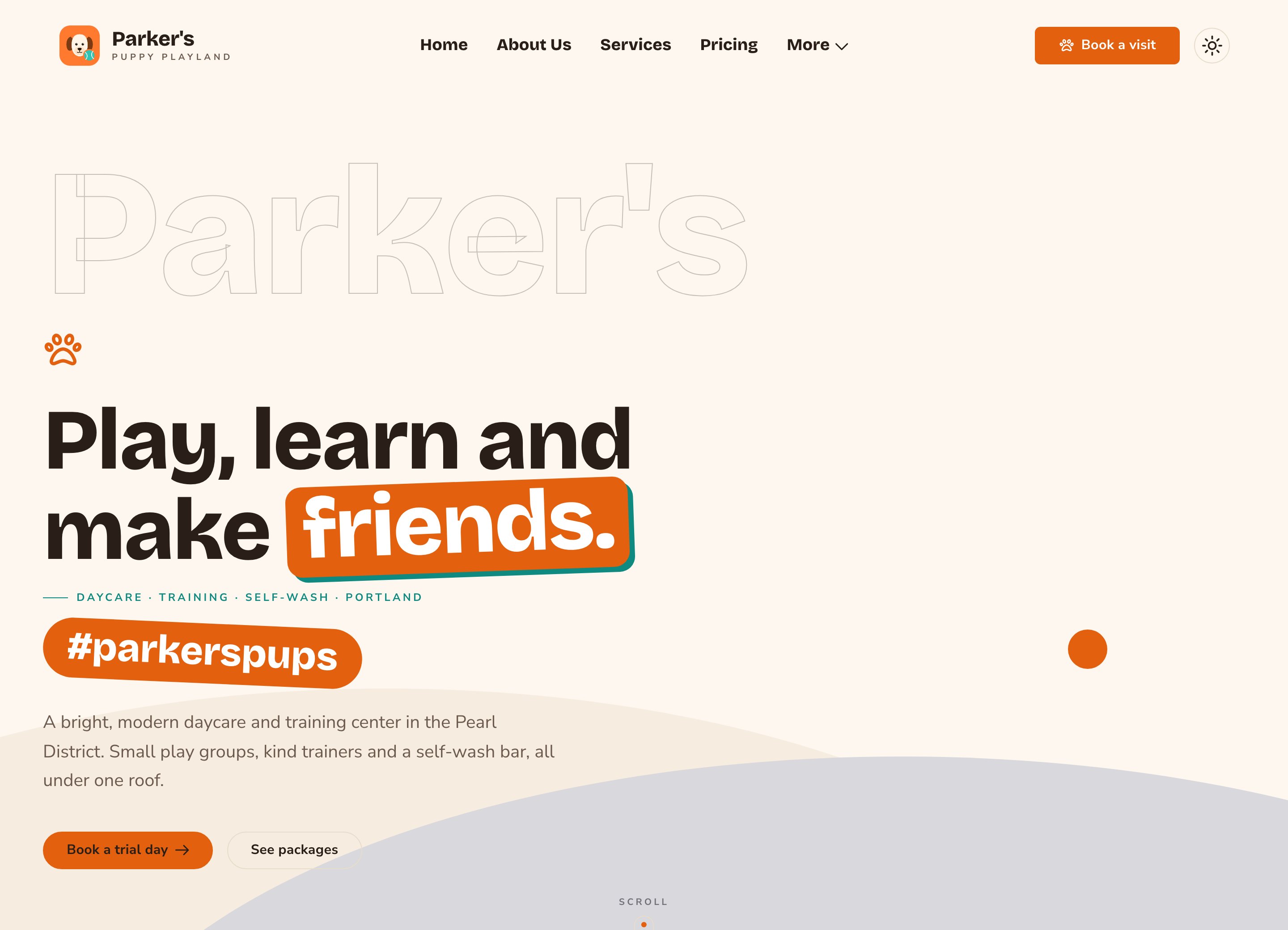
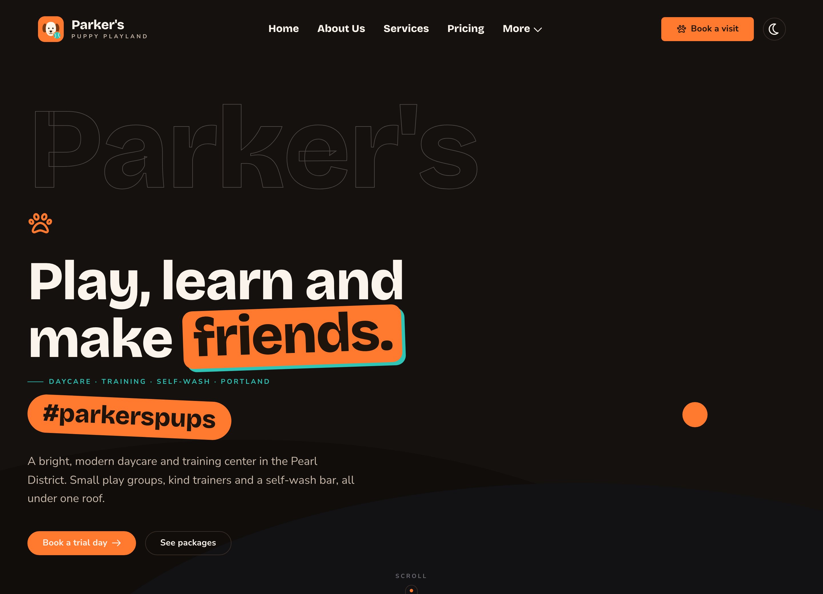
A hashtag patch and an icon add personality.
Good to know
- One main heading per page. If a page has no Hero or Page Header, or has more than one, the CMS won’t publish it. It tells you what to fix.
- Animations play for visitors only. While you edit, the Hero shows its finished state. Visitors who prefer less motion also see it without animation.
- Moving backgrounds. If you use a video, turn on the pause button so visitors can stop it.
- Write alt text for your photo. Alt text is a short description that screen readers read aloud, such as “Two puppies playing tug-of-war on the lawn”. To add it, open the command palette (⌘K, or Ctrl+K on Windows), choose Images, choose the photo, and fill in Alt Text. See The media library.
- Keep the headline short. The Hero’s photo sits behind the text, so make sure the headline stays readable over it.
Appearance options
Most sections also share a few tabs that work the same everywhere:- Background: set the color behind the section, separately for the dark and light themes.
- Fonts: use a different typeface for parts of this section only.
- CSS: add custom styles to this section. Admins and Owners can change it.
Related
Page Header
the lighter opener for inner pages.
Add, move and remove sections
put the Hero where you want it.
Buttons and card styles
every button option.
Motion
turn site animations on or off.