

 AdonisJS
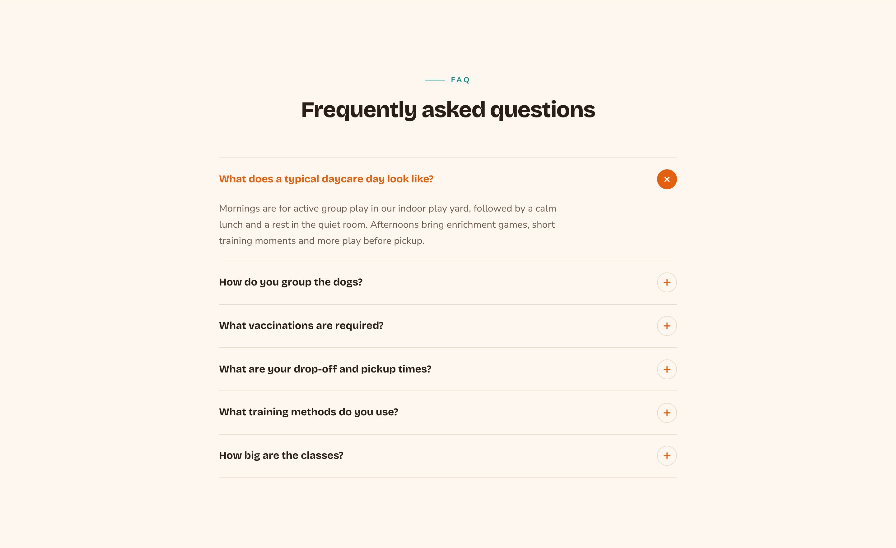
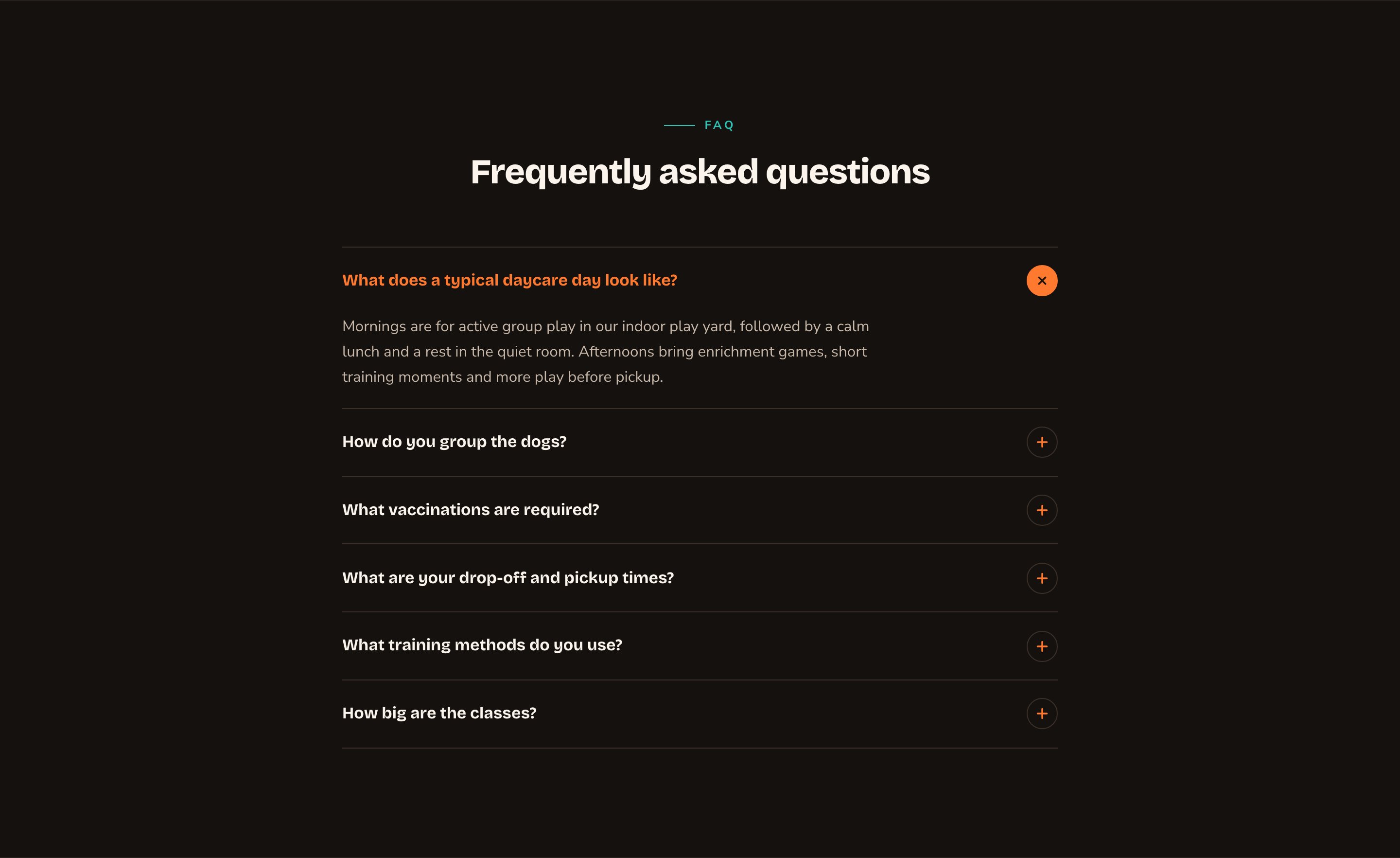
An FAQ in the Accordion layout, with the first answer open.
When to use it
- To build a full FAQ page that answers questions before people call you.
- To show your top 3 to 5 questions on the home page, with a link to the full list.
- To answer questions about one service right on that service’s page.
Where the questions come from
You don’t type questions into the section. You write each question and answer once in the FAQs manager, and sort them into categories in the FAQ Categories manager if you like. Every FAQ section then shows them, in the order you set there. To open a manager, press ⌘K (Ctrl+K on Windows) and choose FAQs or FAQ Categories under Manage. See FAQs for every option.Add it to a page
1
Open the page
Sign in, open the page on your site, and choose Edit in the edit bar at the top.
2
Find the spot
Select the section next to where the new one should go. A round + button appears on its top and bottom edges. On an empty page, choose Add Content in the middle.
3
Choose the section
The Add Content menu opens with its groups. Choose the section, then select it and choose Edit in its side toolbar to make it yours.
What you can change
Select the FAQ section on the page and choose Edit. The editor opens beside the page, so you see each change as you make it. It has eight tabs. Your changes go into the page’s draft. Visitors see them once the page is published with Update in the edit bar (Publish on a page never published).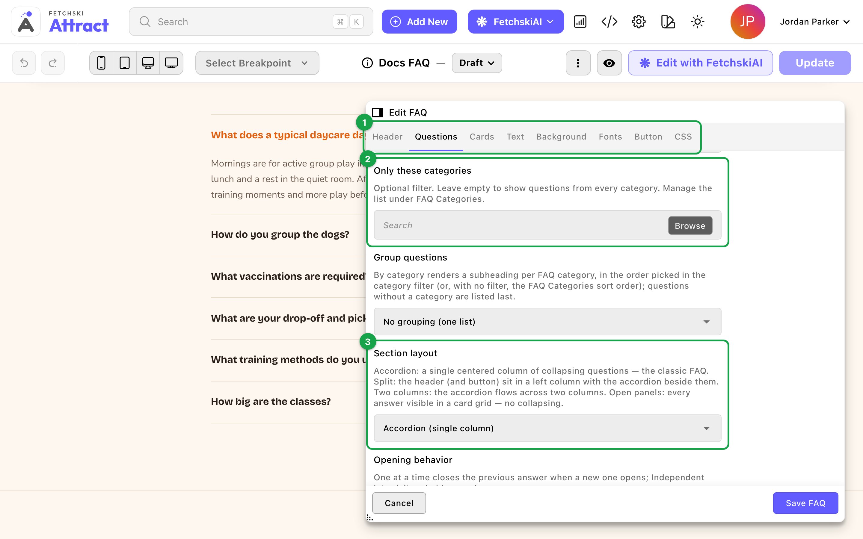
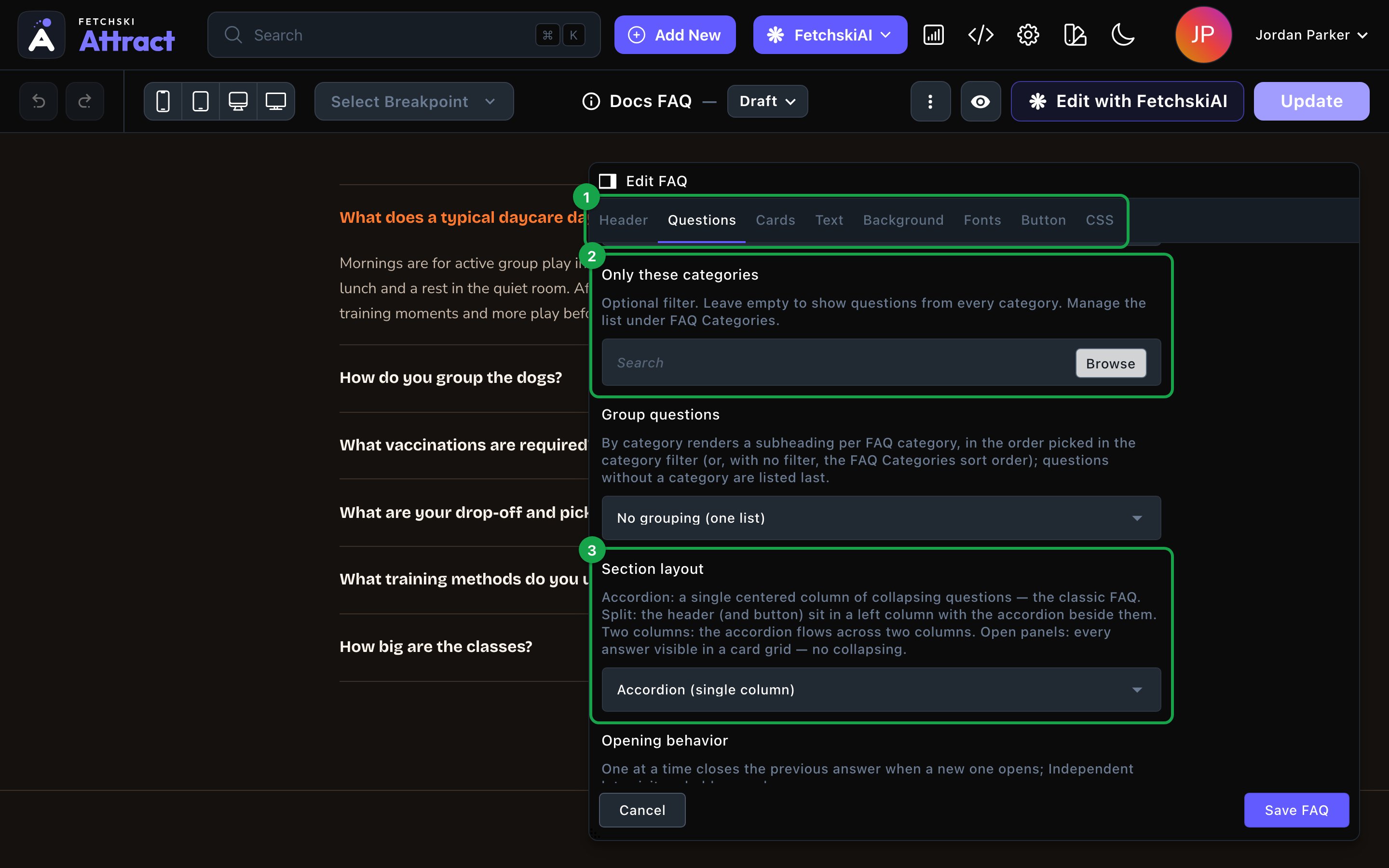
The FAQ editor, with the section updating beside it.
Header
Header
The words above the questions. Each part is optional.
- Eyebrow: a short line above the heading, such as “FAQ”.
- Heading: the section’s title, such as “Frequently asked questions”. Leave it empty to hide the heading. To show just the questions, clear the eyebrow and intro line too.
- Intro line: one short sentence under the heading.
- Header alignment: Center or Left. The Split layout always puts the header on the left.
Questions
Questions
Which questions show, and how visitors open them.Which questions show
- Featured questions only: show only the questions marked Featured in the FAQs manager. Use it for a short top-questions block.
- Maximum questions: the most questions to show, from 1 to 50. The default is 12, so raise it for a full FAQ page.
- Only these categories: pick 1 or more categories to show only their questions. Leave it empty to include every category. Featured questions only and Maximum questions still apply.
- Group questions: No grouping (one list), or By category to put a small heading over each category. Questions without a category come last.
- Accordion (single column): the classic FAQ, one centered column.
- Split (header beside questions): the heading and button sit in a column on the left, with the questions beside them. On phones they stack.
- Two columns: the questions split into 2 columns side by side.
- Open panels (all answers visible): every answer shows at once, in cards. Set Panel columns to 1, 2 or 3.
- Opening behavior: One at a time closes the last answer when a visitor opens another. Independent lets them keep several open.
- Open the first question initially: start with the first answer showing.
- Toggle icon: the symbol beside each question that opens and closes its answer. Plus / close shows a plus that turns into an × when the answer is open. Chevron shows a small arrow that points down, then up when the answer is open.
Cards
Cards
- Card style: the default Plain — no chrome gives the classic list, with a thin line between questions. Any other style turns each question into its own card. See Buttons and card styles.
- Hover effect: what a question does when a visitor points at it. The default is None.
- Accent: the color of the toggle icon and the open question’s highlight. Leave it empty to use your site’s accent color.
Text
Text
The size, weight and color of the questions and the answers. When you group by category, you can also set the weight and color of the category headings.
Background
Background
Give the section its own background color, from your site’s palette or a custom color. See What every section shares.
Fonts
Fonts
Use a different typeface for parts of this section only, such as the questions. Leave it empty to use the page’s fonts, which normally come from Site design → Typography. See What every section shares.
CSS
CSS
Custom styles for this section only. Admins and Owners can change this tab. See Custom CSS.
Looks you can make
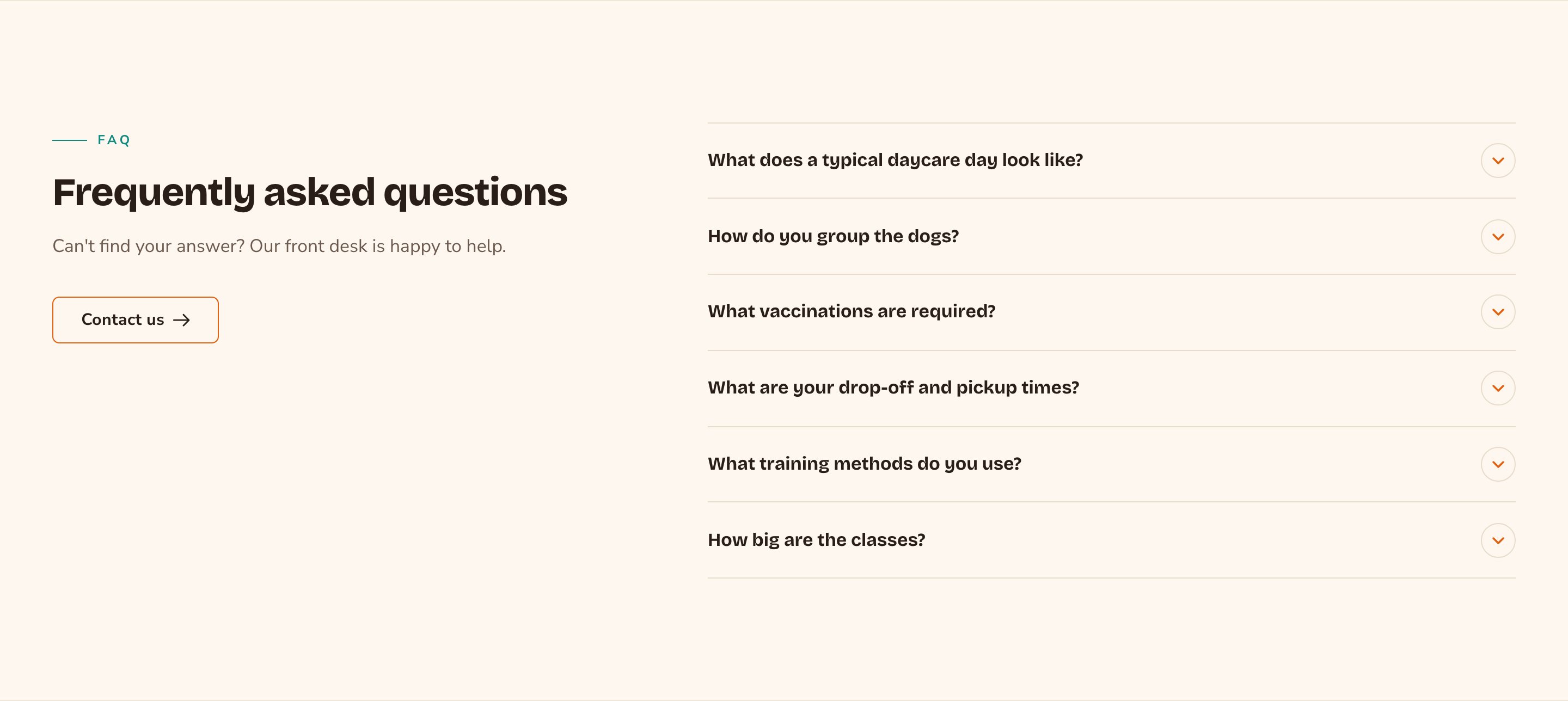
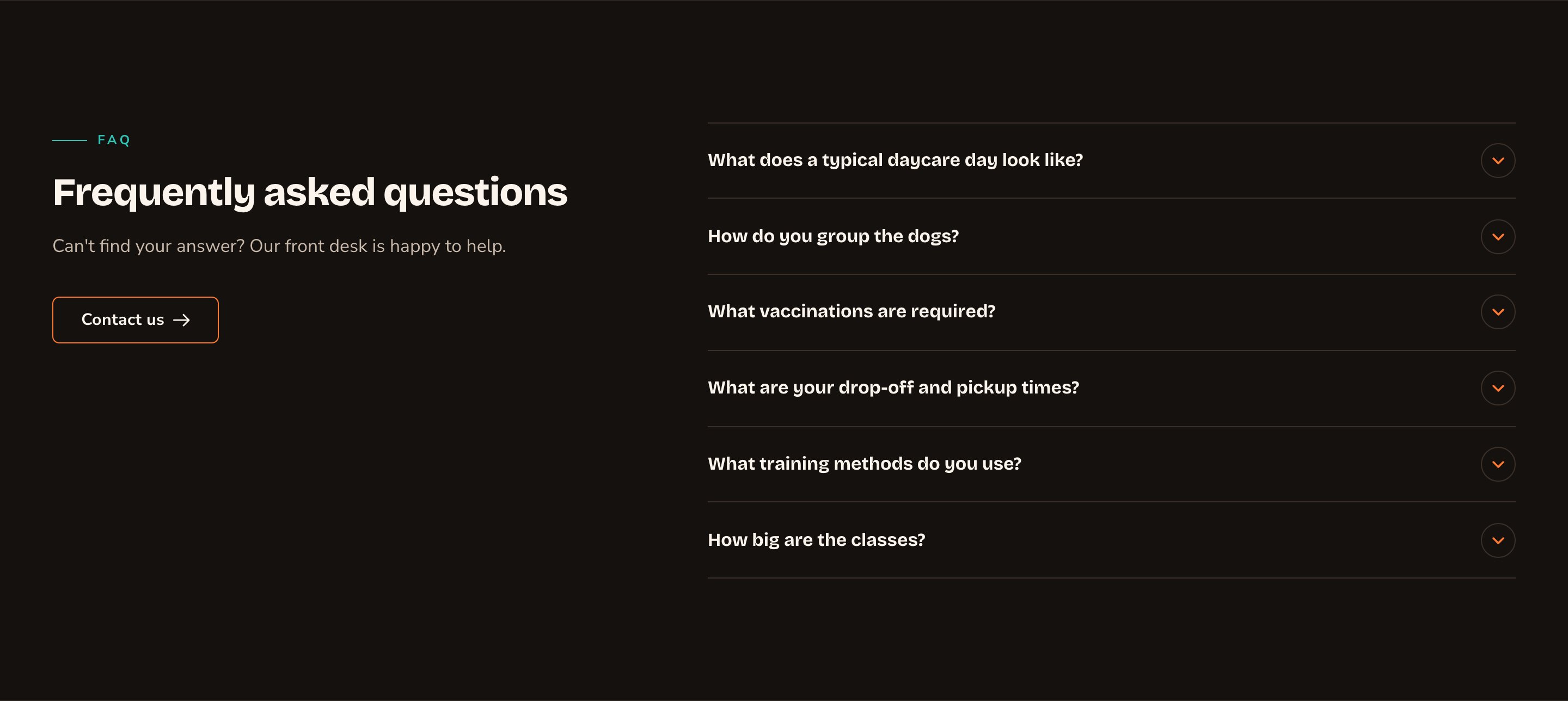
Split puts your heading and button beside the questions.
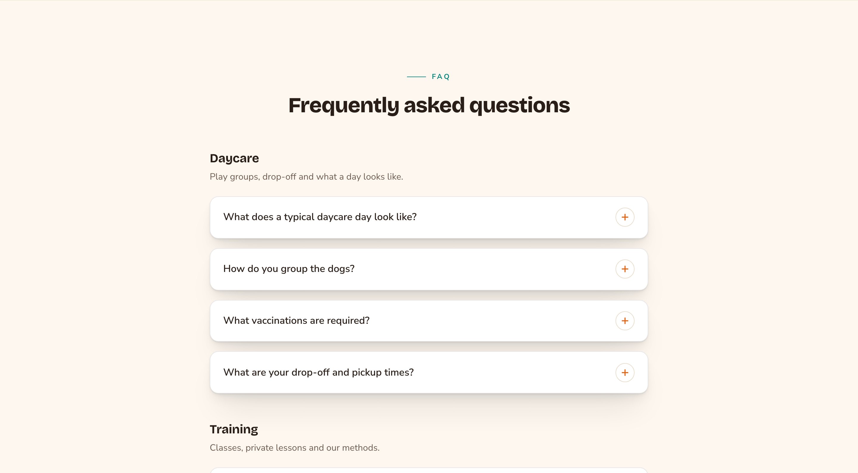
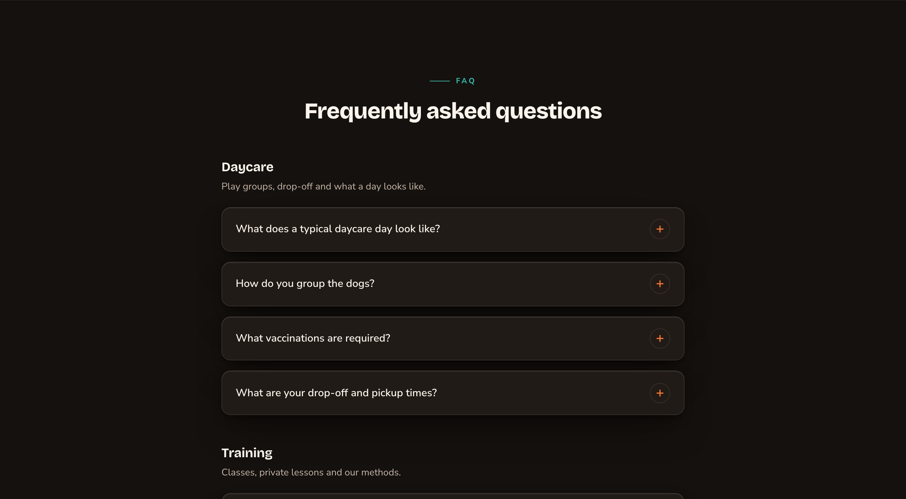
Grouped by category, with each question on its own card.
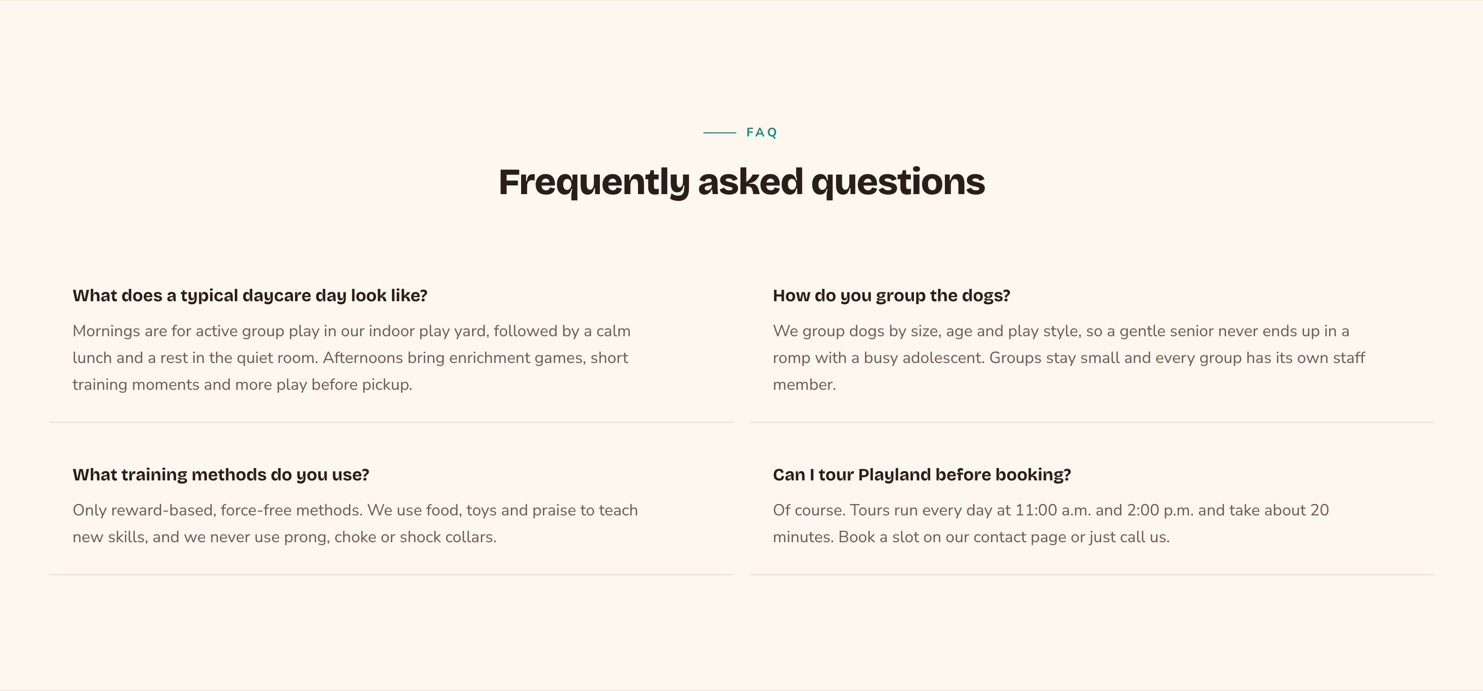
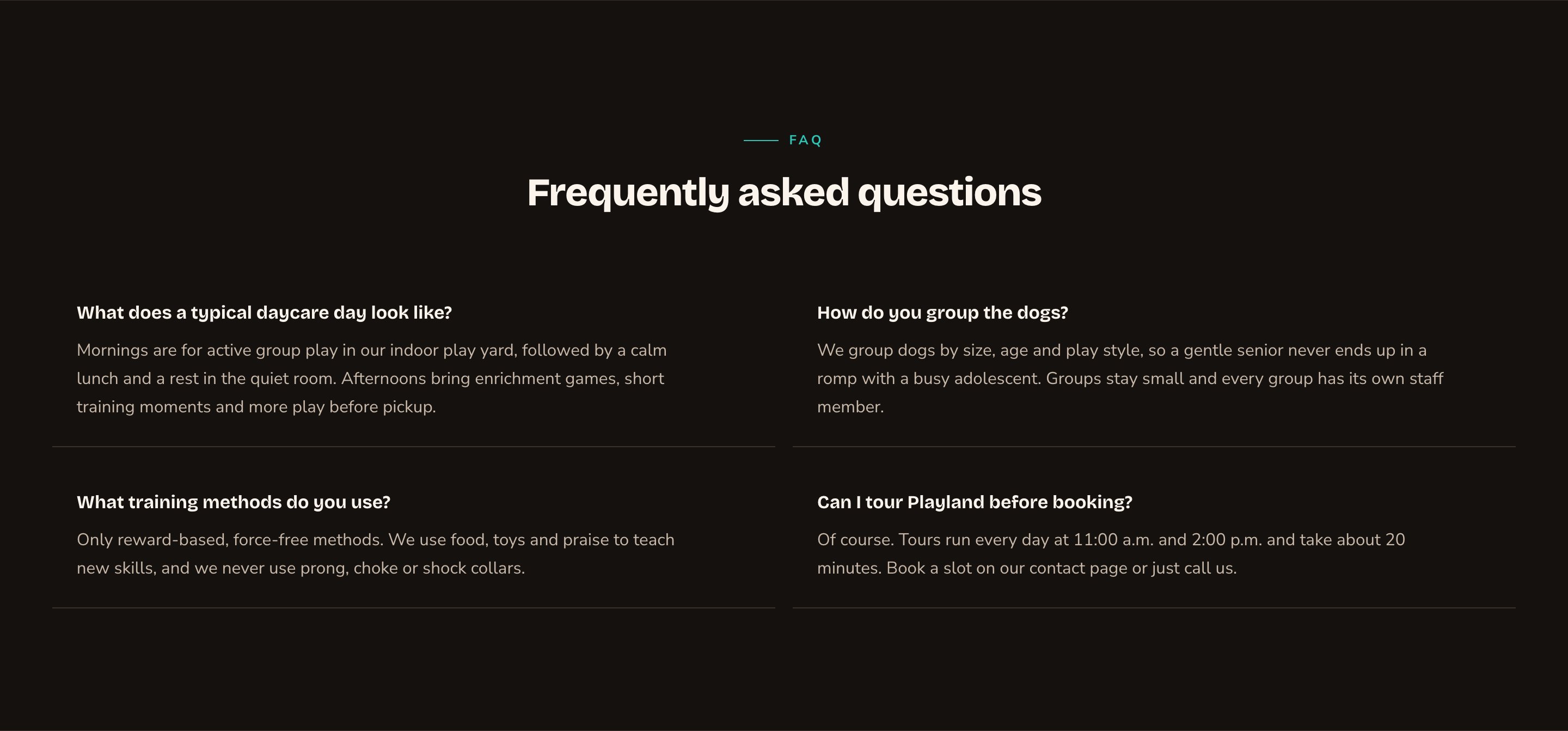
Open panels show every answer at a glance.
Good to know
- Answers open on click. In every layout except Open panels, visitors see the questions and click one to read its answer. To show every answer at once, choose Open panels (all answers visible).
- Built to be accessible. Each question is a real button that works with a keyboard and screen readers. The open and close motion is turned off for visitors who prefer less motion.
- One set of search data per page. If a page has several FAQ sections, their questions are combined for search engines.
- No questions yet? Visitors see nothing. Signed-in editors see a note pointing to the FAQs manager.
- Demo questions. A new site comes with demo questions. While the section shows them, editors see a “Demo content only” notice. Visitors see the demo questions too if you publish the page, so add your real questions first. The demo questions are removed as soon as you publish your first real question.
- Drafts show while you edit. You see questions you haven’t published yet. Visitors see only published ones.
Appearance options
Most sections also share a few tabs that work the same everywhere:- Background: set the color behind the section, separately for the dark and light themes.
- Fonts: use a different typeface for parts of this section only.
- CSS: add custom styles to this section. Admins and Owners can change it.
Related
Manage FAQs
write questions and answers, and sort them into categories.
Side-by-side layouts
put an FAQ in a column next to text or a photo.
Page SEO
how a page shows up in search.
Buttons and card styles
every card style and hover effect.