

 AdonisJS
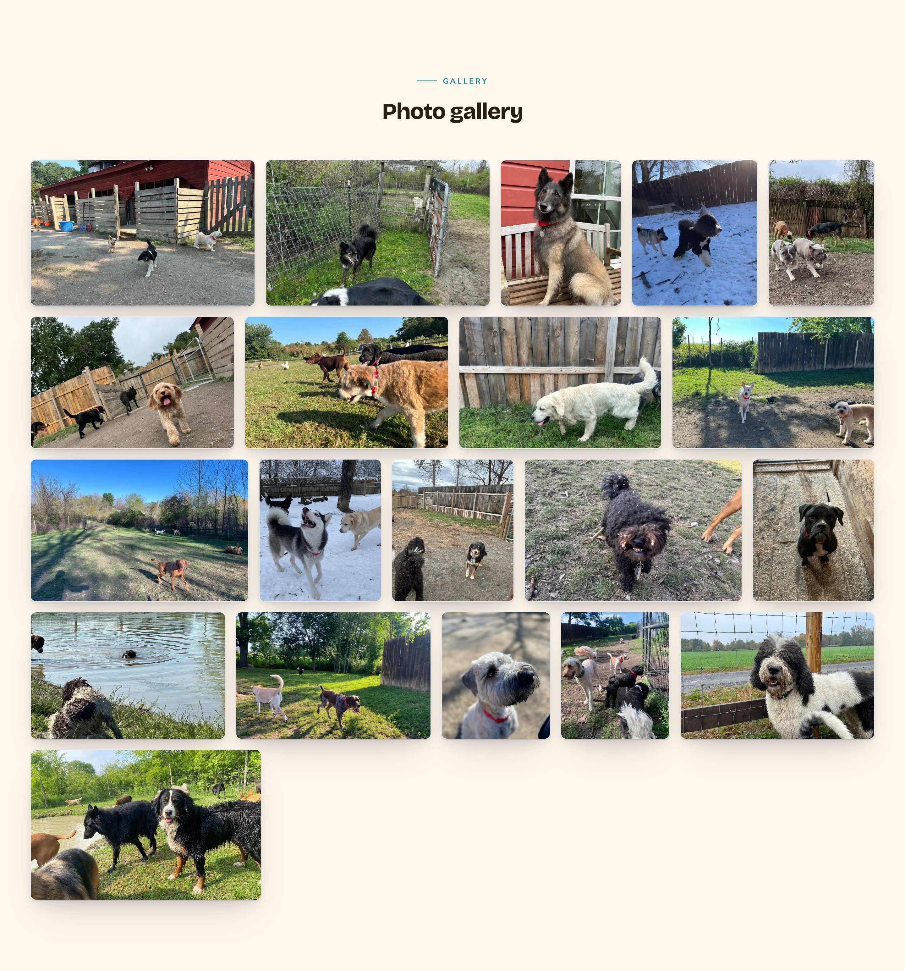
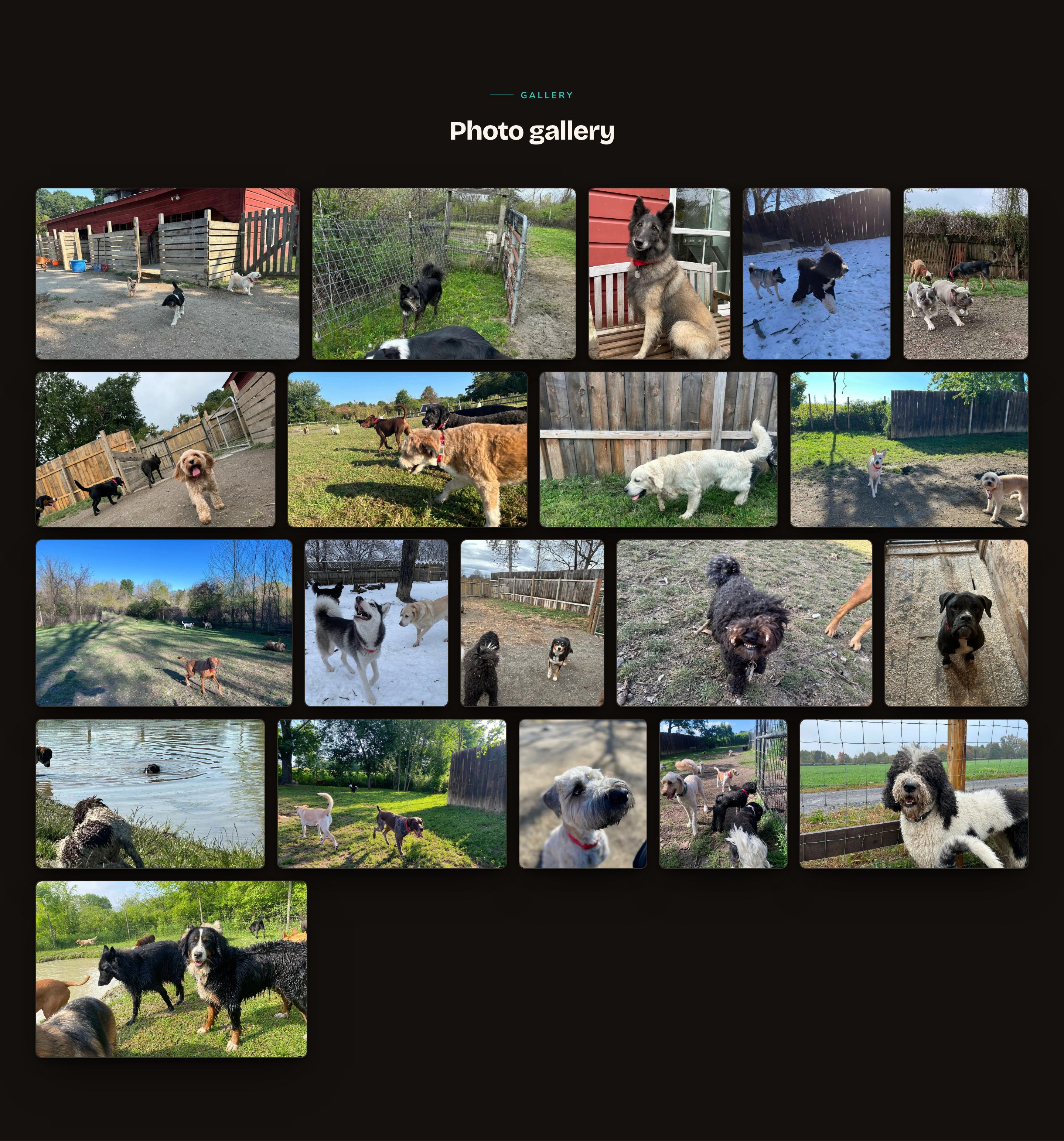
A Mosaic Photo Wall fits every photo into neat rows without cutting off the subject.
When to use it
- To give your home page a taste of your photos, with a button to the full gallery.
- To build a gallery page that shows every photo you’ve picked.
- To add a band of moving photos between 2 other sections.
Where the photos come from
A gallery shows photos from a single source, which you choose under Photo source on its Gallery tab:- Photo Album (hand-picked, hand-ordered): a set of photos you pick and put in order. Best for a designed page. Build albums in the Photo Albums manager first. See Photo albums.
- Media folder (everything in a folder): every photo in one folder of your media library, newest first. Best for a big collection you keep organized. Include subfolders adds the photos in folders inside it. See Folders.
- Photo Feed (refreshes itself from an external source): a set of photos that replaces itself on a schedule, so the gallery changes over time. See Photo feeds.
Add it to a page
1
Open the page
Sign in, open the page on your site, and choose Edit in the edit bar at the top.
2
Find the spot
Select the section next to where the new one should go. A round + button appears on its top and bottom edges. On an empty page, choose Add Content in the middle.
3
Choose the section
The Add Content menu opens with its groups. Choose the section, then select it and choose Edit in its side toolbar to make it yours.
What you can change
Select the gallery on the page and choose Edit. The editor opens beside the page, so you see each change as you make it. It has 7 tabs. Your changes go into the page’s draft. Visitors see them once the page is published with Update in the edit bar (Publish on a page never published).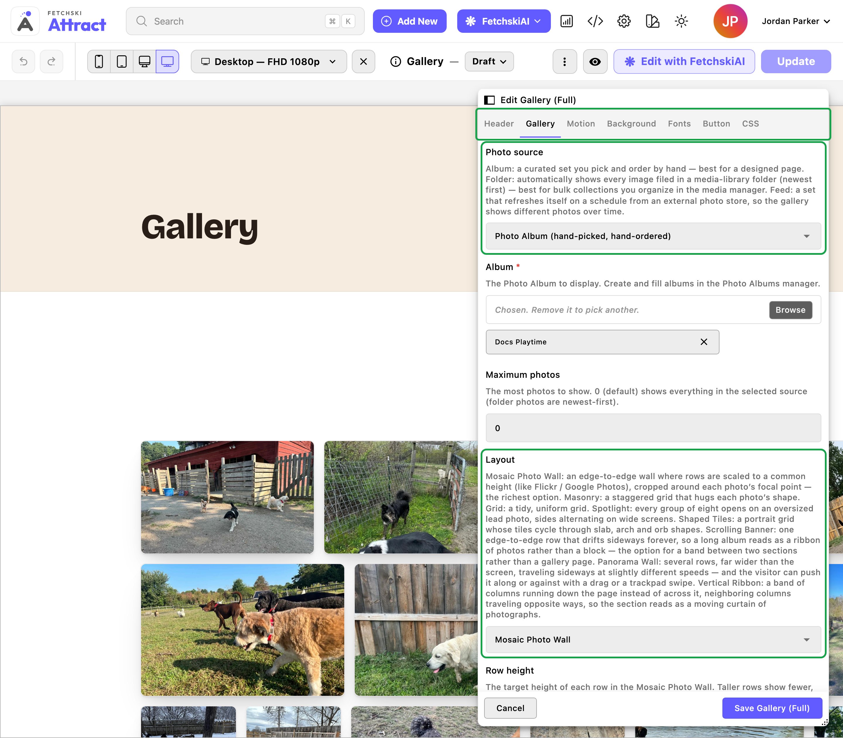
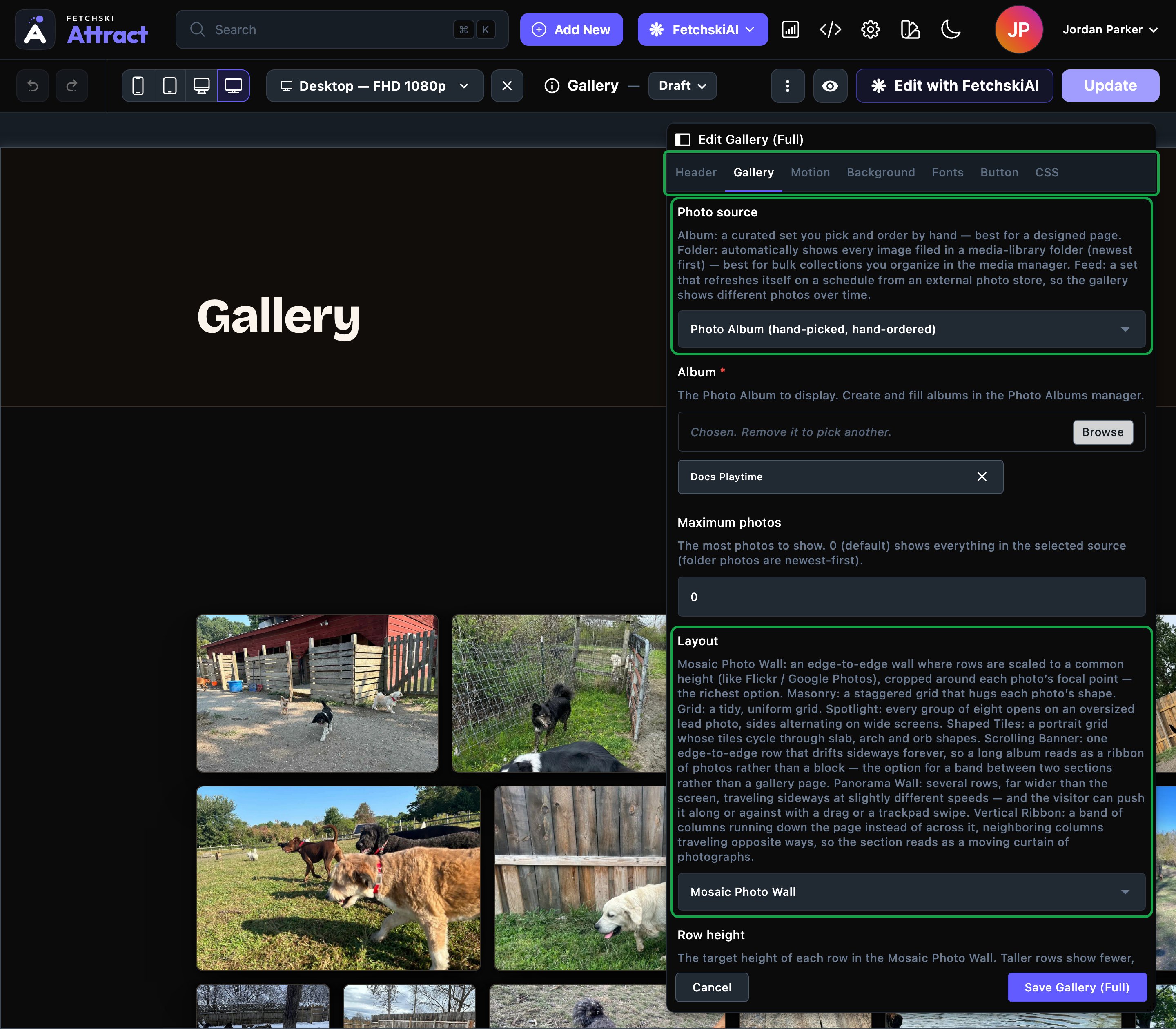
The gallery editor, with the gallery updating beside it.
Header
Header
The words above the photos. Each part is optional.
- Eyebrow: a short line above the heading. It starts as “Gallery”.
- Heading: the section’s title. Leave it empty to hide the heading. To show just the photos, clear the eyebrow and intro line too.
- Intro line: one short sentence under the heading.
- Header alignment: Center or Left.
Gallery
Gallery
The photos, how they’re arranged, and how each tile looks.Photos
- Photo source: Photo Album (hand-picked, hand-ordered), Media folder (everything in a folder) or Photo Feed (refreshes itself from an external source). Then choose the Album, Folder or Photo Feed to show.
- Maximum photos: a number from 1 to 200 shows at most that many photos. 0 is special: it shows everything the source has. That means a whole album, up to 200 photos from a folder, or up to 500 from a photo feed.
- Mosaic Photo Wall: rows of photos at the same height, each photo keeping its own shape. Choose its Row height. For an album where every photo is the same shape, turn on Vary photo shapes to give the wall a livelier mix.
- Masonry: a staggered wall where each tile fits its photo’s shape.
- Grid (uniform): a tidy grid of squares.
- Spotlight (hero + grid): one large photo, then 7 smaller ones around it, repeating.
- Shaped Tiles (sculpted grid): tall tiles in a mix of rectangles, arches and circles.
- Scrolling Banner (one moving row): one row of photos that moves sideways. Set its Banner height, Banner speed and Banner direction.
- Panorama Wall (several moving rows you can push): 2 to 8 moving rows. Visitors can drag or swipe the wall along while Let visitors push the wall is on.
- Vertical Ribbon (columns moving up and down): 2 to 6 columns moving up and down inside a band. Alternate the columns sends neighboring columns opposite ways.
- Gap between tiles: Tight, Normal or Roomy.
- Corner radius: how rounded each tile’s corners are: Square, Slight or Rounded.
- Card style and Hover effect: each tile’s frame and what it does on hover. The default is Raised — lit soft card (a soft card that sits slightly above the page) with Glow — accent halo blooms (a soft colored glow on hover). Choose Plain — no chrome, with no card frame at all, for a clean, edge-to-edge wall. See Buttons and card styles.
- Show captions on hover: shows each photo’s alt text when a visitor points at it.
- Open photos in a lightbox: on by default. A click opens the photo full size, with previous and next buttons. Turn it off for a purely decorative wall.
- Hover accent: the color of the hover glow. Leave it empty to use your Primary / brand color from Site design → Colors · Brand.
Motion
Motion
Extra effects for the photos themselves, all off by default. They’re separate from the 3 moving layouts, which you choose under Layout on the Gallery tab.
- Ambient drift: a very slow pan and zoom on every photo. Choose Subtle — barely perceptible or Noticeable — a clear slow drift.
- Scroll depth: photos slide at different speeds as the visitor scrolls, for a sense of depth. Walls only.
- Shuffle the photos: every few seconds, some photos glide past each other and trade places. Grid (uniform) only. Photos trading places at once sets how many take part, from 2 to 6.
- Rotate photos automatically: photos change a few at a time, swapped for others from the same source. Walls only.
- How a photo changes: Cross-fade is the quietest of 7 styles. The others include Slide in, Zoom through and Turn over — the tile flips like a card.
- Which photos change next: Scattered — spread across the wall, or a Wave, Columns or Rows sweep.
- How often photos change, Photos changing at once and How long a change takes.
- Photos held in reserve: how many extra photos wait their turn, up to 500. More means a longer wait before a visitor sees a repeat.
Background
Background
Give the section its own background color, from your site’s palette or a custom color. See What every section shares.
Fonts
Fonts
Use a different typeface for parts of this section only, such as the heading. Leave it empty to use the page’s fonts, which normally come from Site design → Typography. See What every section shares.
CSS
CSS
Custom styles for this section only. Admins and Owners can change this tab. See Custom CSS.
Looks you can make
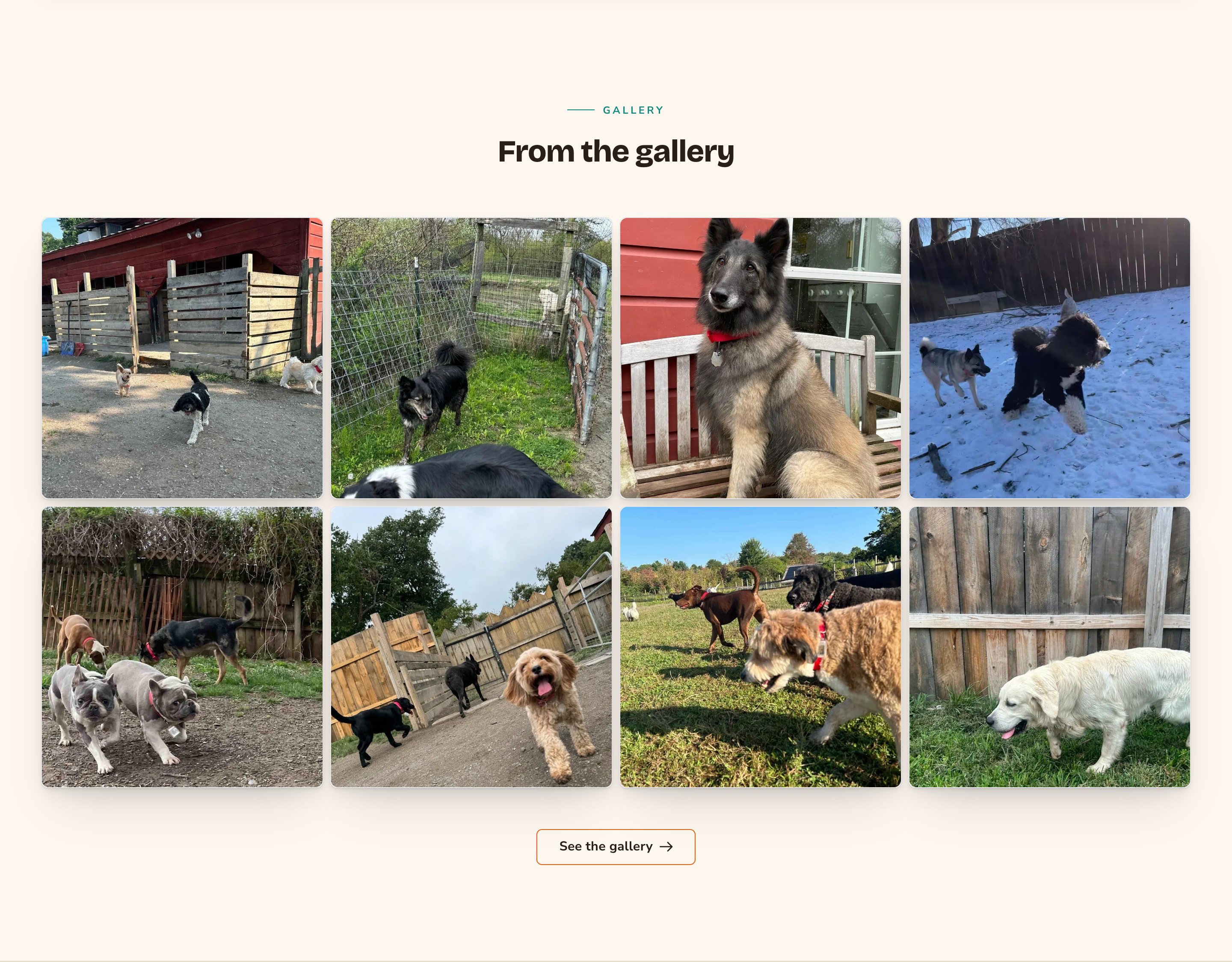
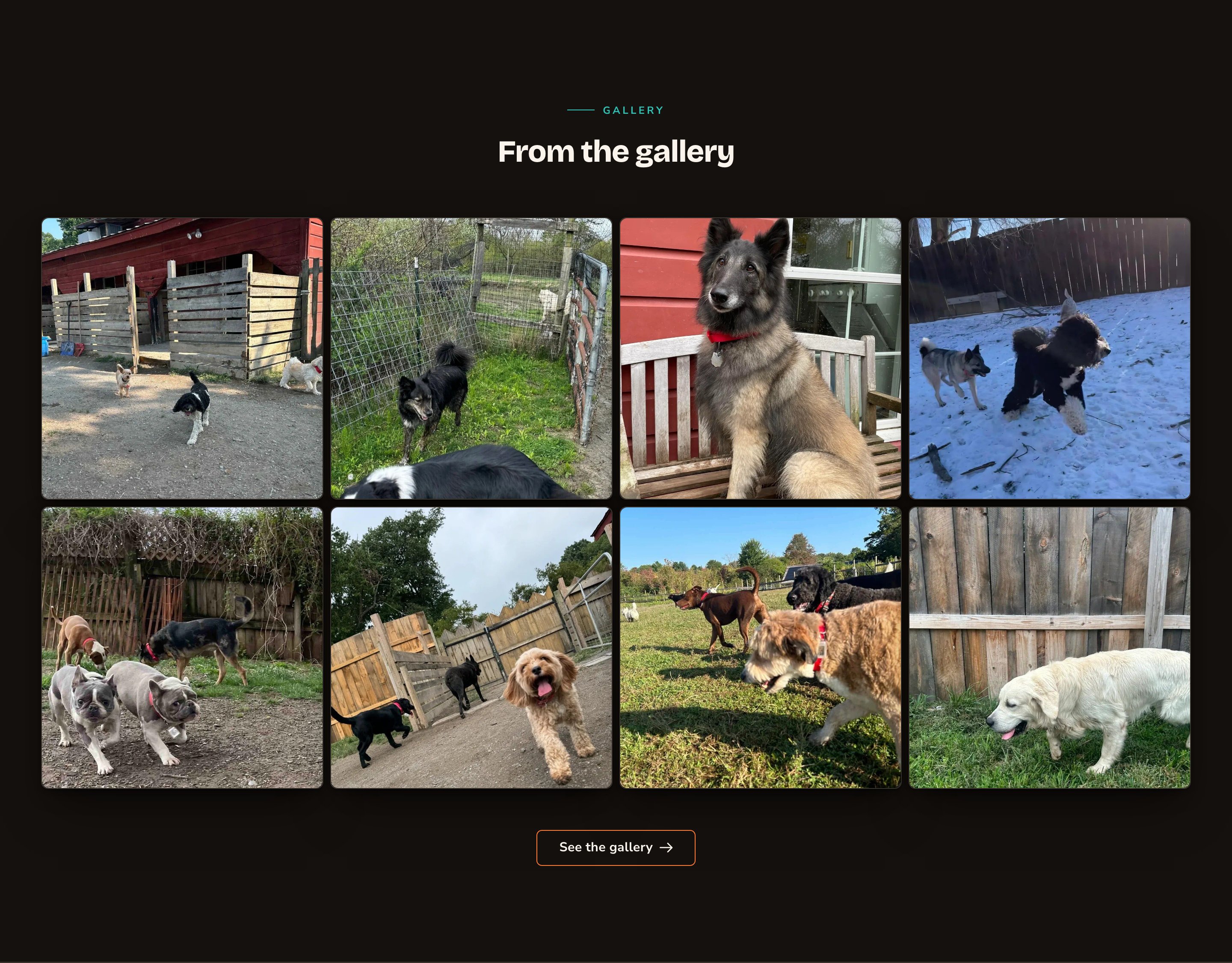
A home page teaser that leads to the full gallery.
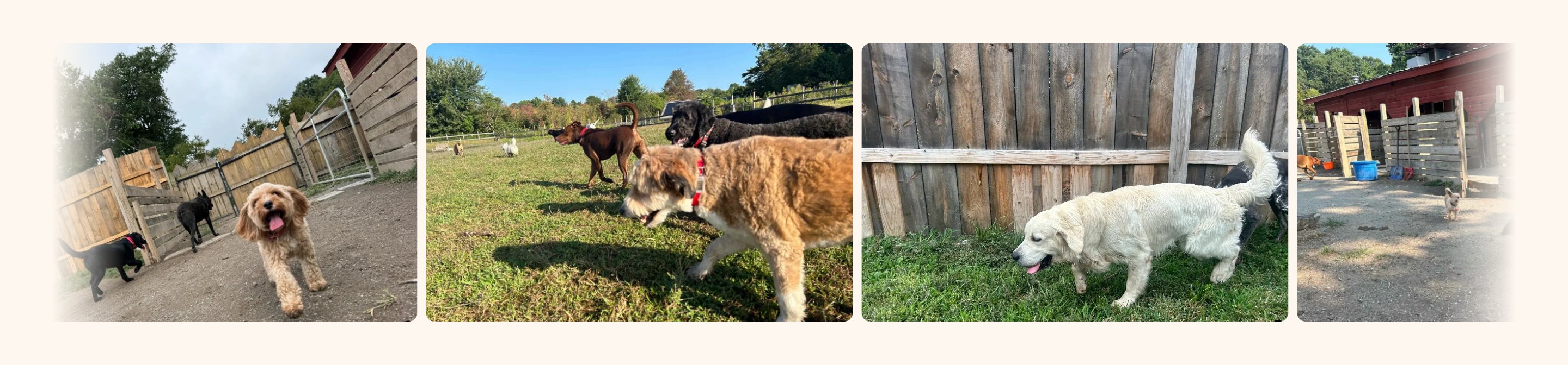
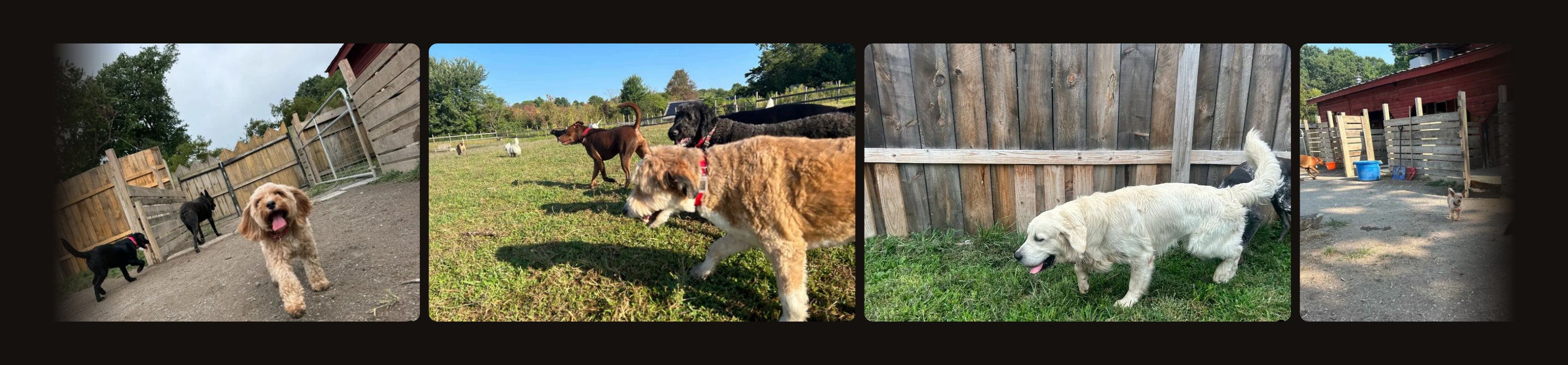
A moving band of photos between two sections.
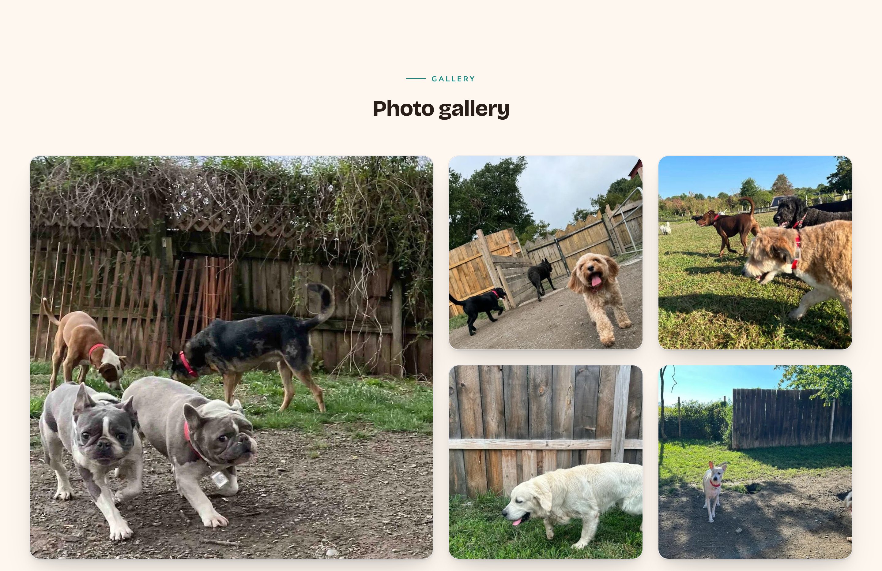
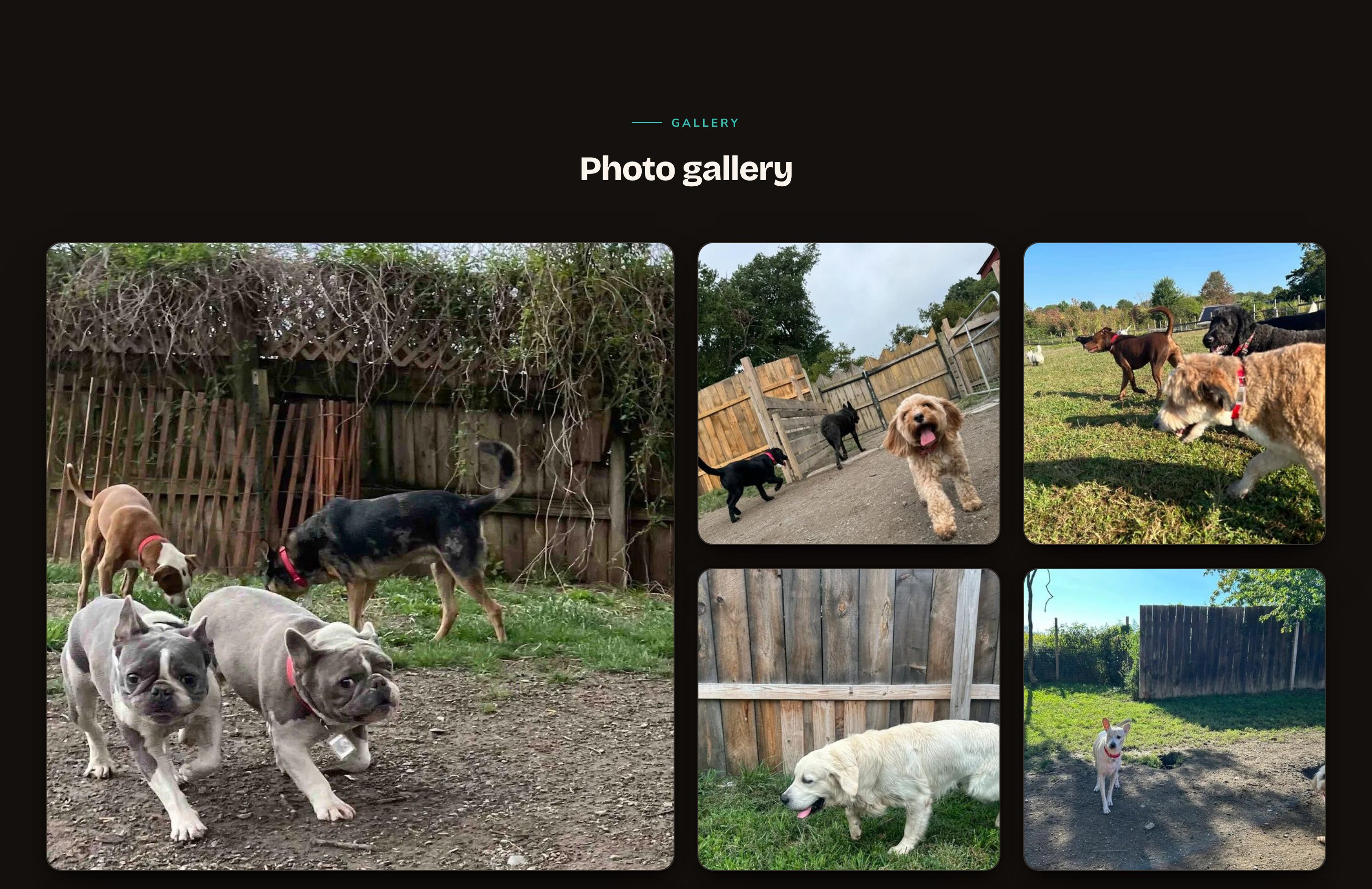
Spotlight puts one photo in the lead, then fills in around it.
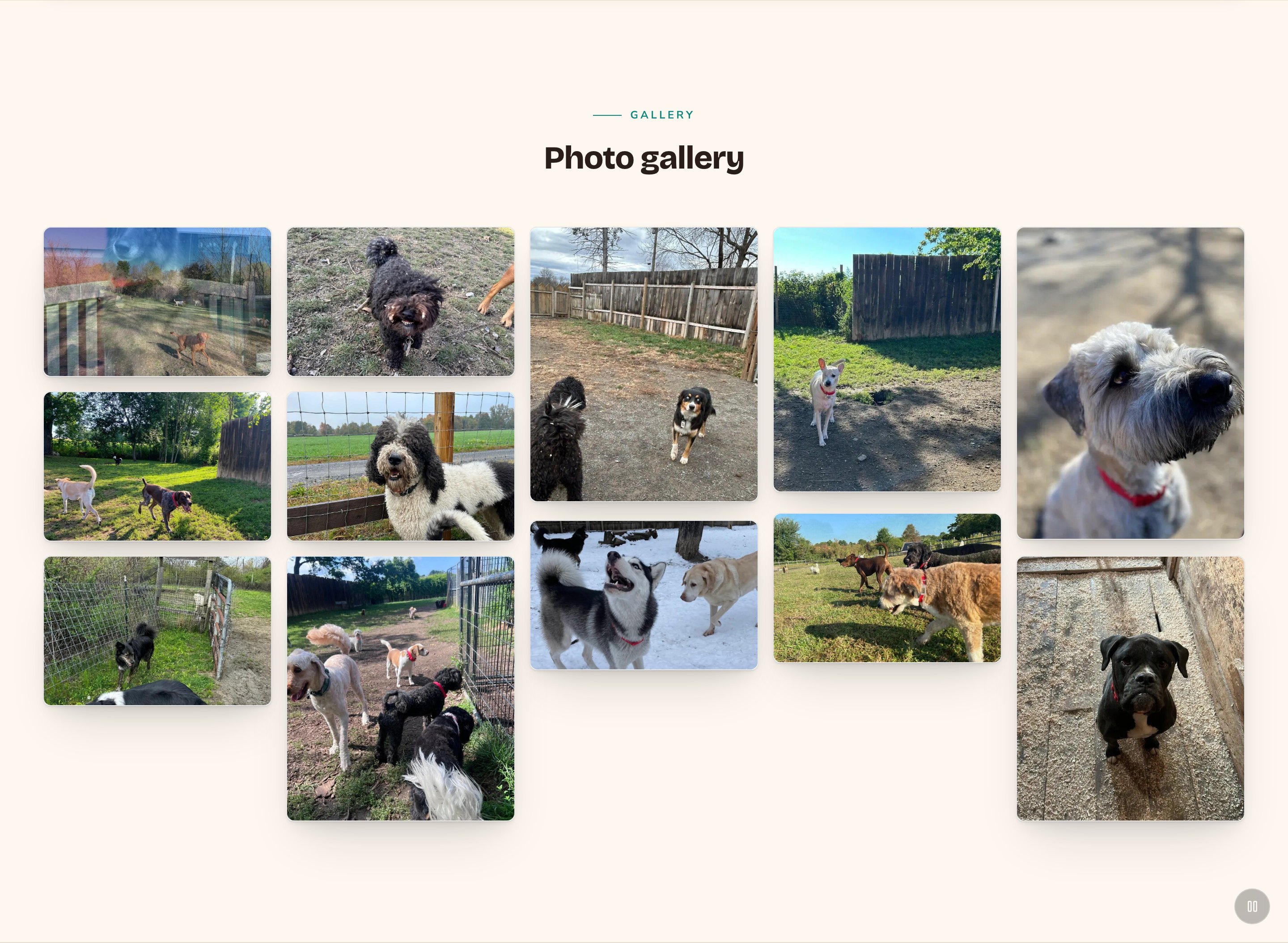
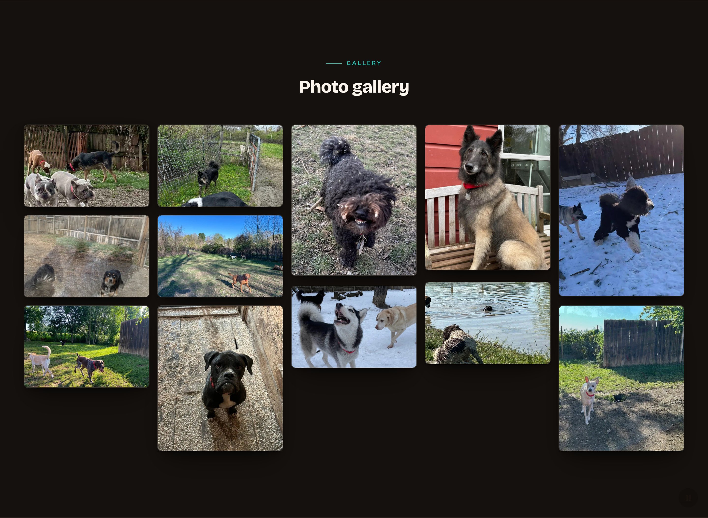
A wall that keeps showing new photos while visitors watch.
Good to know
- No photos, no section. If the album, folder or feed is empty, the gallery stays hidden, even while you edit.
- Moving galleries can be paused. Whenever a gallery moves on its own, it gets a pause button automatically. Visitors who prefer less motion don’t see the drift, scroll depth, shuffle or rotation.
- Motion plays for visitors only. While you edit, drift, scroll depth, shuffle and rotation don’t run, so you can arrange things calmly. They also stay off when animations are off in Motion. The 3 moving layouts keep moving in both cases.
- Write alt text for your photos in the media library. It describes each photo for people using screen readers, and it’s the caption in the lightbox.
- Where it fits. Both gallery sections are full width. They aren’t offered inside columns or on blog posts.
Appearance options
Most sections also share a few tabs that work the same everywhere:- Background: set the color behind the section, separately for the dark and light themes.
- Fonts: use a different typeface for parts of this section only.
- CSS: add custom styles to this section. Admins and Owners can change it.
Related
Photo albums
pick and order the photos a gallery shows.
Photo feeds
a set of photos that refreshes itself.
Folders
organize your media library, then show a whole folder.
Instagram Feed
show your Instagram posts instead.