

 AdonisJS
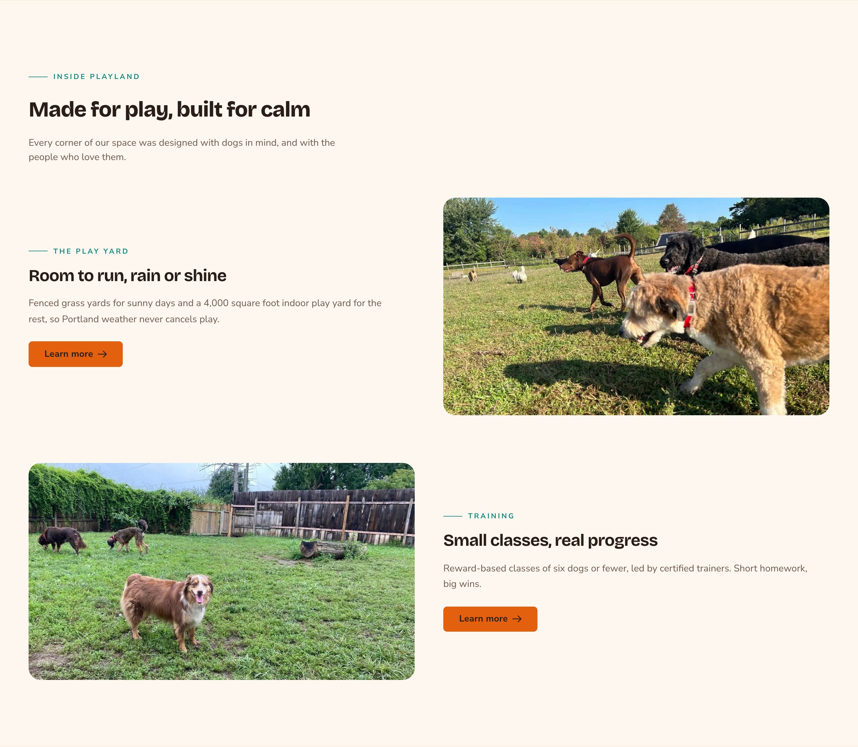
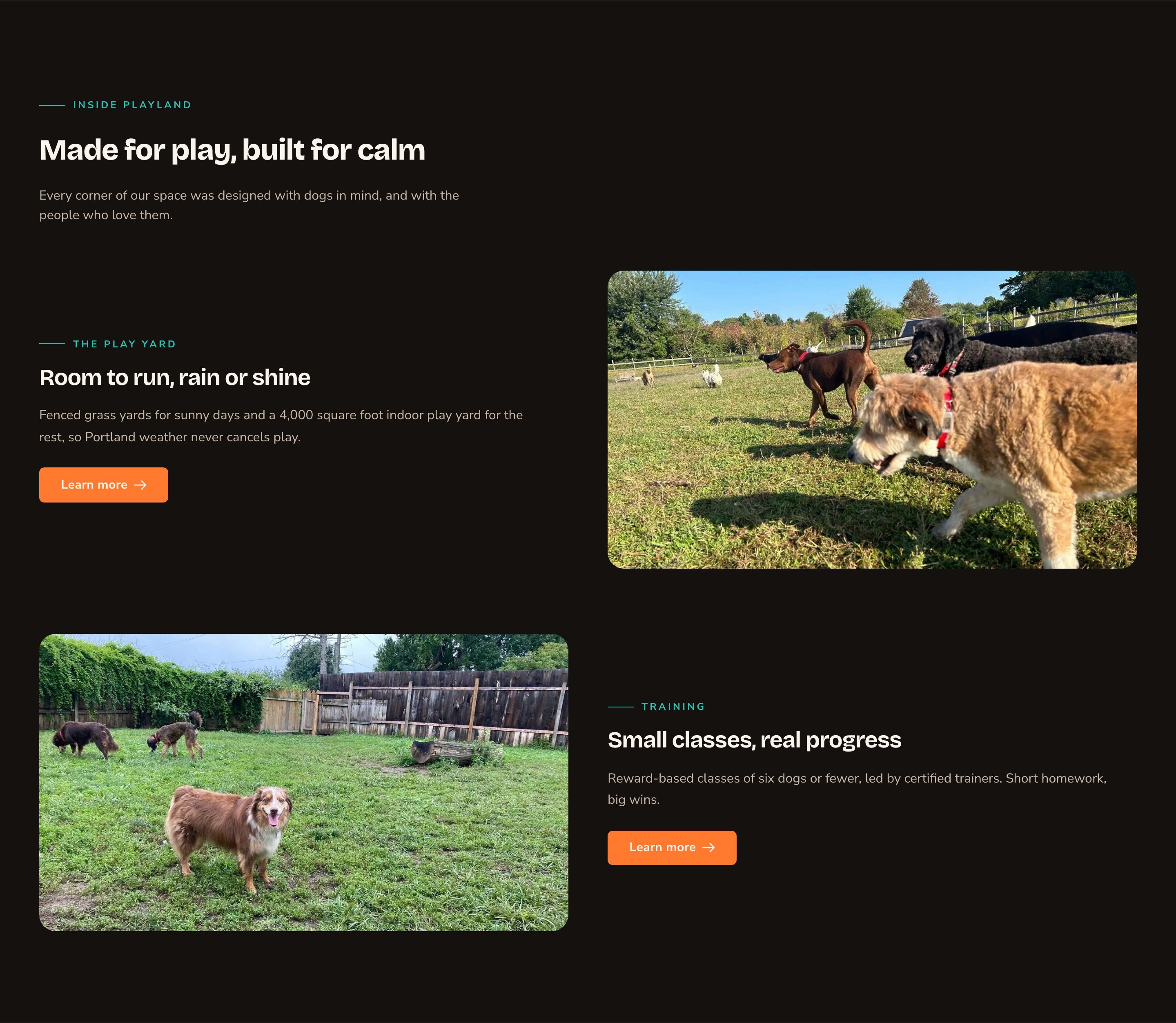
Two blocks in a zig-zag, each with a photo and a button.
When to use it
- To tell your story in pictures and words, one point at a time.
- To show off your space, your team at work, or a product.
- To embed a YouTube or Vimeo video with a few lines about it.
Add it to a page
1
Open the page
Sign in, open the page on your site, and choose Edit in the edit bar at the top.
2
Find the spot
Select the section next to where the new one should go. A round + button appears on its top and bottom edges. On an empty page, choose Add Content in the middle.
3
Choose the section
The Add Content menu opens with its groups. Choose the section, then select it and choose Edit in its side toolbar to make it yours.
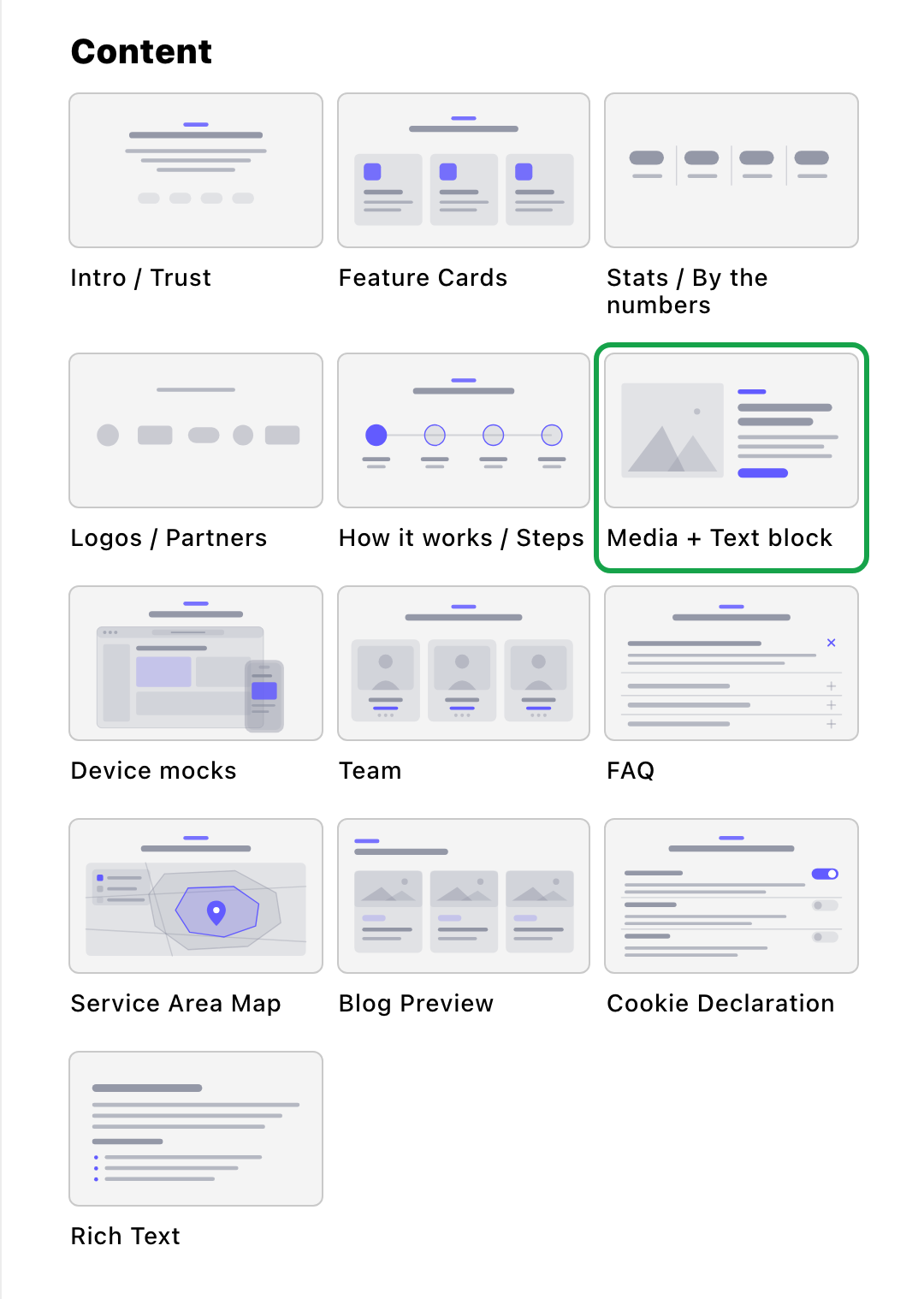
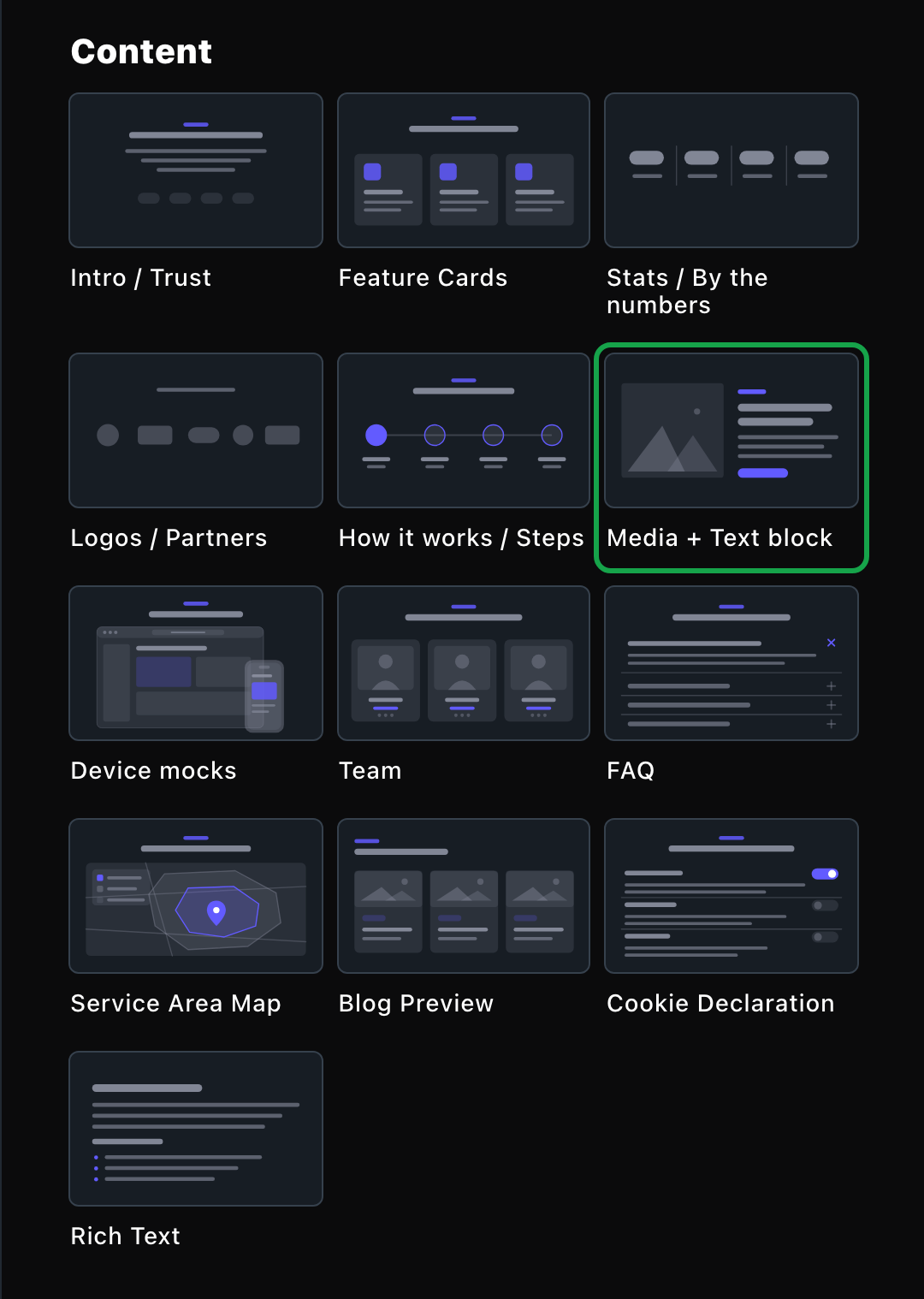
Media + Text block lives in the Content group.
What you can change
Select the section on the page and choose Edit. The editor opens beside the page, so you see each change as you make it. It has five tabs: Media + Text, Background, Fonts, Button and CSS. Your changes go into the page’s draft. Visitors see them once the page is published with Update in the edit bar (Publish on a page never published).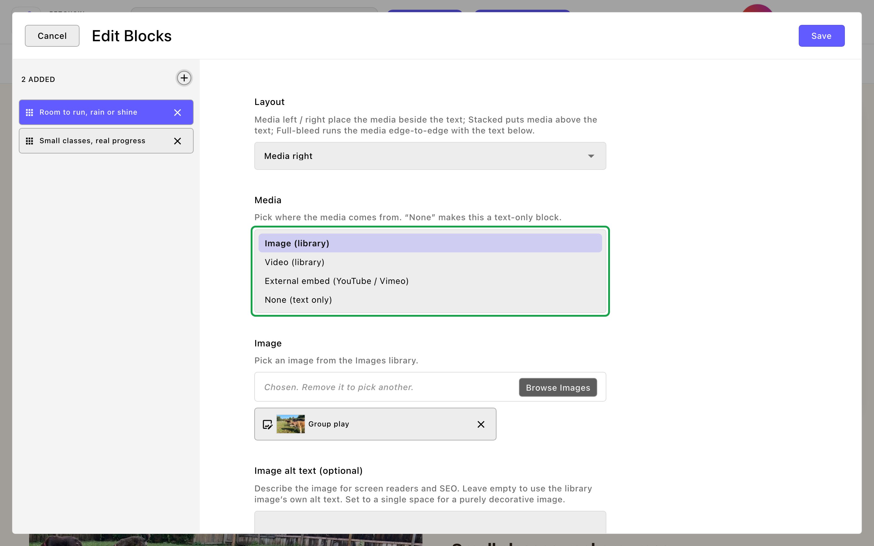
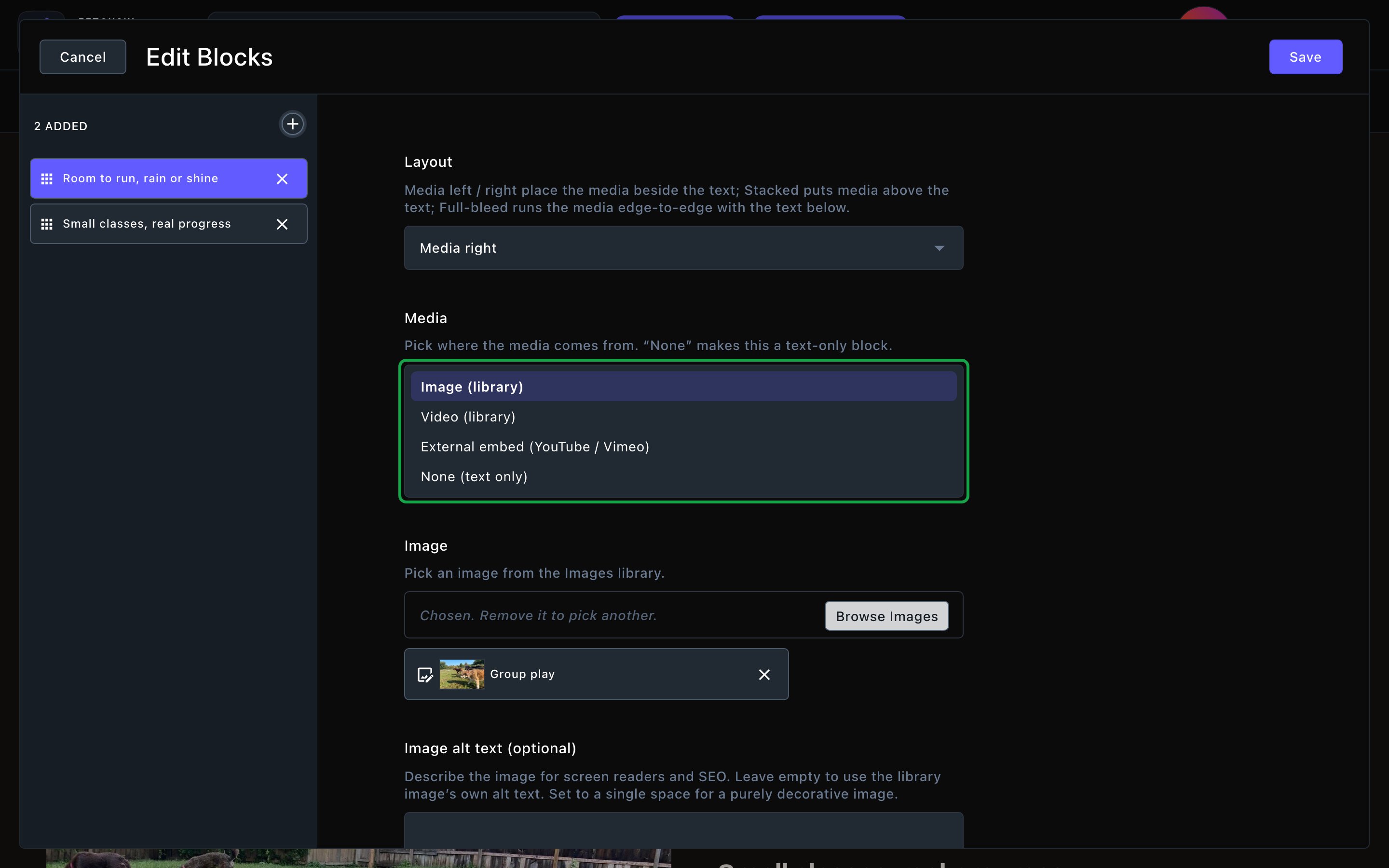
Each block chooses where its media comes from.
Media + Text
Media + Text
Everything about the section header, how the blocks are laid out, and the blocks themselves.Header
- Show eyebrow and Eyebrow: a small line above the heading, “Why us” to start.
- Heading and Intro line: an optional heading and a short sentence under it. Clearing the heading hides only the heading. To show just the blocks, also turn off Show eyebrow and clear the intro line.
- Text alignment: Left or Center. Side-by-side blocks usually read best on the left.
- Media / text split: how a side-by-side block shares its width: Balanced (50 / 50), Wider media or Wider text.
- Vertical alignment: line the text up with the Center or the Top of the media.
- Media shape: the shape of the media frame, such as Landscape (16:9), Square (1:1) or Portrait (4:5). The numbers compare width with height, so 16:9 is wide and 4:5 is a little taller than wide. The frame trims the edges of a photo to fit its shape. Your original image isn’t changed. Auto (image’s natural shape) keeps a photo as it is. Videos always use a fixed shape.
- Media corners: Large, Rounded, Slight or Square.
- Gap between blocks and Show dividers between blocks: the space between blocks, and an optional thin line.
- The block eyebrow, block heading and block body each have a color and a weight, and the heading and body also have a size. They apply to every block, so your rows stay consistent.
- Layout: Media left or Media right puts the media beside the text. Stacked (media on top) puts it above. Full-bleed media runs it edge to edge across the screen, with the text below.
- Media: where the media comes from:
- Image (library): choose an Image from your Images library. Image alt text (optional) describes it for screen readers; leave it empty to use the library’s own alt text.
- Video (library): choose a Video from your Videos library. Turn on Auto-play (muted loop) to play it silently on repeat, or leave it off for a normal player with play controls.
- External embed (YouTube / Vimeo): paste the link into Video URL, such as
https://youtu.be/…. - None (text only): a block with just text.
- Eyebrow (optional), Heading (optional) and Body (optional): the block’s text. Leave a blank line between paragraphs in Body (optional). Leave all three empty for a media-only block.
- Button label (optional) and Button link (optional): this block’s button. It shows only when both are filled in. Open button in new tab appears once you add a link.
Background
Background
A background color for the whole section, set separately for the dark and light themes. It starts as Transparent (page background). See What every section shares.
Fonts
Fonts
Use a different typeface for parts of this section only, such as the block headings. Leave it empty to use the page’s fonts, which normally come from Site design → Typography. See What every section shares.
CSS
CSS
Custom styles for this section only. Admins and Owners can change this tab. See Custom CSS.
Looks you can make
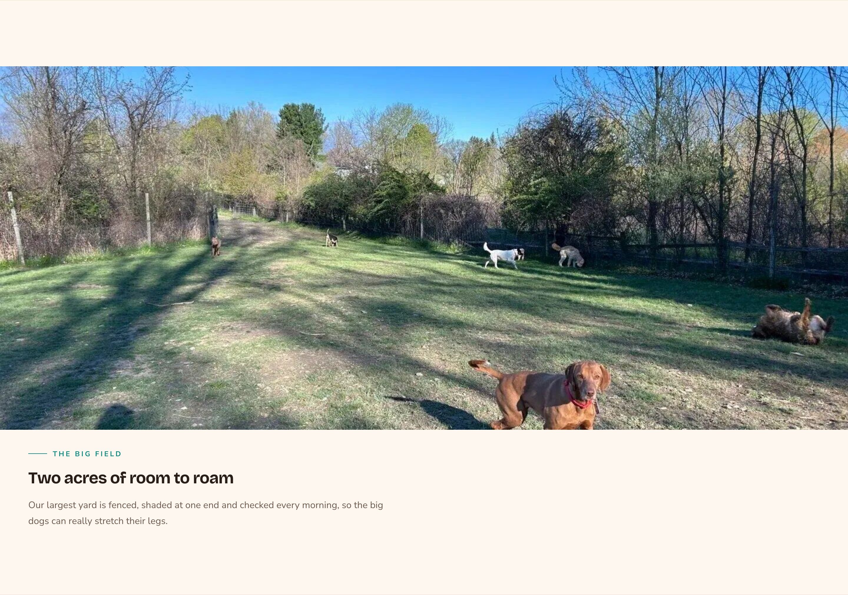
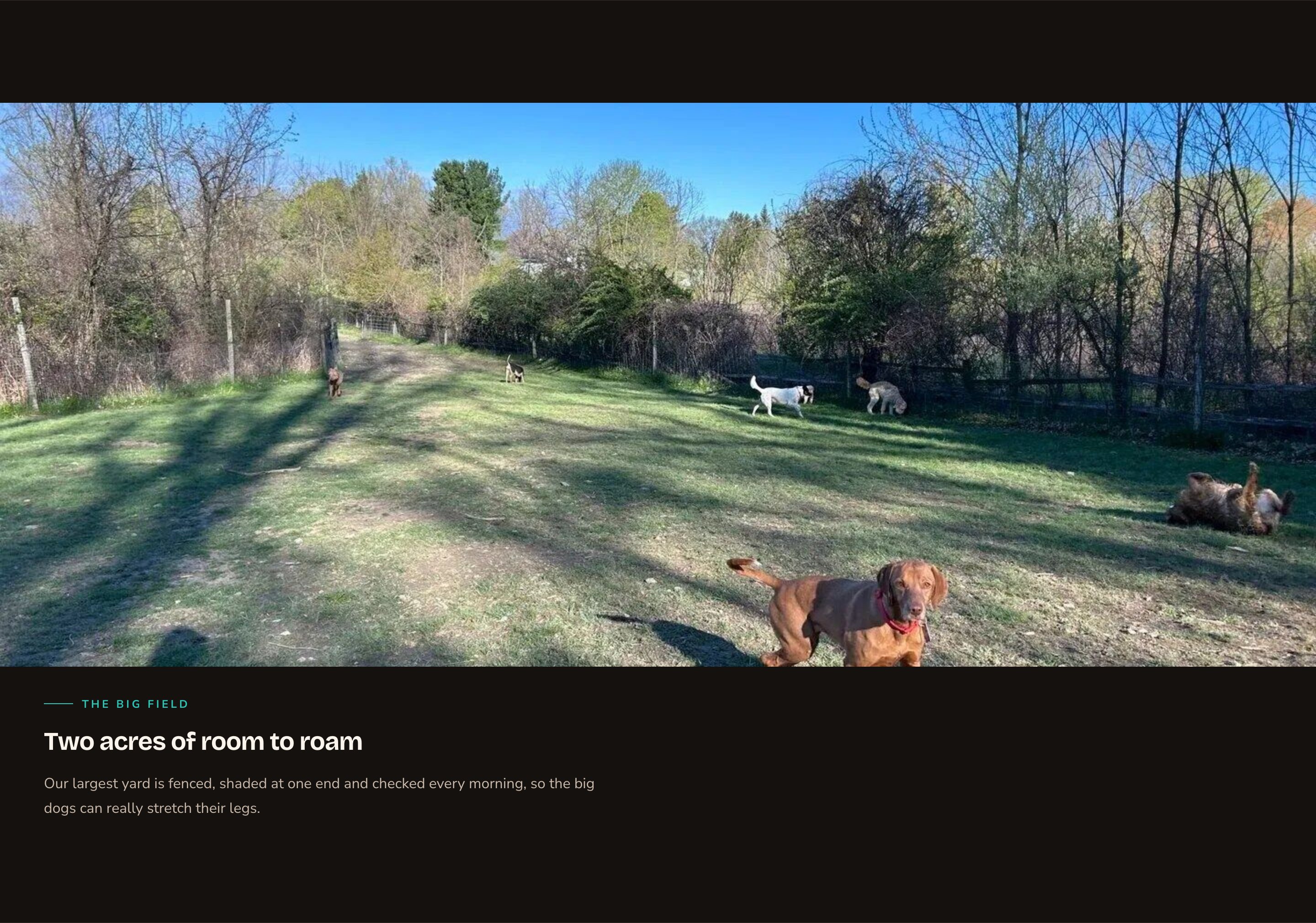
A full-bleed photo with the story below.
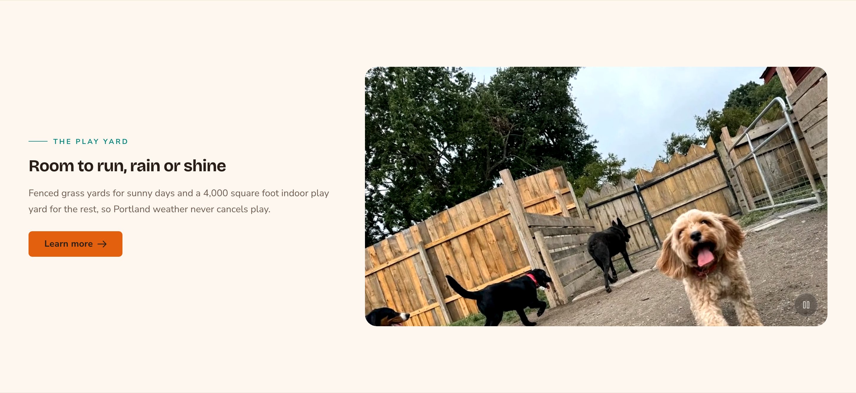
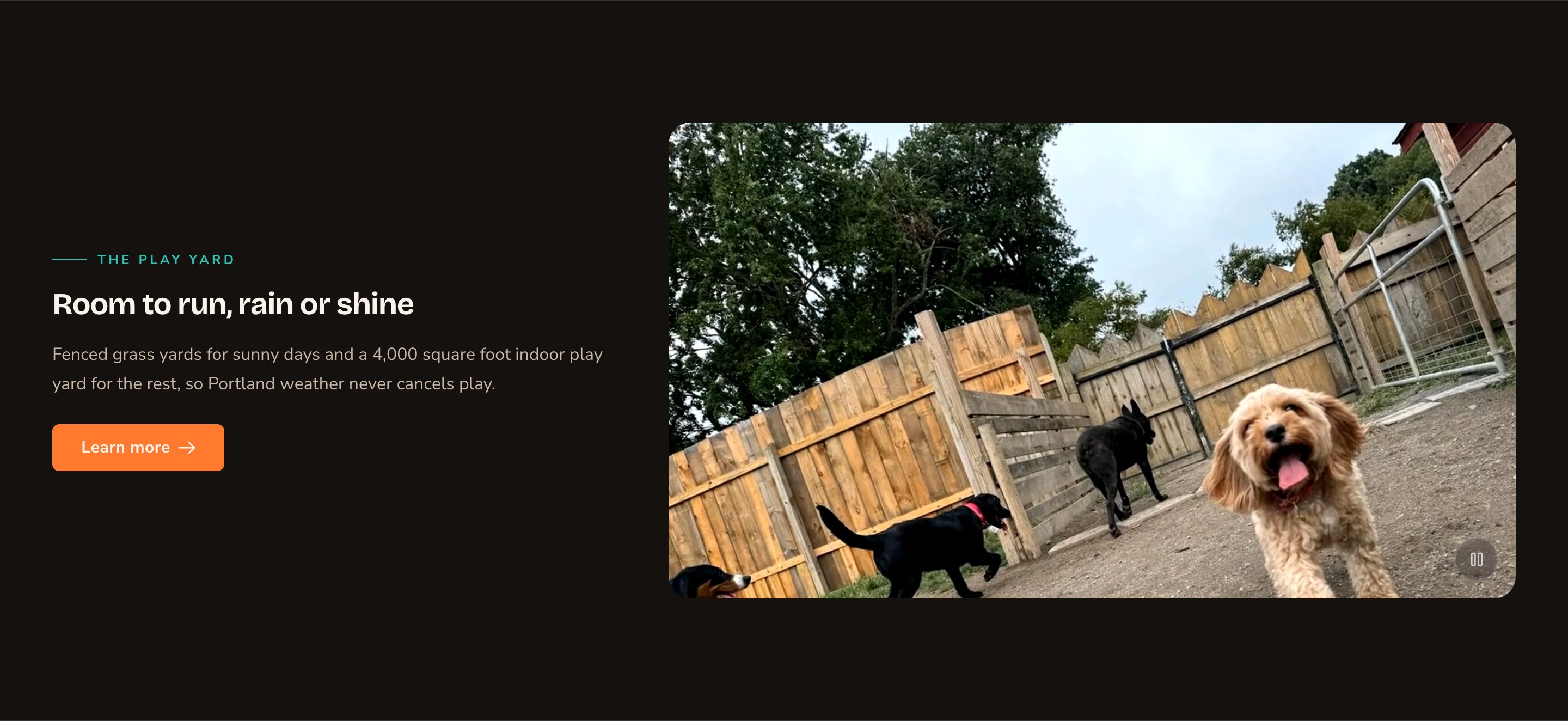
A looping video beside your text, with a pause button.
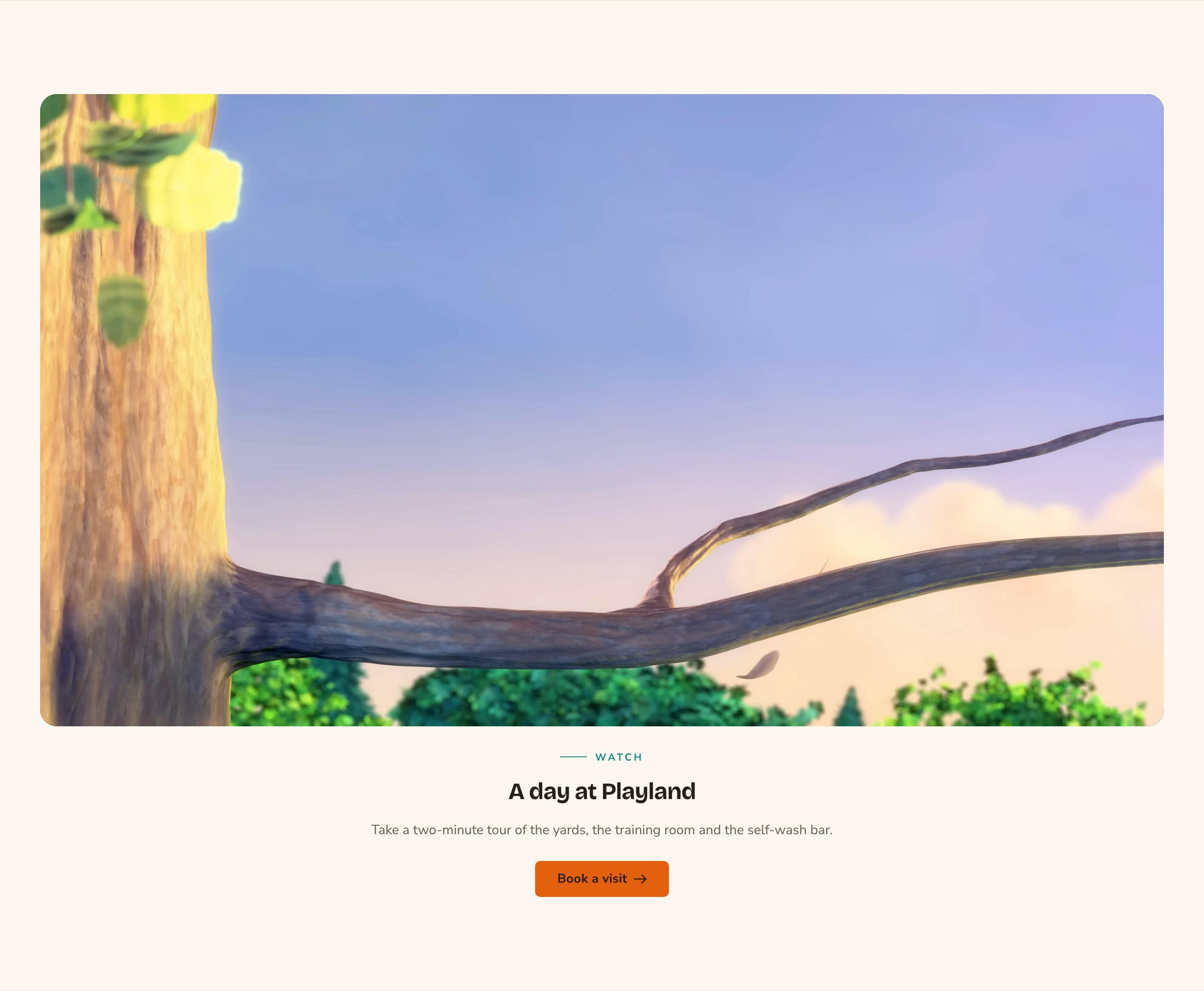
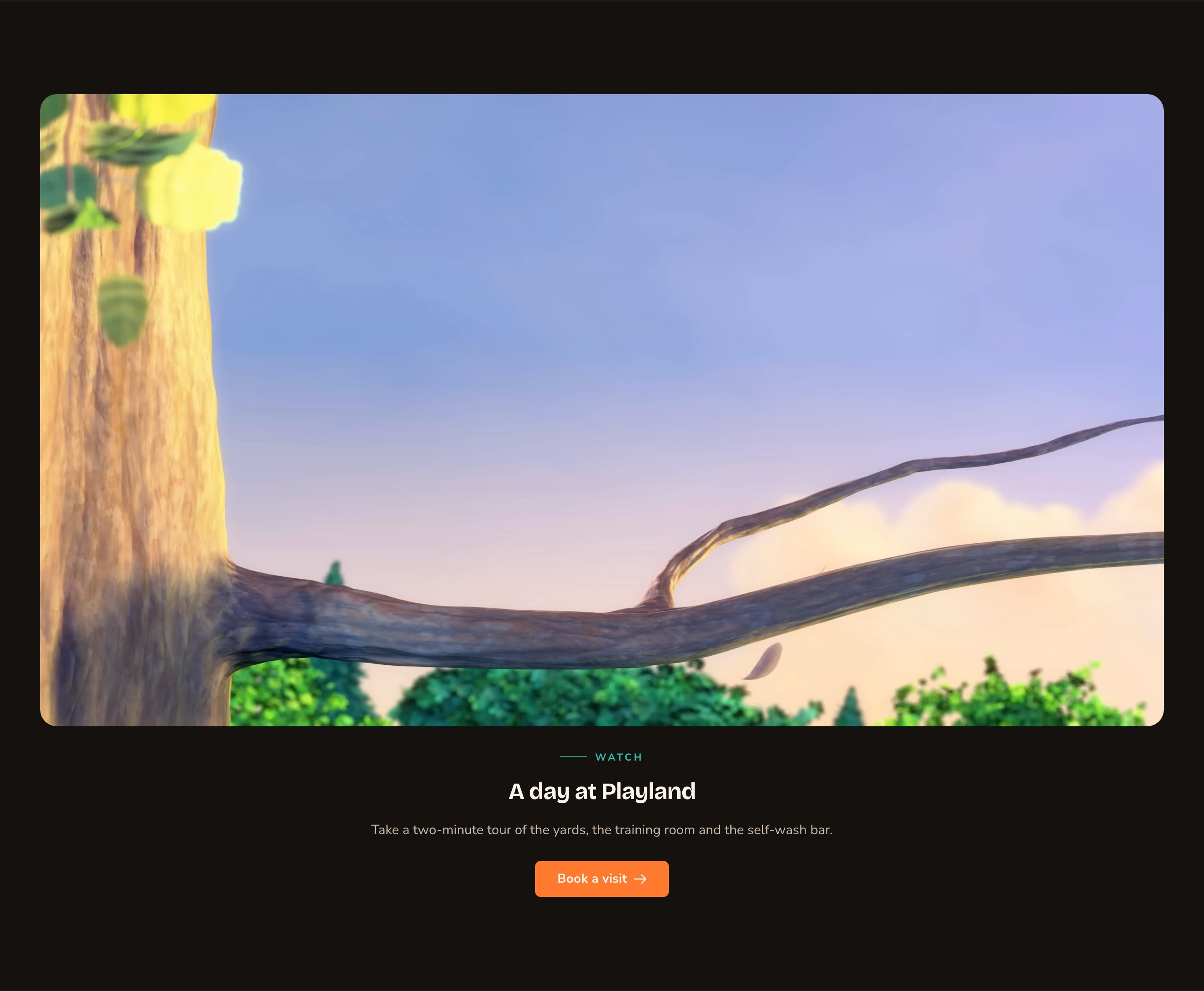
A YouTube video with a few lines about it.
Good to know
- Finding your Videos library. Open the command palette (press ⌘K, or Ctrl+K on Windows) and choose Videos under Manage.
- Looping videos and motion. An auto-playing video always gets a pause button. Visitors who prefer less motion see the video’s still picture instead. Set it in the Videos library as the video’s Poster / fallback image.
- On phones, side-by-side blocks stack with the media on top, so every block reads well on a small screen.
- Full-bleed media has square corners, whatever you choose in Media corners, so it meets the edges of the screen cleanly.
- Headings stay in order. The section heading is a subheading on the page, and each block heading sits one level below it.
- YouTube and Vimeo videos play from the video service’s own player. For YouTube, the section uses YouTube’s privacy-enhanced player, which doesn’t store cookies in a visitor’s browser unless they play the video.
Appearance options
Most sections also share a few tabs that work the same everywhere:- Background: set the color behind the section, separately for the dark and light themes.
- Fonts: use a different typeface for parts of this section only.
- CSS: add custom styles to this section. Admins and Owners can change it.
Related
The media library
upload photos and videos.
Images and videos
a single photo or video in a column or post.
Device mocks
show screenshots inside a phone or laptop.
Buttons and card styles
every button option.