

 AdonisJS
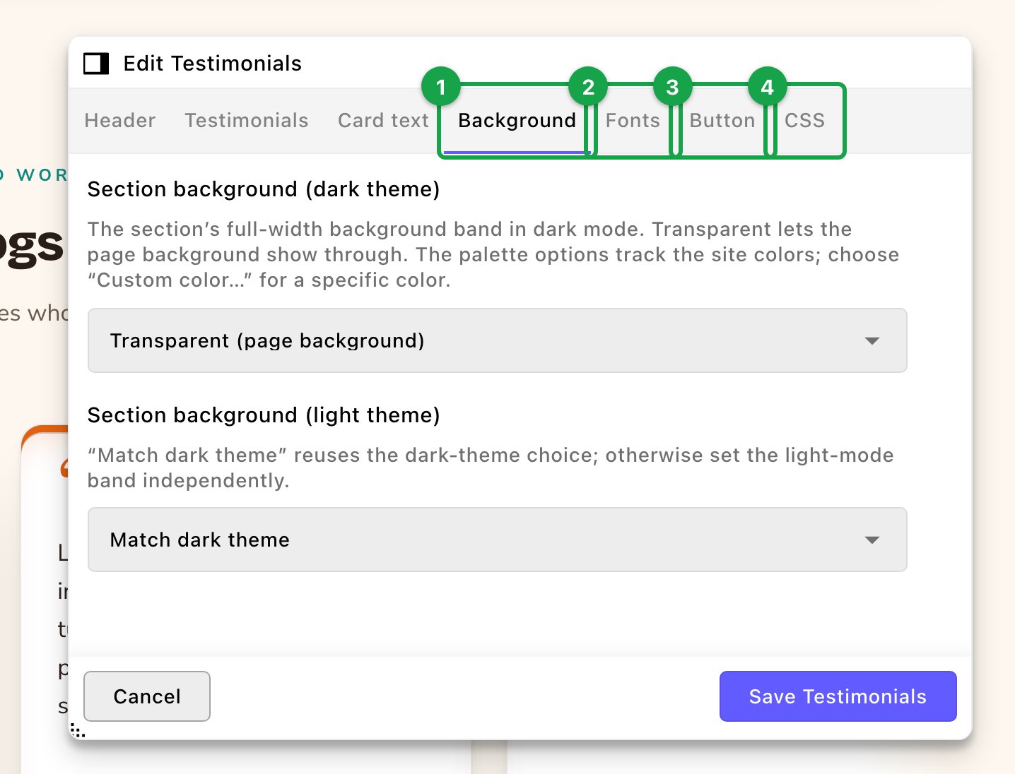
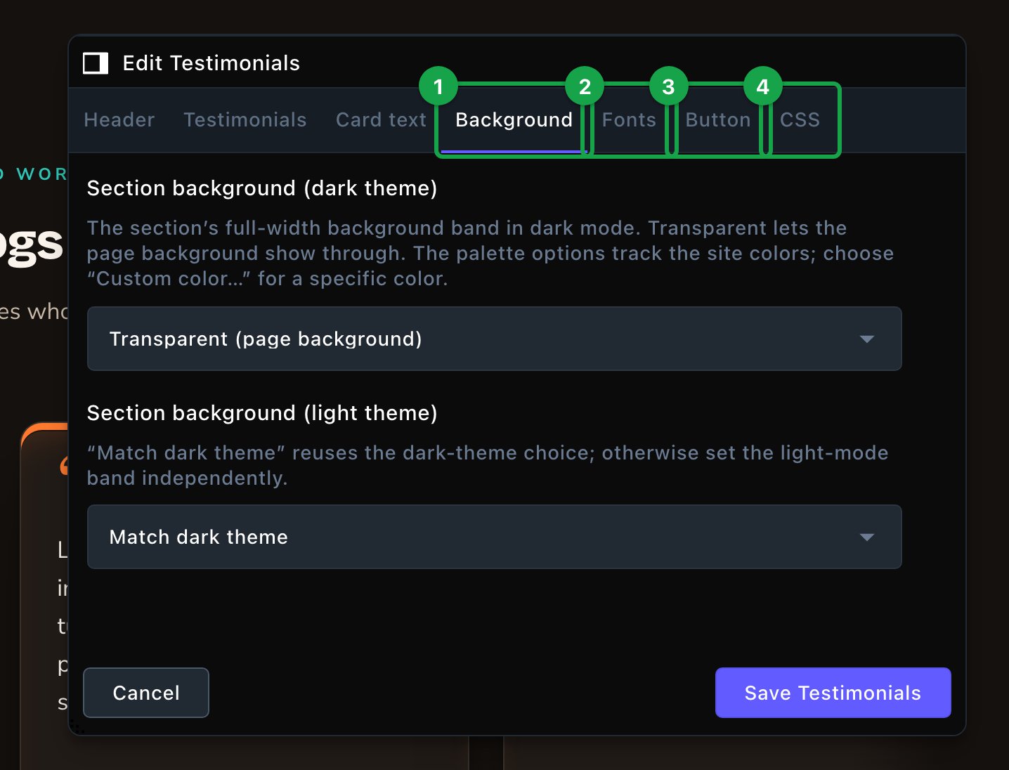
A section's own tabs come first. The shared ones follow.
The idea
Most sections open on a tab named after the section, such as Hero or Stats, for their content and layout. Some spread that content over several tabs instead. Team, FAQ, Testimonials, Google Reviews, Instagram Feed, Service Area Map and the gallery sections start with a Header tab, then a tab for their content, such as Team or Questions. The shared tabs come after the section’s own tabs. They look and behave the same in a Hero, a FAQ or a Pricing section. Everything here is optional. Leave a shared tab alone, and the section follows the rest of your site.- Colors come from Site design.
- Fonts come from the page first, then the site. A section’s own Fonts tab wins. Without one, the section uses the page’s Fonts tab, if that’s set. Without either, it uses Site design → Typography.
Lists of items
Many sections hold a list, such as the cards in Feature Cards, the numbers in Stats or the logos in Logos / Partners. Each list works the same way.- In the section editor, find the list, such as Feature cards, and choose its Edit button, such as Edit Feature cards. The list opens in its own window.
- To add an item, choose the + button (Add Item) at the top of the list, then fill in its settings.
- To change an item, choose it in the list, then edit its settings.
- To reorder items, drag them up or down the list.
- To remove an item, choose the ✕ (Remove Item) beside it in the list.
- Choose Save. The page beside the editor updates.
Colors for light and dark
Your site has a light and a dark theme, and visitors can switch between them. So most color options come in pairs, such as Section background (dark theme) and Section background (light theme).- Set the dark one only, and it’s used in both themes.
- Set the light one too, to use a different color in the light theme.
- Leave both empty, and the section uses your site’s colors from Site design (the Colors · Brand, Colors · UI and Colors · Status tabs).
Background
The Background tab gives a section its own full-width color band. Bands make a long page easier to read, because each section stands apart from the next.-
Section background (dark theme): the band in the dark theme. Choose Transparent (page background) to let the page show through, or one of your site’s colors:
- Surface: your page background color.
- Raised (card): your card color, a little lighter than the page in the dark theme.
- Sunken: your band color, a little darker than the page.
- Hill: a built-in neutral shade between the page and the band colors. You can’t change it in Site design.
- Accent (soft tint): a pale wash of your Primary / brand color.
- Section background (light theme): Match dark theme uses the same choice, or pick a different one.
- Custom color…: for an exact color. It opens Custom background (dark theme) or Custom background (light theme), where you pick the color.
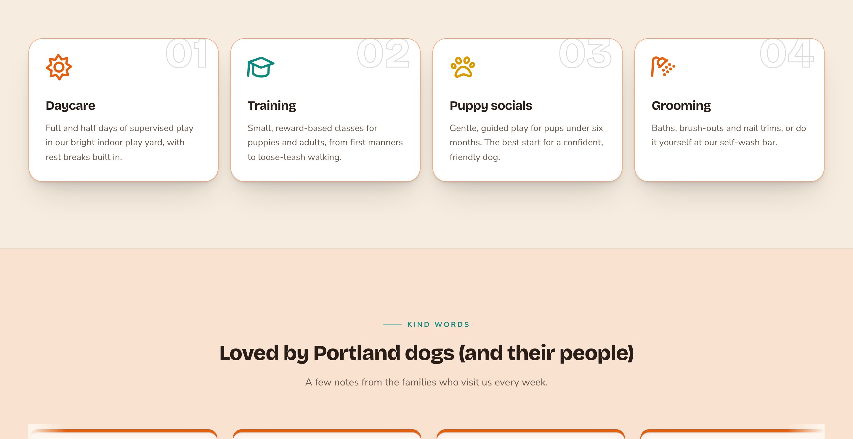
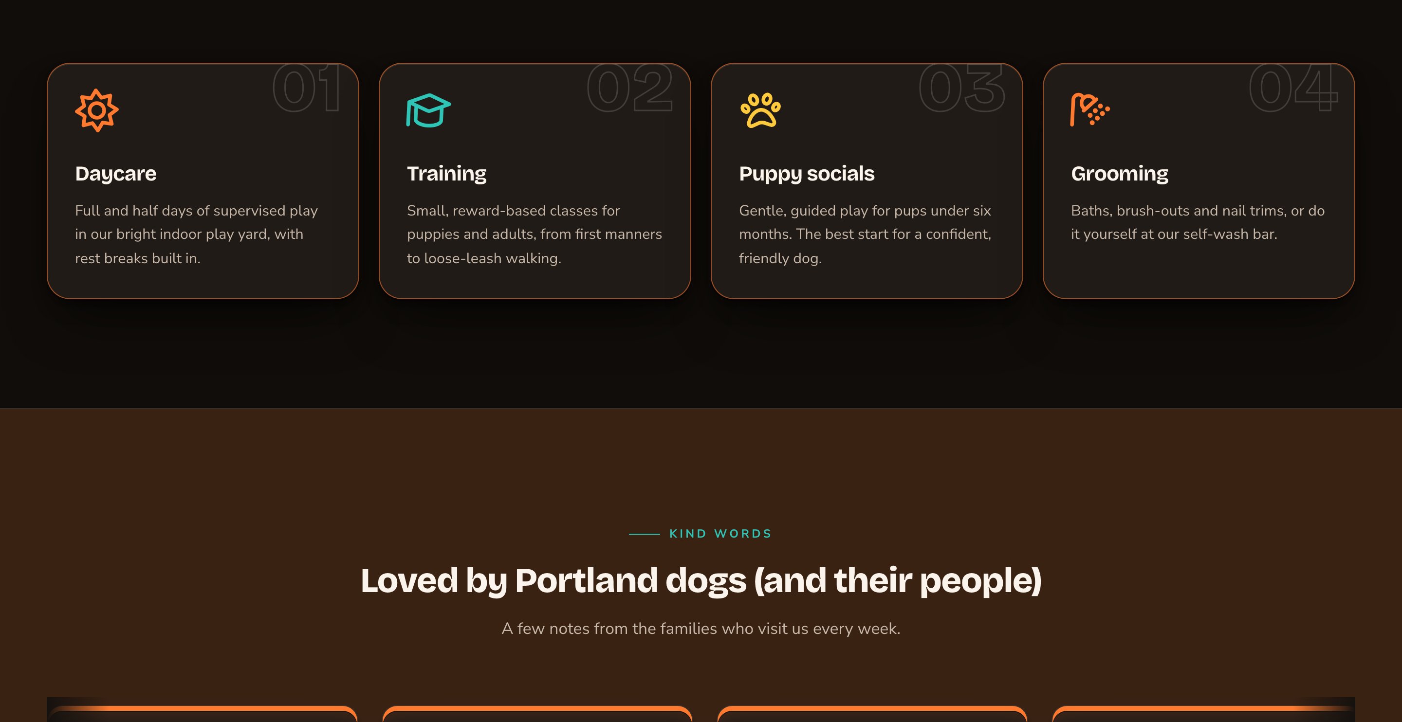
Alternate the bands so each section stands apart.
Fonts
The Fonts tab sets part of one section in a different font. (The CMS calls a font a “typeface”.) For example, give one section’s headings a playful display font, a bold font made for big headings. Use it sparingly: a site looks best with few fonts. When the list is empty, it reads “No overrides — this follows the site’s fonts”. Choose Add typeface to add a row and change a font. Each row has:- Apply to: which text changes: Everything in this section, Headings, Body text, Eyebrows / kickers, Buttons or Code / monospace.
- Typeface: where the font comes from.
- One of the site’s three typefaces: pick the Display font, Body font or Accent / mono font from Site design → Typography. These are already loaded, so they keep pages fast.
- Curated pick: a ready-checked typeface from Bunny Fonts or Fontshare.
- CDN family by name: load any font from an online font library.
- Choose the Provider: Bunny Fonts (Google Fonts catalog) or Fontshare.
- Use the link under it to browse the library (fonts.bunny.net or fontshare.com).
- Type the font’s name in Family name exactly as the library spells it, such as “Space Grotesk”.
- In Weights, list the weights you want, such as 400, 700. A weight is how bold the letters are, from 100 (thin) to 900 (black). 400 is normal and 700 is bold. A font’s page in the library shows the weights it has. Leave Weights empty to load 400, 500 and 700.
- Uploaded font files: upload your own font files, one per weight or style.
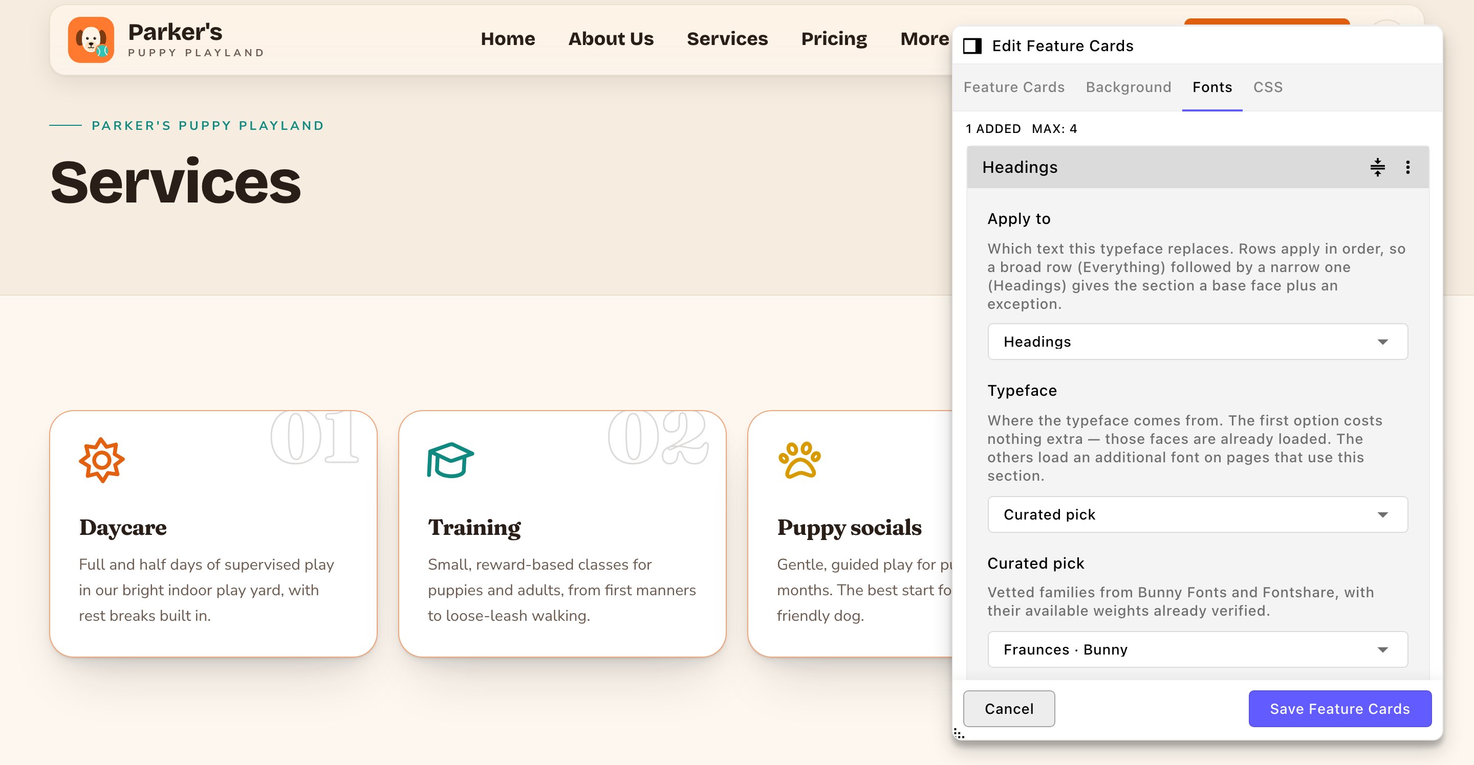
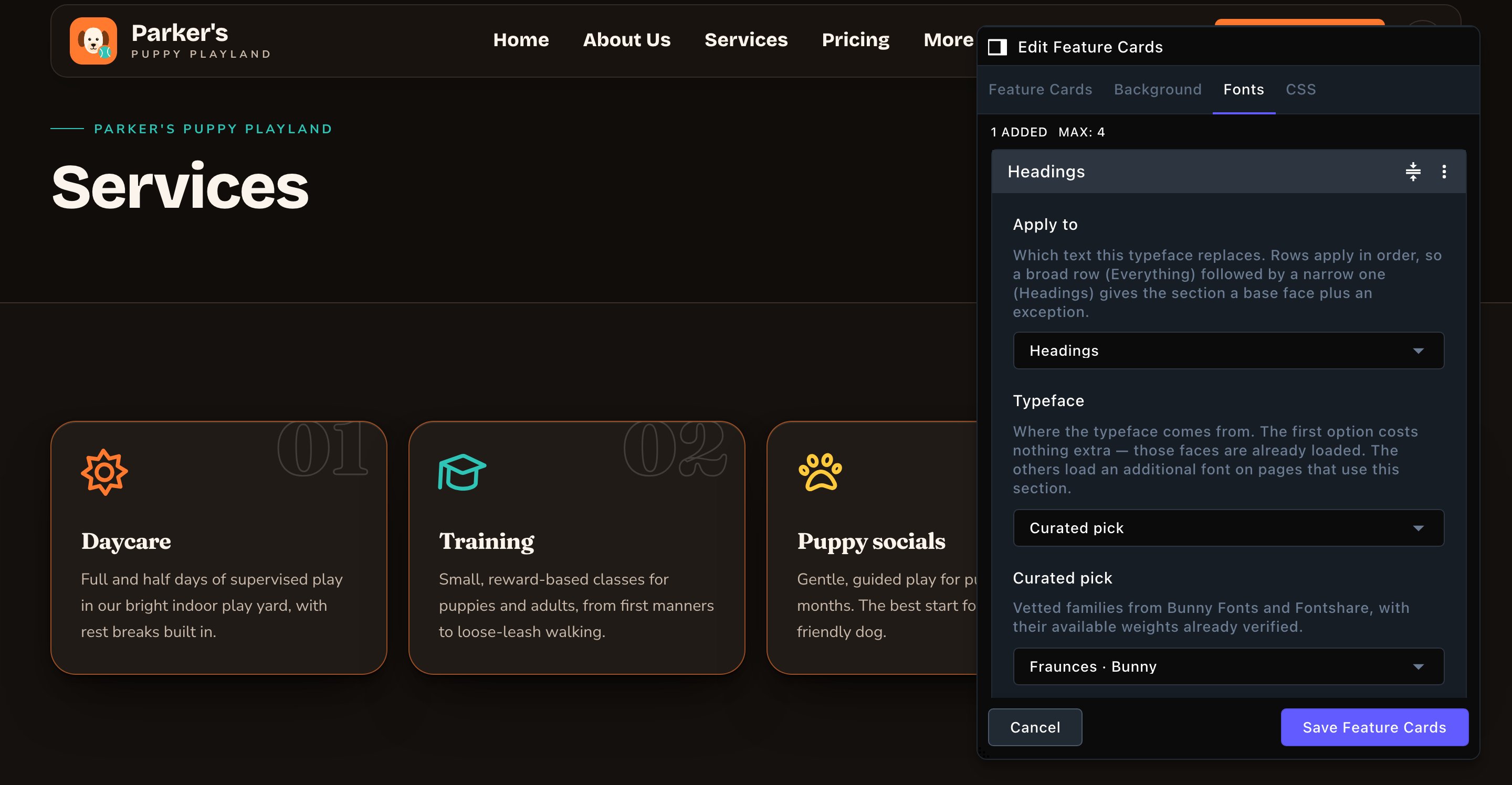
One row changes the card titles in this section only.
Buttons
Every button on your site has the same options. A section with one button has a Button tab, and a section with two has a Buttons tab. What it says and where it goes- Button label: the text on the button. Leave it empty to hide the button.
- Button link: a page on your site, such as /contact-us, or a full web address.
- Open in new tab: opens the link in a new browser tab.
- Button style: Solid (filled), Outline, Soft (tinted fill) or Text link.
- Button size: from Small to Large.
- Corner radius: how rounded the button’s corners are, from Pill (fully round ends) to Square.
- Button color, Label color and Hover color: each comes as a dark and a light theme pair. These three are the exception to the rule above: an empty button color means no color, not your site’s color. So clear a solid button’s Button color, and you get an outline-only button.
- Hover surface: what appears behind the button, such as Soft shadow, Soft glow or Fill sweep.
- Hover motion: Lift (small slide up), Scale (grow), Lift + scale or None.
- Icon name and Icon family: add an icon to the button. Find an icon at fontawesome.com/icons and type its name without “fa-”, such as arrow-right. Then pick its look in Icon family, such as Classic Regular. Feature Cards, Stats and How it works / Steps use the same two fields for their icons.
- Icon position: Before label or After label. Turn on Nudge icon on hover to slide it a little on hover.
Card styles
Sections that show cards, such as Feature Cards, Testimonials or Pricing / Packages, share 2 options for the cards. Card style sets how each card looks at rest. In How it works / Steps it’s called Step style. There are 12 styles:
Beside it, Card corners sets the rounding: Default, Square, Slight, Rounded or Large. Default keeps the section’s own corners (Forge gets tight corners). Some styles bring extra options:
- Card style color: the color of the Spine rail, the Bracket marks, the Forge frame and the Press margin line. Leave it empty to use your accent color.
- Forge color placement and Forge line weight: for Forge only. Color just a corner mark or the whole frame, in a fine, medium or bold line.
- Lift, Pop, Press, Glow and Outline: quick reactions such as rising or glowing.
- Sheen: a soft light sweeps across the card.
- Tilt, Magnetic and Spotlight: the card follows the visitor’s pointer. These need animations turned on in Site design → Motion.
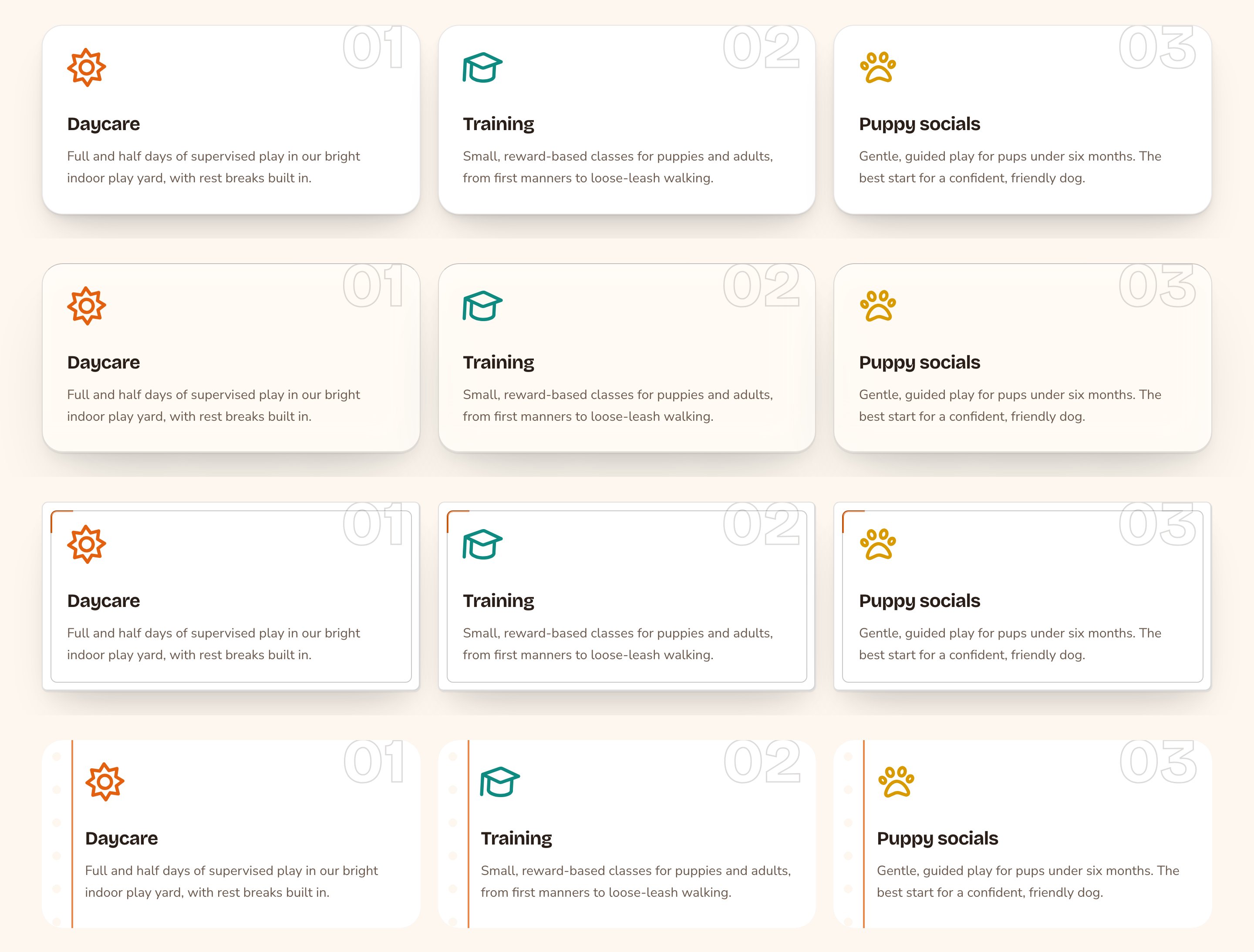
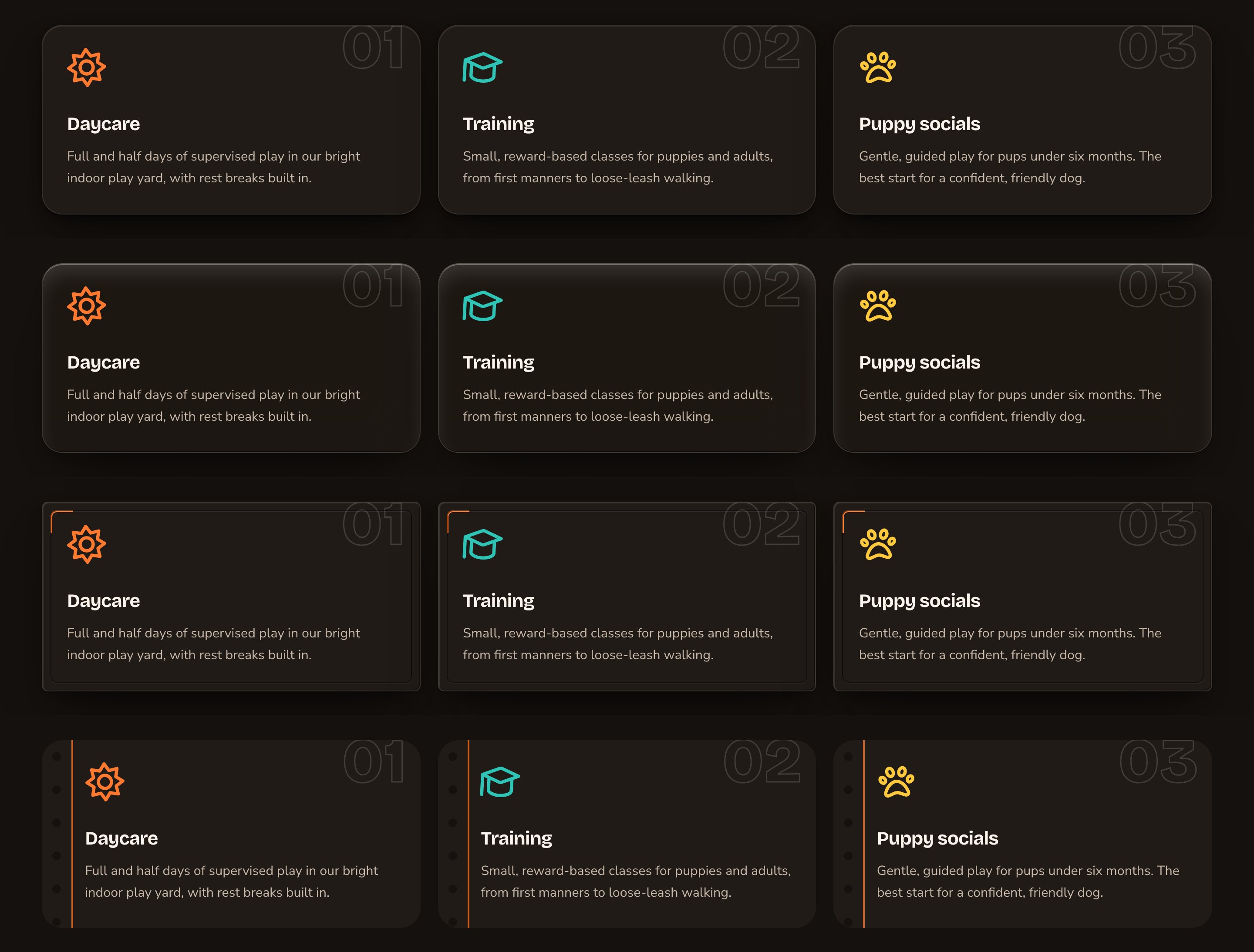
One set of cards in four card styles.
CSS
The CSS tab is an optional, advanced feature. CSS is the styling language web pages use, so this tab is for small touches the other options don’t cover. Admins and Owners can use it. Everyone else sees “Custom CSS needs the “Write custom CSS” permission. Saving keeps the CSS as it is.” The tab holds one Custom CSS field. In it, each part of the section has its own slot, such as its heading, its cards or its buttons. Type CSS into the slot of the part you want to change, and it styles that part of this one section only.- Point at a slot to outline its part on the page.
- Open Currently applied in a slot to see what already styles that part.
- CSS with mistakes isn’t saved. The CMS lists each problem and how to fix it.
Which sections have what
Every section in the list also has a CSS tab.
A short example
Parker’s Puppy Playland wants its home page to feel less like one long block.- Jordan opens the Feature Cards section’s Background tab and sets Section background (dark theme) to Sunken. The light theme follows, because it’s on Match dark theme.
- On the Testimonials section, Jordan picks Accent (soft tint), so the reviews get a soft band of the brand color.
- On the Fonts tab of Feature Cards, Jordan adds a row: Apply to Headings, Typeface One of the site’s three typefaces, Site typeface Accent / mono font. The card titles change, and nothing else on the site does.
- Jordan publishes the page.
Related
Buttons and card styles
every button and card option in depth.
Typography
choose your site’s three typefaces.
Colors
the palette every section draws from.
Custom CSS
slots, examples and messages.