

 AdonisJS
Open the header settings
- In the toolbar (the bar across the top of your site once you’re signed in; see The toolbar), choose Site design, then one of the five Header: tabs.
- Or open the command palette (⌘K, or Ctrl+K on Windows), choose Site design, then a Header: tab.
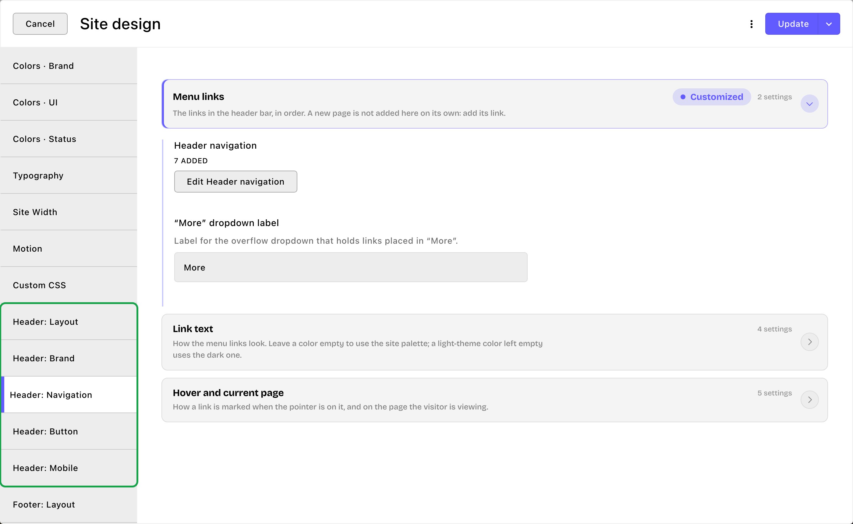
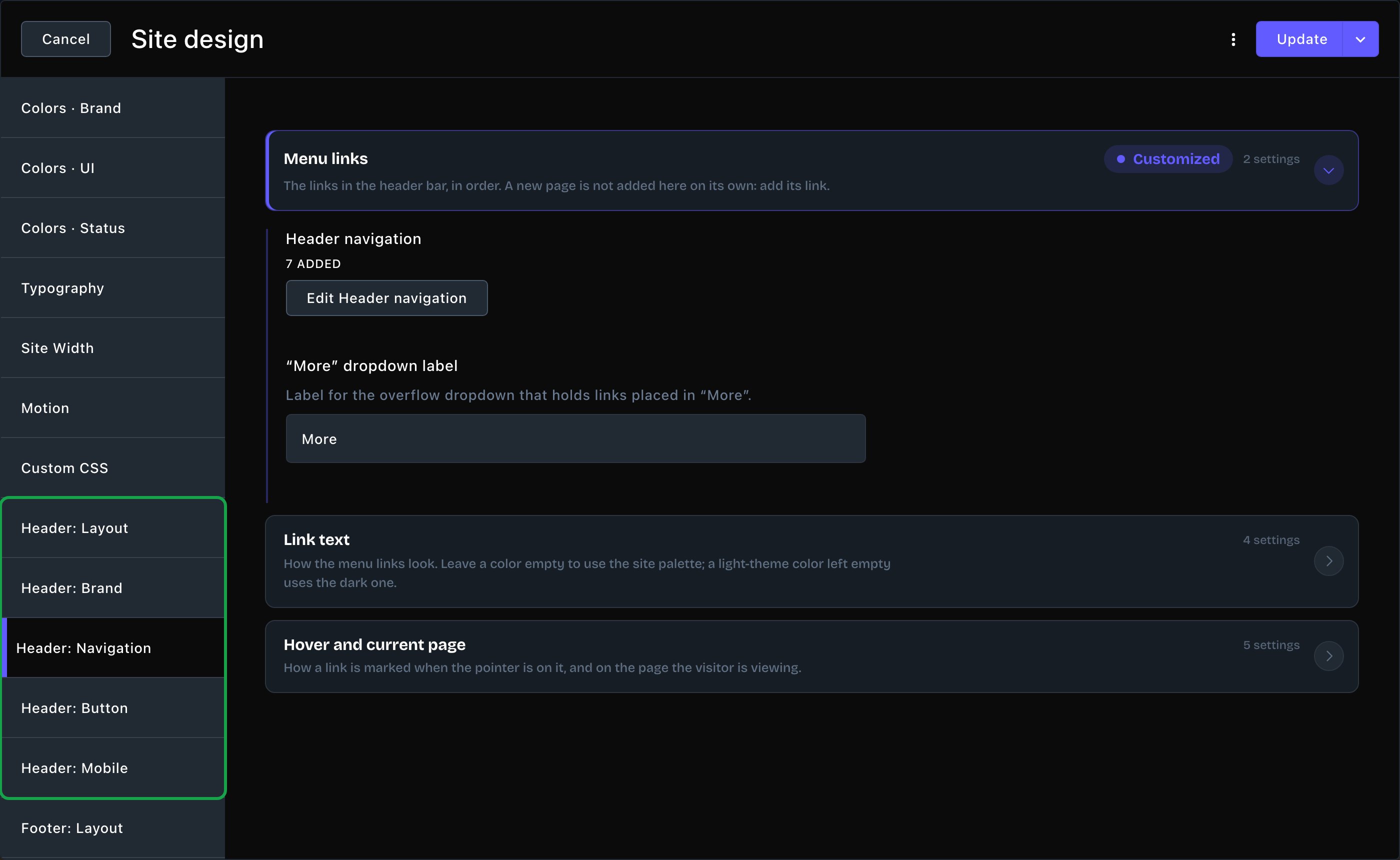
The Header: Navigation tab, with Parker's menu links.
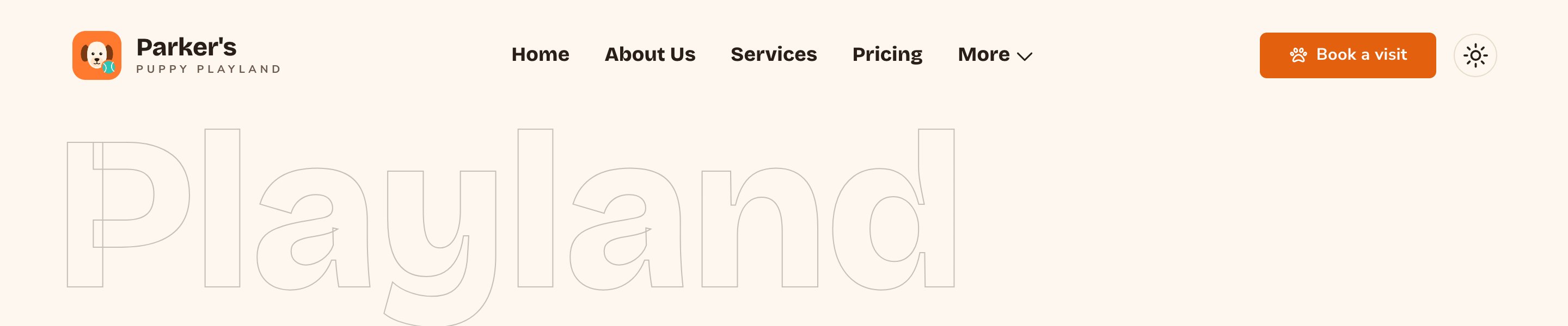
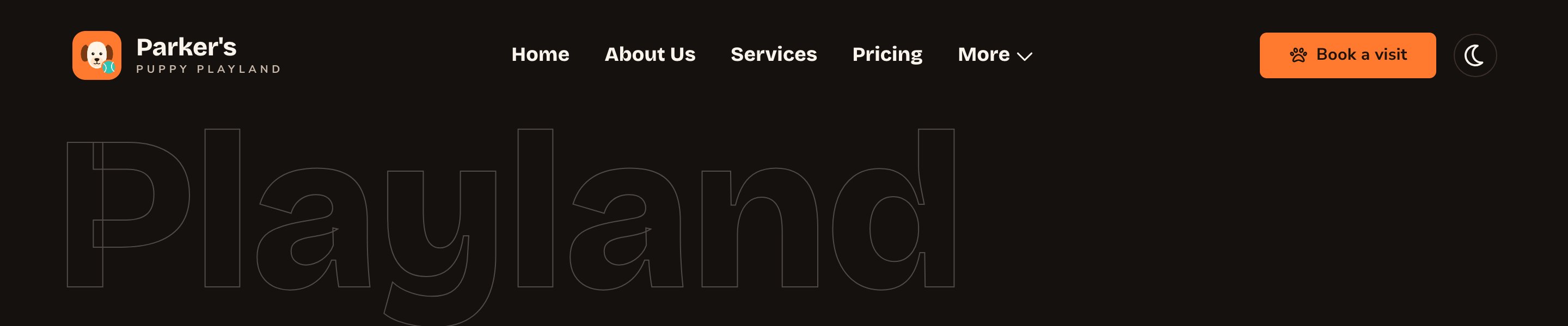
Parker's header: logo, menu links and a button.
Header: Layout
Bar- Bar style: how the bar looks.
- Floating (transparent → glass on scroll) sits see-through over the top of the page, then turns to frosted glass as visitors scroll.
- Glass (always frosted) is frosted from the start.
- Solid is a plain, filled bar.
- Bar width: Island (floating, contained) is a rounded bar that floats inside the page width. Full width (edge-to-edge) runs from one side of the screen to the other, with square corners.
- Bar corner radius: how round an Island bar is: Pill, Rounded, Slight or Square.
- Background: the bar’s color, for Glass and Solid bars. Leave it empty to use your card color.
- Show bar border and Show bar shadow: a thin outline and a soft shadow around the bar.
- Hide on scroll down: the bar slides away as visitors scroll down, and comes back when they scroll up.
- Morph to glass on scroll: for a Floating bar. Turn it off to keep the bar see-through all the time.
- Use the dark-theme header in both themes: keeps the header dark even when visitors switch your site to light. Use it when your header always sits on a dark photo. While it’s on, the light-theme header colors and your light-theme logo aren’t used.
- Collapse nav to menu at: below this screen width, the menu links fold into a menu button. Choose Medium (768px), Large (1024px) or Extra large (1280px). Pick a larger width if you have many links or long ones.
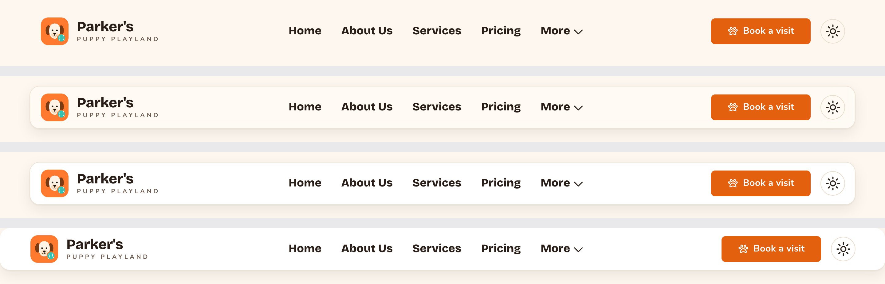
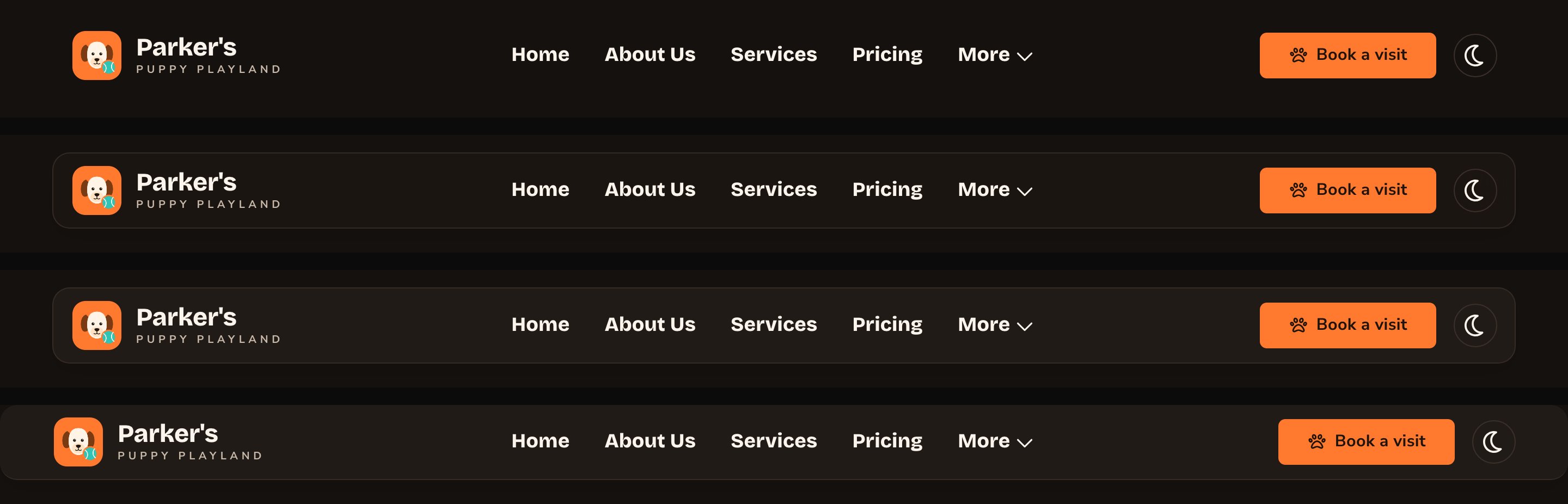
Floating, Glass and Solid bars, and a full-width bar.
Header: Brand
Your logo images and business name come from Site settings → Brand. These settings choose how they look in the header. See Brand. Logo- Logo height: Small, Medium or Large.
- Animate logo on hover: the logo tilts and grows a little when the pointer is on it.
- Show text wordmark: turn it off when your logo already includes your name.
- Wordmark text: different words for the wordmark. Leave it empty to use your business name.
- Split wordmark into name + caption: shows the first word large and the rest small underneath. “Parker’s Puppy Playland” becomes a big “Parker’s” over a small “Puppy Playland”.
Header: Navigation
Menu links Header navigation is the list of links in your header, in order. To change it:- Open the Menu links card and choose Edit Header navigation. The list opens in its own window.
- To add a link, choose Add Item, then fill in its settings (below).
- To change a link, choose it in the list. To reorder links, drag them up or down. To remove one, use the remove button beside it.
- Choose Save in the list window to keep the list, then choose Update to save everything.
- Label: the words visitors see, such as “Daycare”.
- URL: where it goes. For a page on your site, type its address without the domain, starting with /, such as /daycare. To find it, open the page on your site and copy the part of the address after your domain. For another website, paste its full web address, starting with https://.
- Placement: Visible in the nav bar, or In the “More” dropdown to tuck it into a menu at the end of the bar.
- No link placed in “More”: the bar shows your first 4 links and puts the rest in “More” for you. With 5 links, the 5th goes in “More”.
- At least one link placed in “More”: the 4-link limit no longer applies. Every link set to Visible in the nav bar shows on the bar, and only the links you placed in “More” go there. With 5 links and 1 placed in “More”, the bar shows 4 and “More” holds 1.
- Marker: how a link is marked under the pointer and on the current page. Choose Underline sweep, Underline grow (from center), Pill background or None (color only).
- Hover color: the link’s color under the pointer. It uses your primary color until you set it.
- Current page color: the color that marks the page visitors are on. It uses your secondary color until you set it.


Links placed in More open from a menu at the end of the bar.
Header: Button
The button at the end of the header, such as “Book a visit”. It’s your header’s call to action (CTA): the one thing you most want visitors to do. A new site starts with a placeholder button: change its words and link, or clear Button label to hide it. The tab opens with a Live preview of the button in your settings. Under it, Reset Header CTA to: (CTA is this call-to-action button) puts the button back to your site’s Primary Default or Secondary Default look.- Button: Button label, Button link, Open in new tab, Button style, Button size and Corner radius.
- Colors: Button color, Label color and Hover color, each for light and dark.
- Hover effect: what the button does under the pointer: Hover surface, Offset / glow color and Hover motion.
- Icon: an optional icon beside the label: Icon name, Icon family, Icon position and Nudge icon on hover. Find an icon at fontawesome.com/icons and type its name without “fa-”, such as calendar-check. Then pick its look in Icon family, such as Classic Regular.
Header: Mobile
On phones and small screens, the menu links fold into a menu button. Tapping it opens a drawer that slides in from the side. Menu drawer- Drawer side: Right or Left.
- Drawer width: Narrow, Normal or Wide.
- Background: the drawer’s color. Leave it empty to use your page background.
- Show logo in drawer: your logo at the top of the drawer.
- Show CTA button in drawer: your header button (the call to action) at the bottom of the drawer.
- Show scroll cue: a small moving hint when there are more links than fit, so visitors know to scroll.
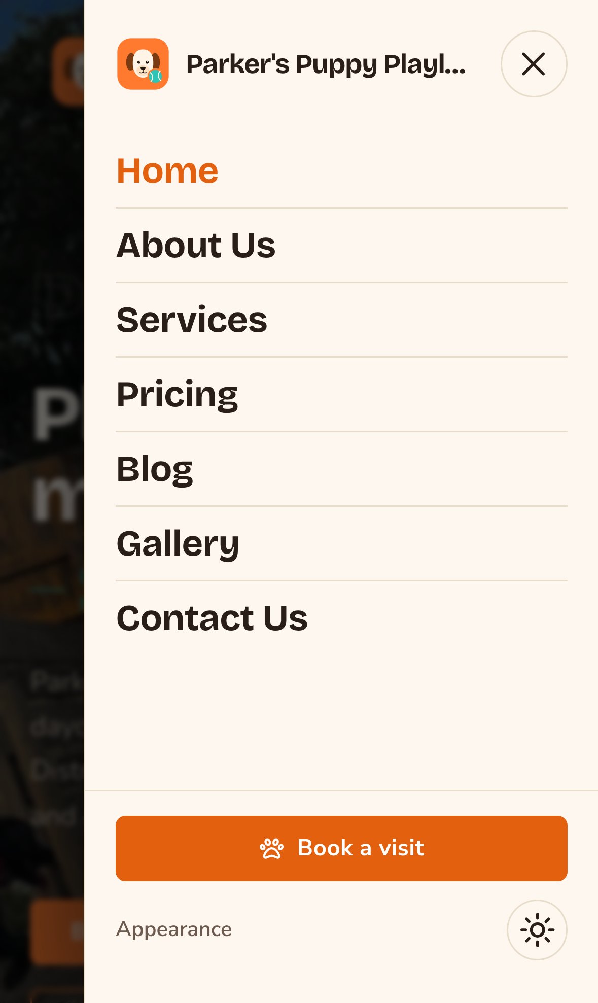
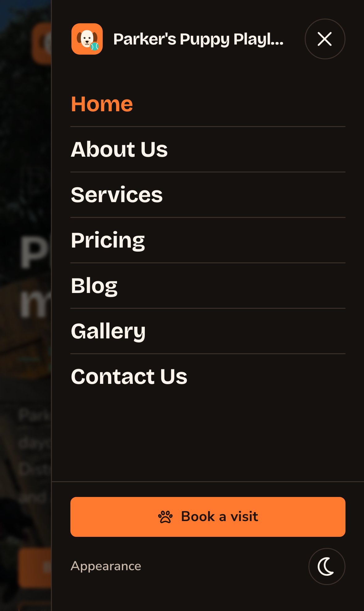
The menu drawer on a phone, with the logo and the header button.
Put your header live
Choose Update to save your header and put it live on every page. To save it without putting it live yet, open the arrow next to Update (More save options) and choose Save Draft. Your changes wait there; open the window again and choose Update when you’re ready to put them live. Only the Header: Button tab has a preview. To see the other tabs’ changes, you put them live: choose Update, then look at your site. Check it in both themes, and on a phone-sized screen.Good to know
- Leave colors empty to stay on brand. In the header’s own settings, an empty color follows your site’s palette, and a light-theme color left empty uses the dark-theme one. See Colors. The header button’s colors follow the button rules instead; see Buttons and card styles.
- The header uses your site fonts. Change them in Typography. Pages and sections can’t give the header a different font.
- The header follows your site width. See Site width.
- The light and dark switch is in the header. Visitors use it to change your site’s theme. On a phone, it’s inside the menu drawer.
Related
Footer
the bar at the bottom of every page.
Brand
your logo and business name.
Buttons and card styles
every button setting, explained.
Site design
every tab on this screen.